BRAND DESIGN
A closer look at three projects where I built visual identities; from concept to a complete brand system.
Showcase 01
·
Showcase 01 ·
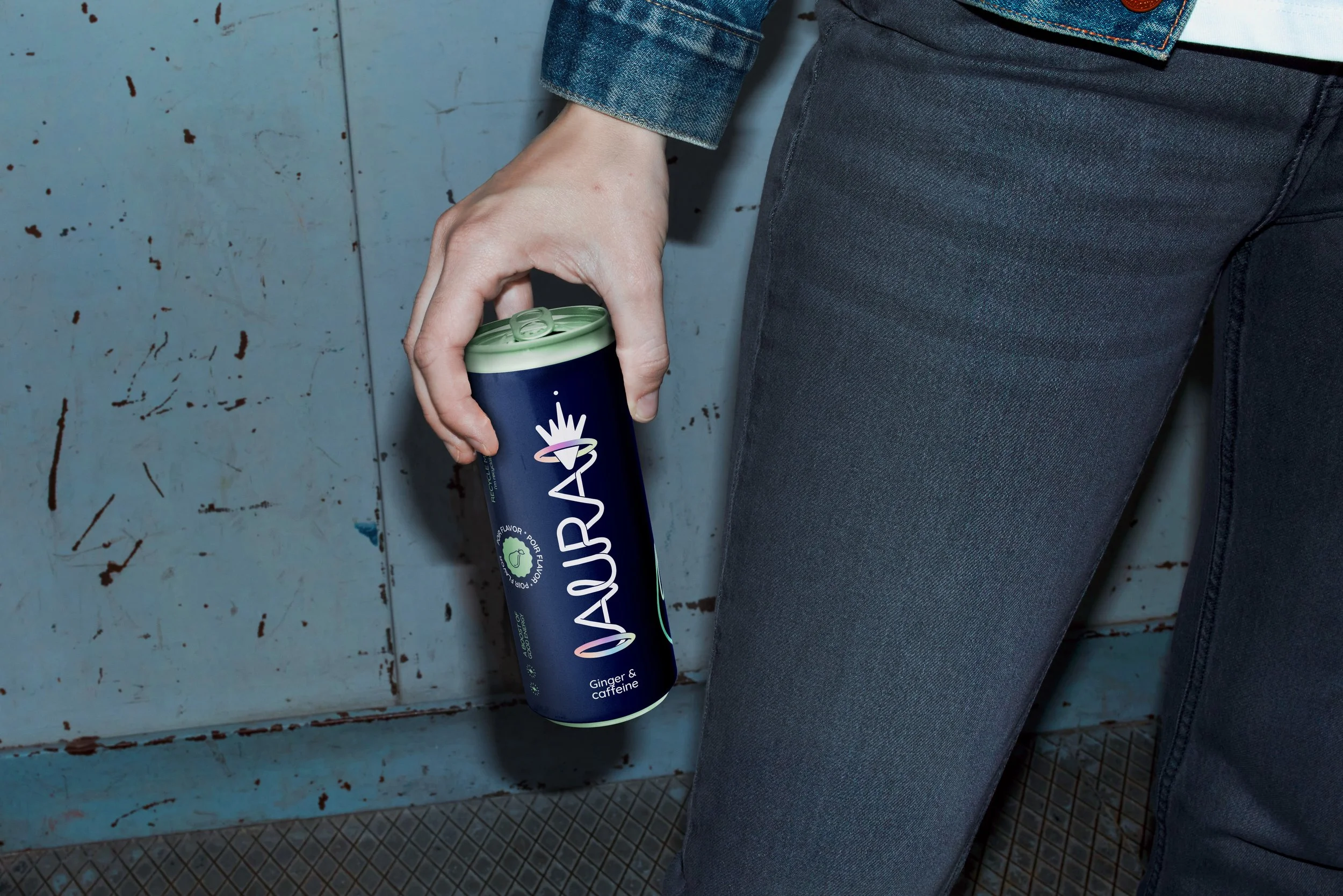
Aura
Energydrink concept
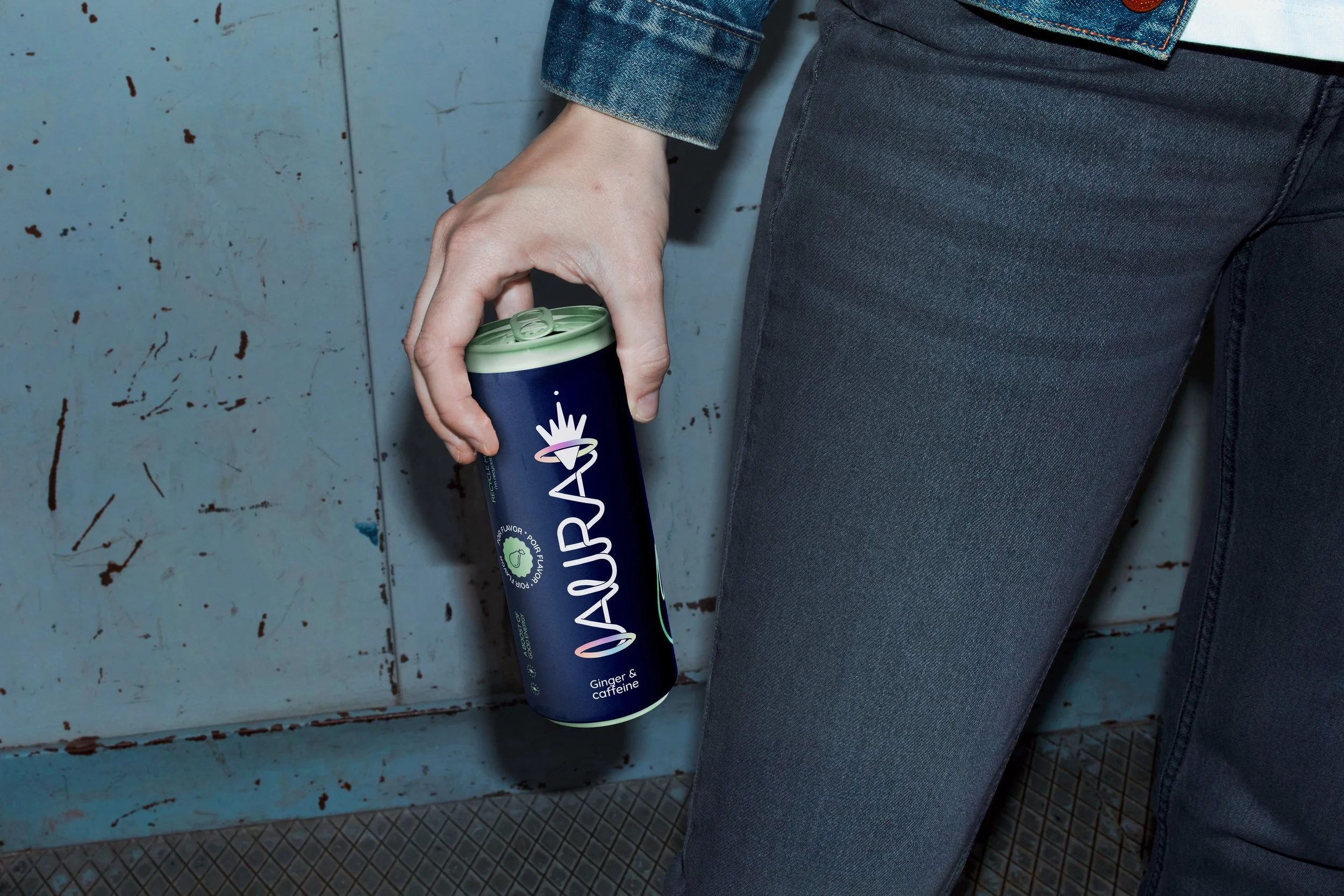
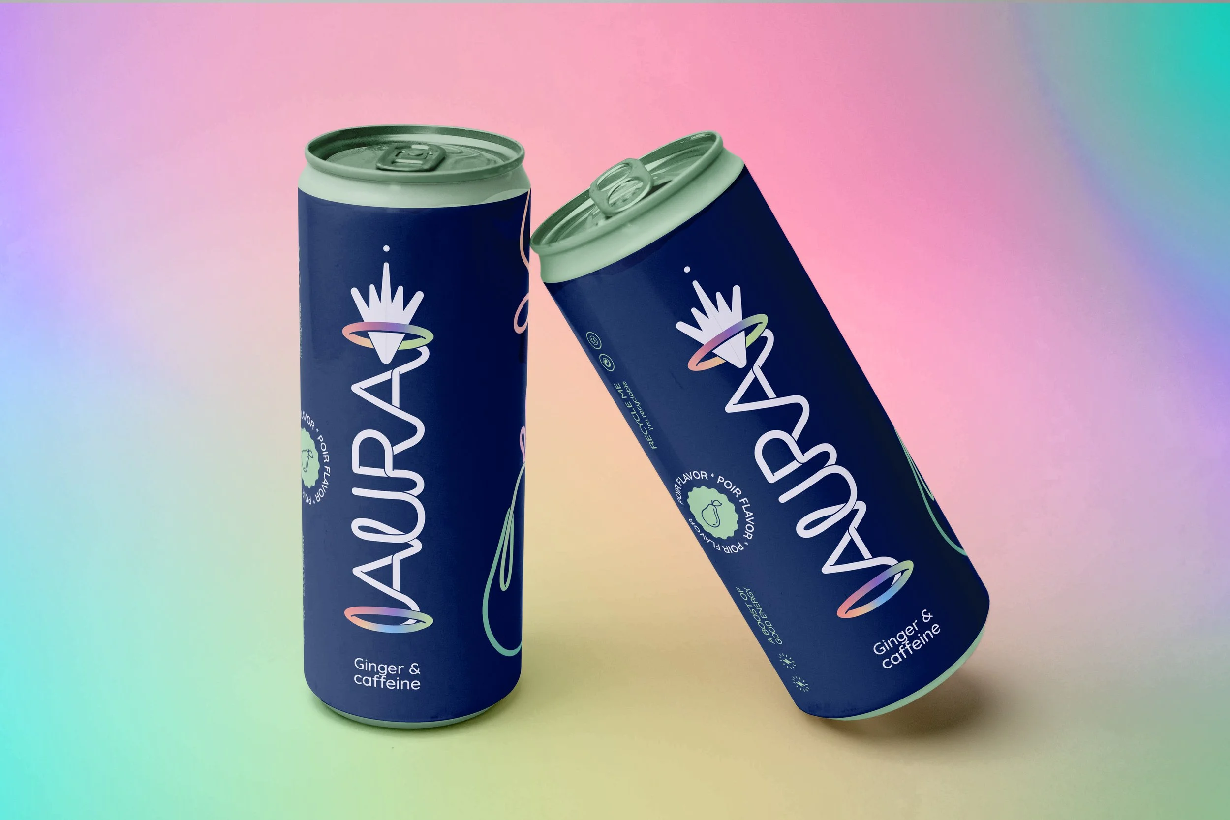
Aura is a fruity, healthy energy drink created for students who want a more nourishing boost during late study nights. Rather than relying on traditional energy‑drink clichés, it aims to feel just as energetic and appealing through a fresher, more contemporary approach.
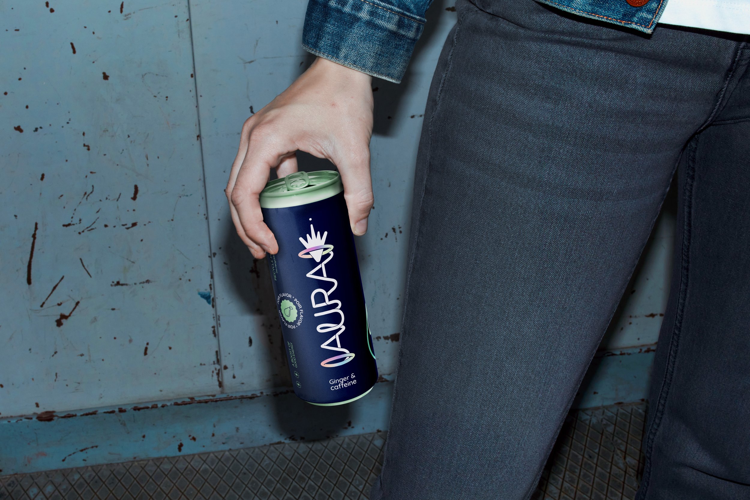
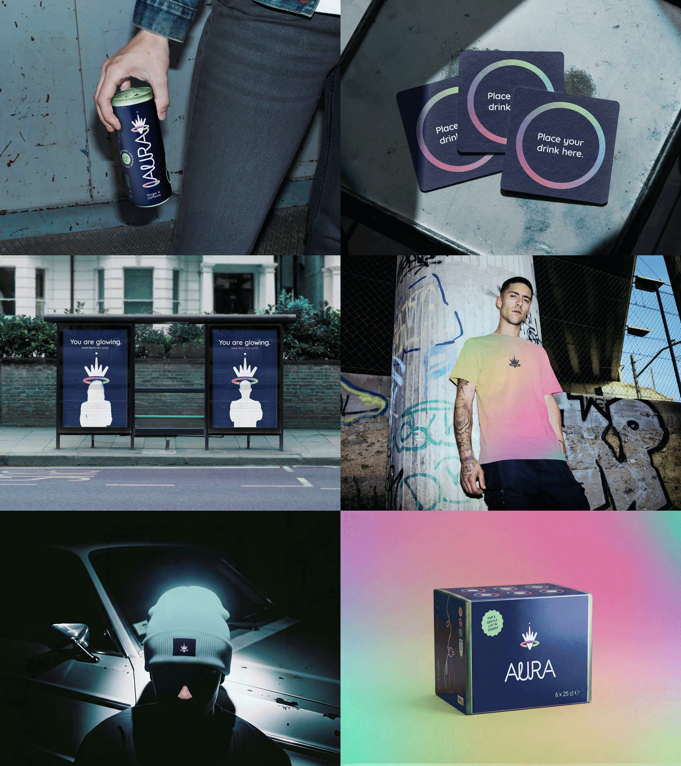
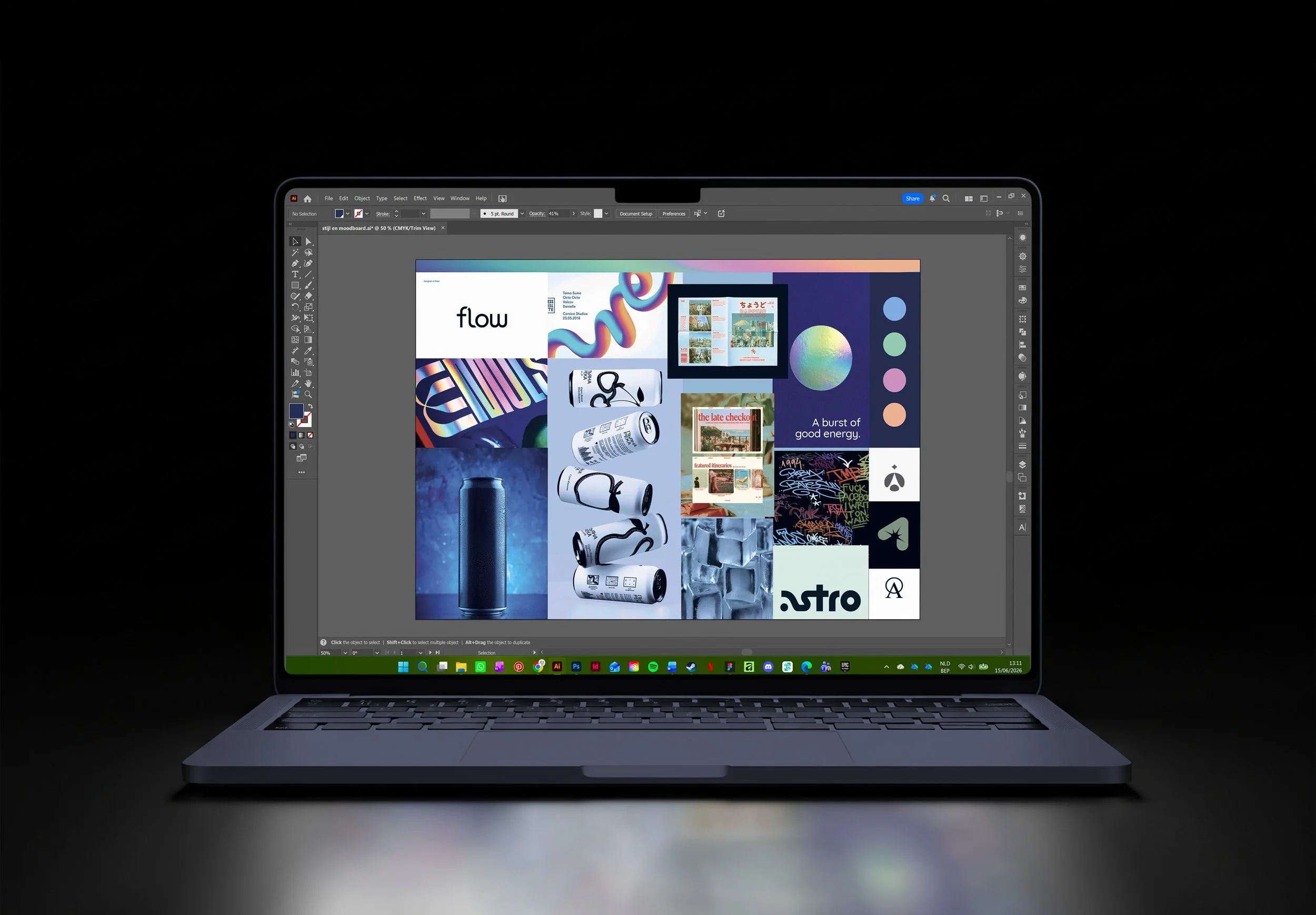
The visual identity reflects this balance. Pastel colours, cooltoned, flash images, and a modern aesthetic convey the cool energy students look for, while a thoughtful, supportive tone ensures the brand leaves a lasting and positive impression.
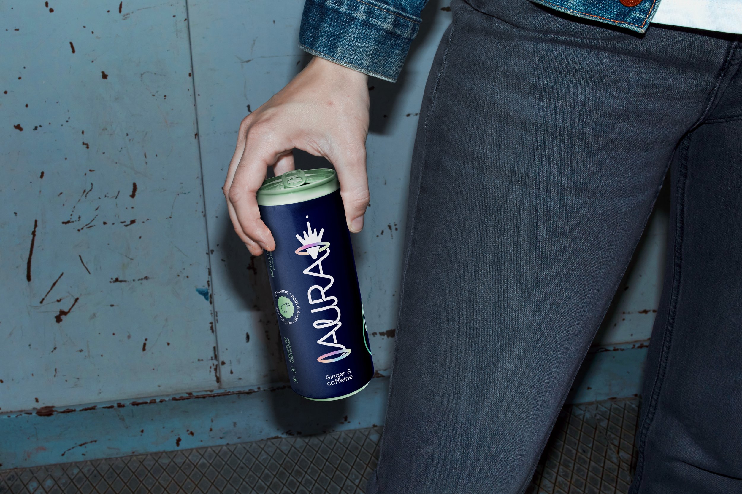
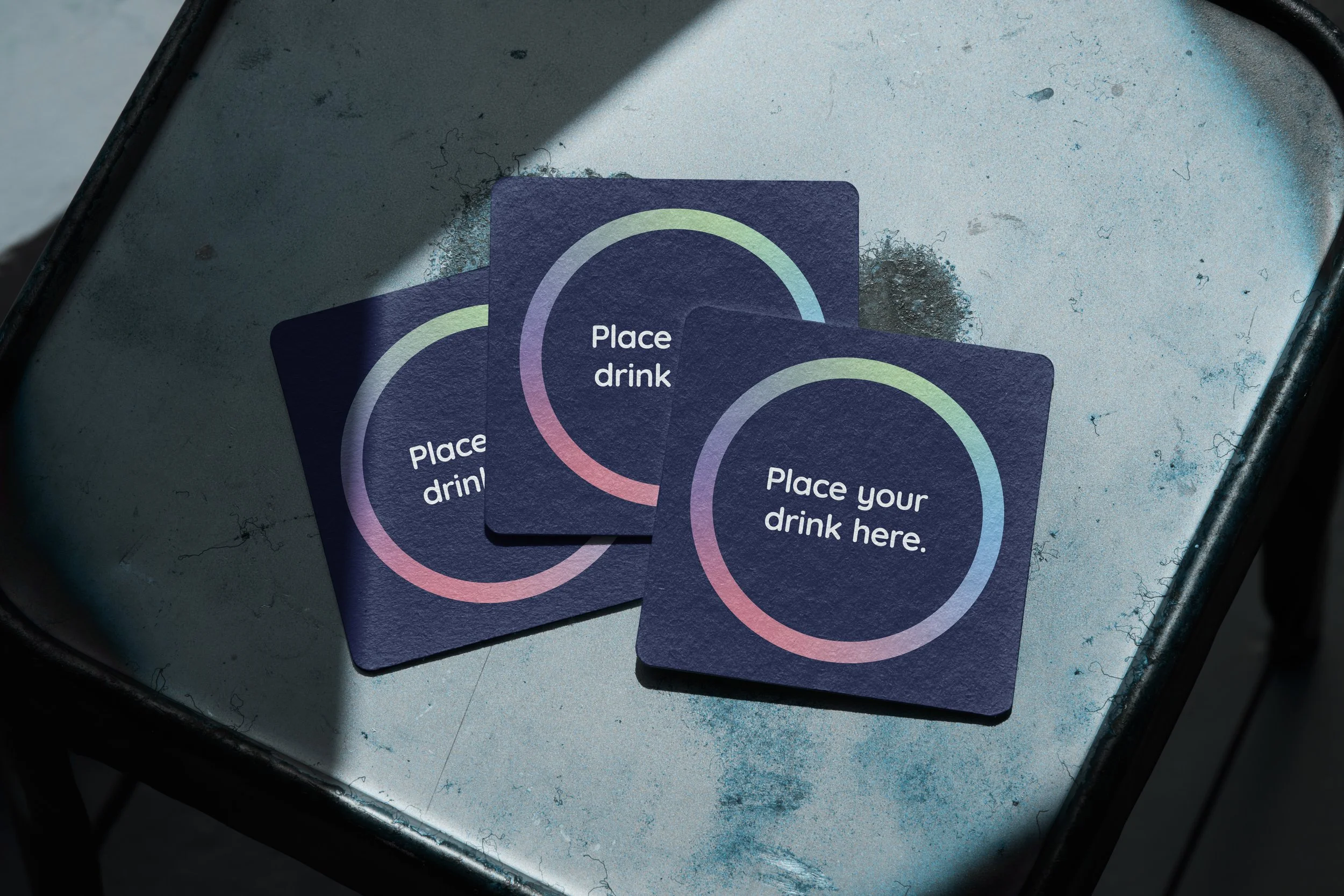
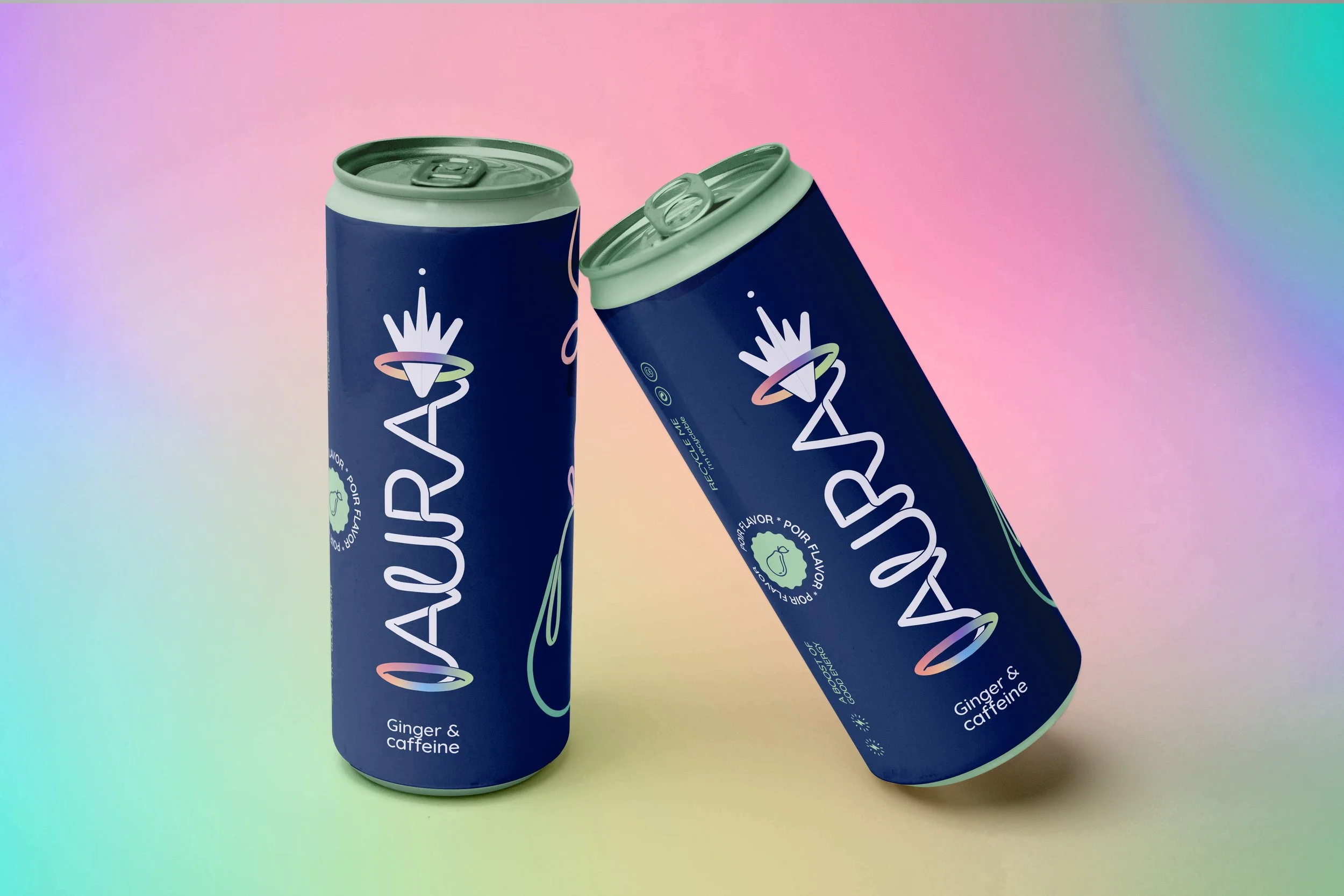
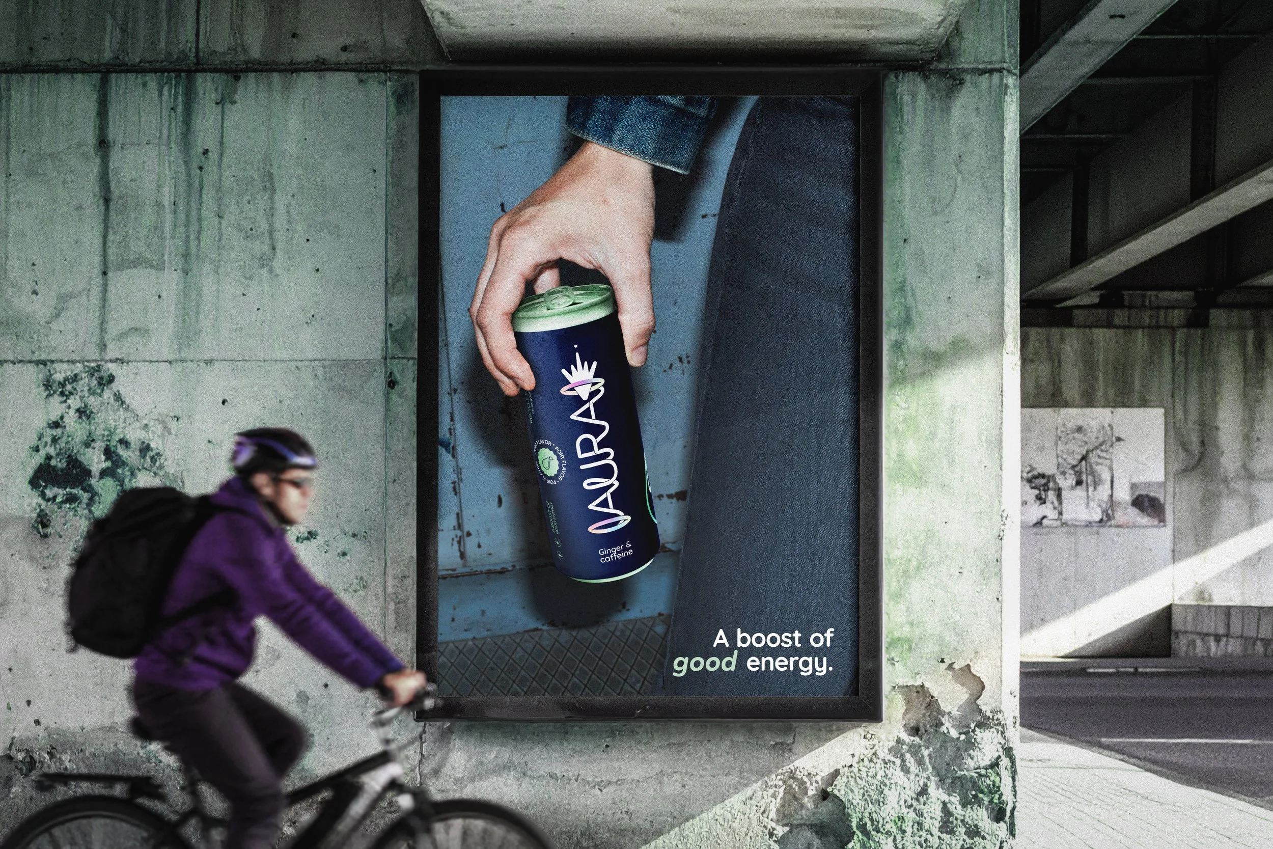
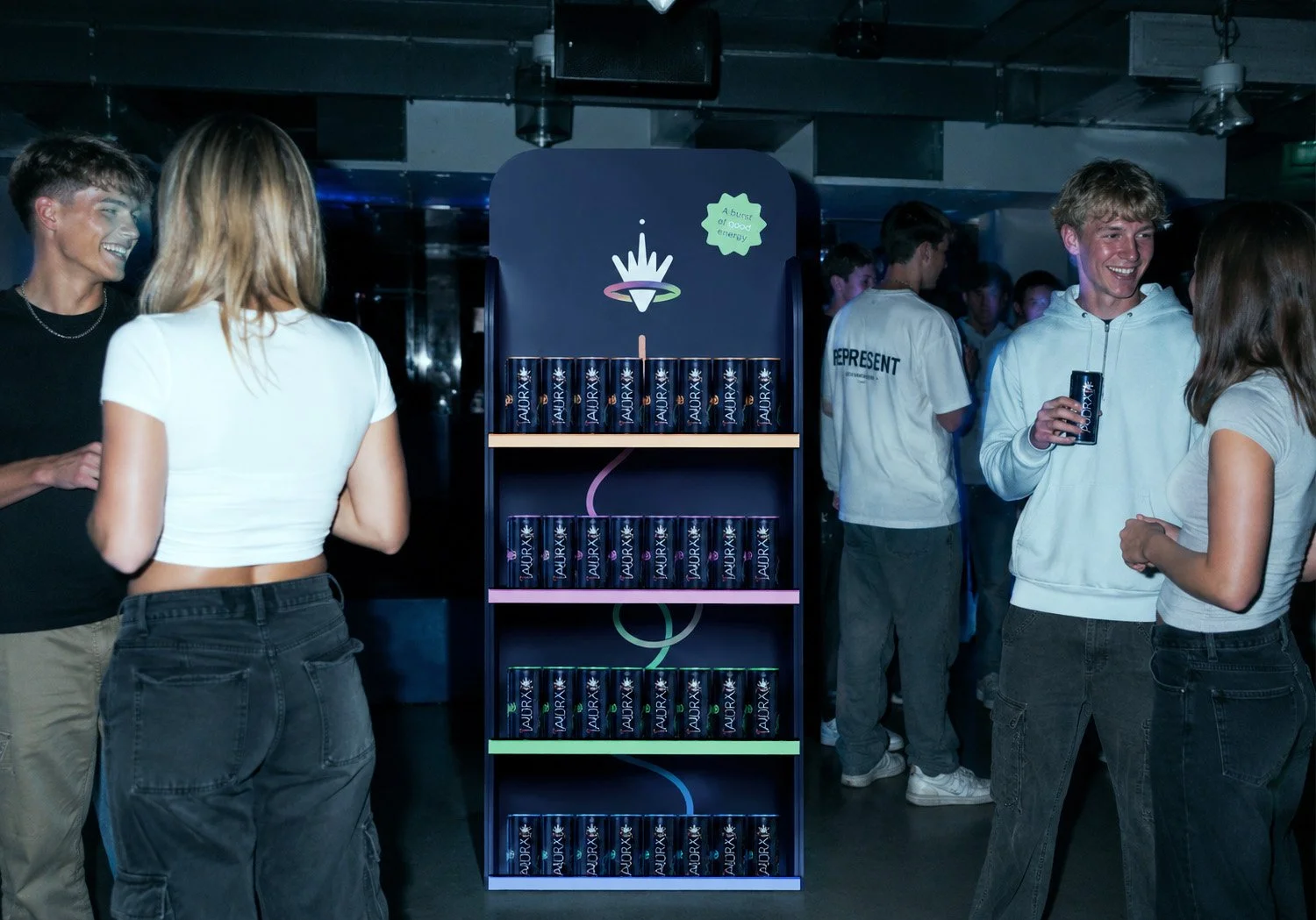
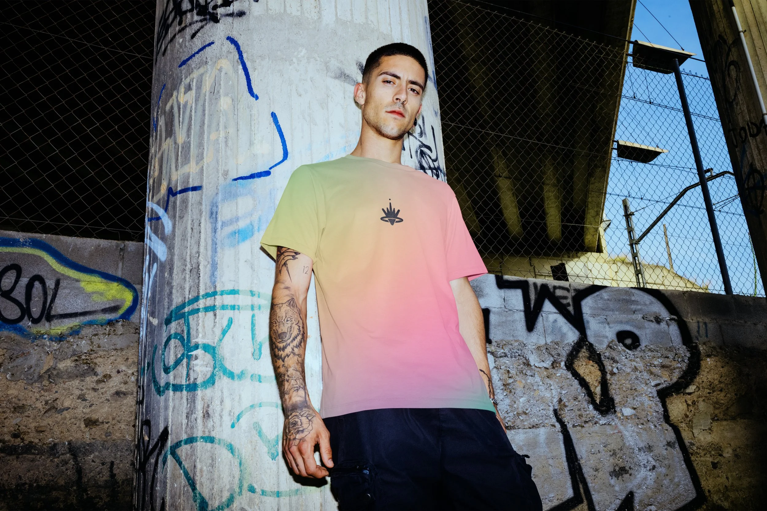
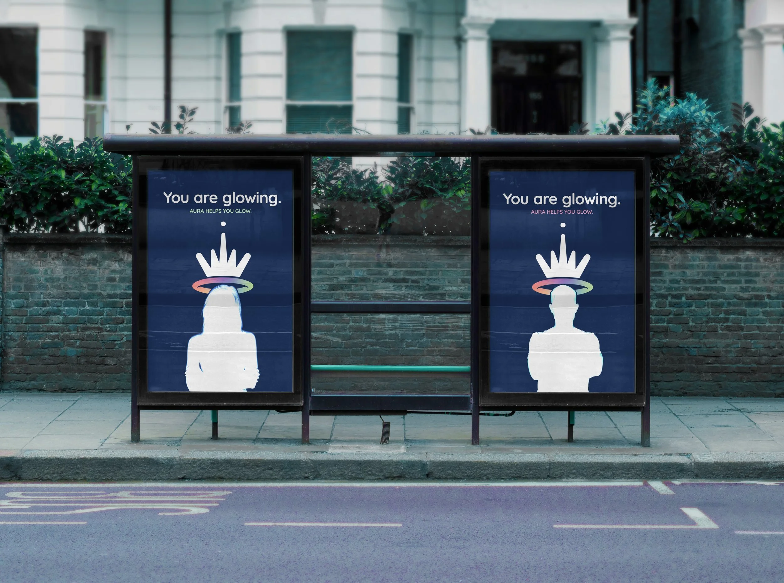
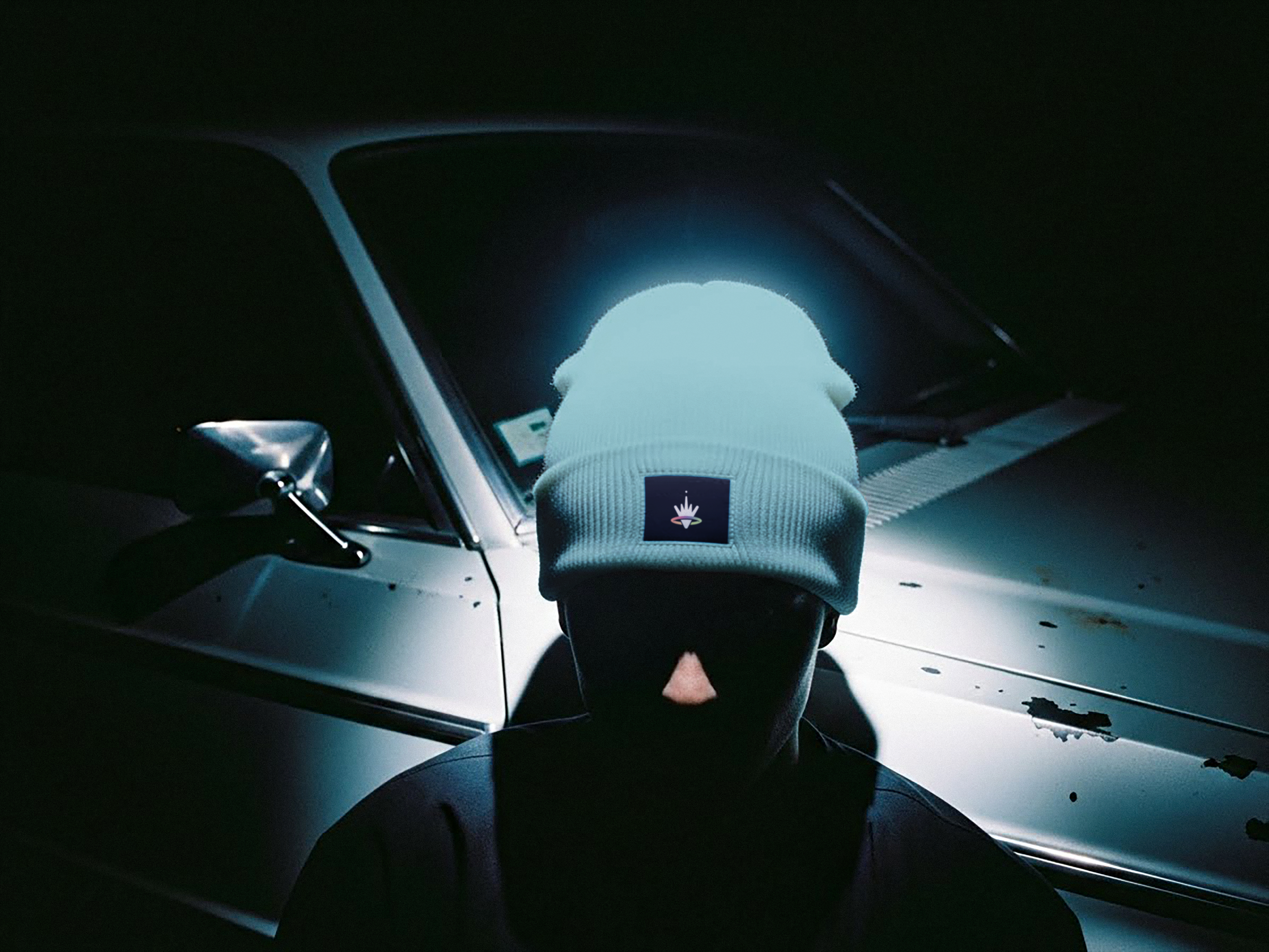
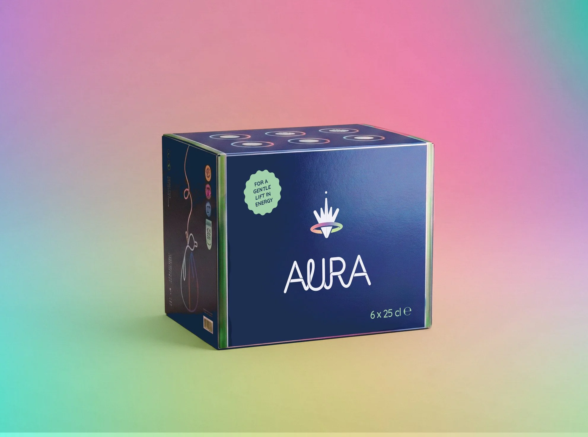
Conceptual educational project. Stock- and generated images were used for educational and mock-up purposes.
Evaluation:
"Beautiful work, Anne, congratulations! A highly polished project with a consistent look and feel. There's a lot to discover, yet everything works together seamlessly. The many layers within your design clearly show the amount of thought and care you invested in every decision."
Process Aura
Analysis & Concept:
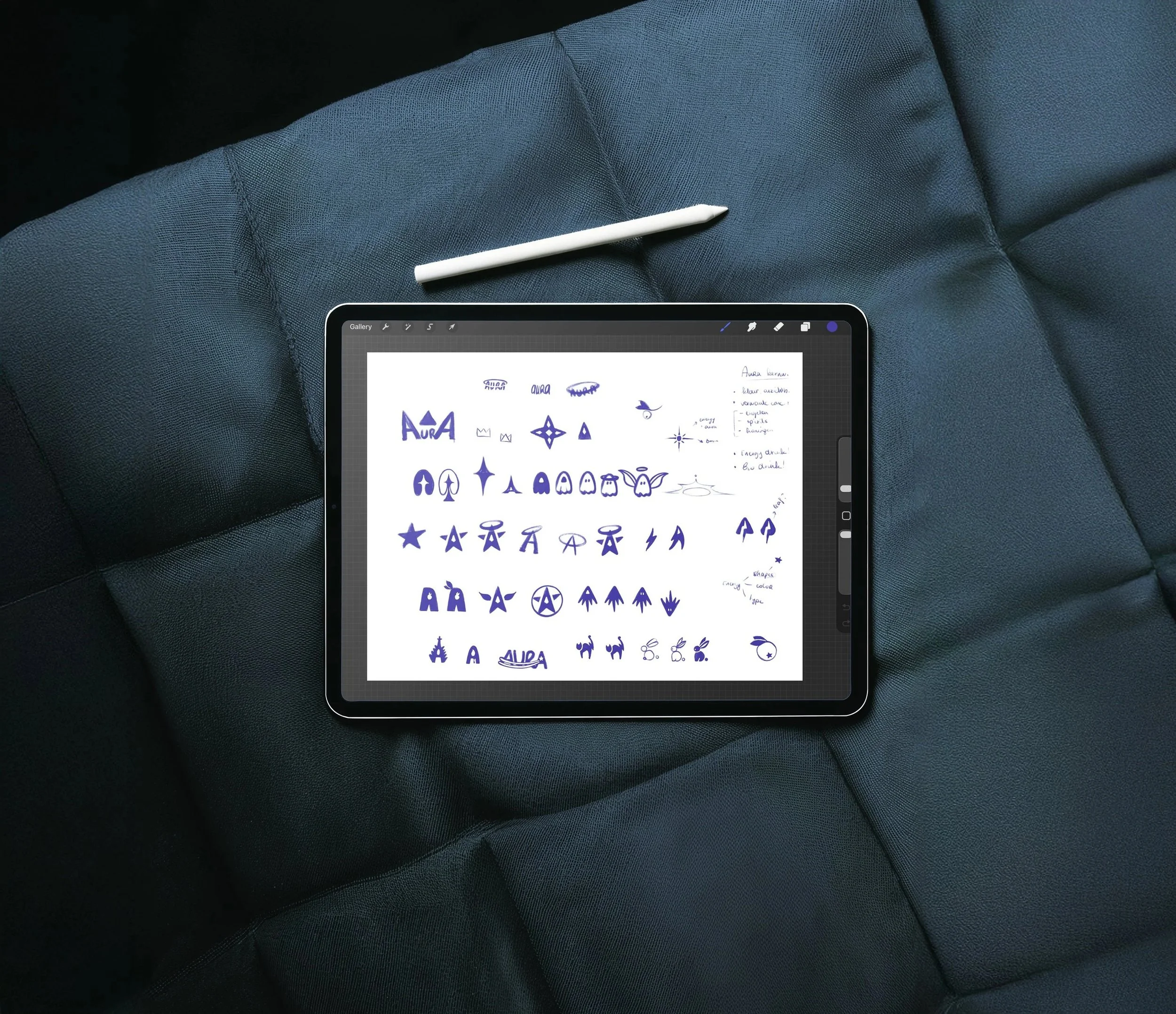
The project began with logo sketches, packaging studies and the development of a detailed brand story. Together, these formed the foundation for an energy drink with a clear purpose, personality and visual identity.
Iteration & Interpretation:
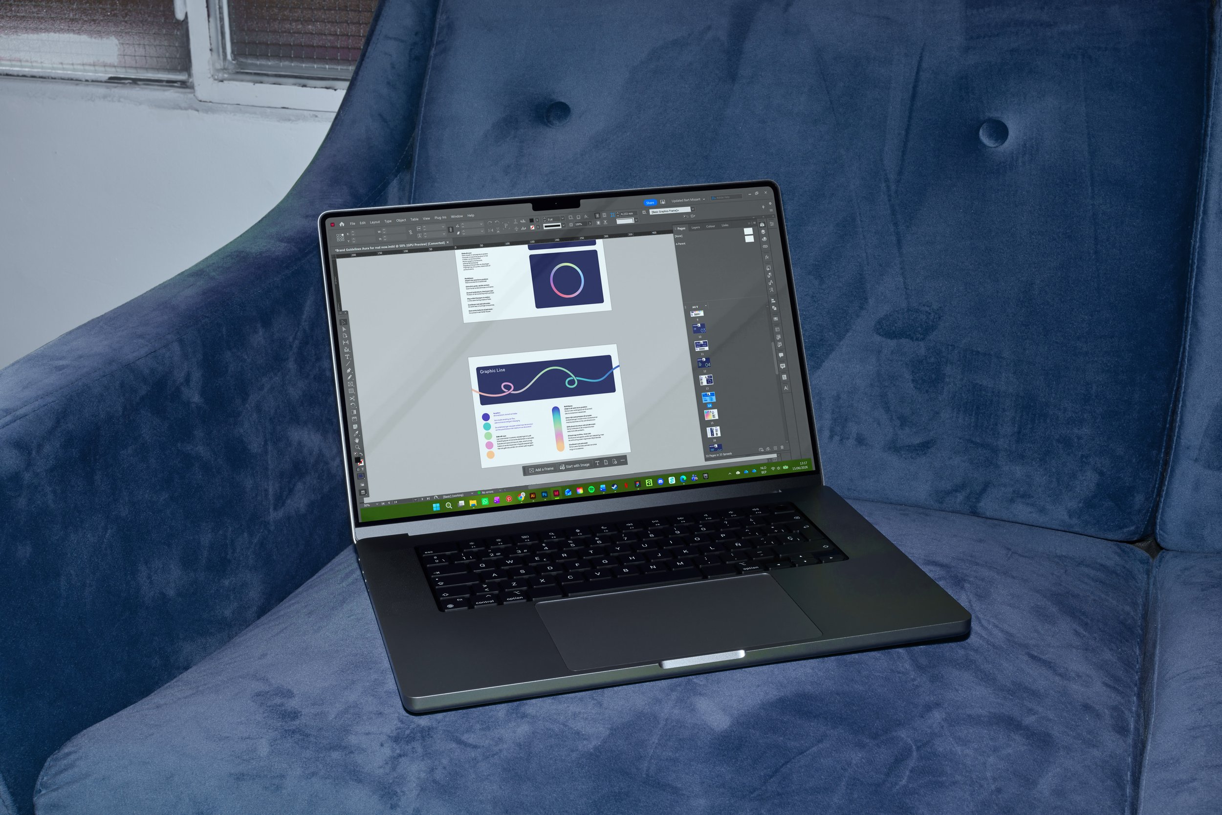
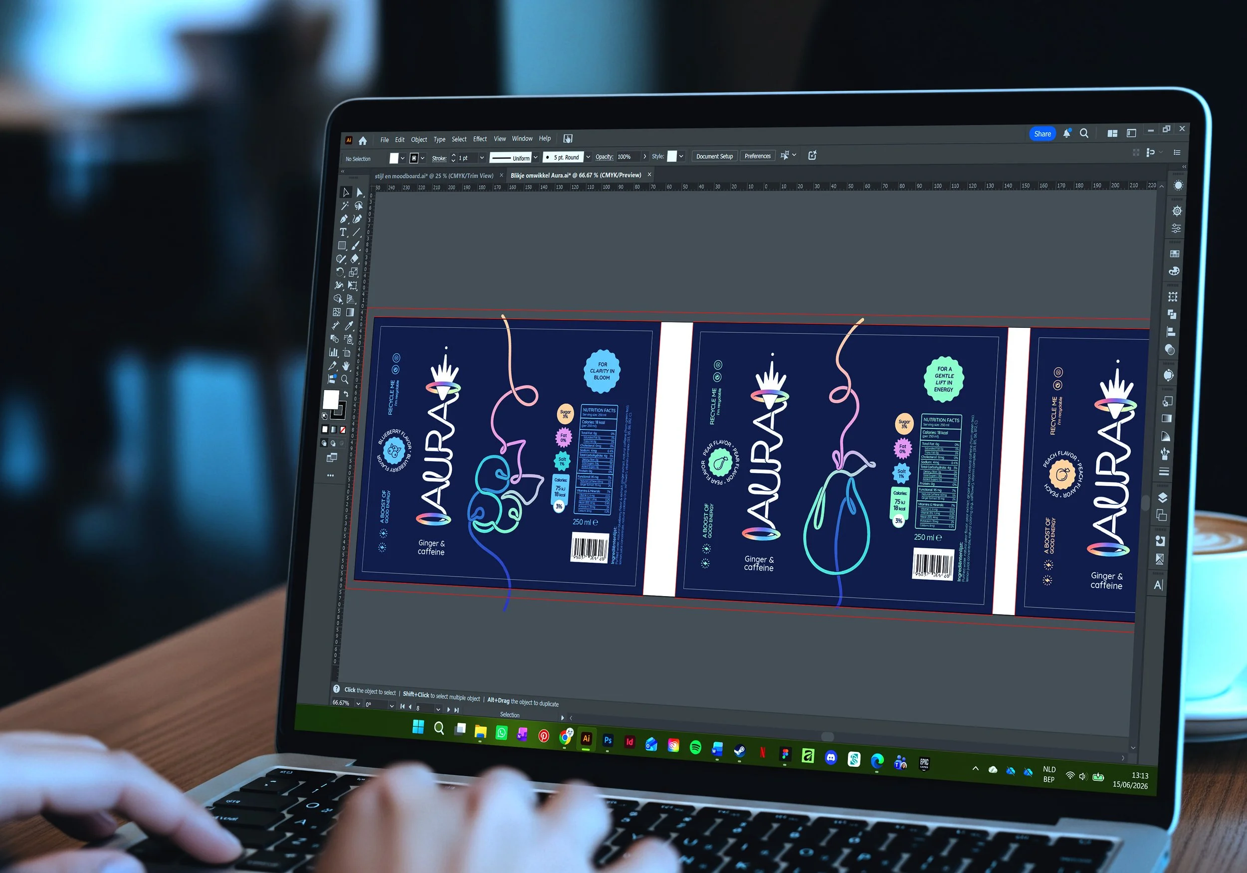
From brand guidelines to packaging and carefully selected mock-ups, every element was refined to create a vibrant and consistent brand world. Each design decision reinforces Aura's energetic character while maintaining a clean and approachable visual language.
Curious about the process behind this project? I'd be happy to share the full research, concept development and visual studies that shaped the final design. Feel free to get in touch.
Showcase 02
·
Showcase 02 ·
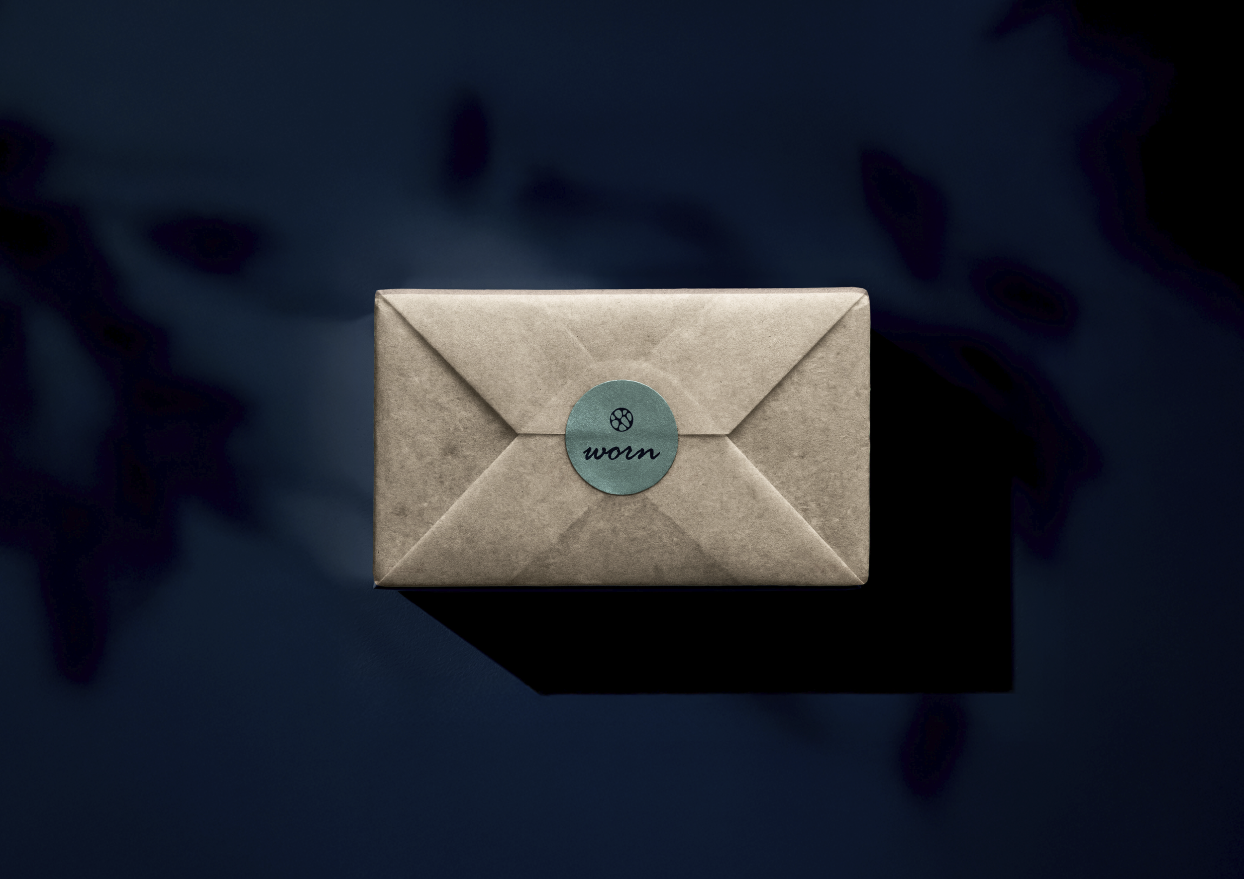
Worn
Solid Perfume concept
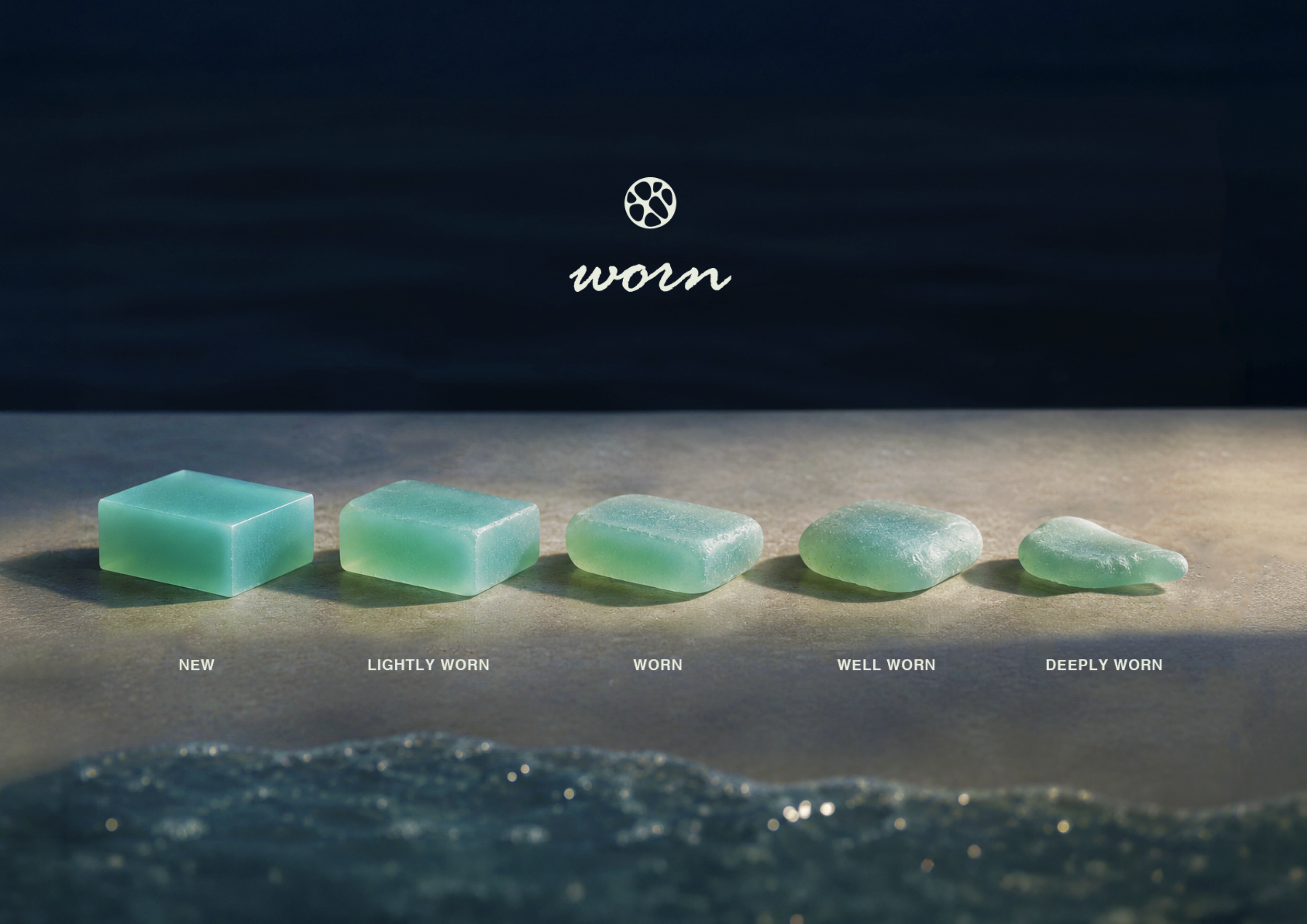
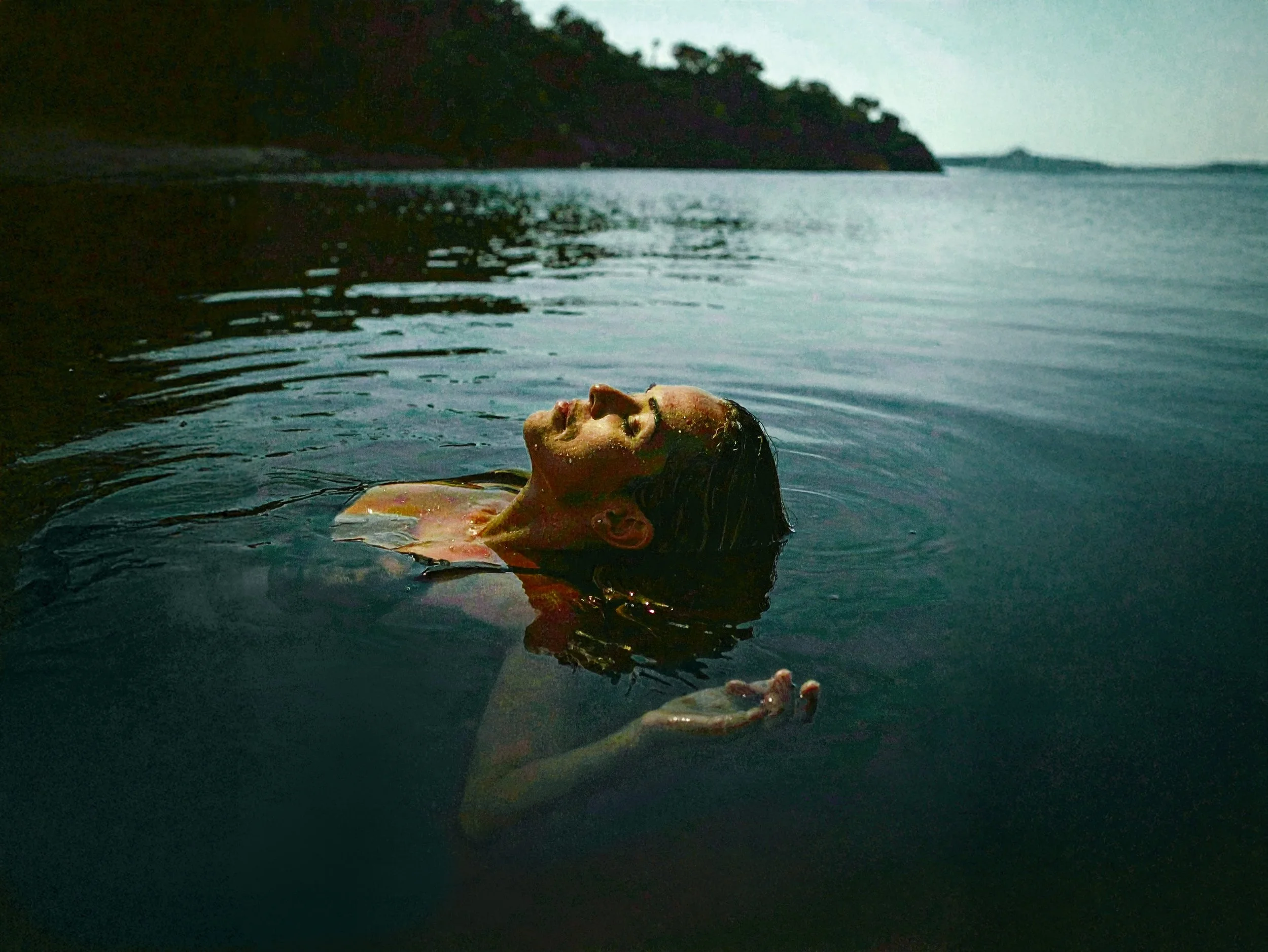
Worn is a solid perfume brand centred around softness, intimacy and quiet confidence. Rather than chasing bold statements, it speaks to people whose identity has been shaped through experience; those who appreciate beauty that grows richer over time.
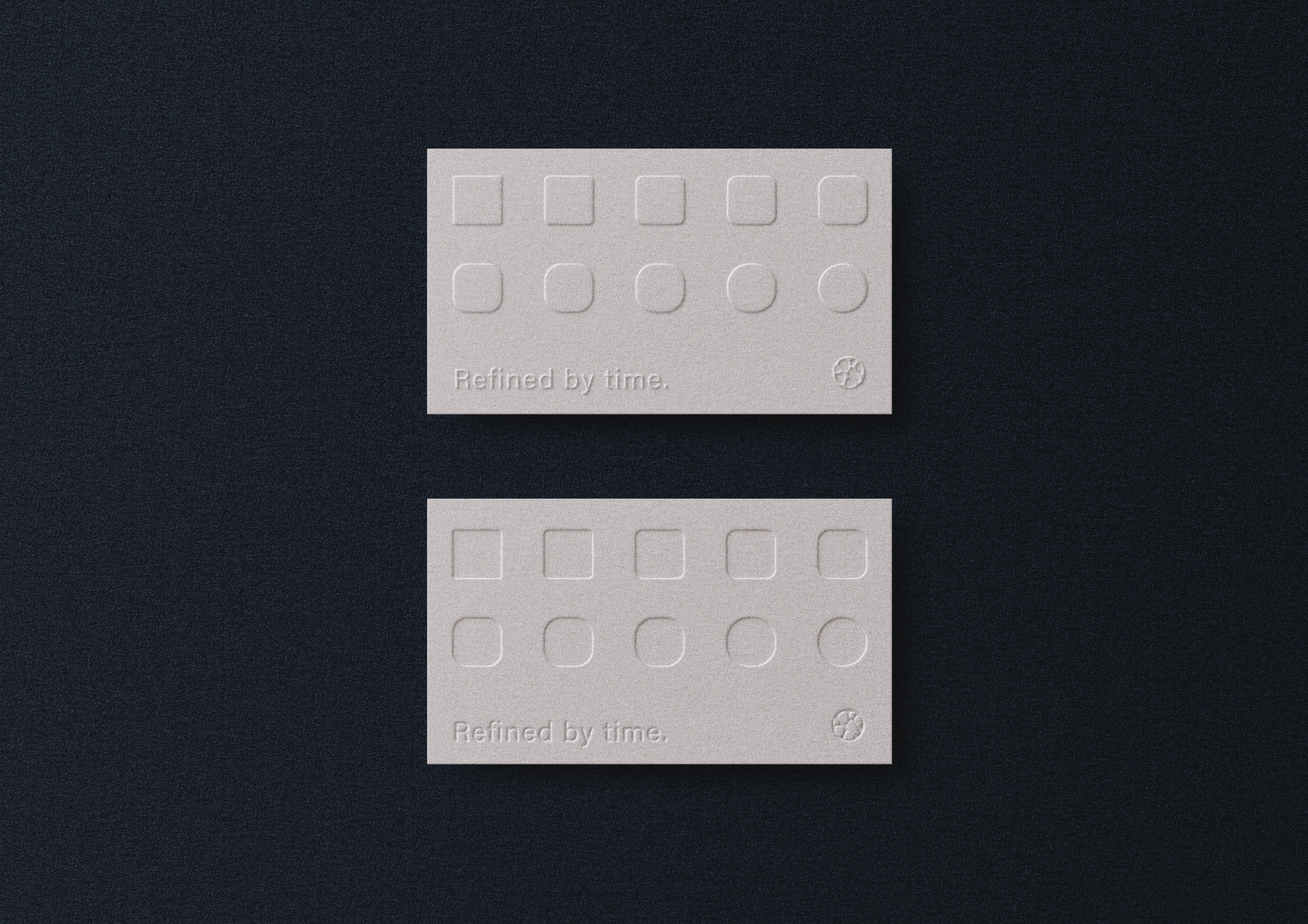
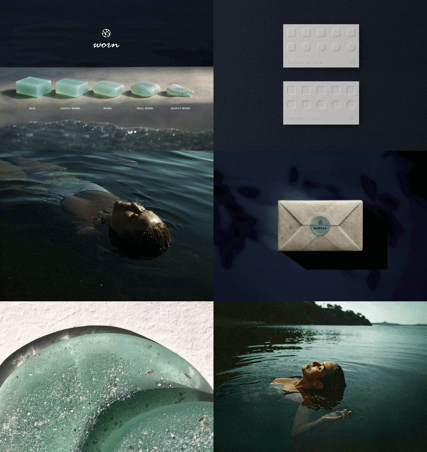
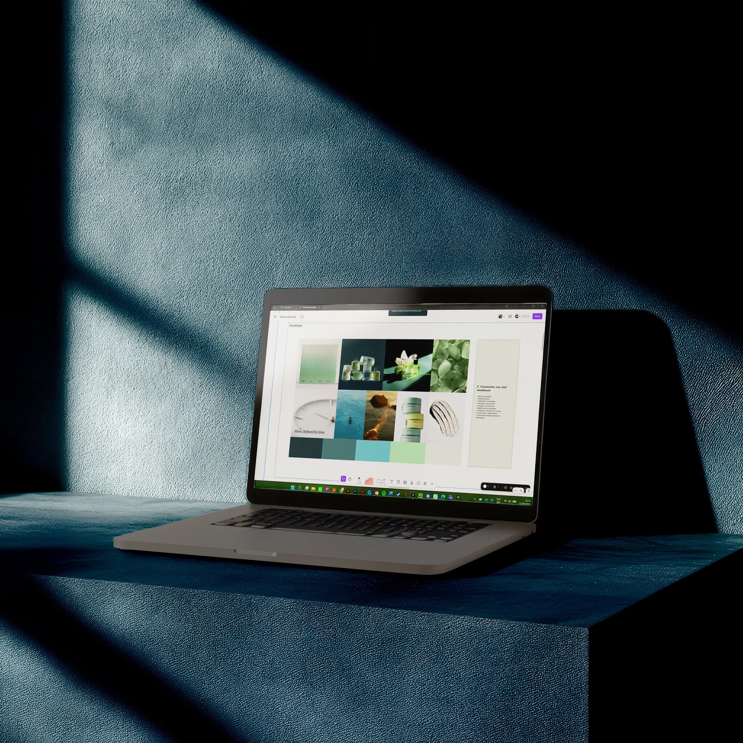
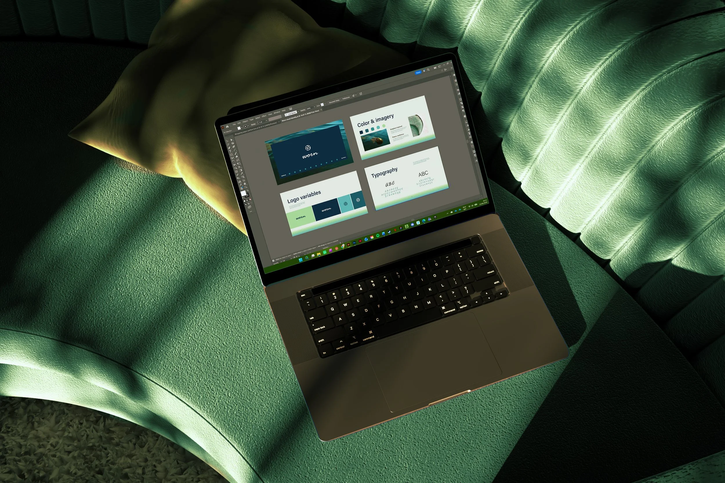
The visual identity reflects this philosophy. Inspired by sea glass, it embraces the idea that time refines rather than diminishes, captured in the calm, tactile aesthetic and the tagline Refined by Time.
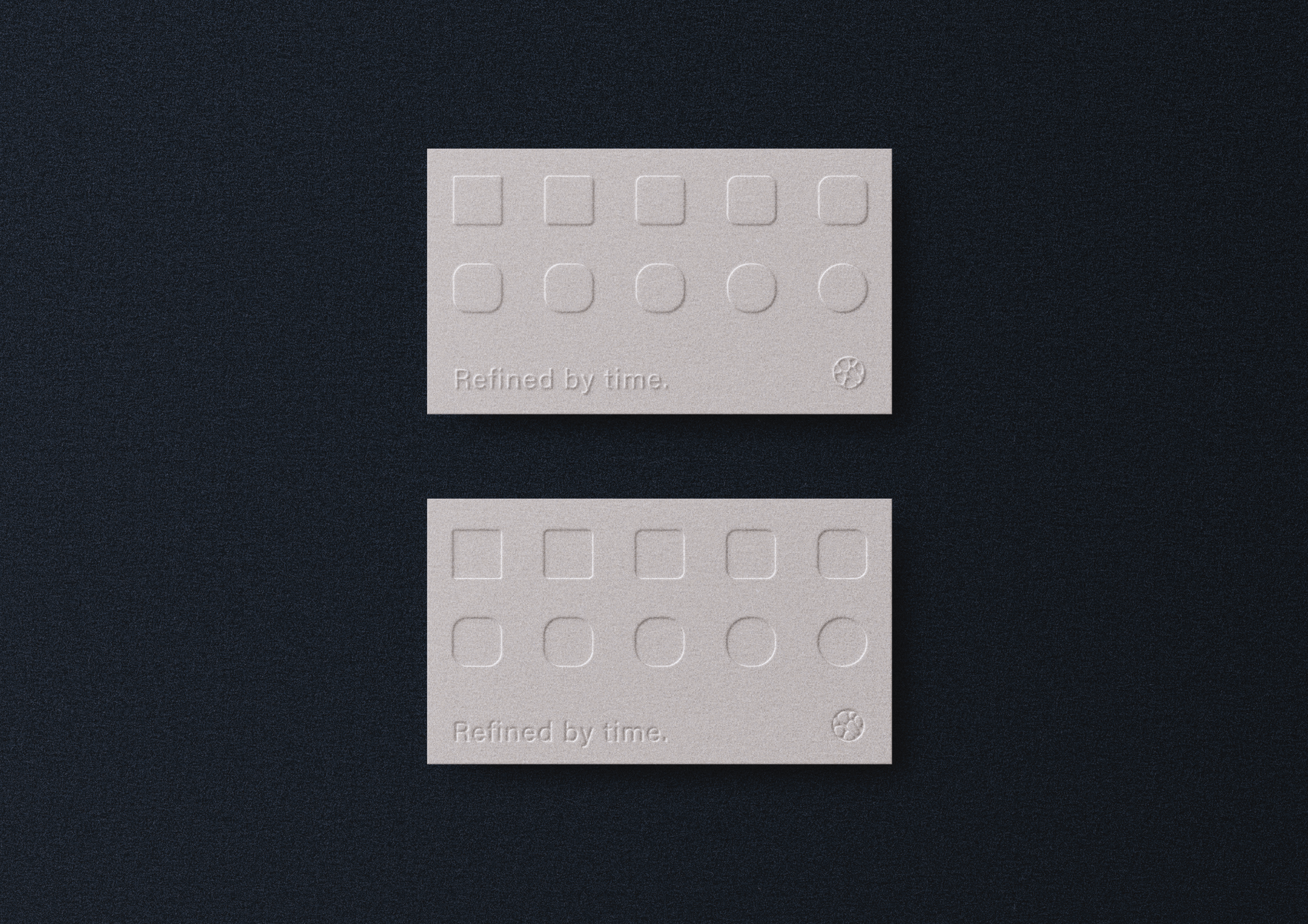
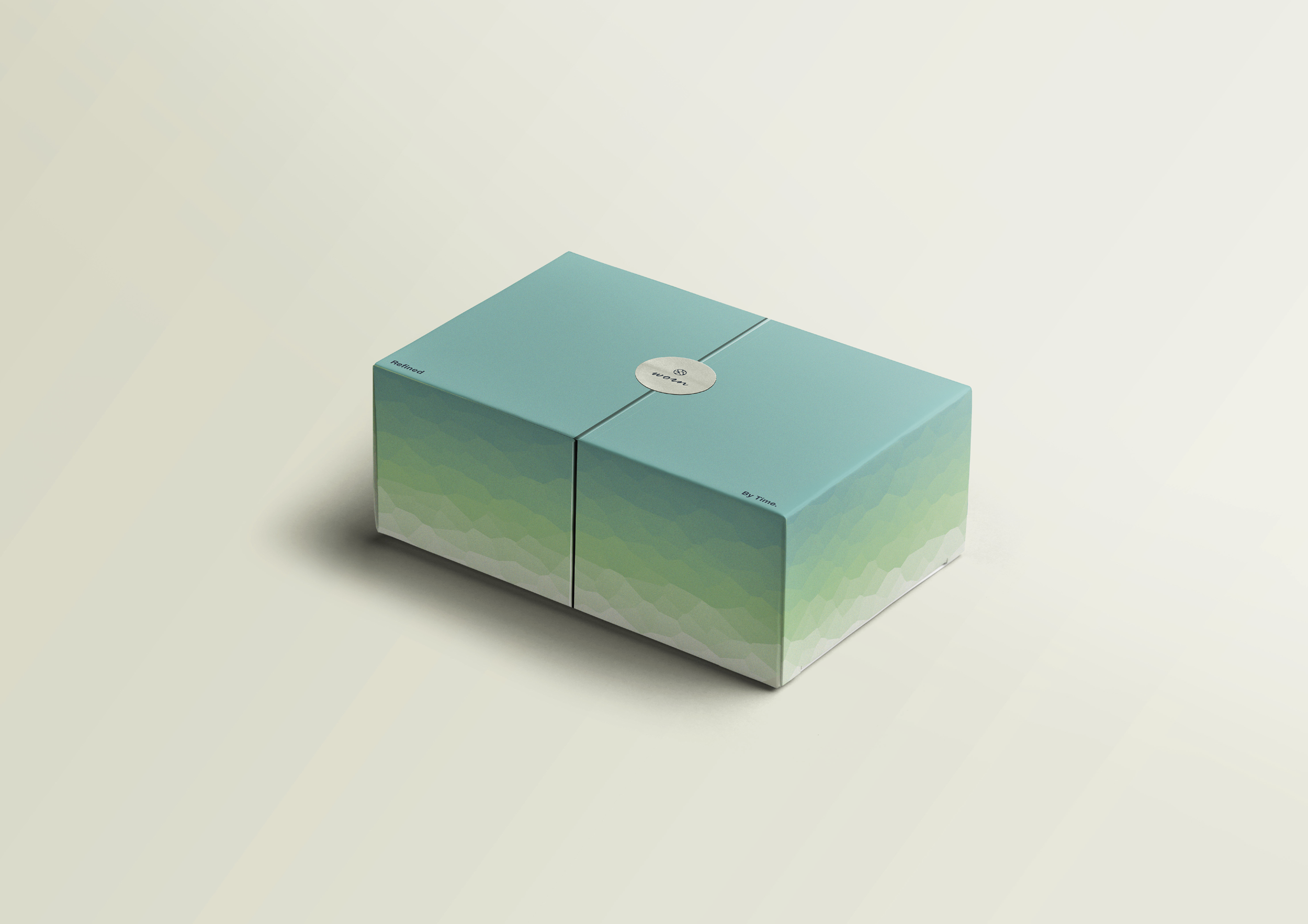
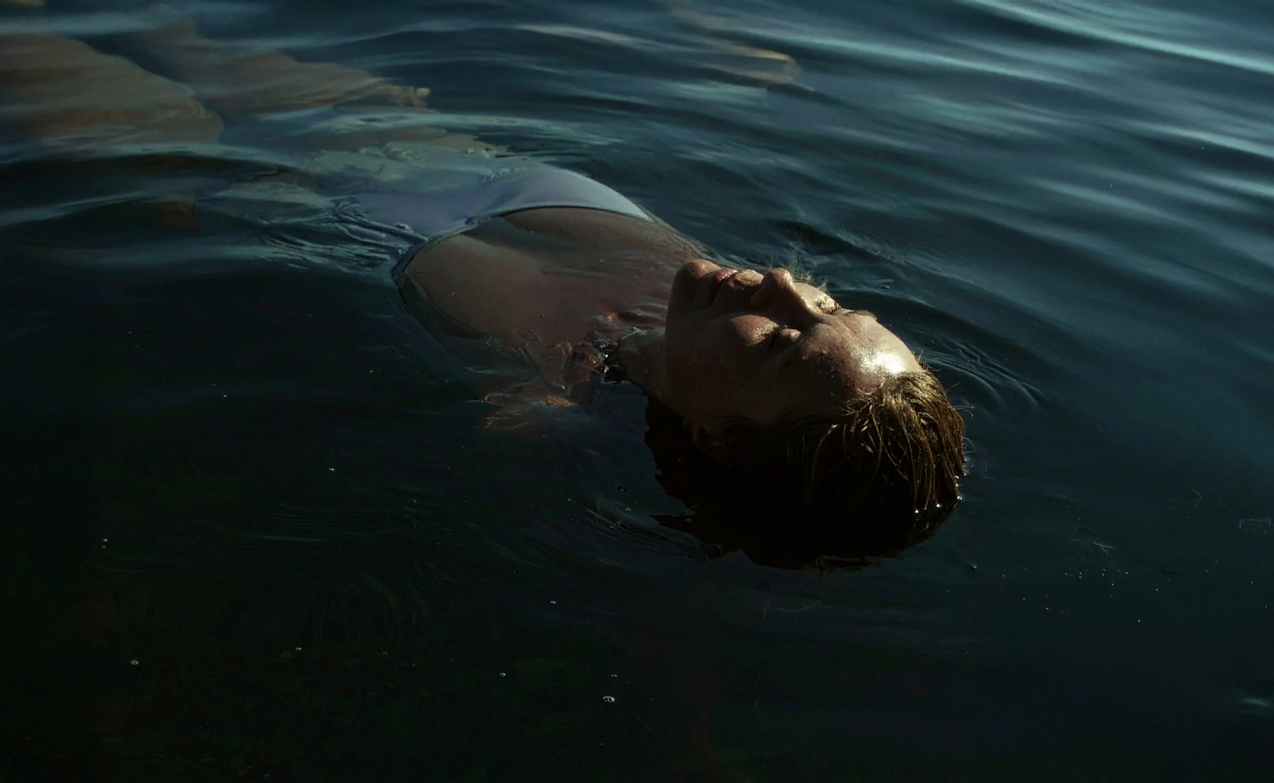
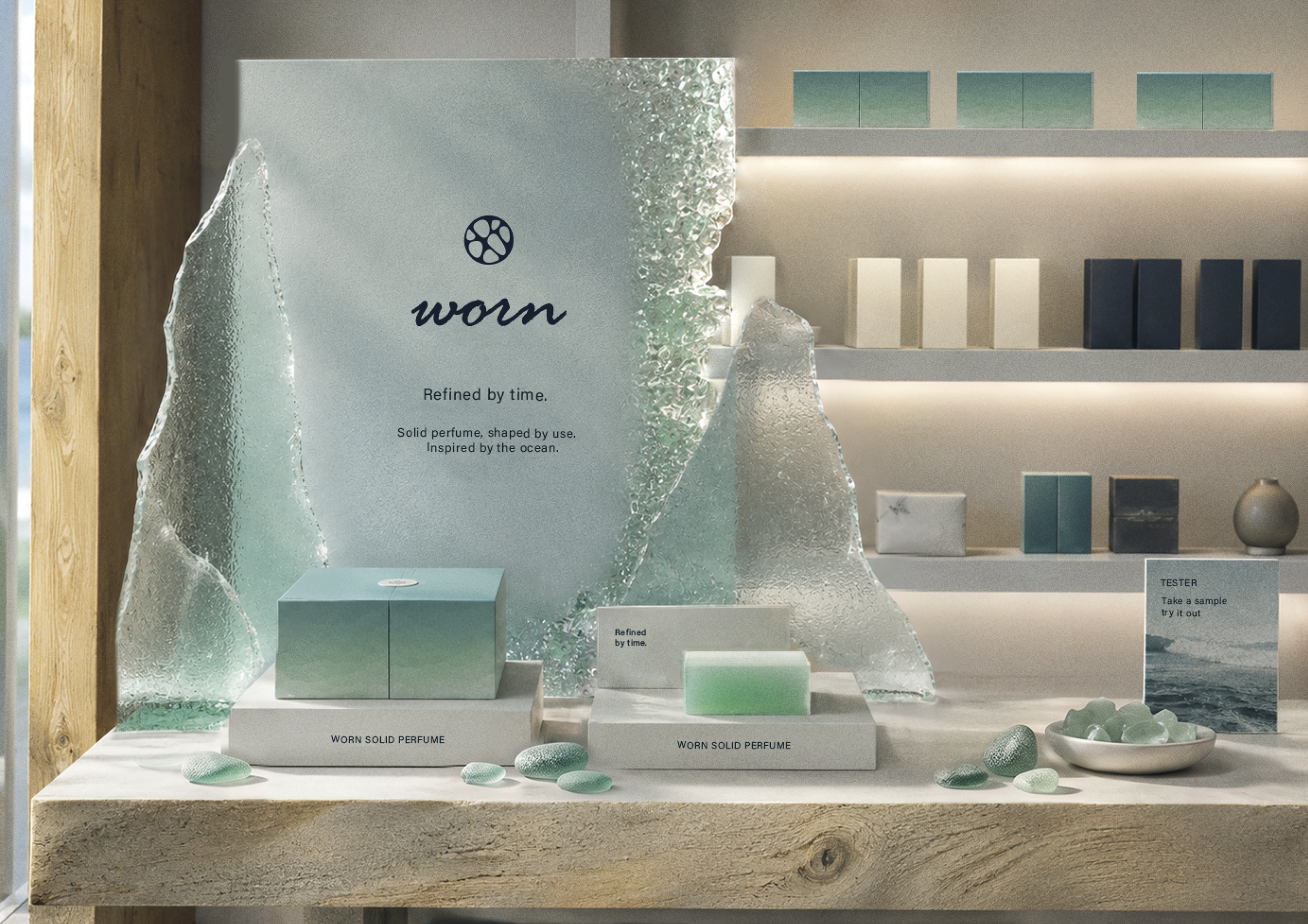
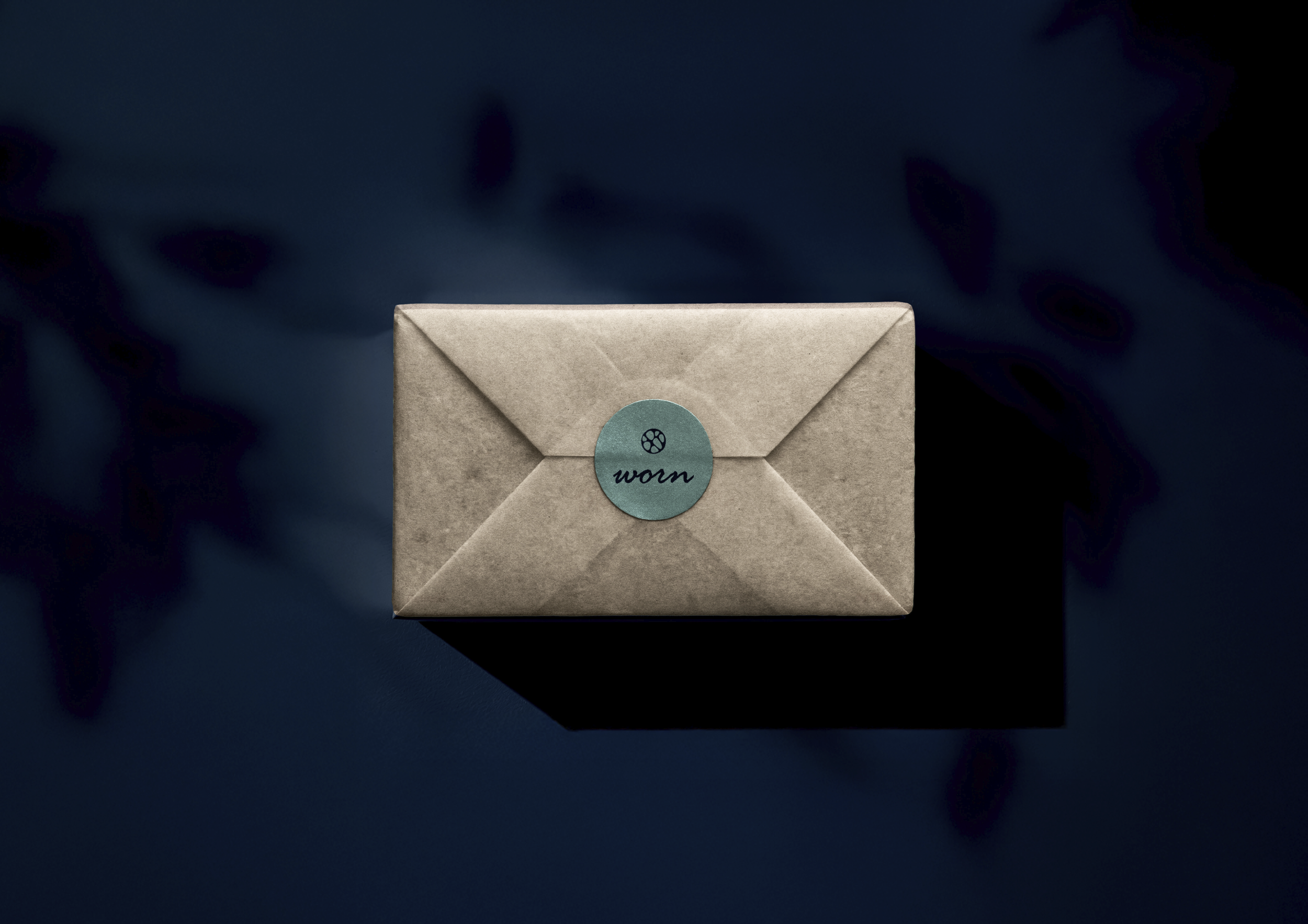
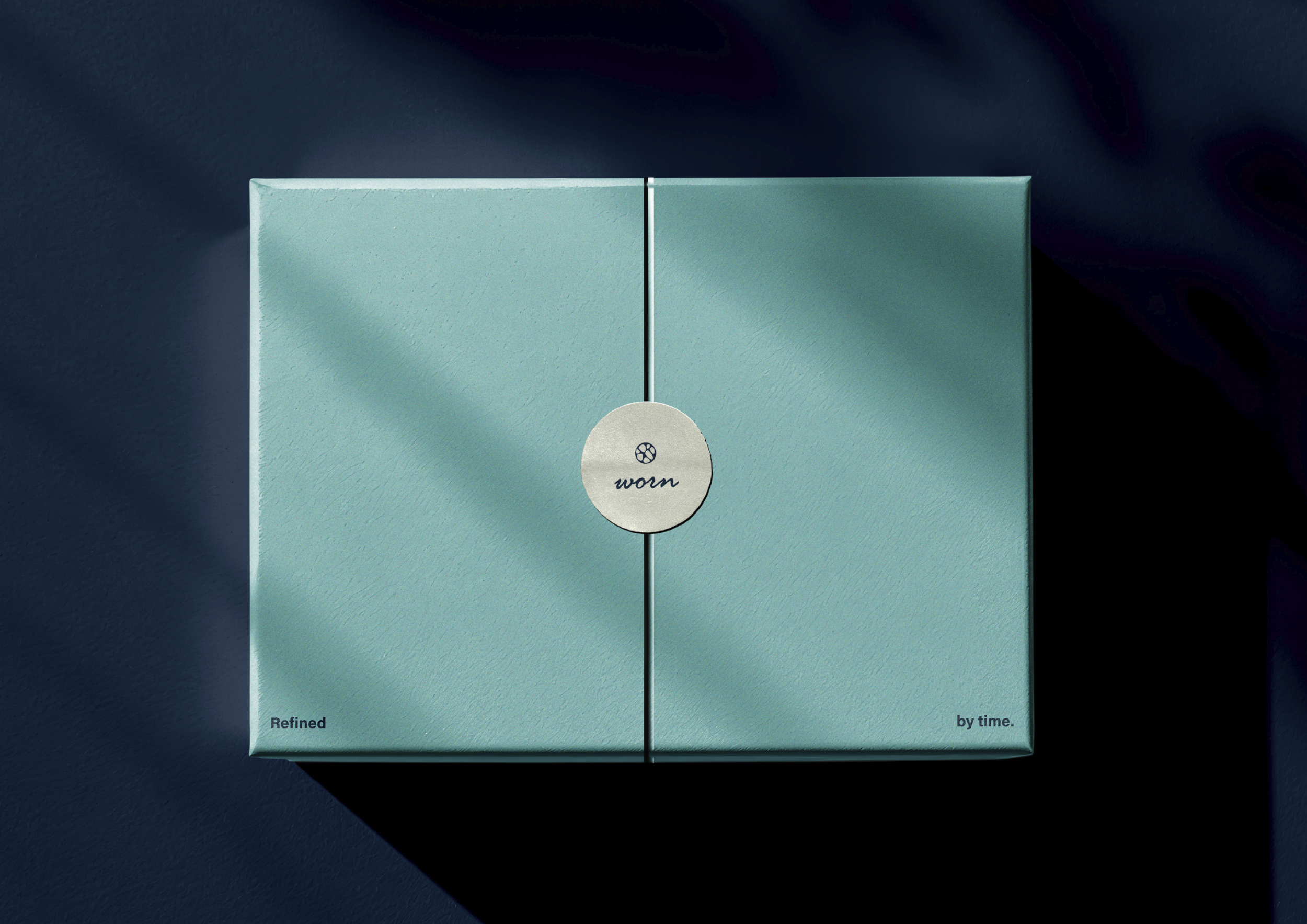
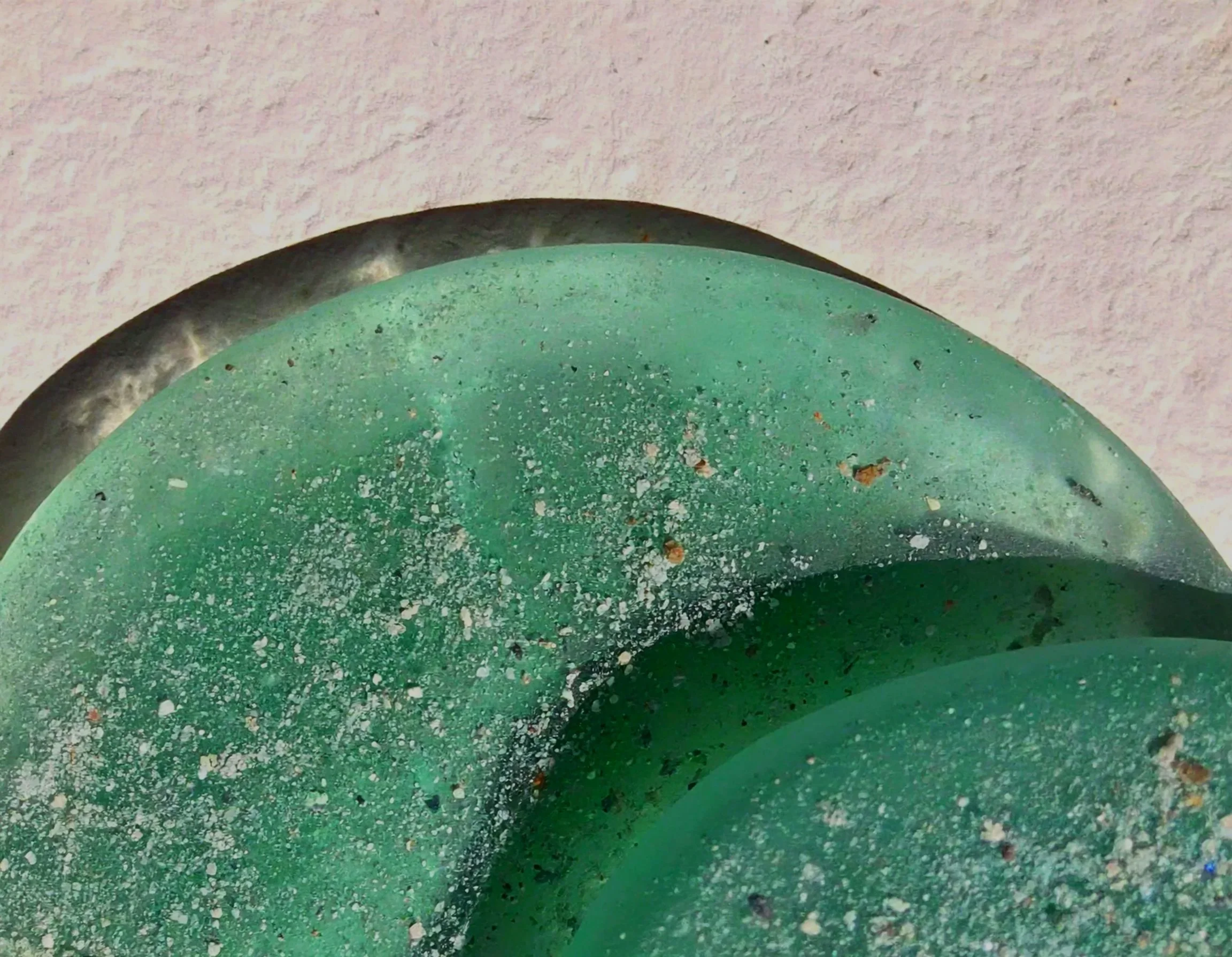
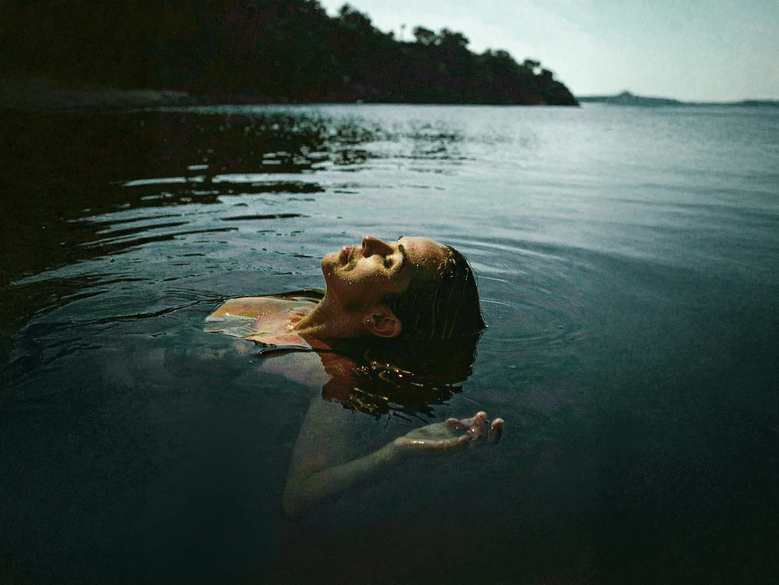
Conceptual educational project. Stock- and generated images were used for educational and mock-up purposes.
Reflection:
"Worn pushed me outside my comfort zone. I usually create colourful and expressive brands, so designing something this quiet and tactile challenged me in a completely different way. That challenge is exactly what made the final result so rewarding."
Process Worn
Analysis & Concept:
The concept evolved through research into scent associations, materials and audience perception. Together, these explorations shaped a brand identity focused on tactility, calmness and understated elegance.
Iteration & Interpretation:
Every iteration refined the visual language further. Delicate typography, restrained colour choices and curated mock-ups translated the concept into a brand that feels minimal and human in a way that creates connection.
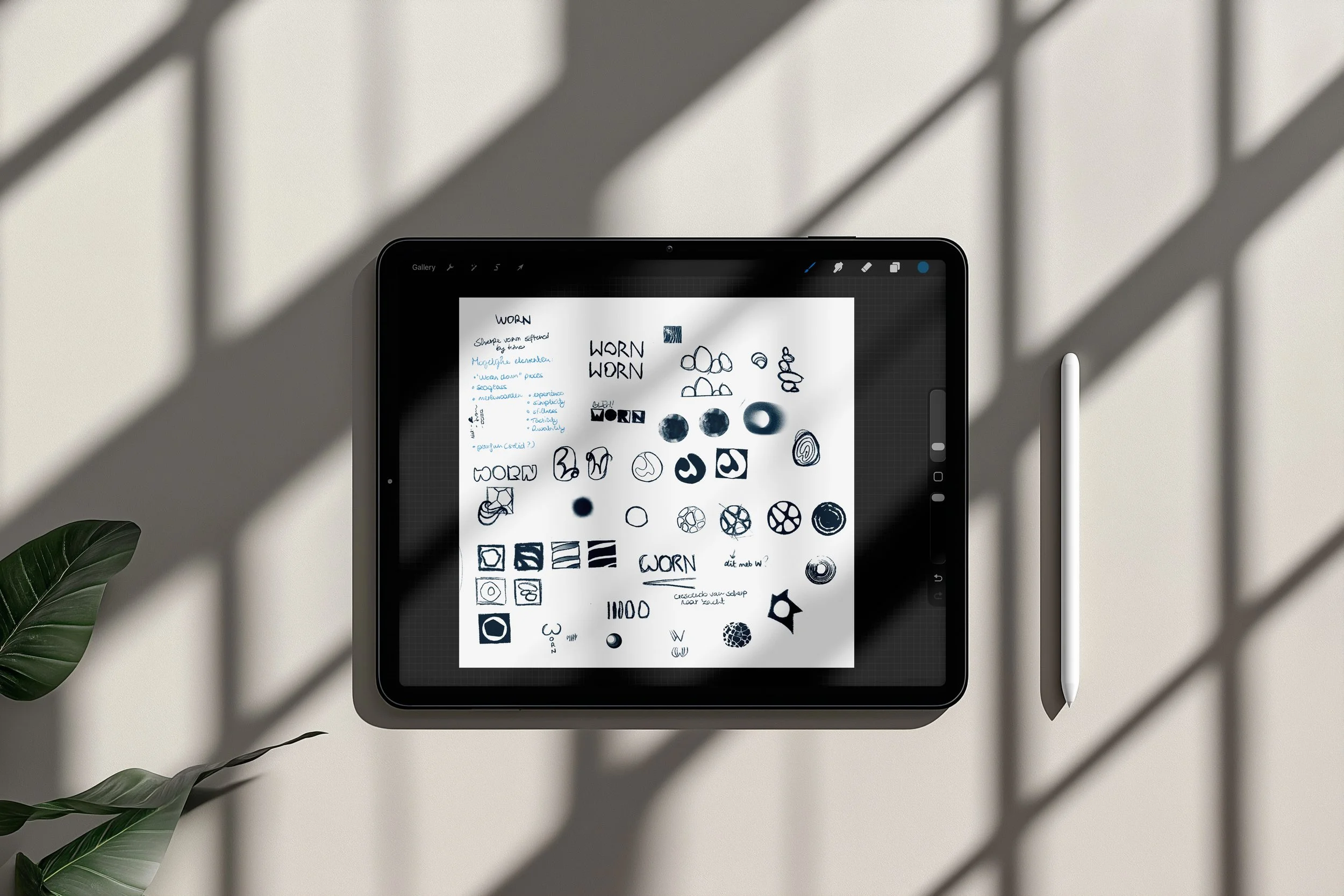
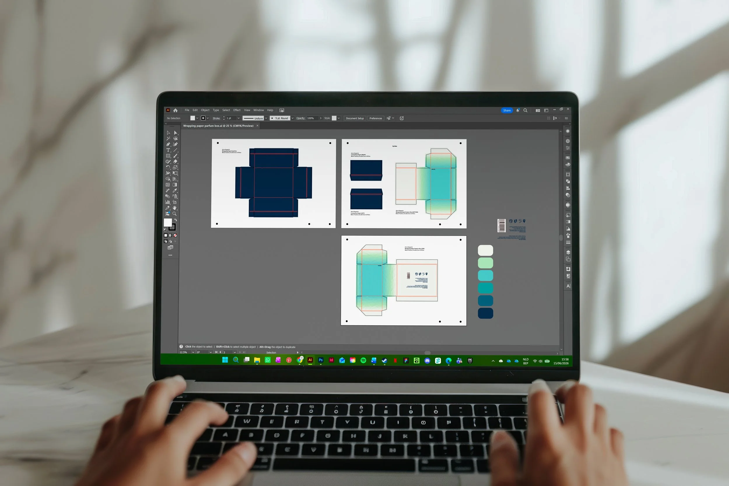
Curious about the process behind this project? I'd be happy to share the full research, concept development and visual studies that shaped the final design. Feel free to get in touch.
Showcase 03
·
Showcase 03 ·
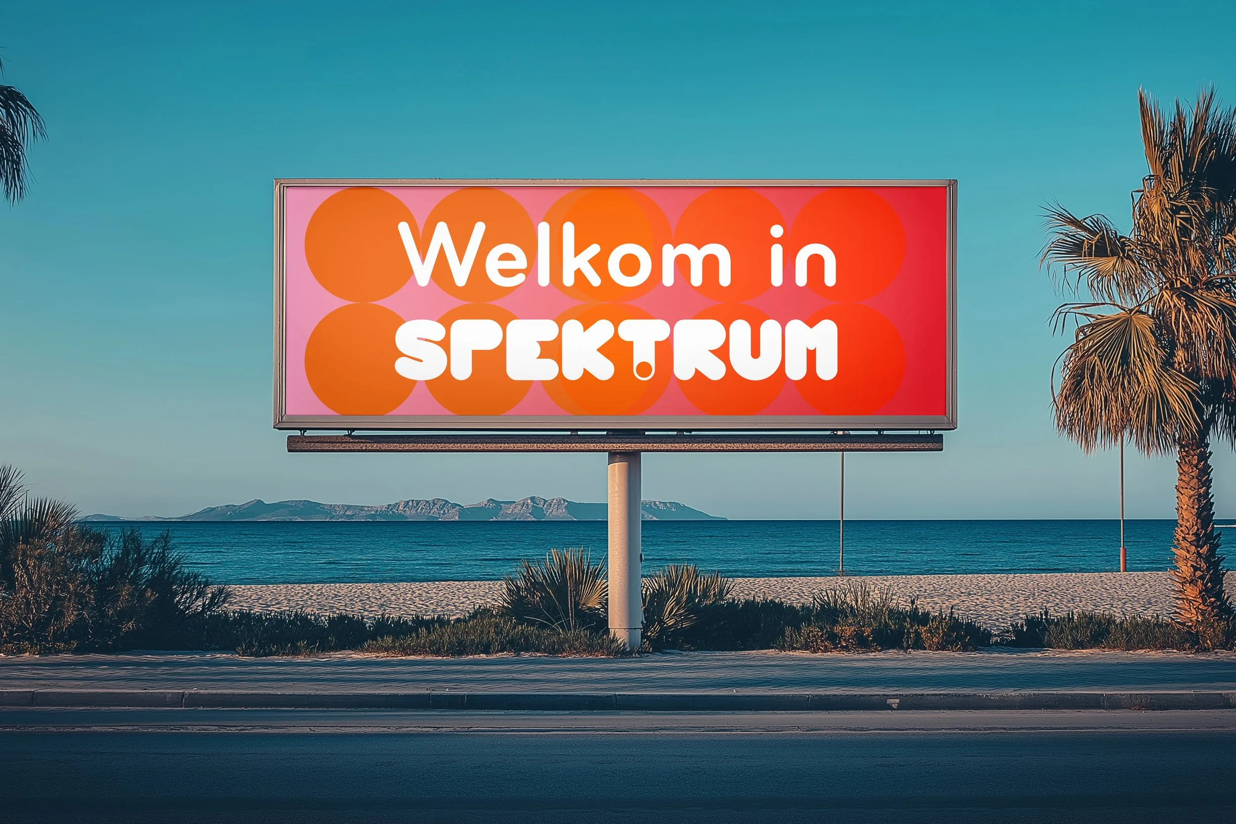
Spektrum
Micronation concept
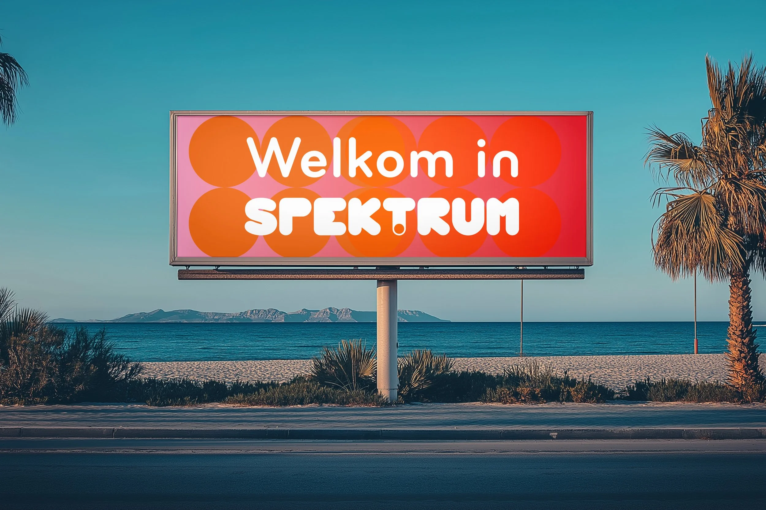
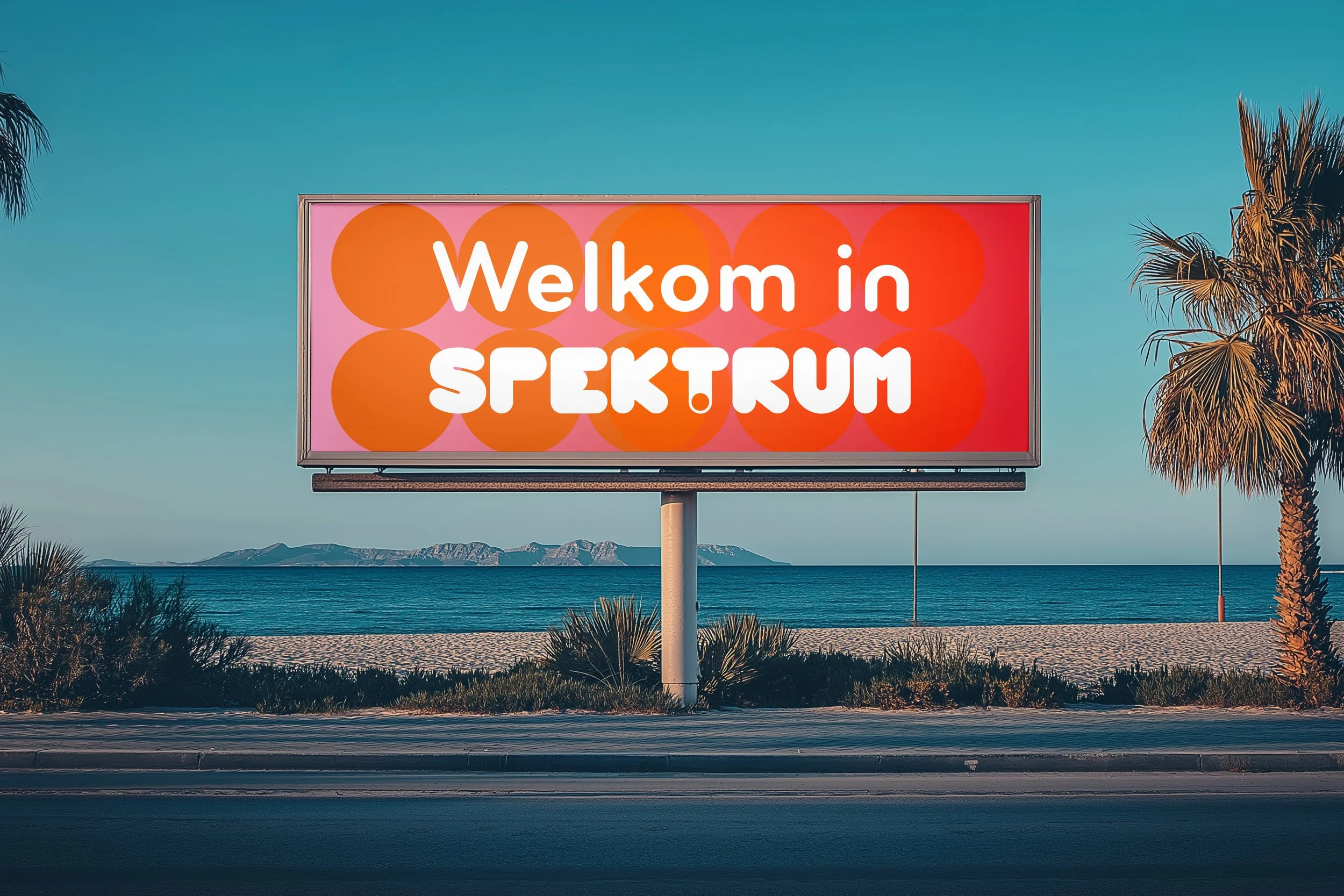
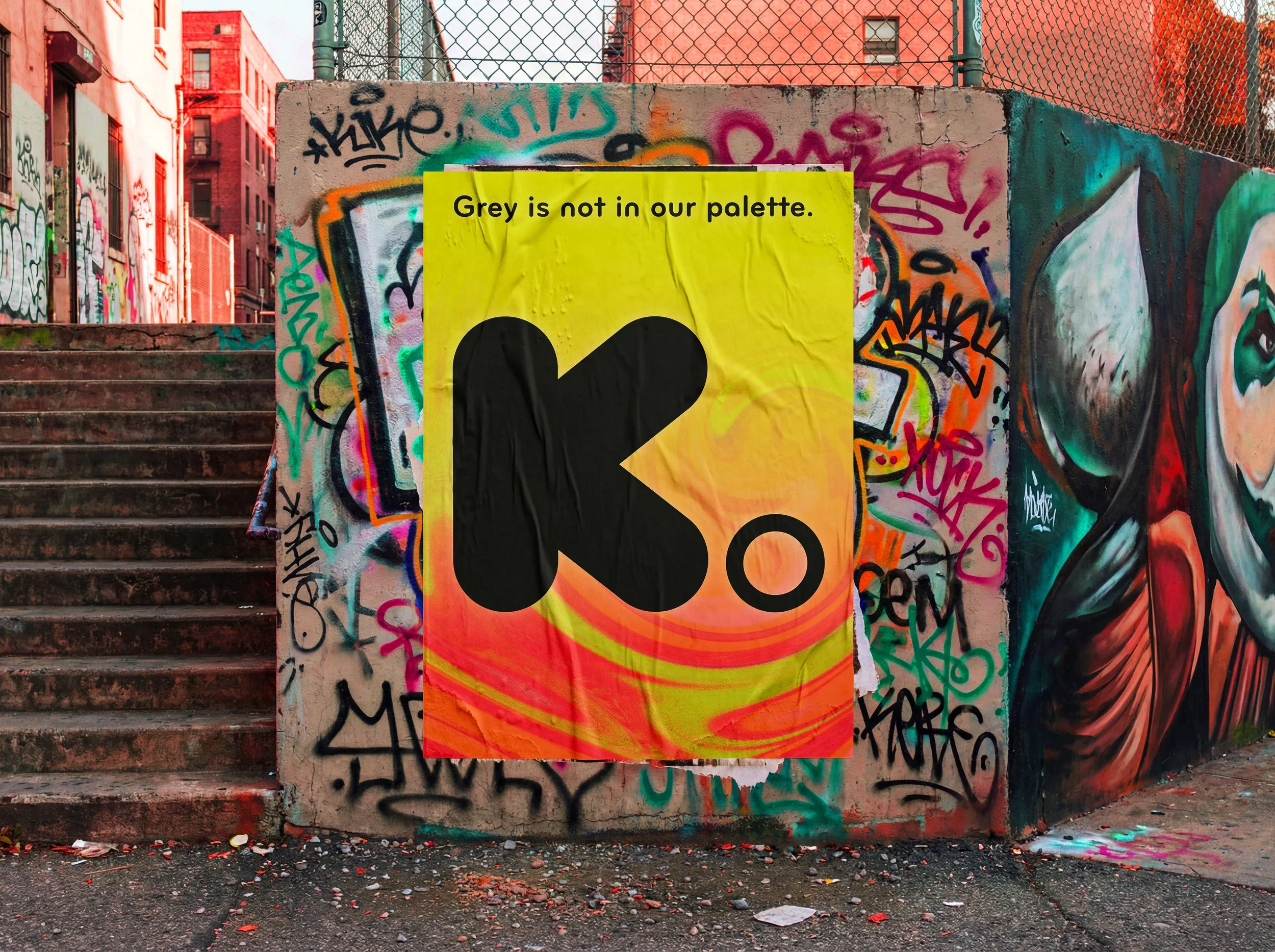
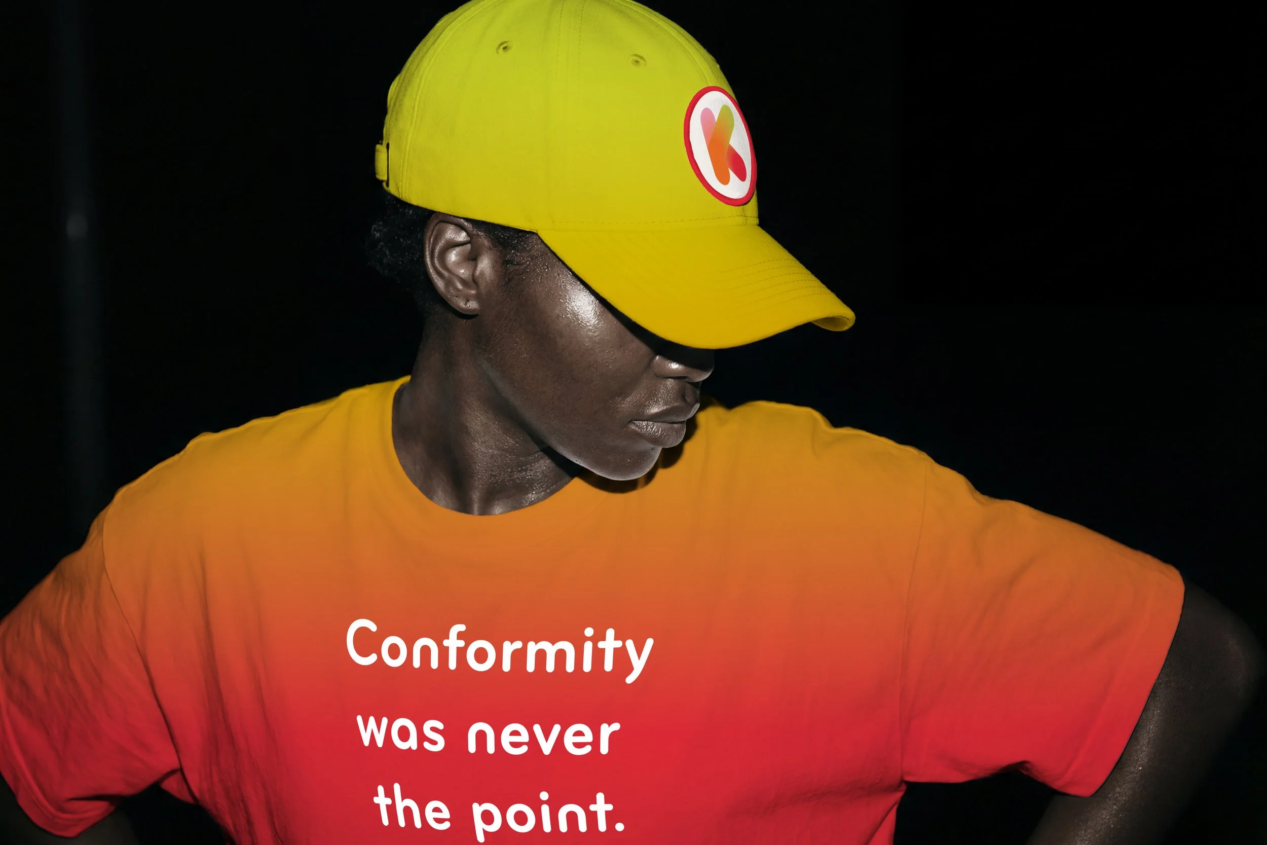
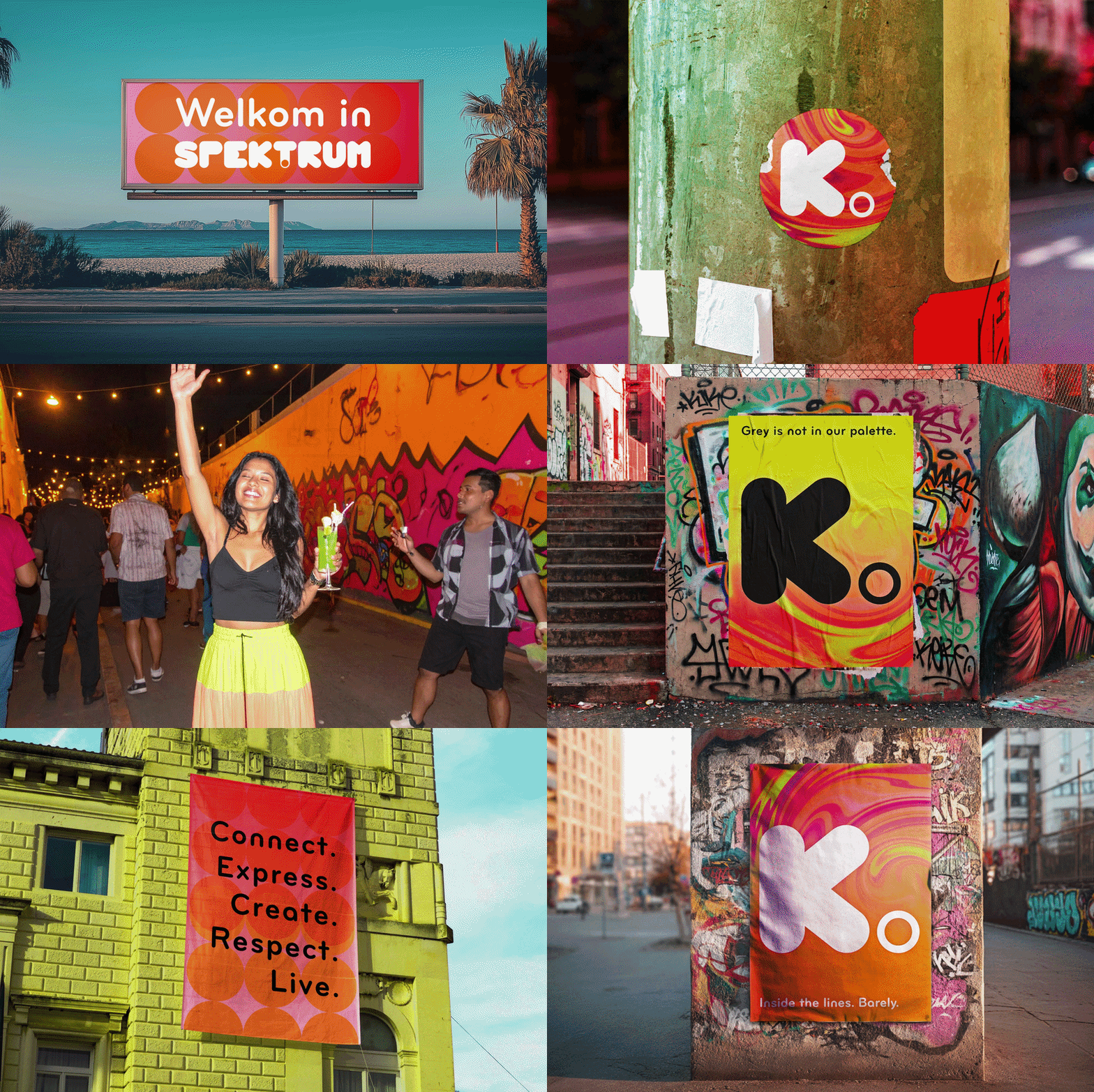
Spektrum is a fictional micronation where creativity replaces conformity. Rather than following traditional social norms, its citizens paint the streets, colour their homes and build a culture shaped entirely by self‑expression.
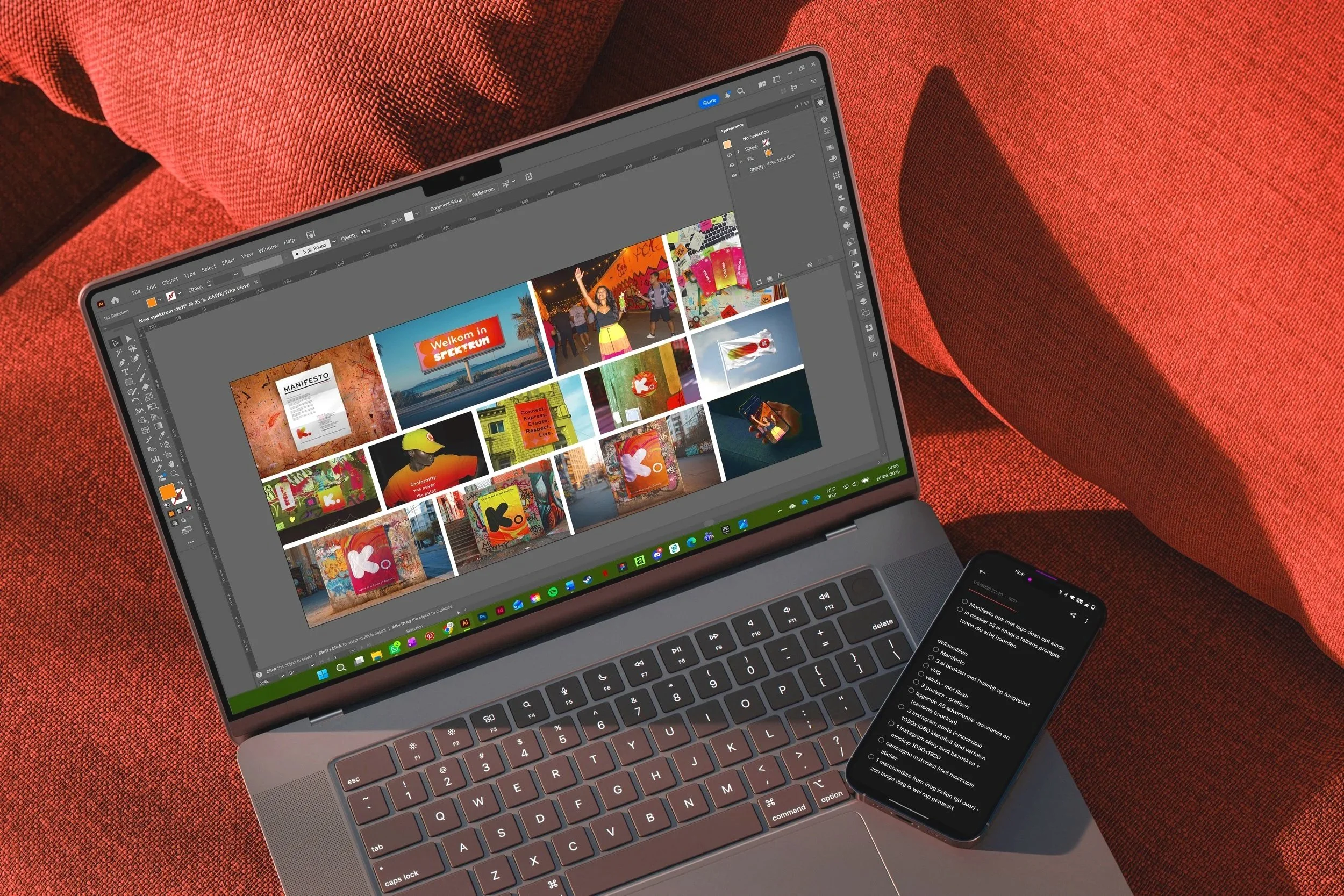
The visual identity reflects this lived creativity. Instead of existing only on paper, the branding extends into the physical environment, forming a visual system that mirrors a nation where art isn’t simply displayed.
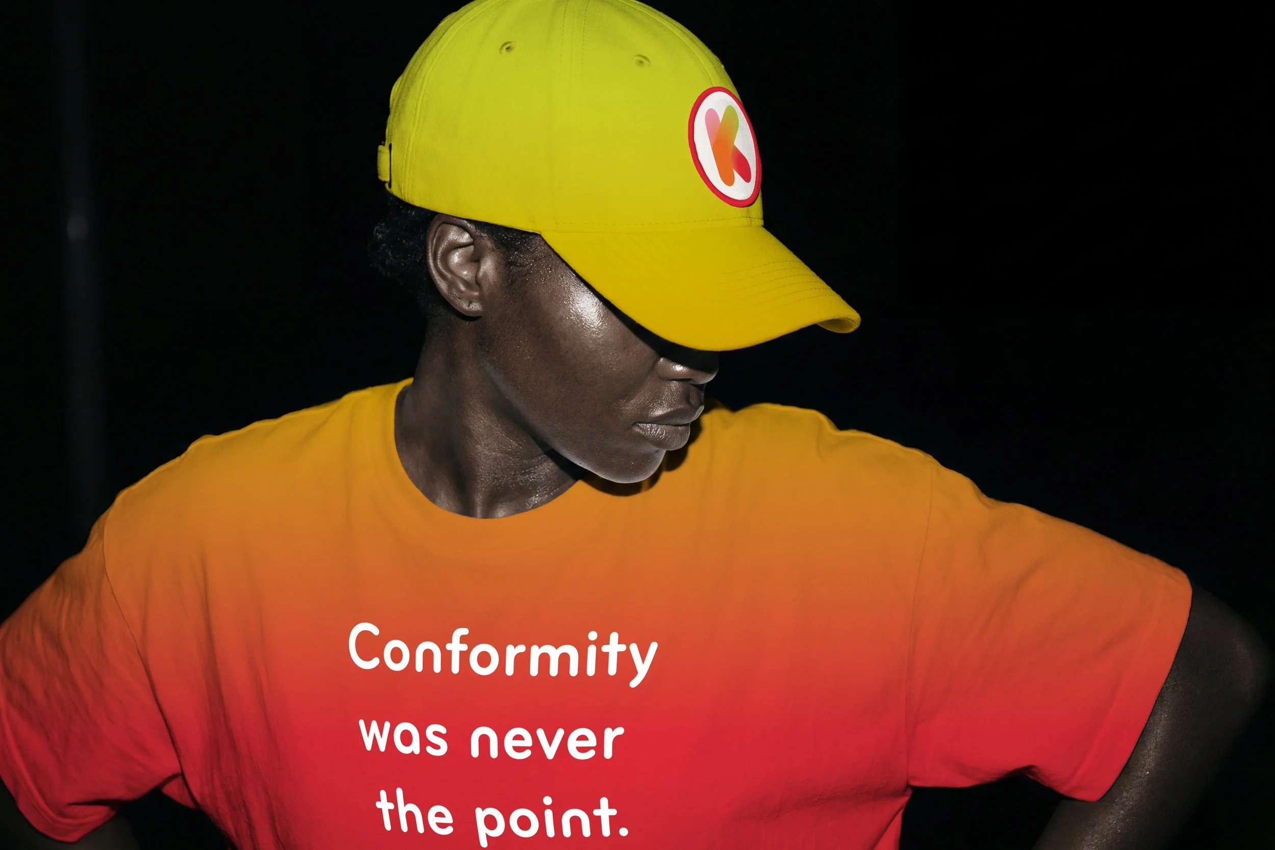
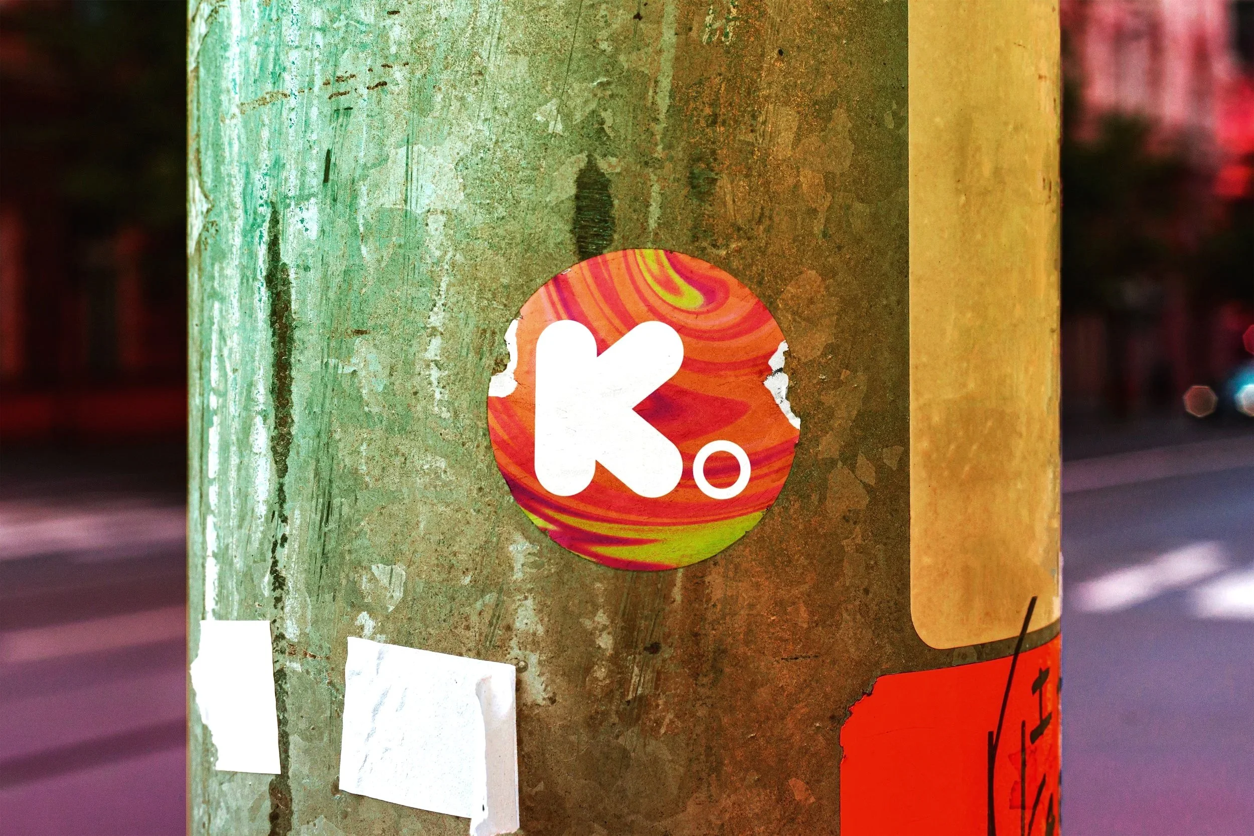
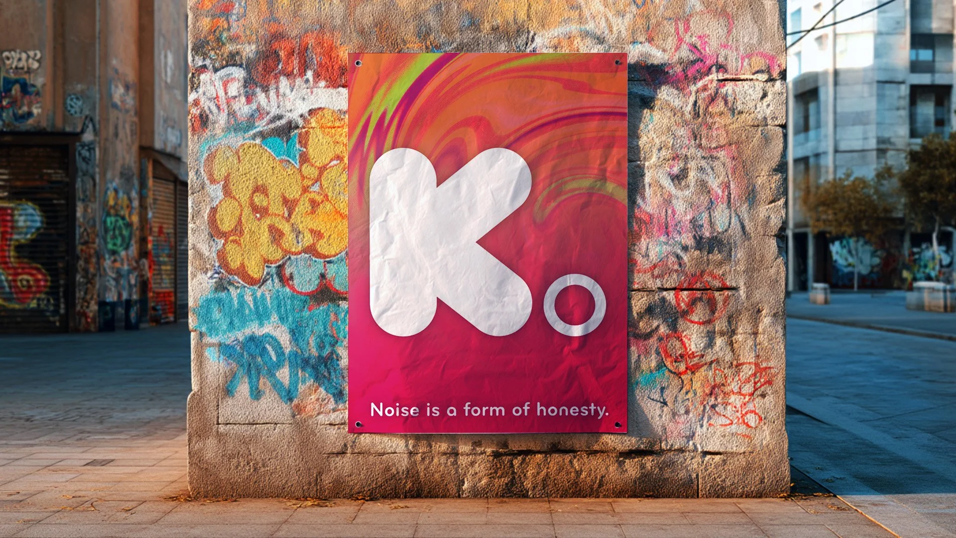
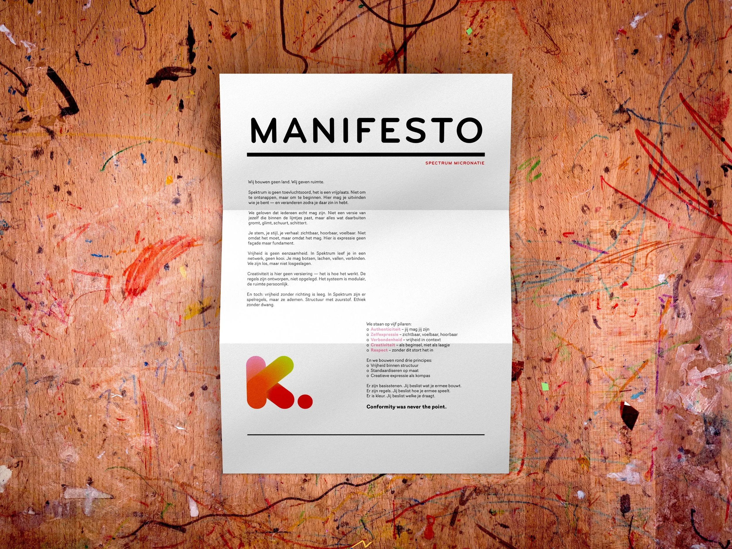

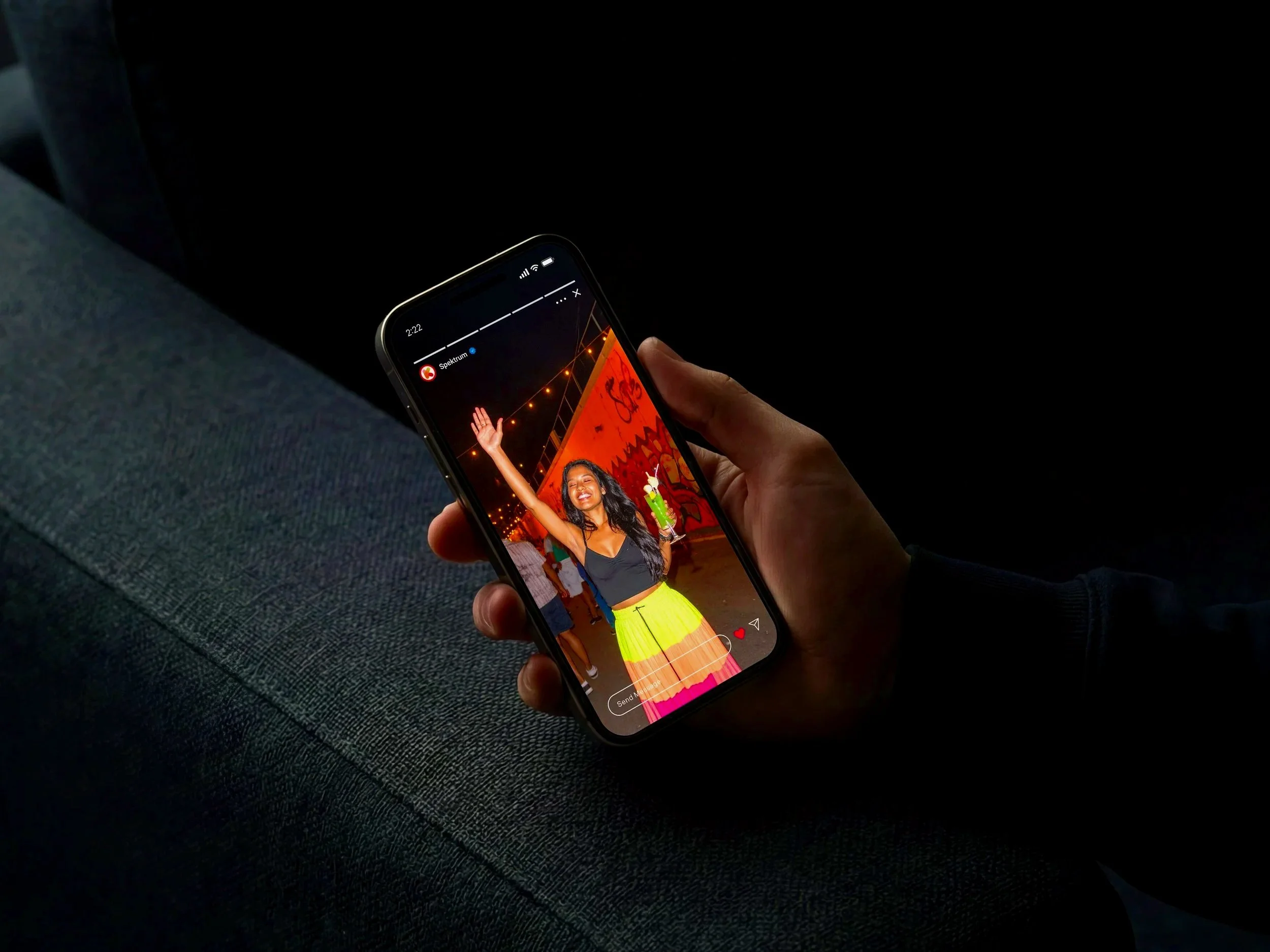
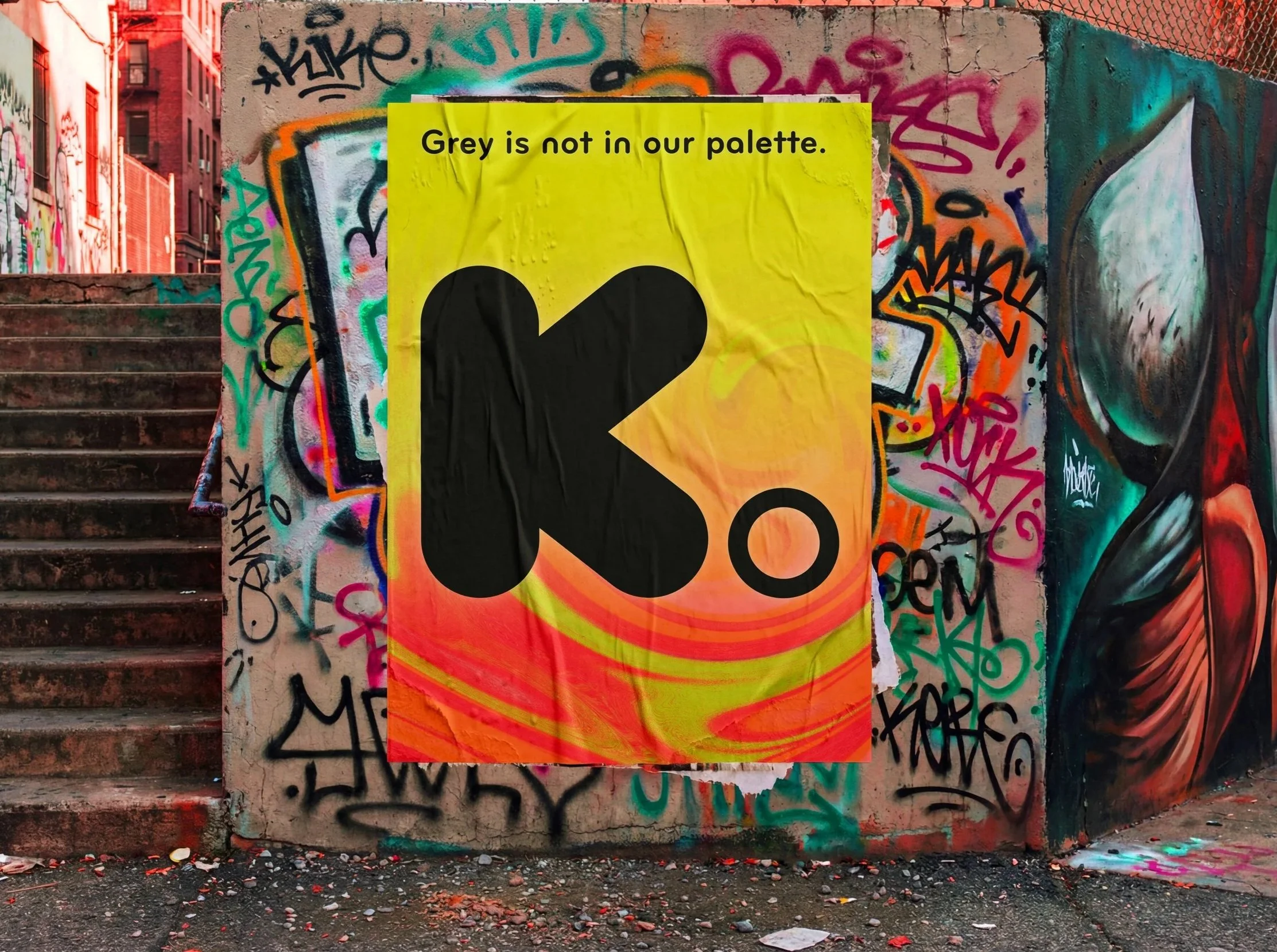
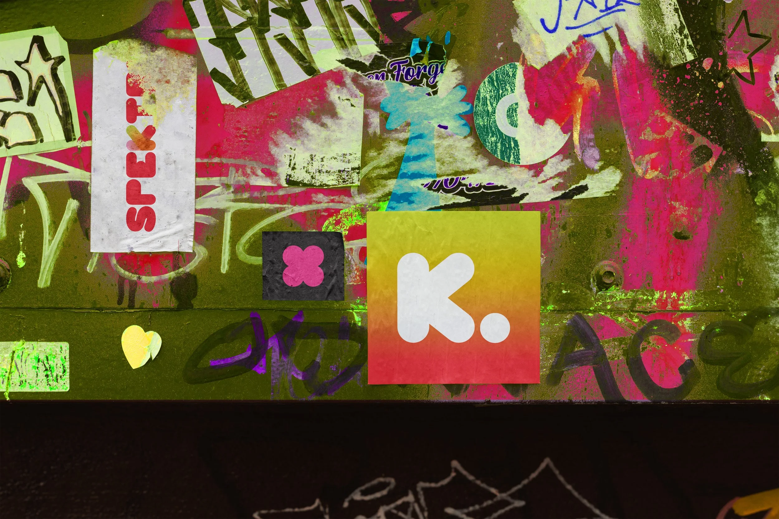
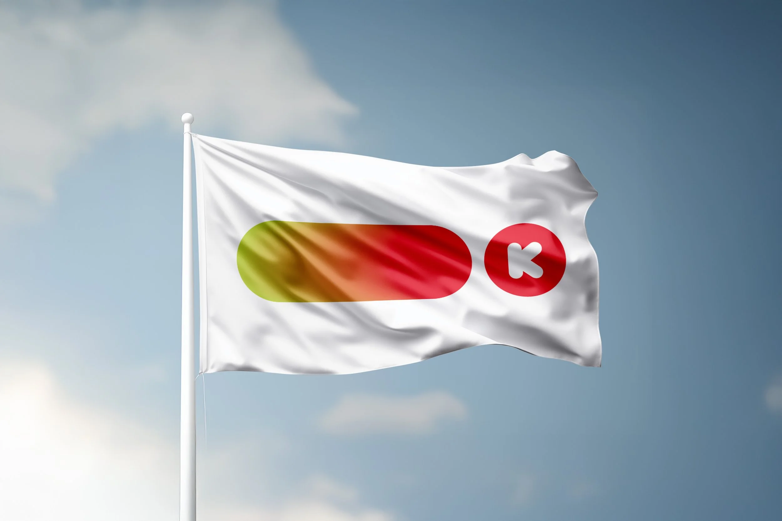
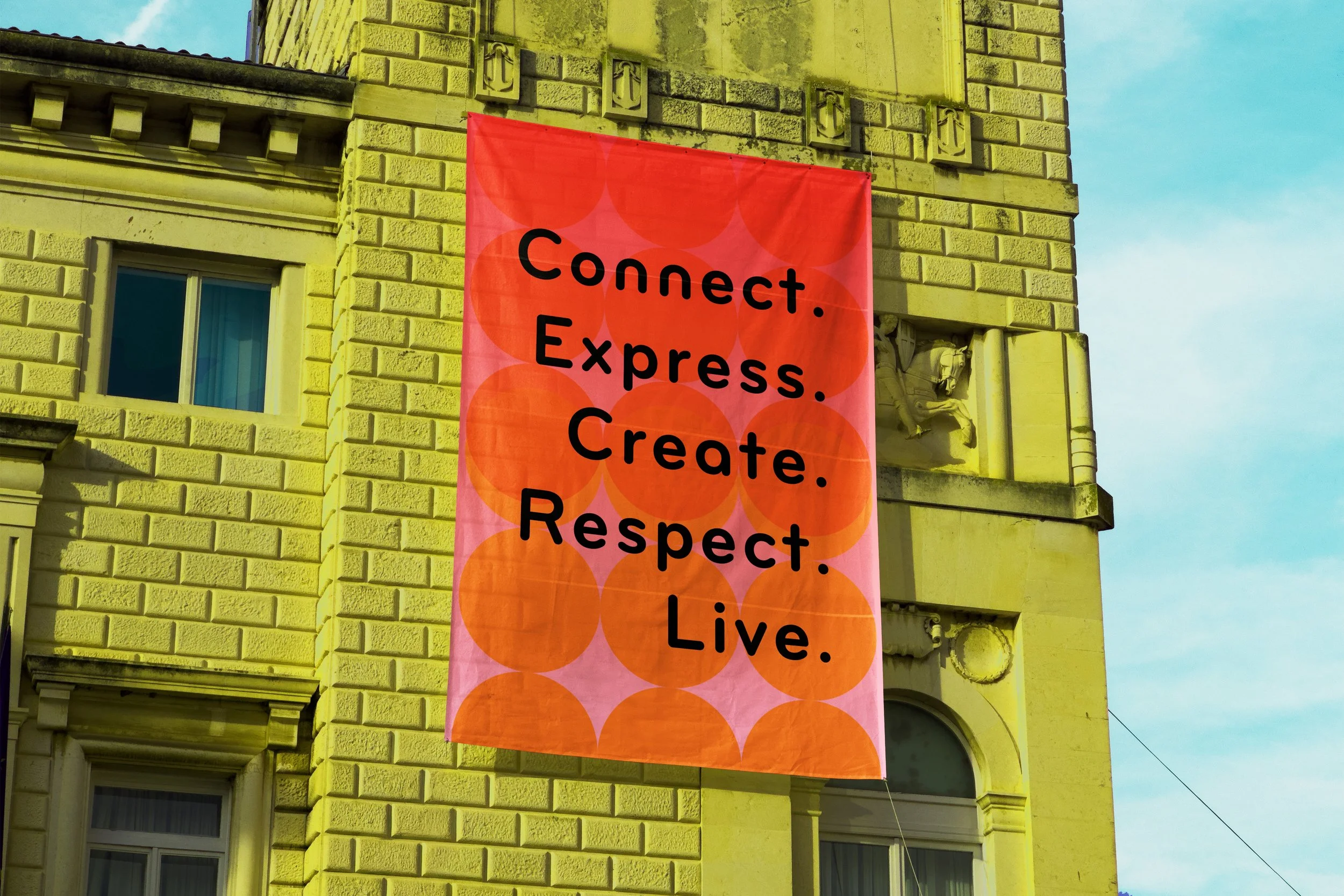
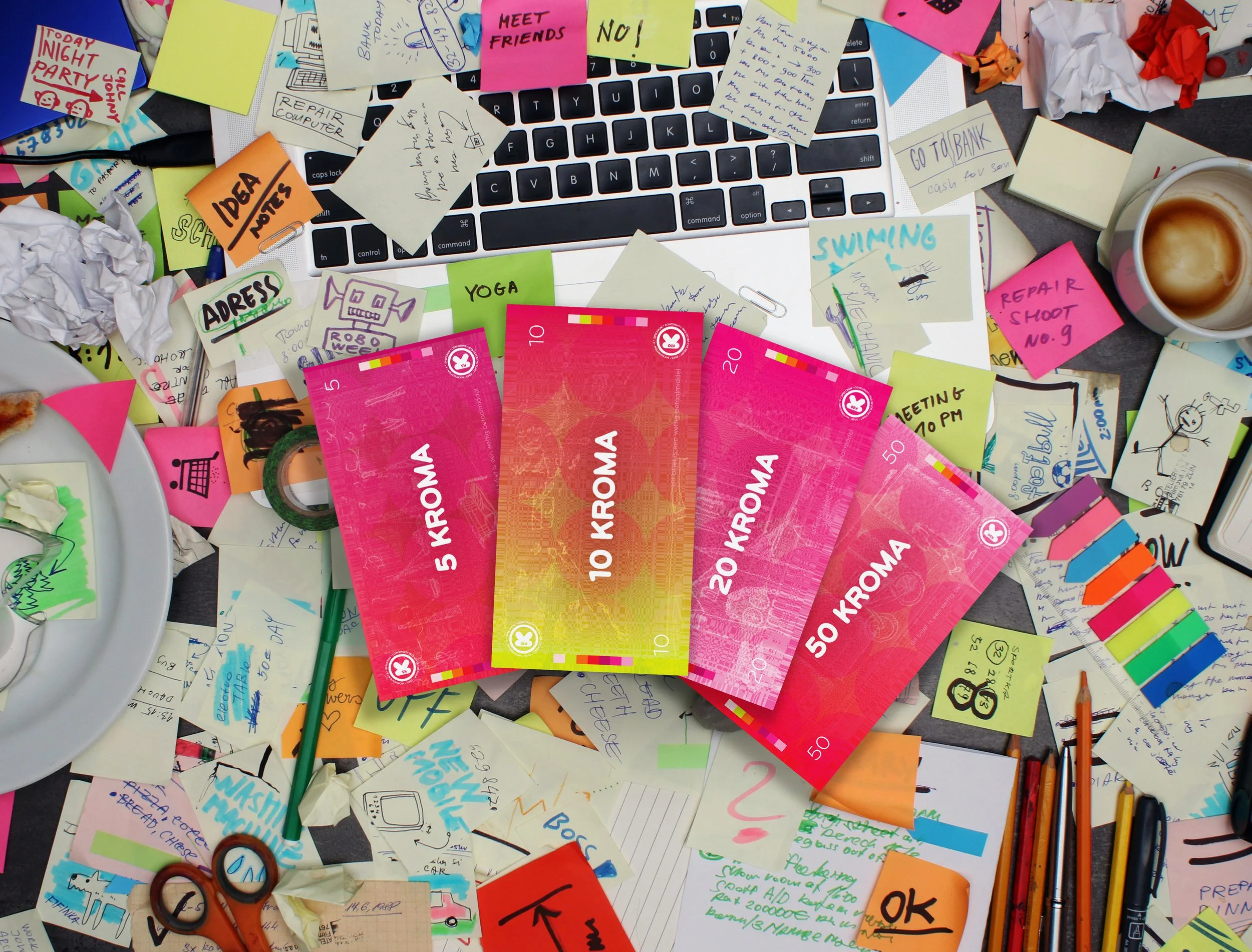
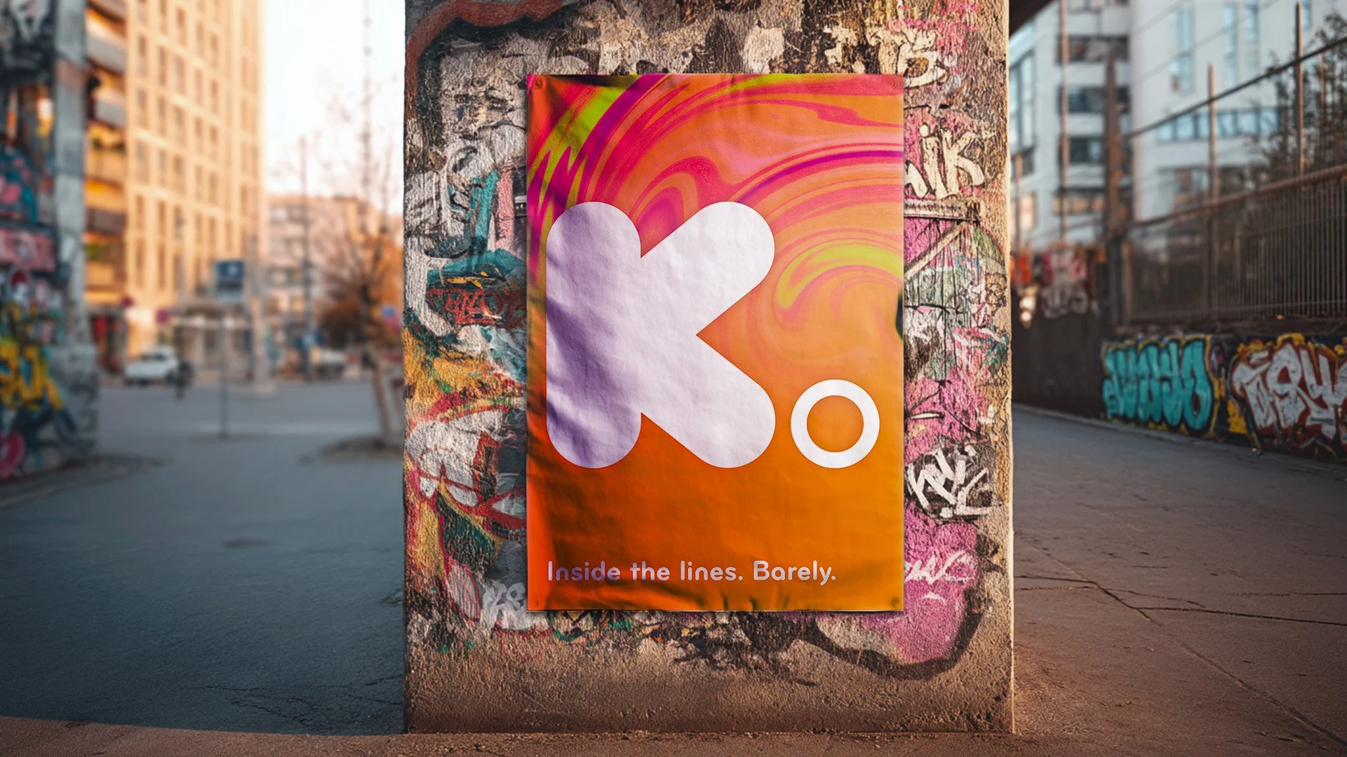
Conceptual educational project. Stock- and generated images were used for educational and mock-up purposes.
Project Note:
"This project was originally created during my first year of Graphic Design. One year later, I completely reworked the art direction and environmental mock-ups to better reflect the rebellious nature of the concept while showcasing my growth as a designer and art director."
Process Spektrum
Analysis & Concept:
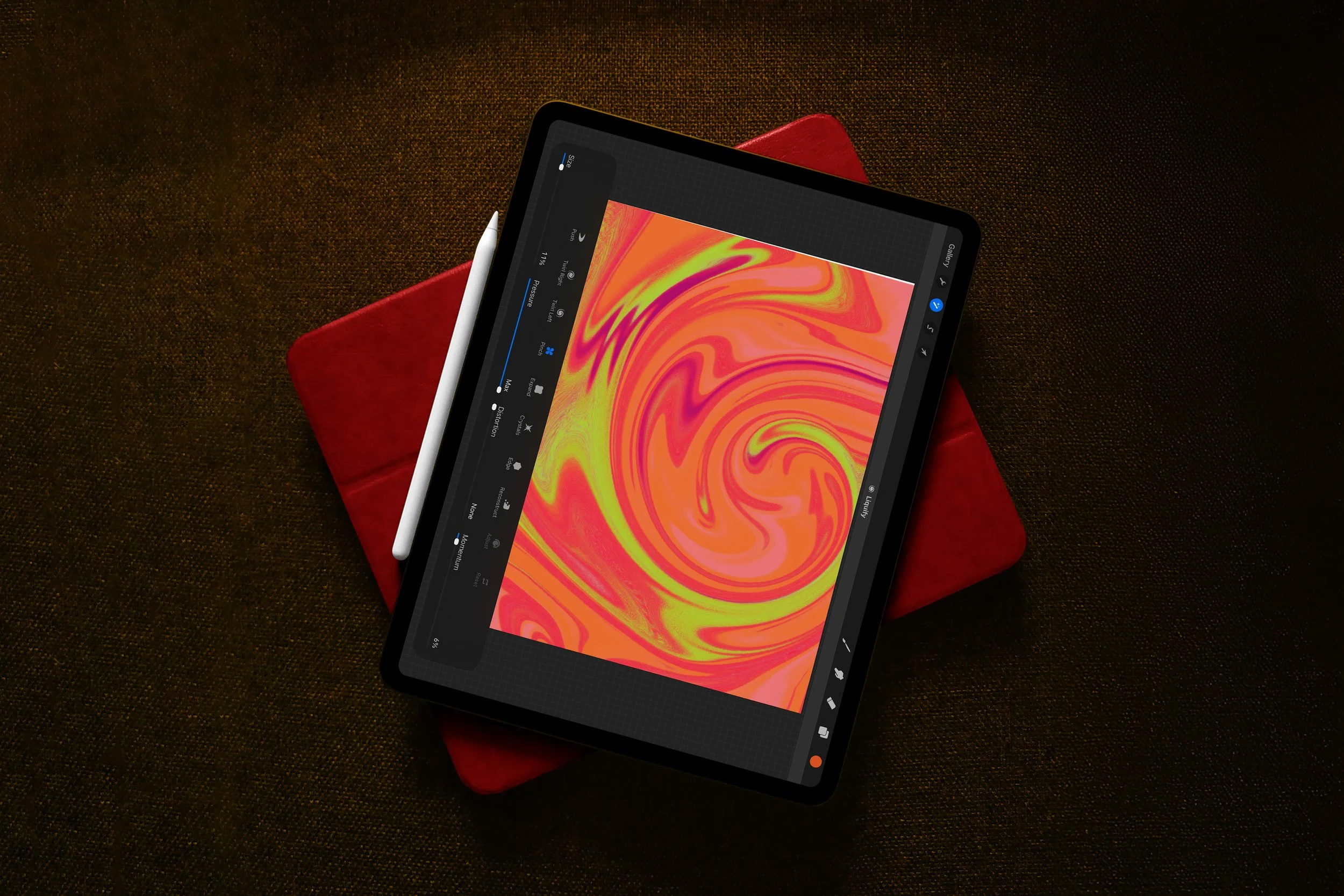
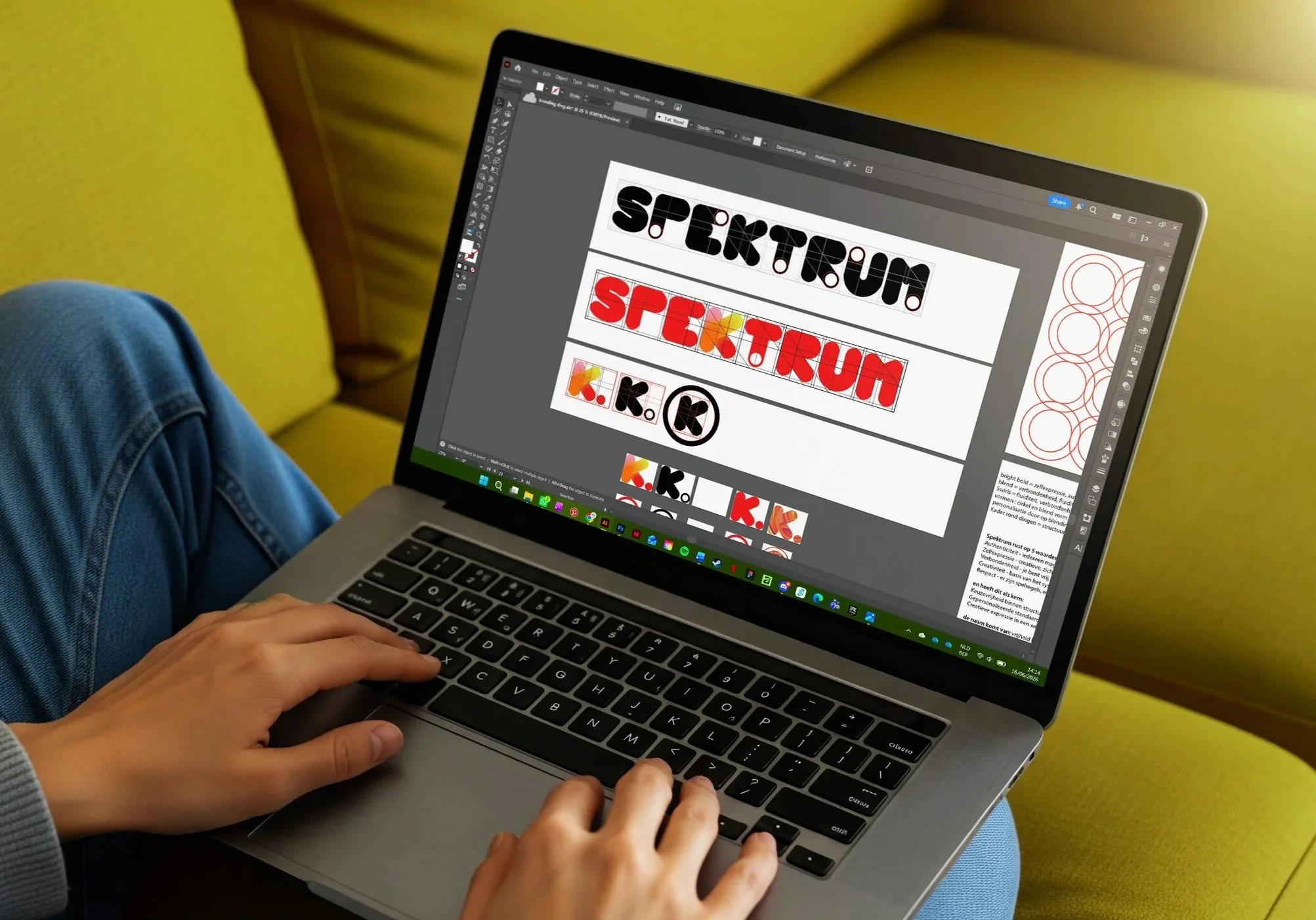
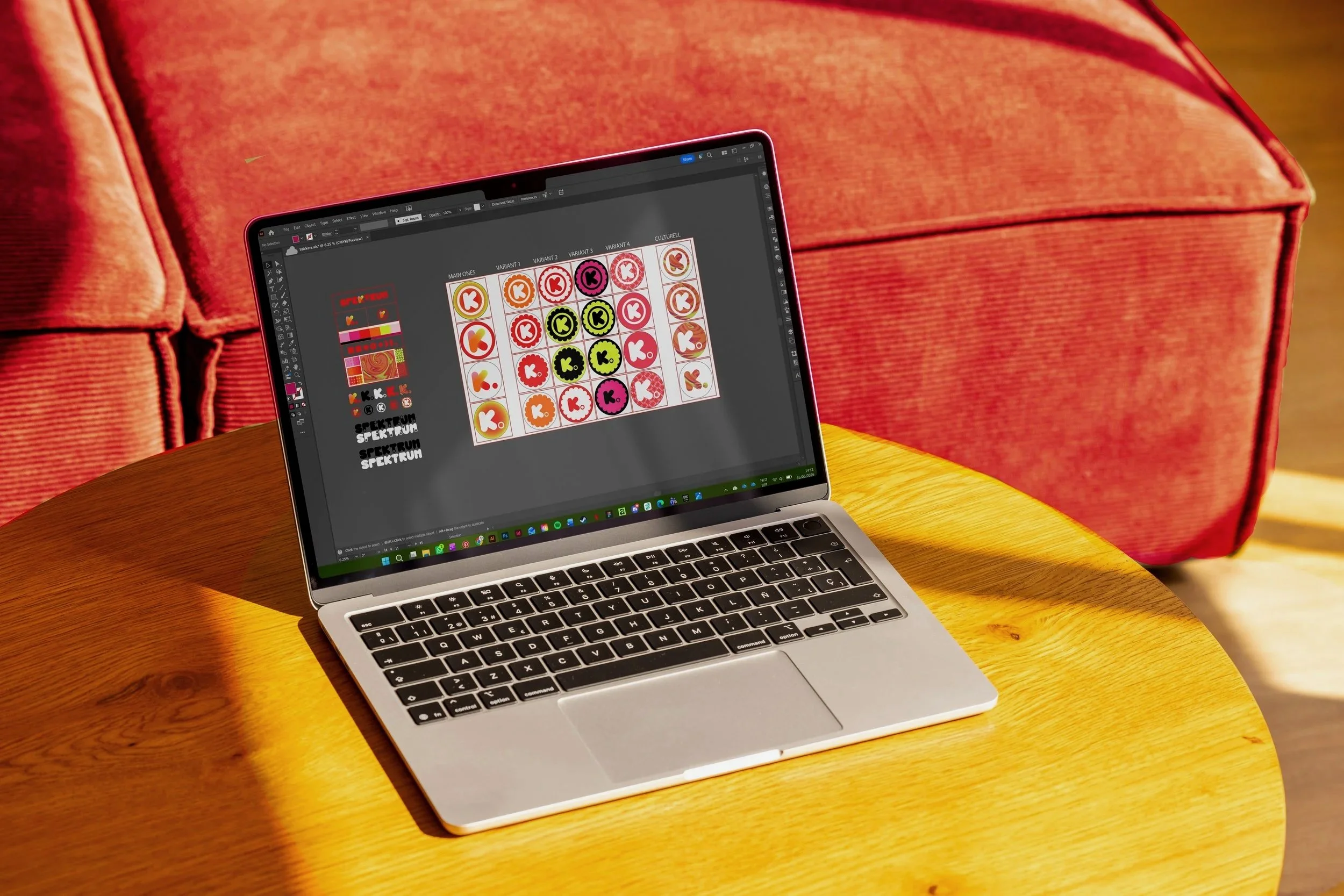
Spektrum emerged from research into identity, symbolism and systems of belonging. Flags, rituals, colour, language and graphic codes became the building blocks of a fictional nation with its own visual logic and cultural identity.
Iteration & Interpretation:
Through continuous experimentation with form, iconography and storytelling, the project evolved into a fully realised brand world. The updated environmental mock-ups strengthen the immersive experience while presenting the identity within a clear and systematic design framework.
Curious about the process behind this project? I'd be happy to share the full research, concept development and visual studies that shaped the final design. Feel free to get in touch.
People-First Strategy
·
Visual Storytelling
·
People-First Strategy · Visual Storytelling ·
Design Method
-

In-depth Research
Every project begins with listening and observing. I explore the story behind the brand or product to understand what it truly wants to communicate.
-

Concept Development
Those insights evolve into a visual system where emotion and strategy come together. This is where the tone, rhythm and direction of the design take shape.
-

Iterative Exploration
Typography, colour and composition are refined through experimentation. Every iteration brings the visual language closer to its strongest and most coherent form.
-

Presentation
The final outcome should be more than a finished design; it should tell a story. Every project is presented with careful attention to context, consistency and experience.