LAYOUT DESIGN
A closer look at three projects where I focused on editorial layout, structure, and storytelling through print.
Showcase 01
·
Showcase 01 ·
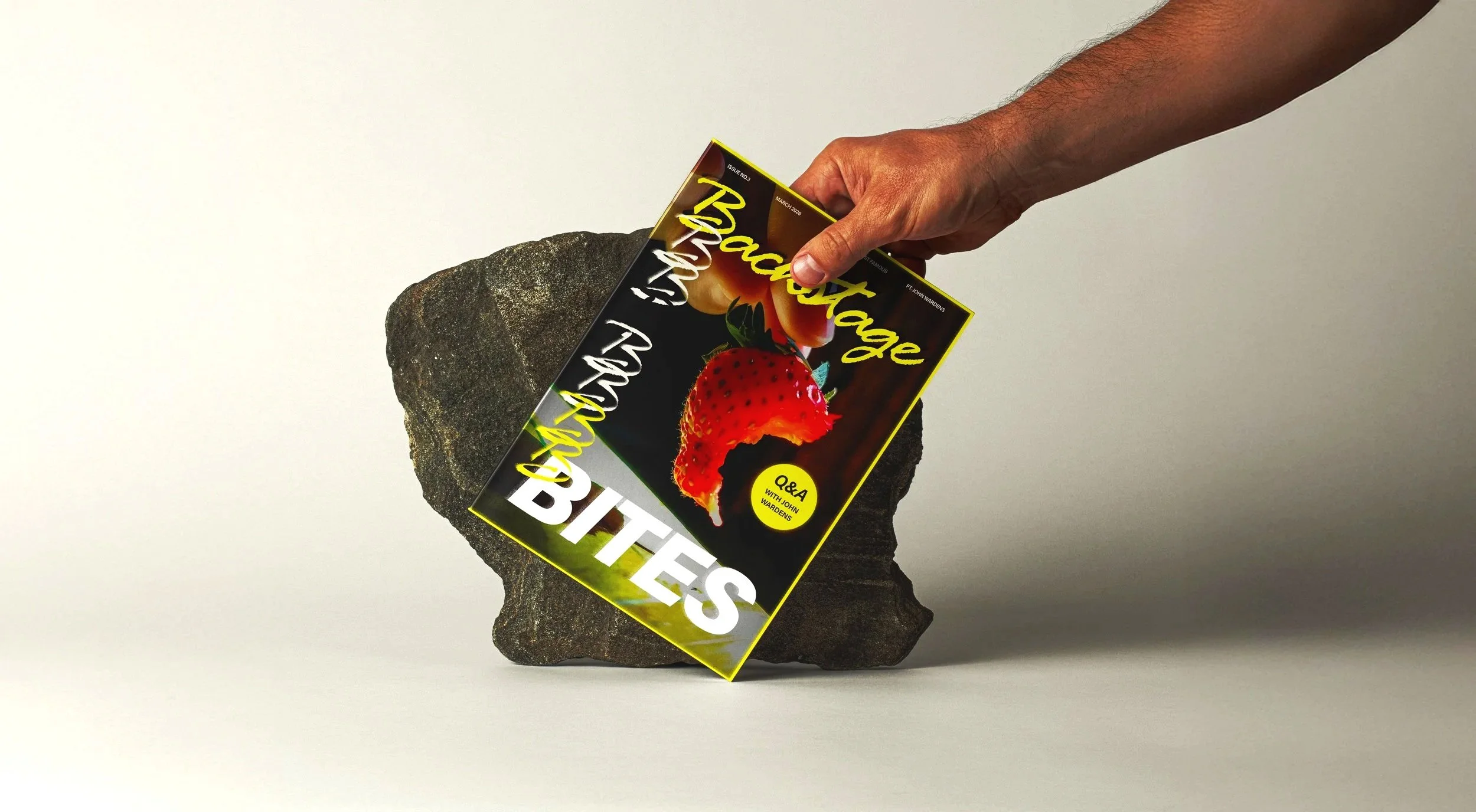
Backstage Bites
Magazine concept
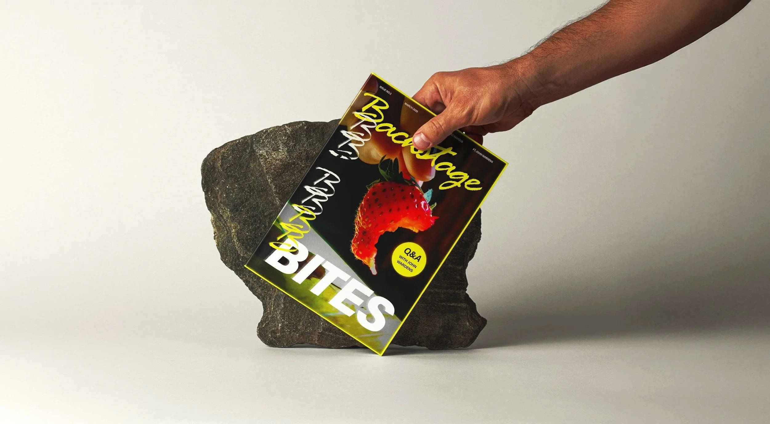
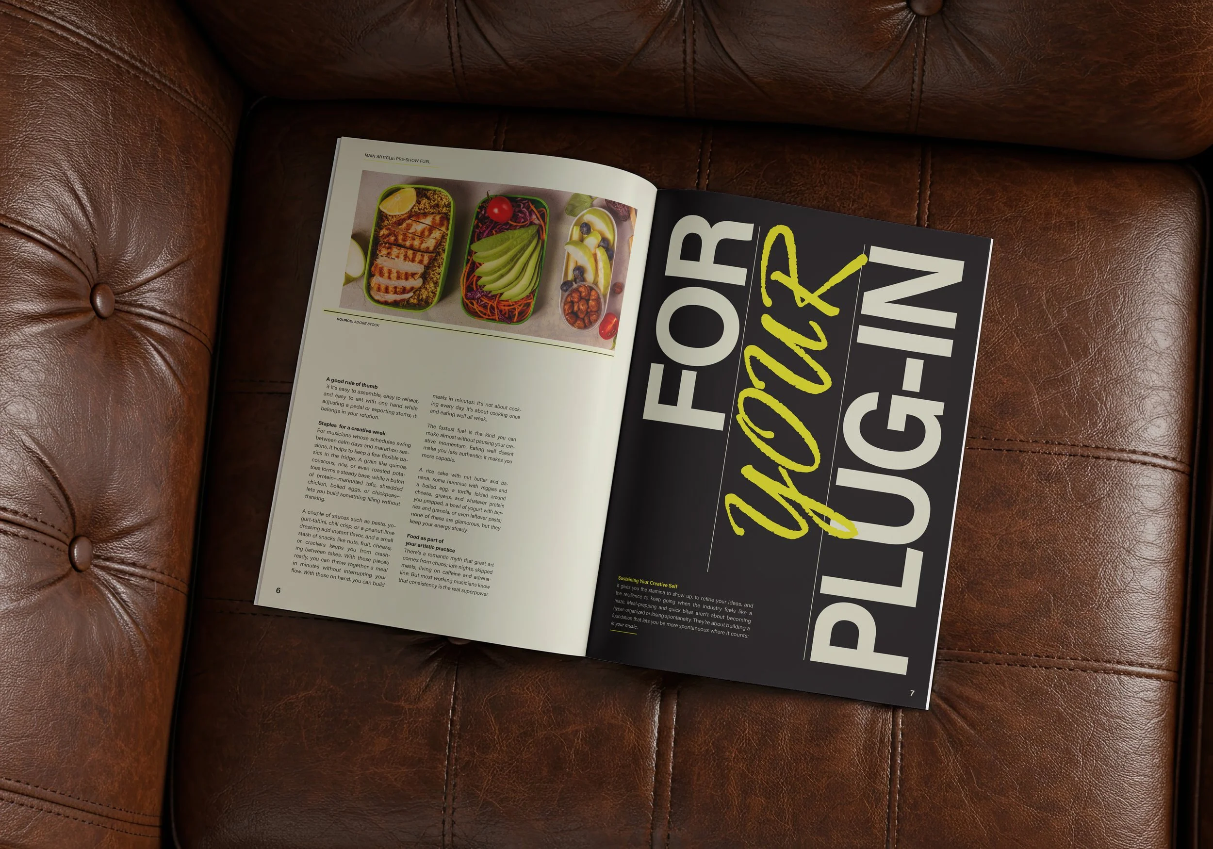
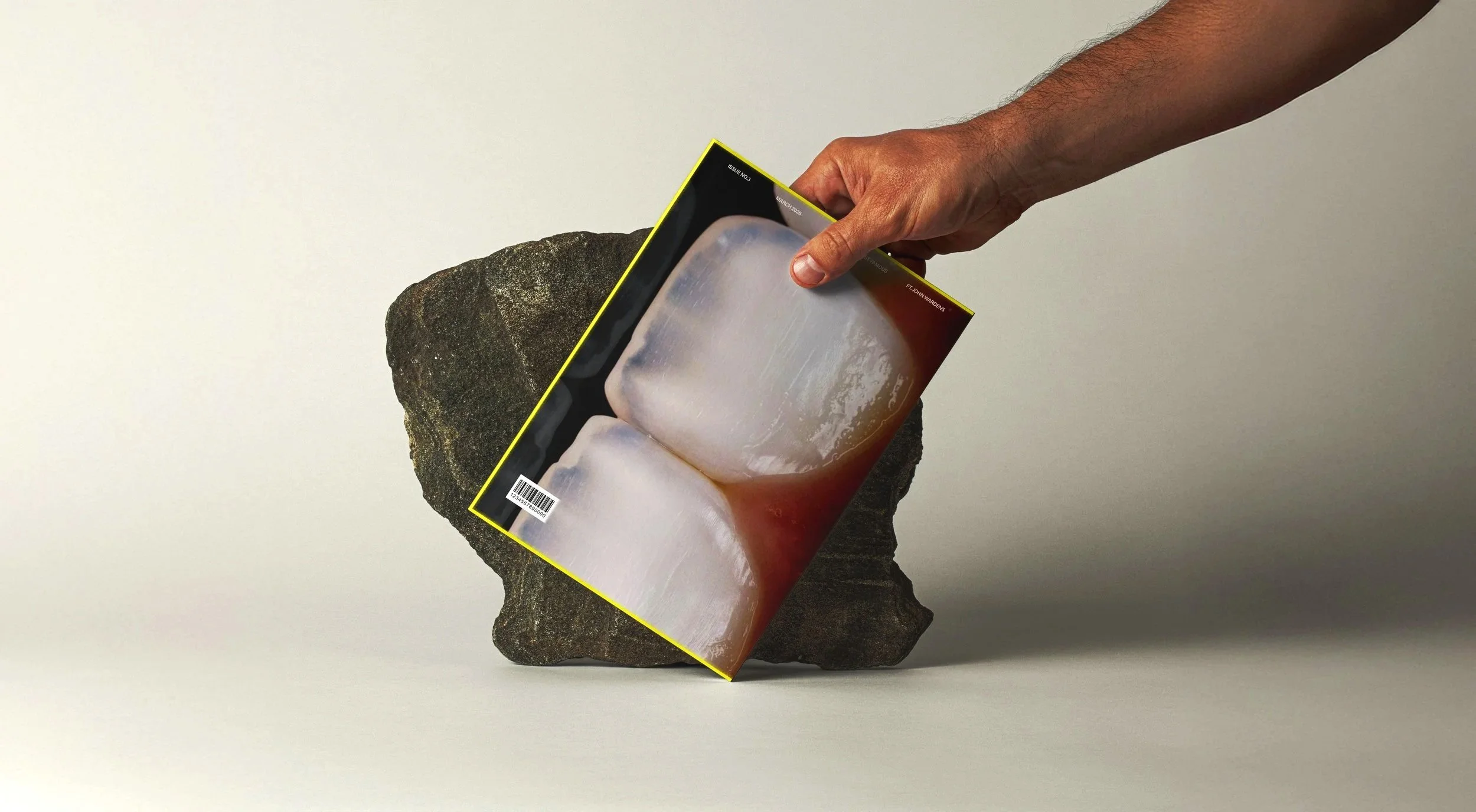
Backstage Bites is a food magazine inspired by the world behind the stage. Rather than focusing solely on recipes, it explores how food fuels creativity during rehearsals, performances and life on tour.
The visual identity reflects this contrast. Dynamic compositions, bold typography and layered graphic elements capture the energy of backstage life, while a structured grid keeps the magazine clear and easy to navigate.
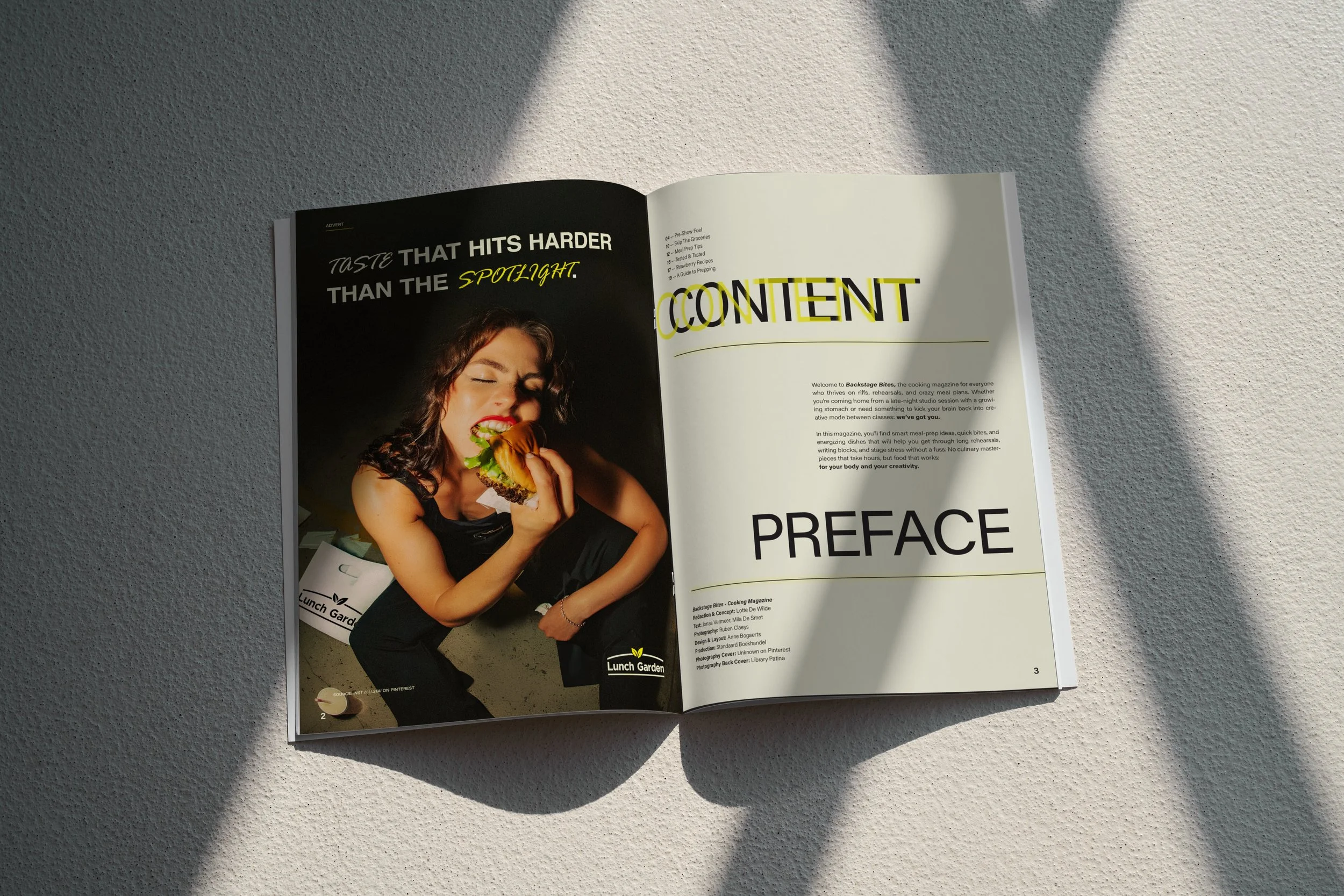
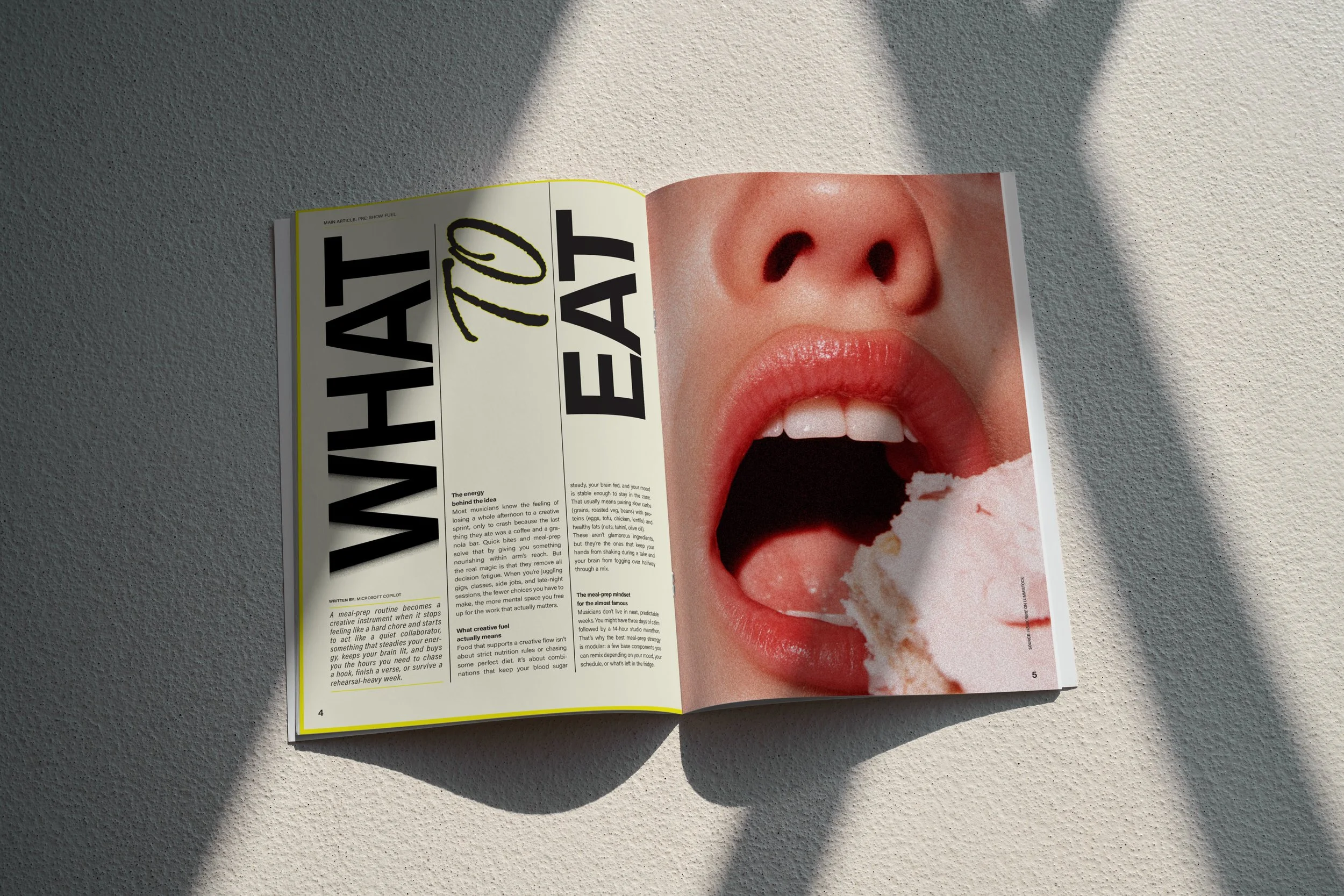
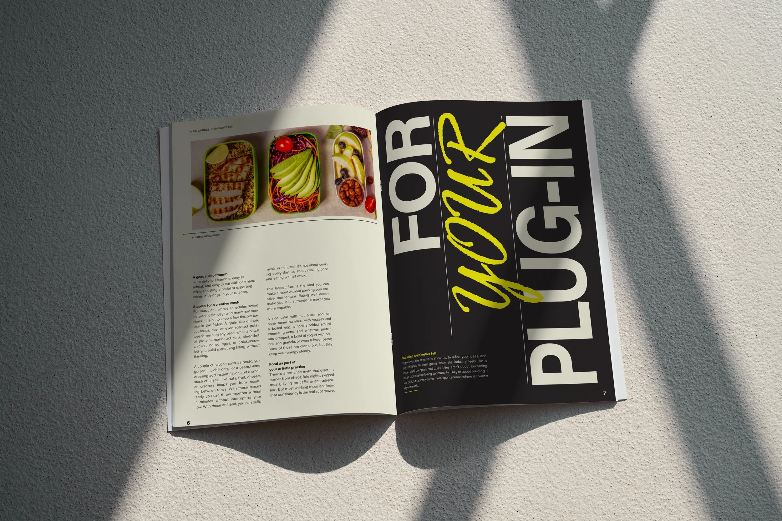
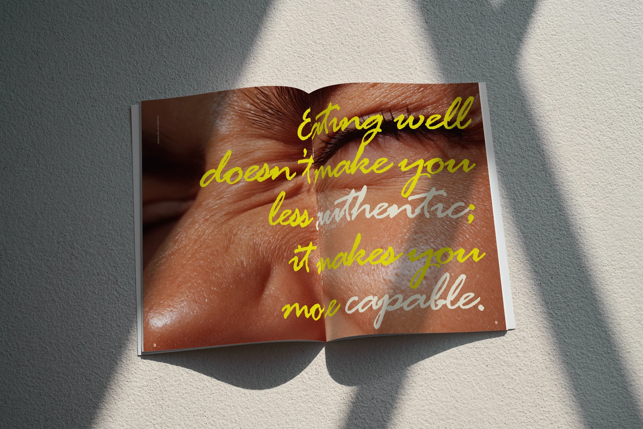
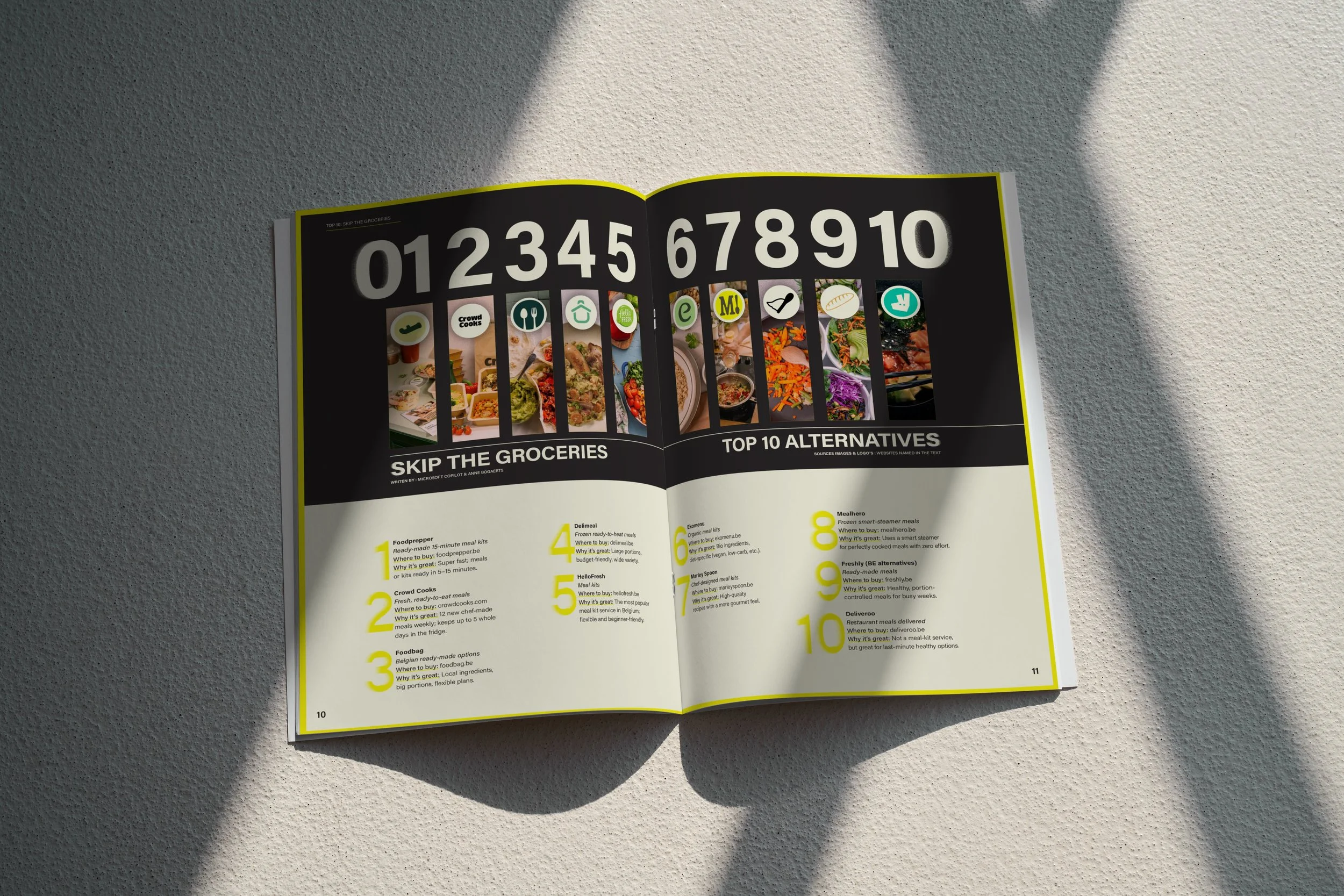
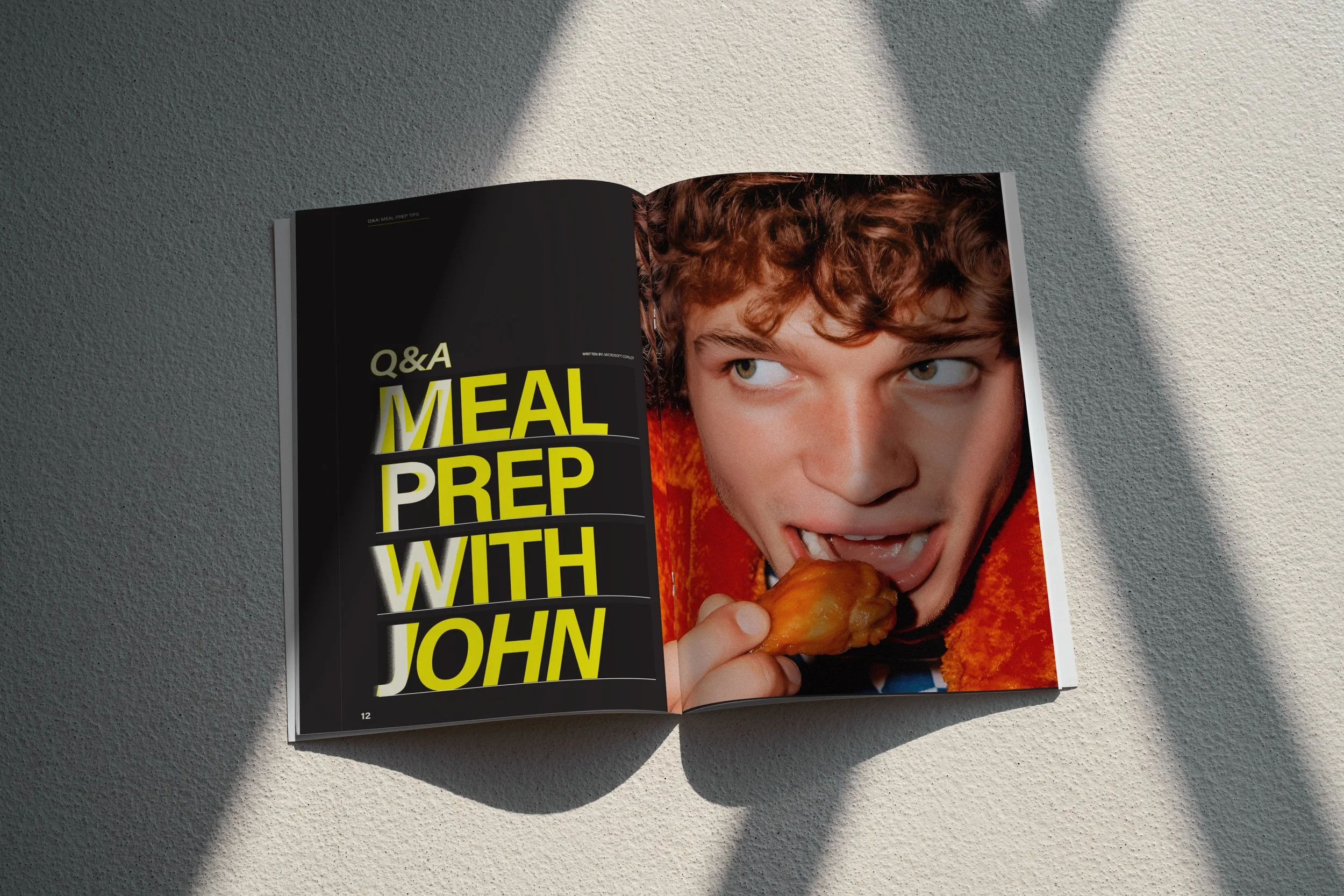
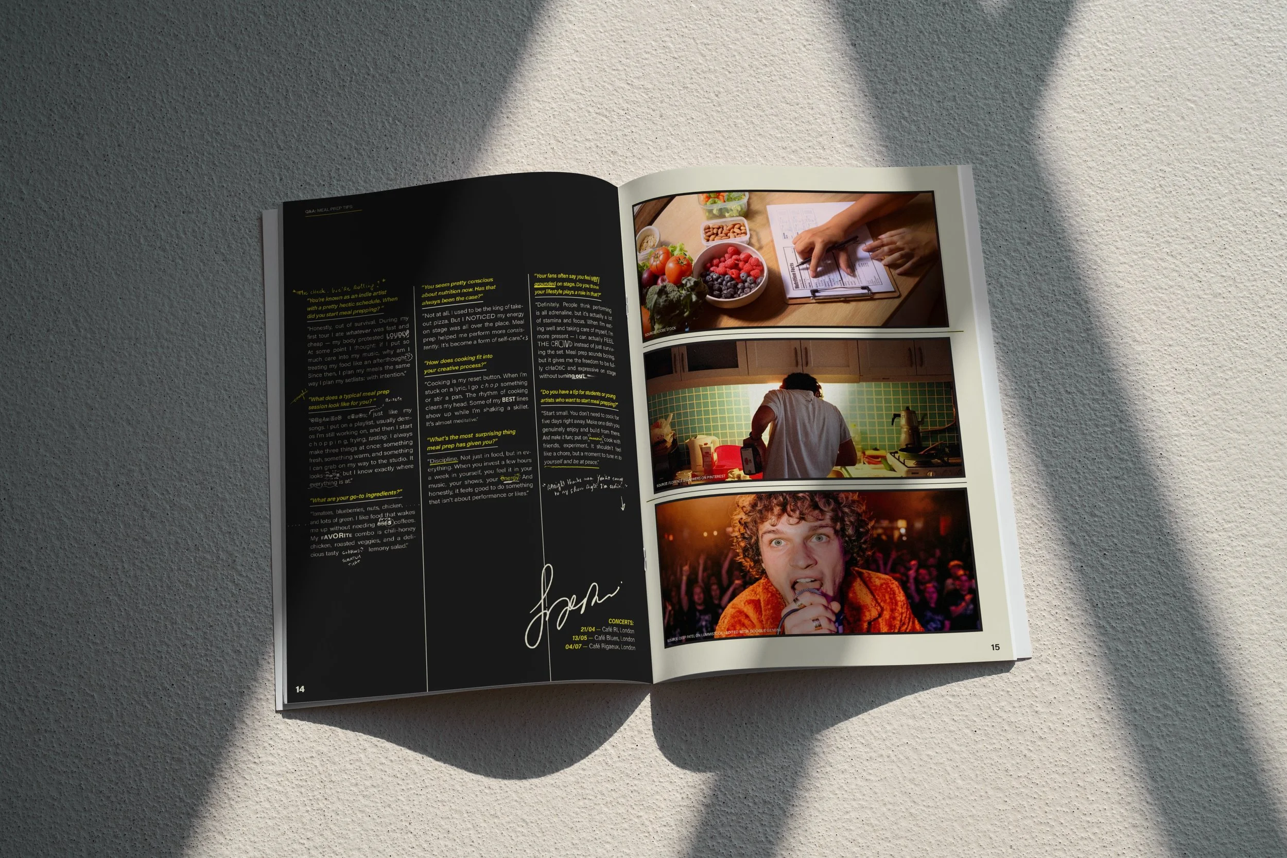
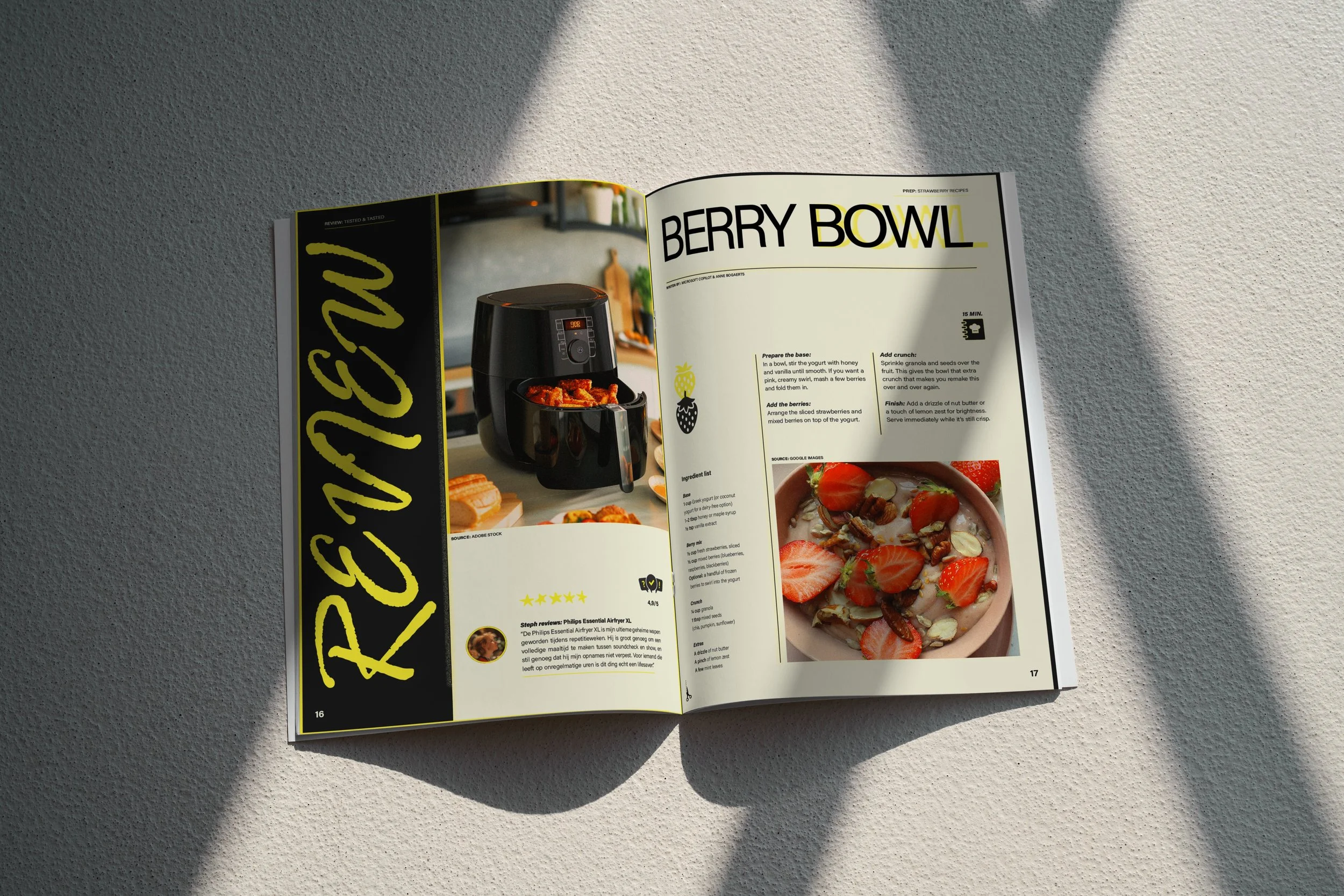
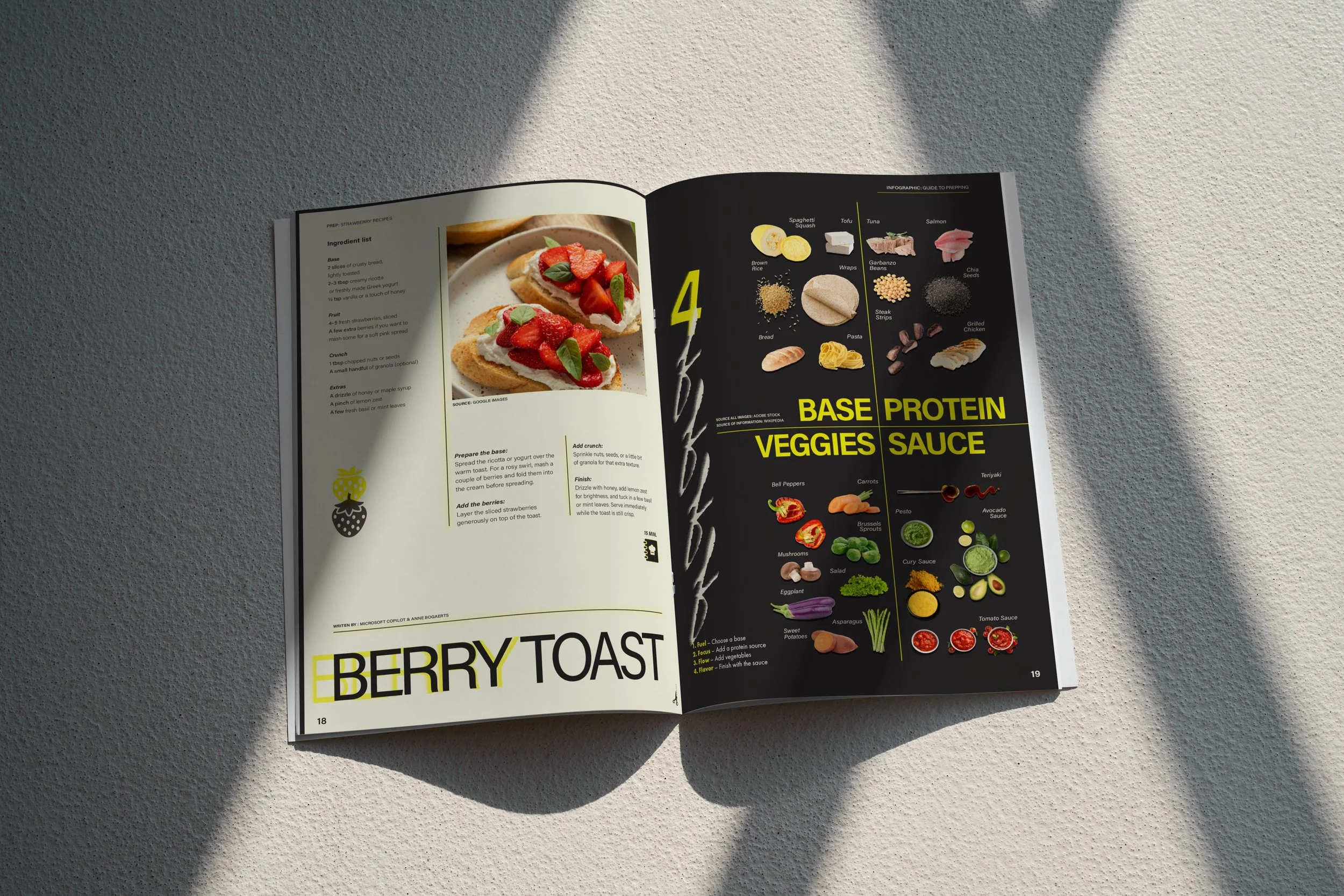
Conceptual educational project. Images and generated texts were used for educational and mock-up purposes.
Evaluation:
“I am genuinely impressed by how structured your analysis and dossier are. You can be truly proud of this, as you are delivering work of a professional standard. Your design is also striking, cohesive, and varied at the same time. Well done!”
Process backstage Bites
Analysis & Concept:
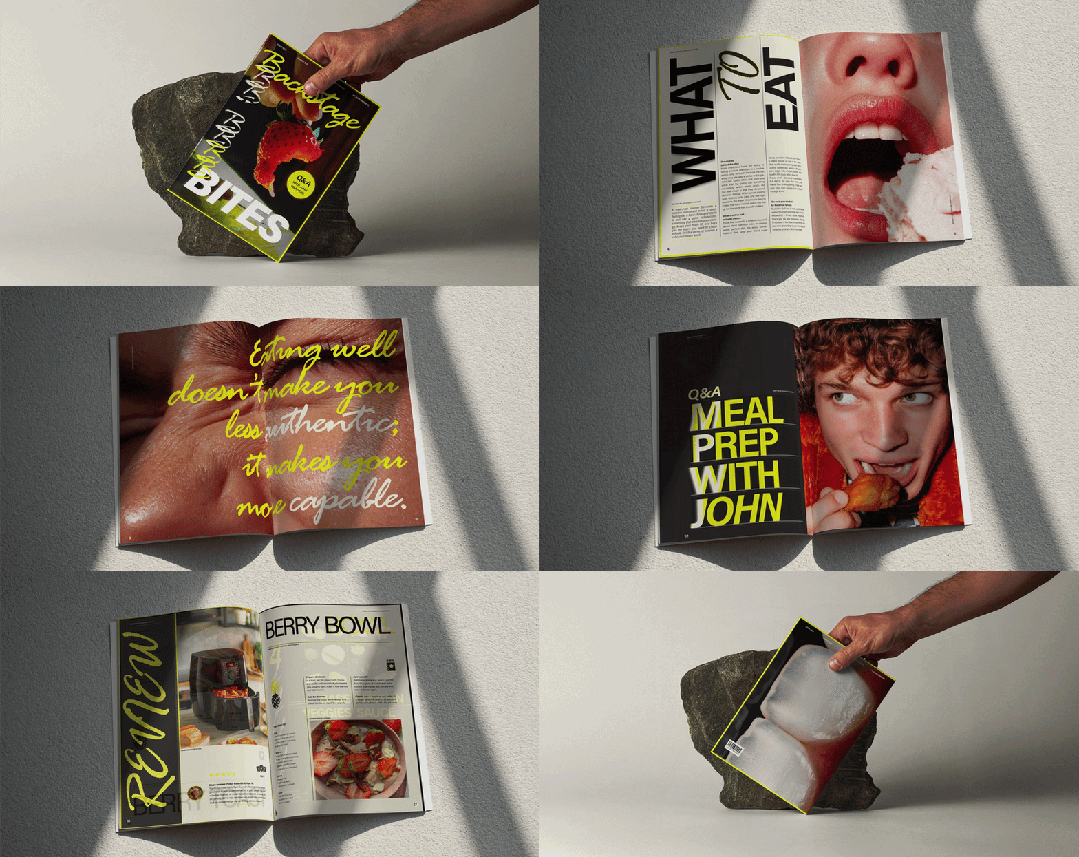
I began by analysing existing food magazines, paying close attention to their audience, visual rhythm and editorial tone. Those insights shaped every design decision, from the pacing of the layouts to the hierarchy of the typography.
Iteration & Interpretation:
Every spread went through multiple iterations to refine the balance between expressive layouts and readability. Throughout the process, I continuously returned to my moodboard to ensure every design decision strengthened the magazine's visual identity.
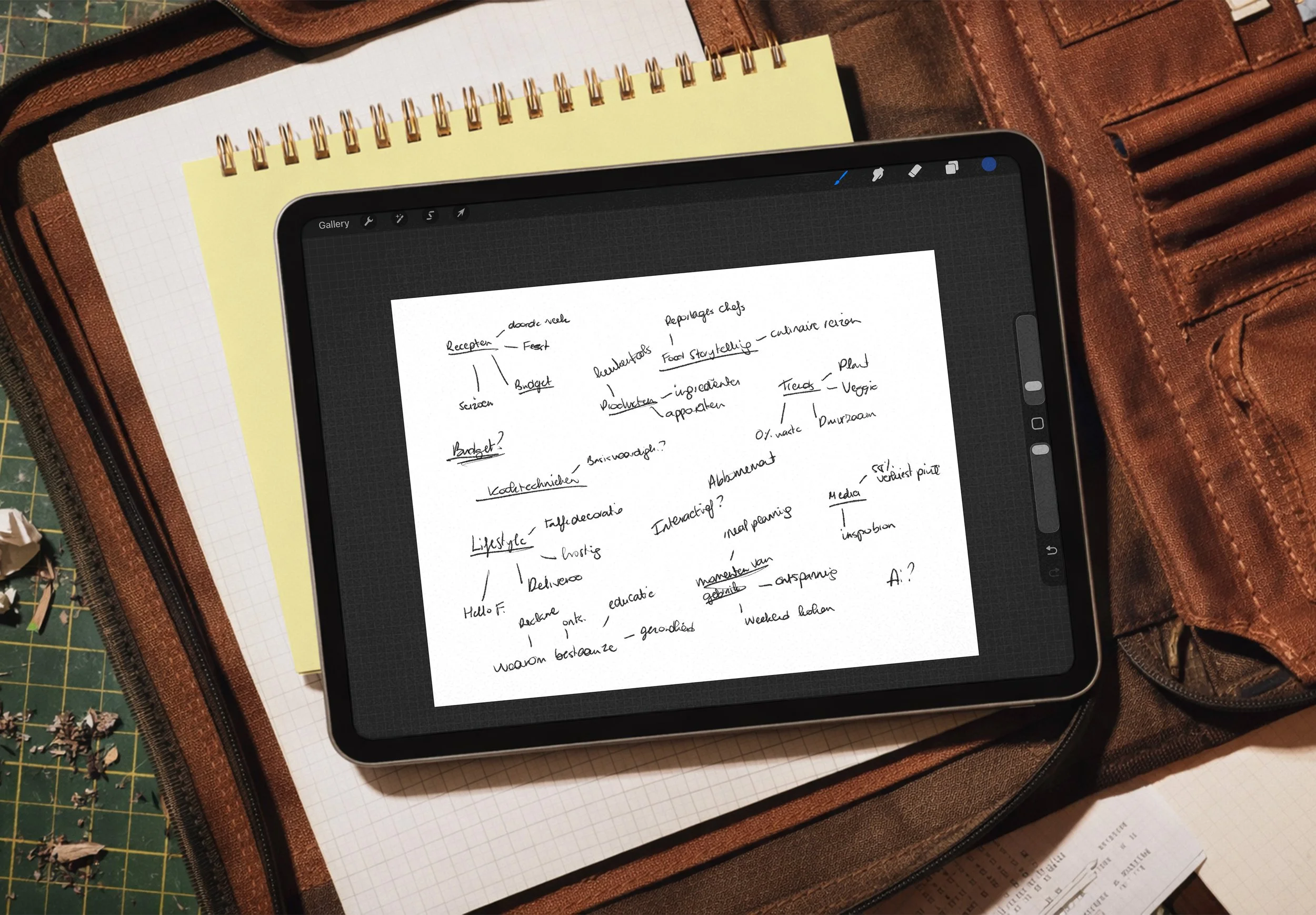
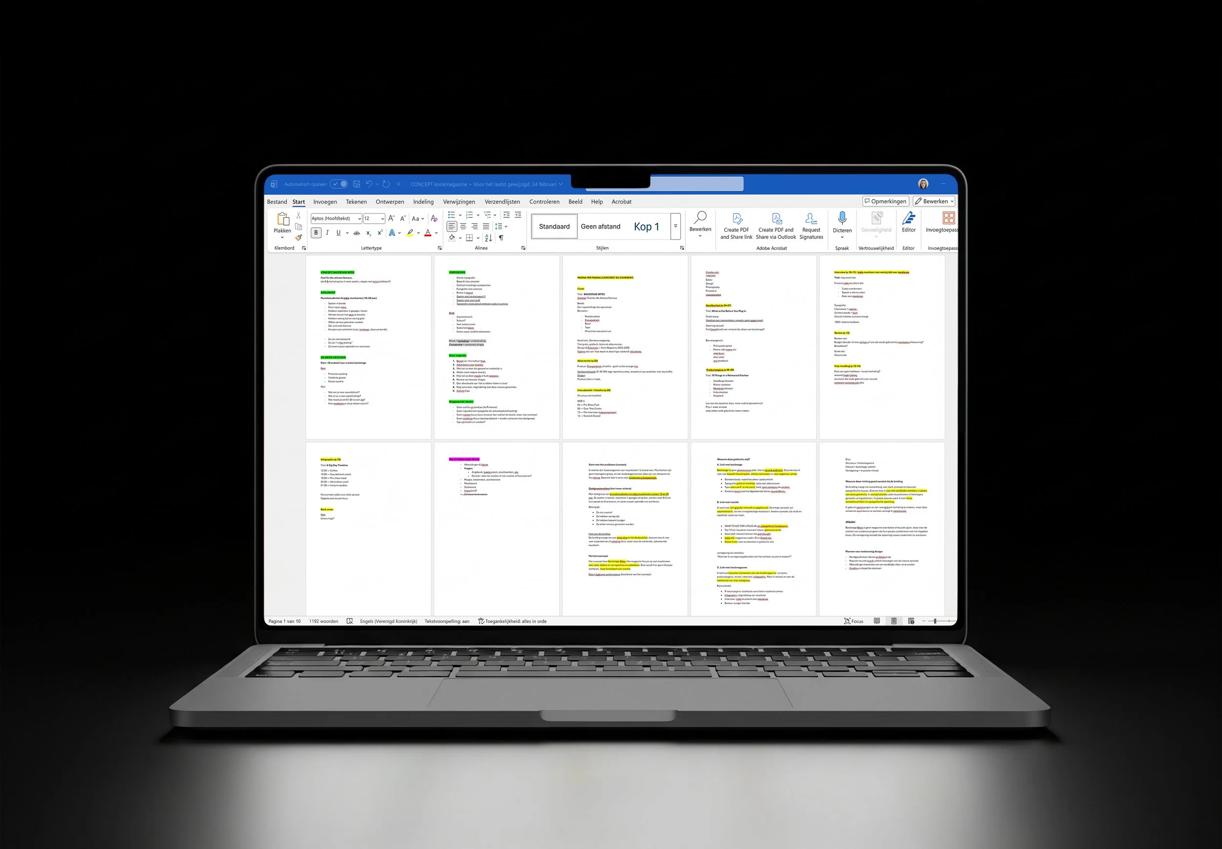
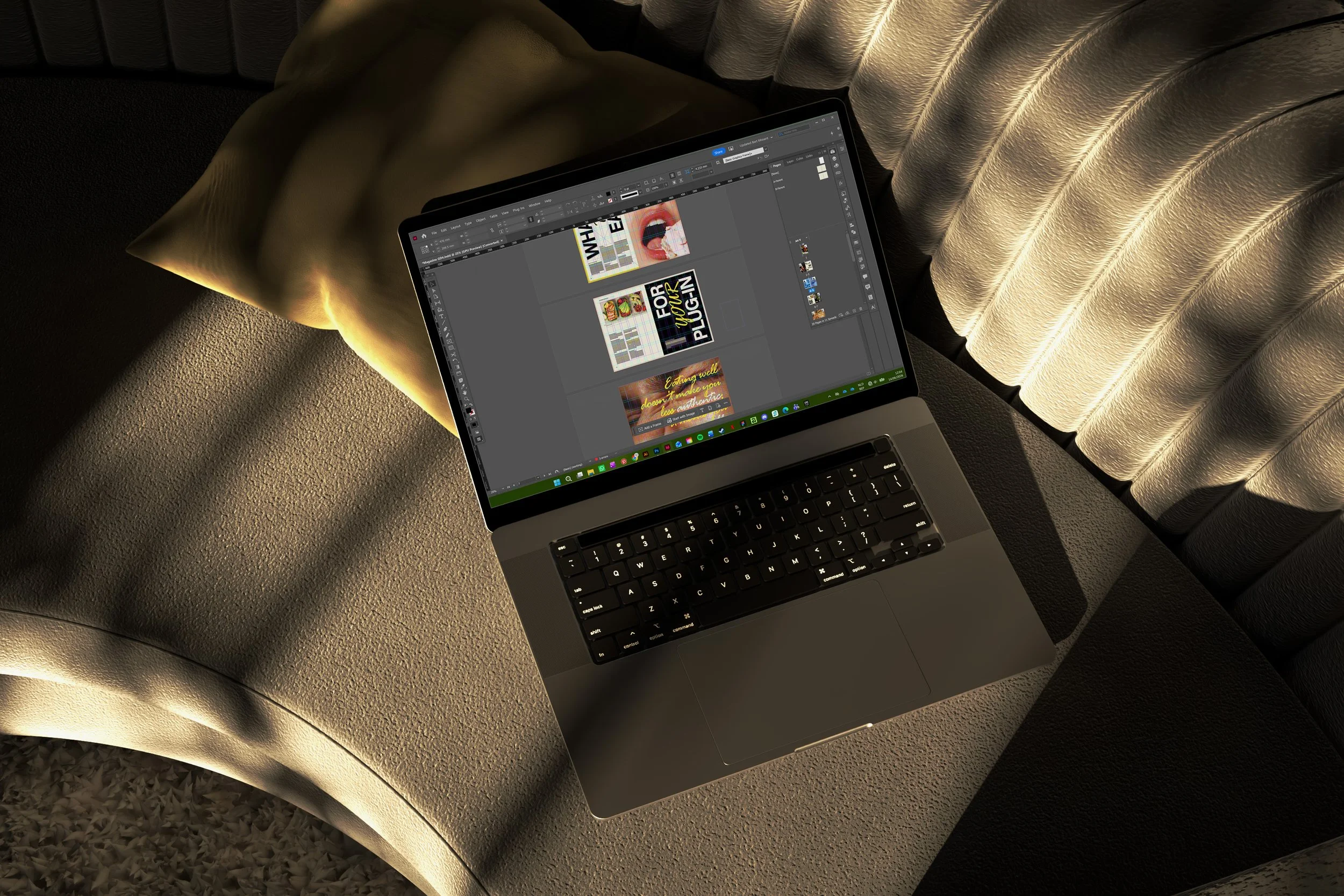
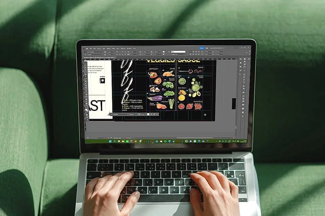
Curious about the process behind this project? I'd be happy to share the full research, concept development and visual studies that shaped the final design. Feel free to get in touch.
Showcase 02
·
Showcase 02 ·
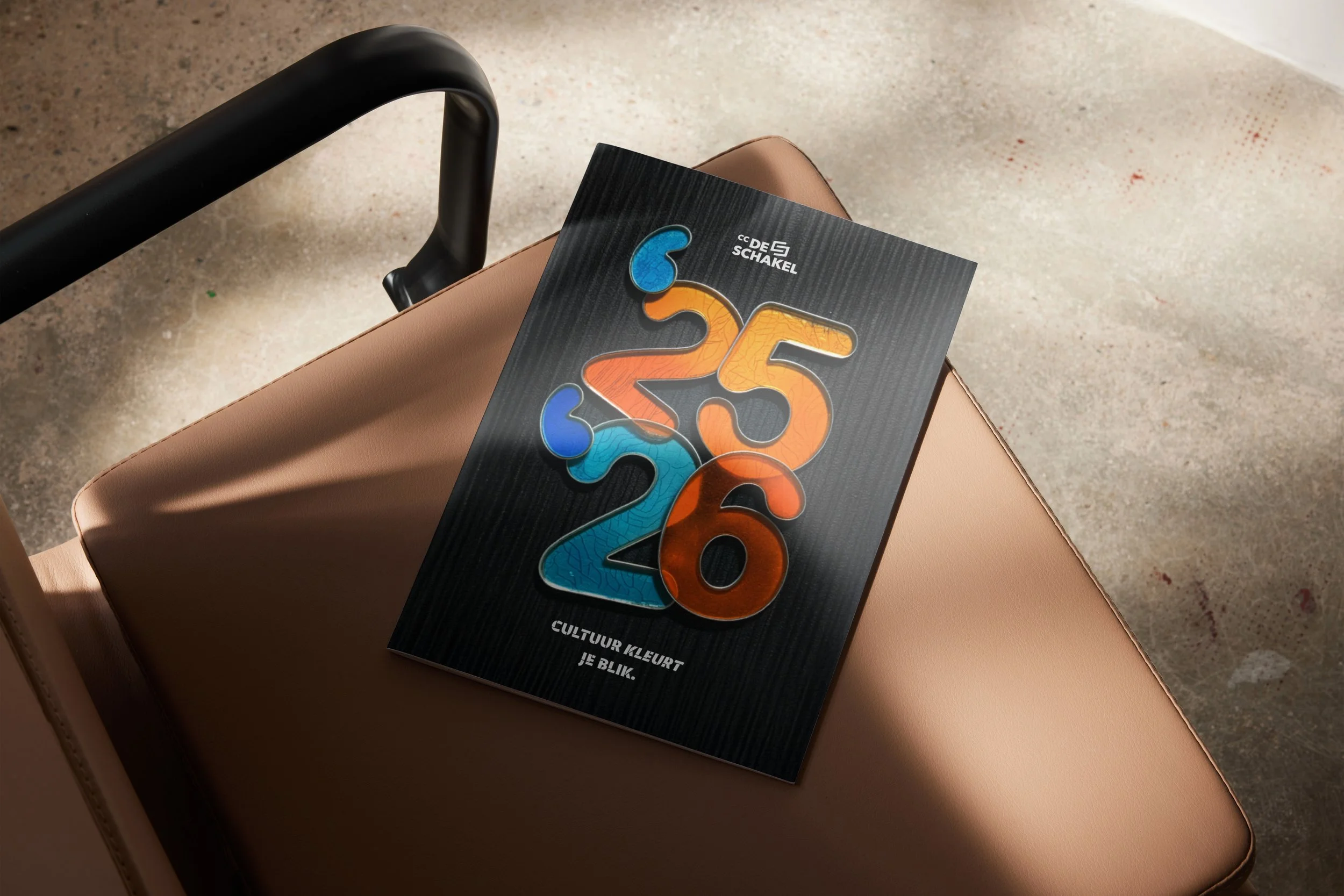
De Schakel
2026
Cultural brochure concept
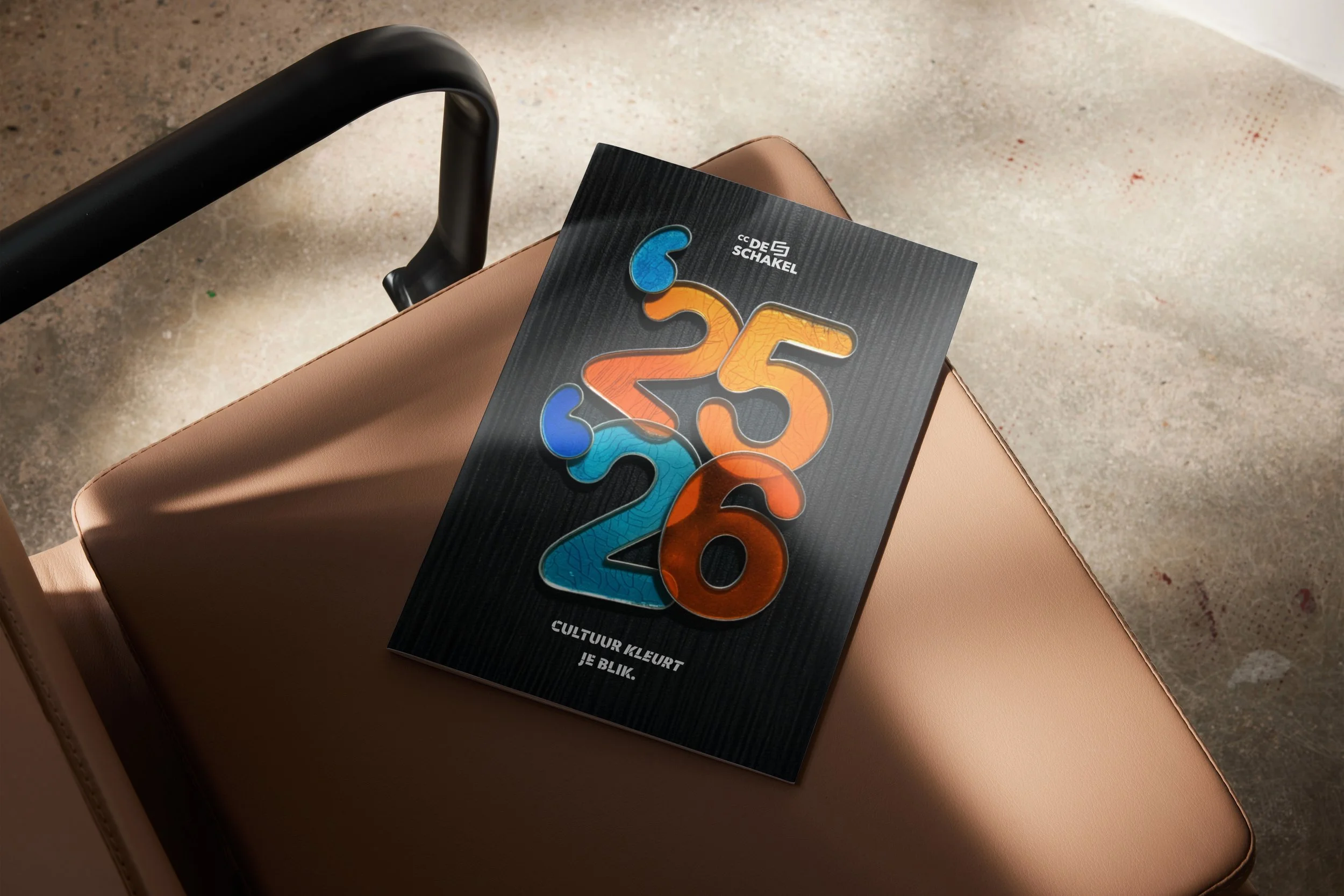
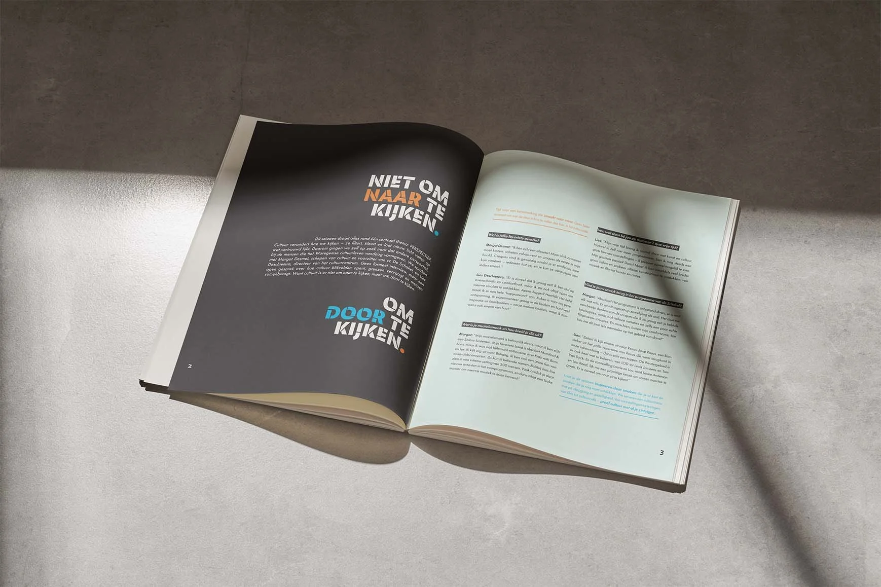
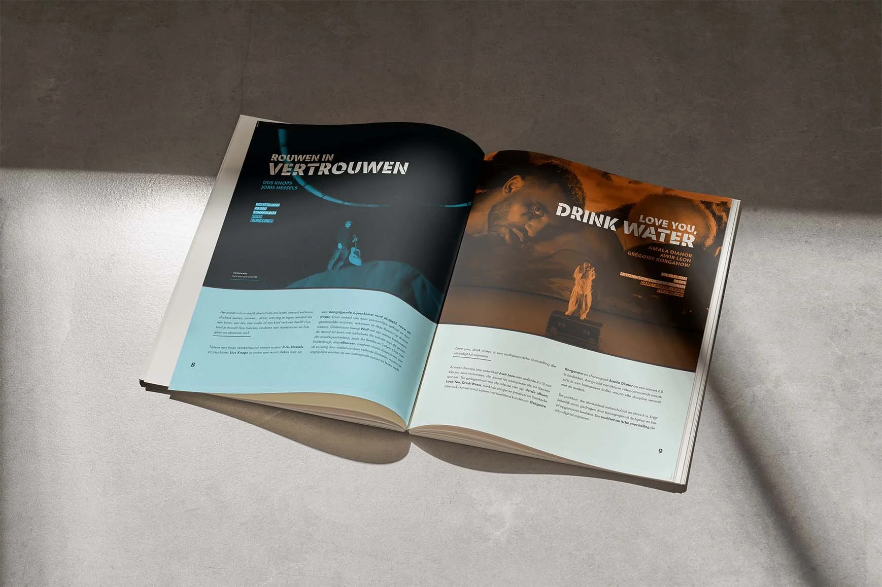
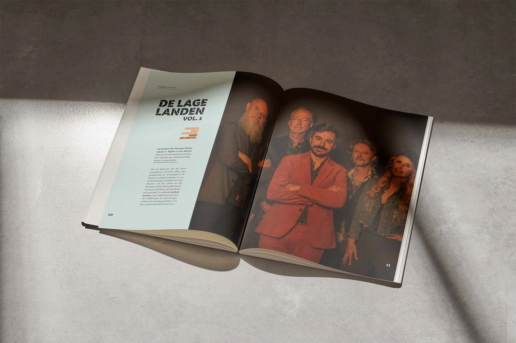
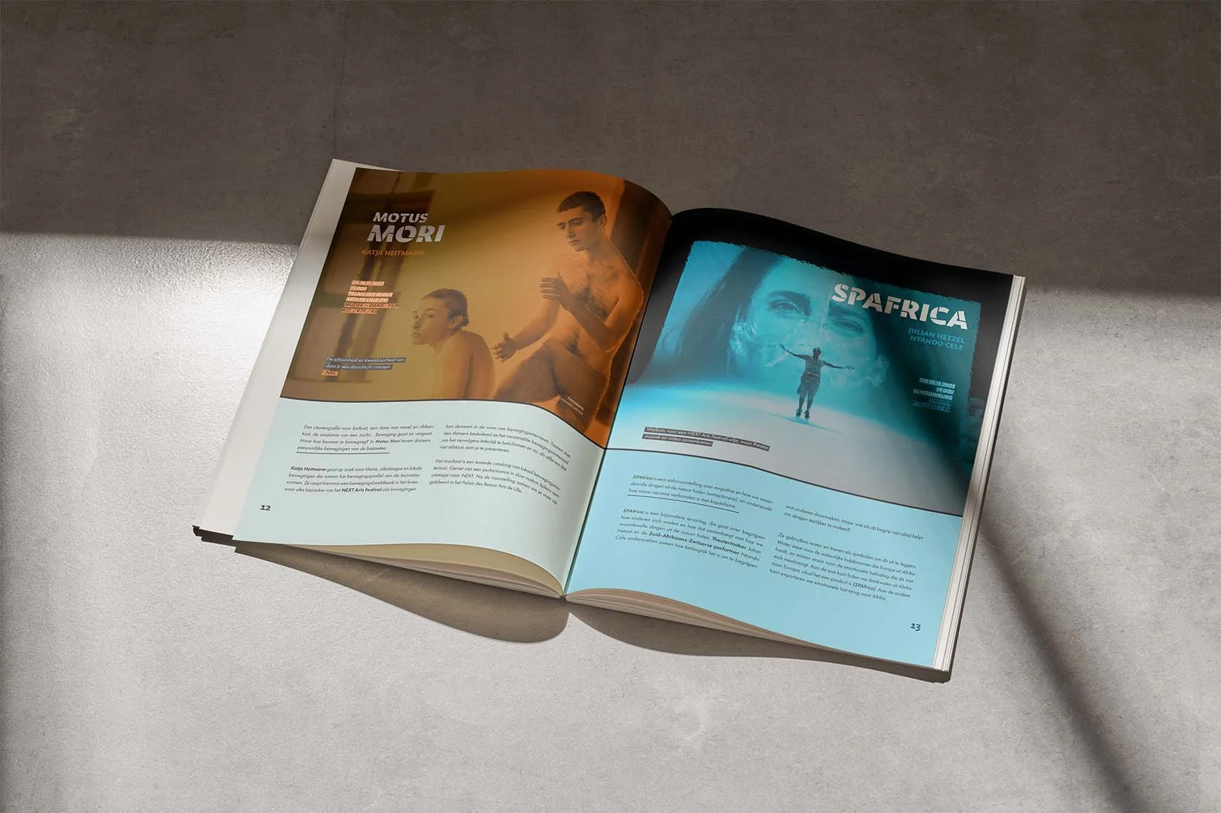
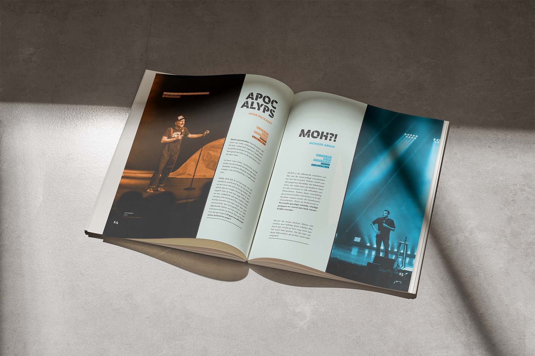
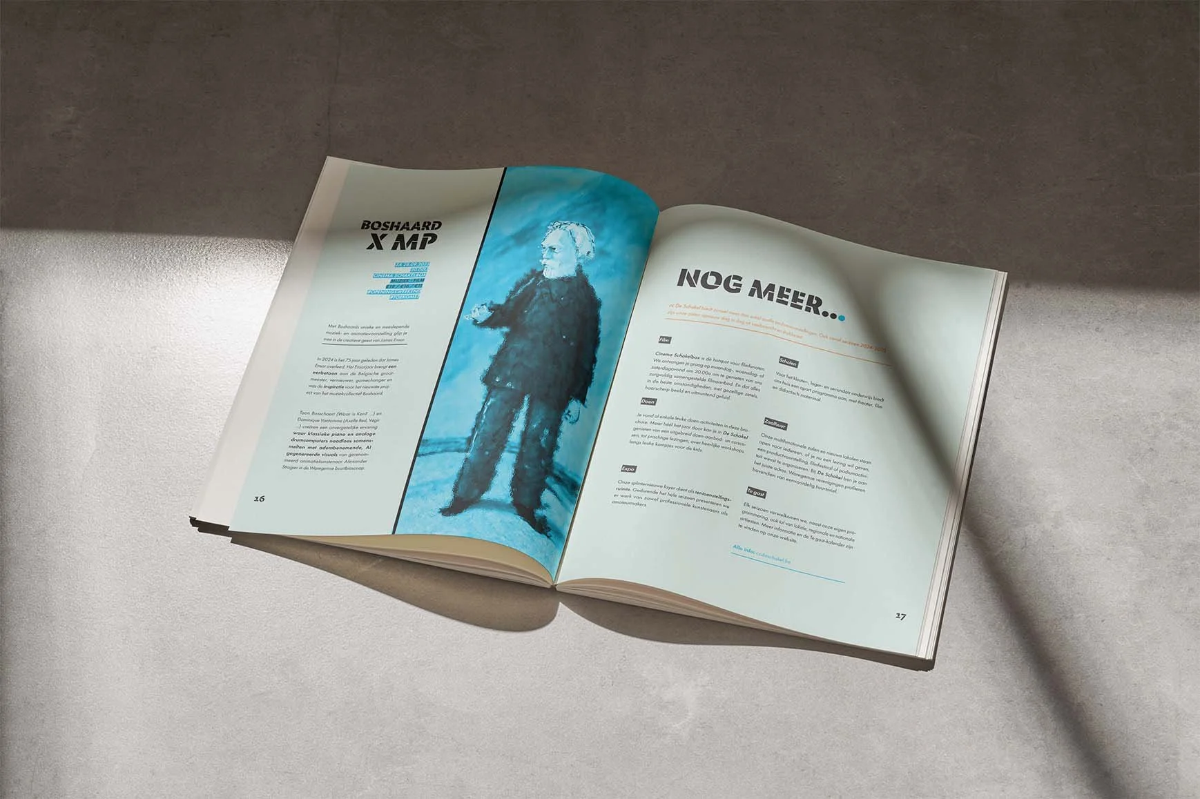
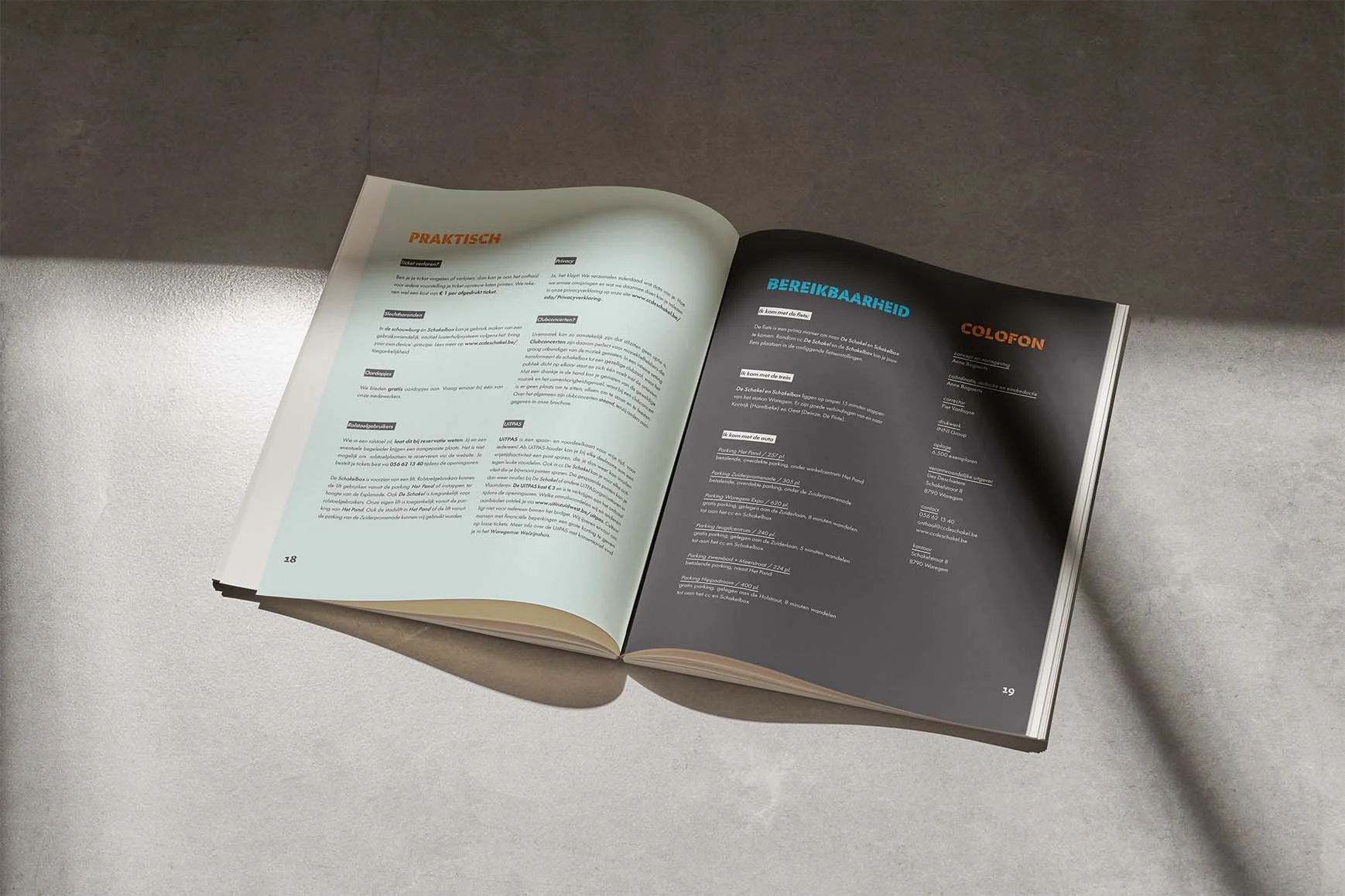
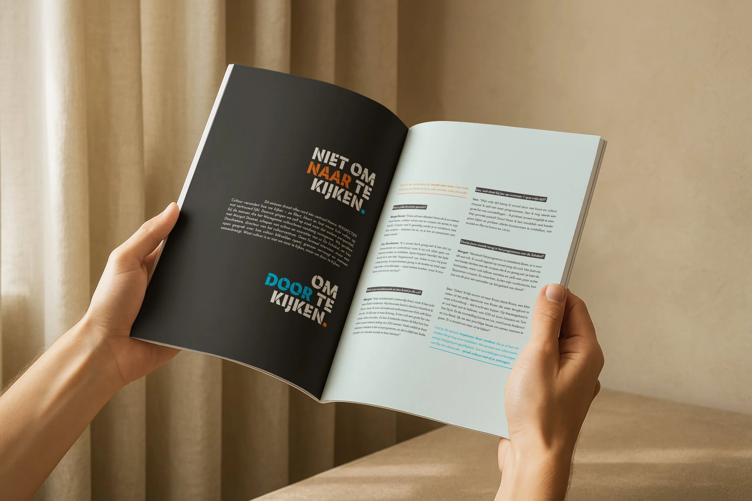
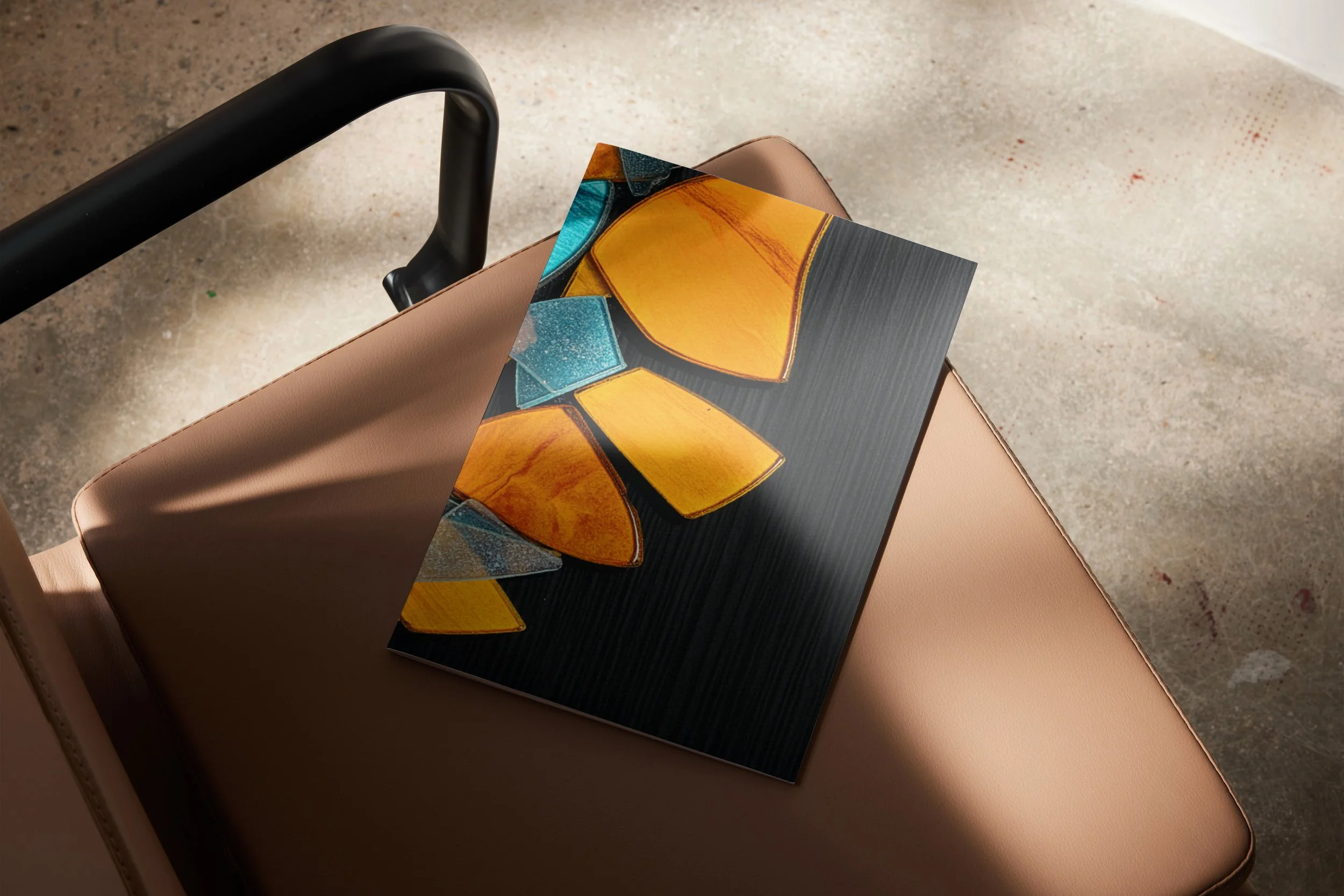
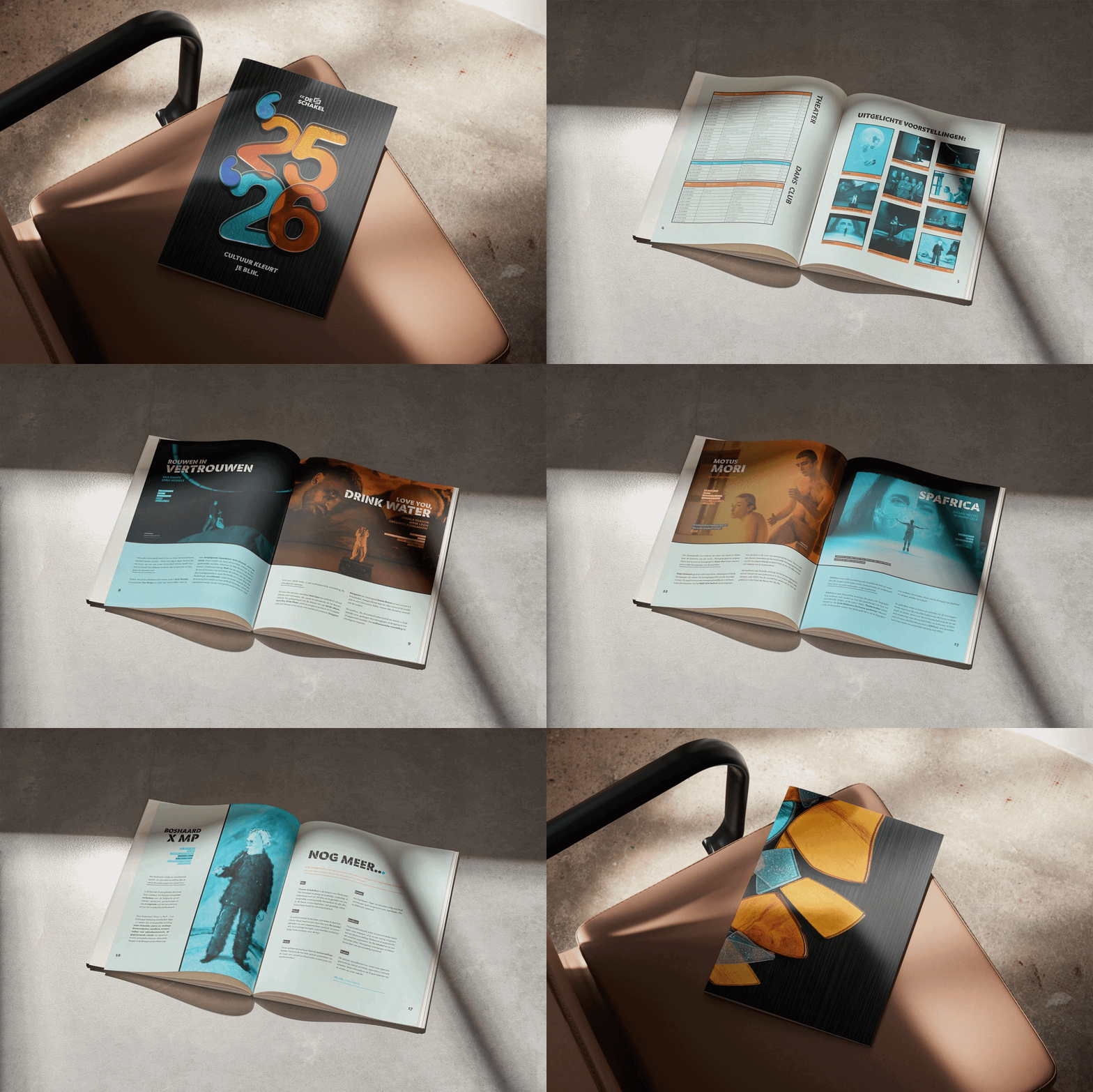
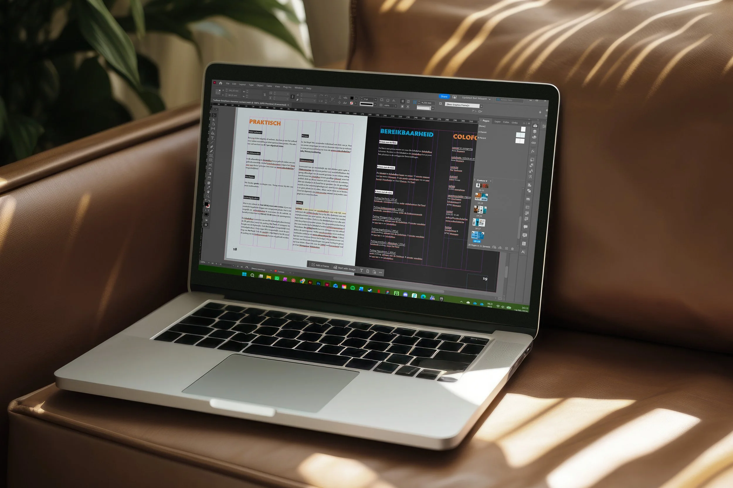
De Schakel 2026 is a cultural brochure designed to bring clarity and calm to a diverse programme. Rather than overwhelming readers with information, it invites them to look through culture, inspired by the visual logic of stained glass.
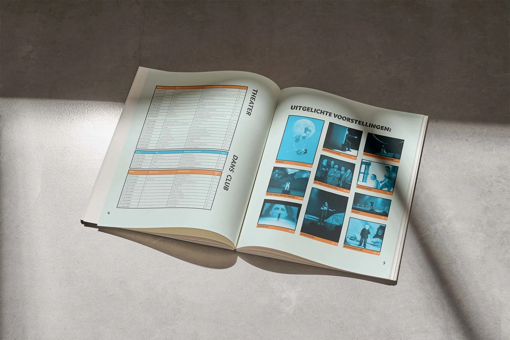
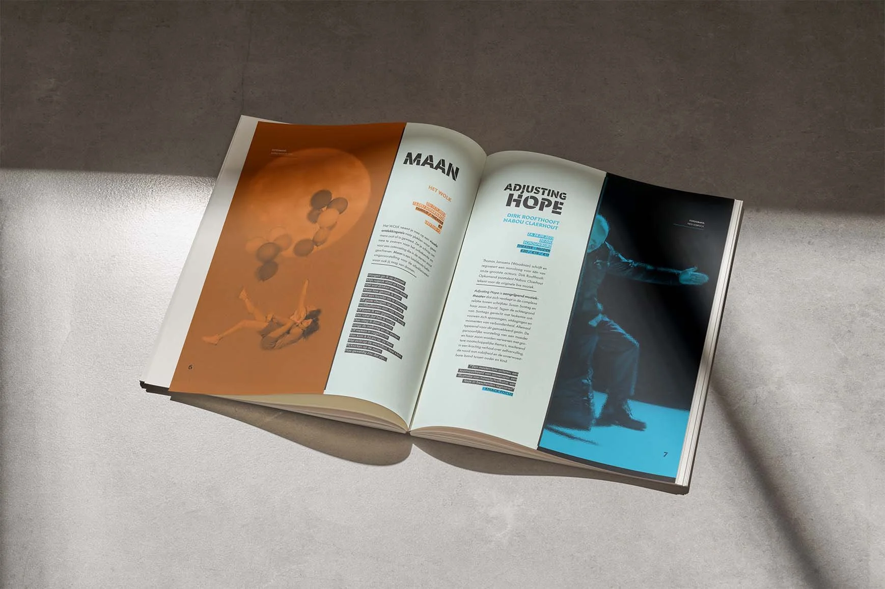
The visual identity reflects this idea. Transparent structures, a clear typographic hierarchy and an organised layout guide visitors naturally through the publication, creating a brochure that feels open, structured and quietly expressive.
Evaluation:
"You take me through your entire design process with great care. Your exploration of composition, colour and typography clearly shows experimentation and variation. The only thing I would have liked to see is more sketching on paper."
Conceptual educational project. Provided Images and texts were used for educational and mock-up purposes.
Process De Schakel 2026
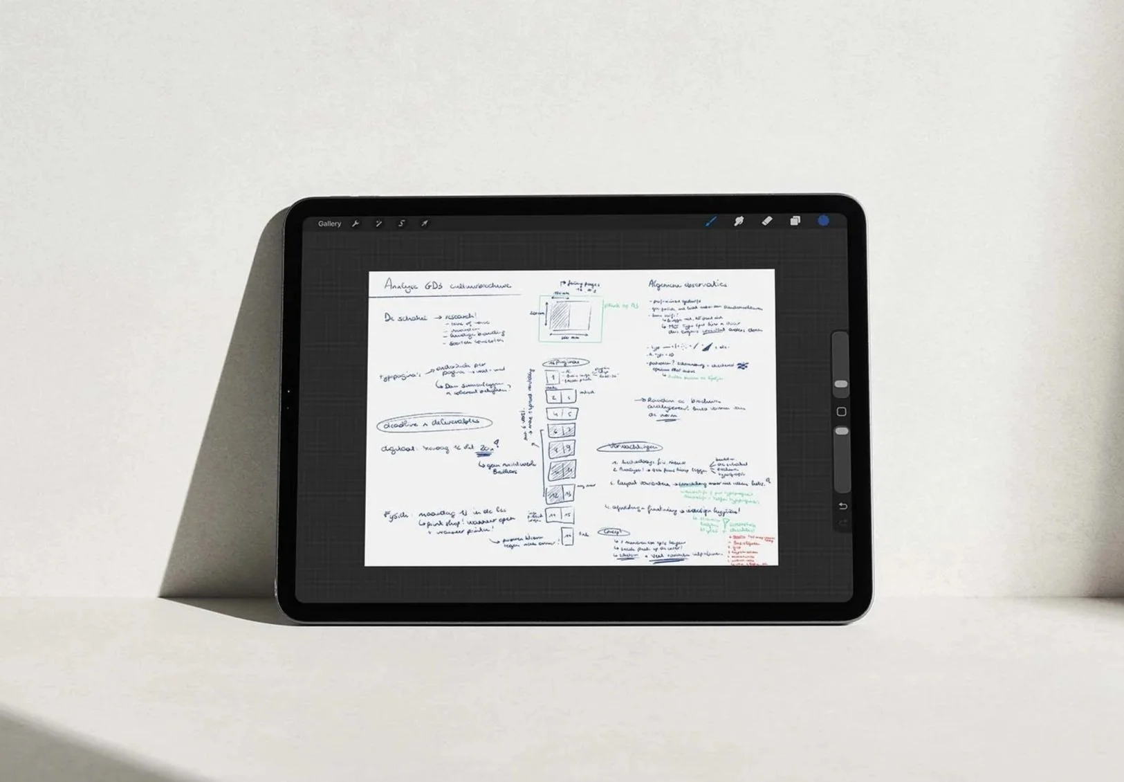
Analysis & Concept:
Because the editorial content was provided, my focus shifted entirely to structure and navigation. I developed a clear rhythm and page sequence, ensuring the programme remained accessible despite the large amount of information.
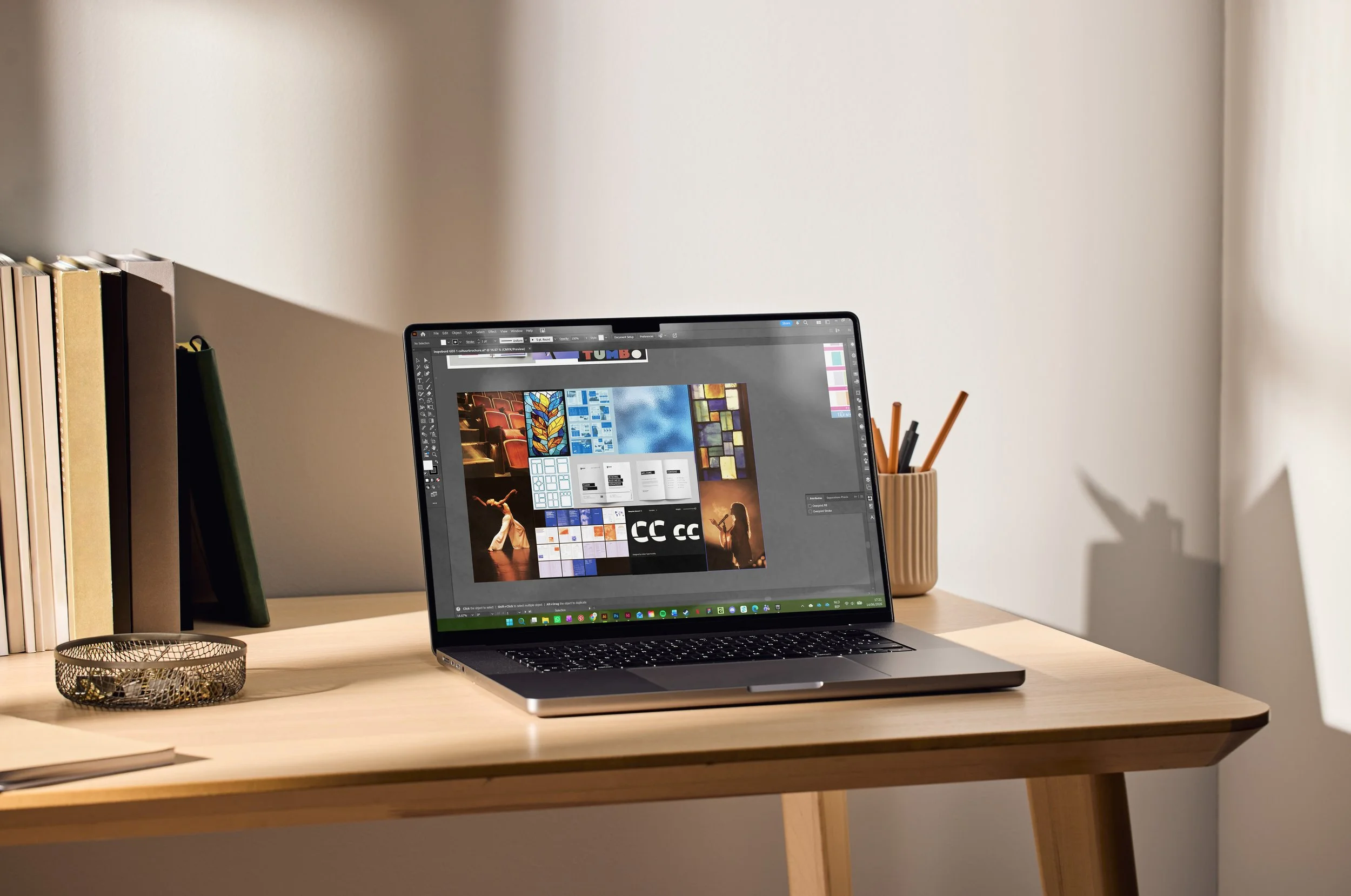
Iteration & Interpretation:
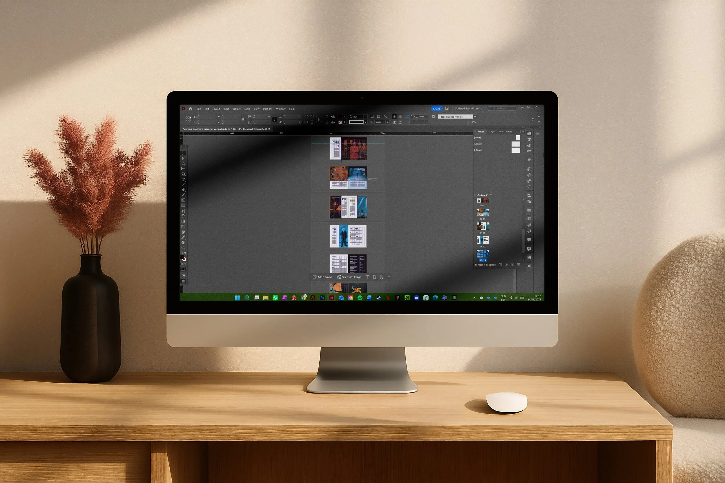
Using a structured grid and a restrained typographic hierarchy, I refined every spread through continuous testing. Each iteration improved the balance between imagery, white space and composition until the brochure felt both calm and intuitive to navigate.
Curious about the process behind this project? I'd be happy to share the full research, concept development and visual studies that shaped the final design. Feel free to get in touch.
Showcase 03
·
Showcase 03 ·
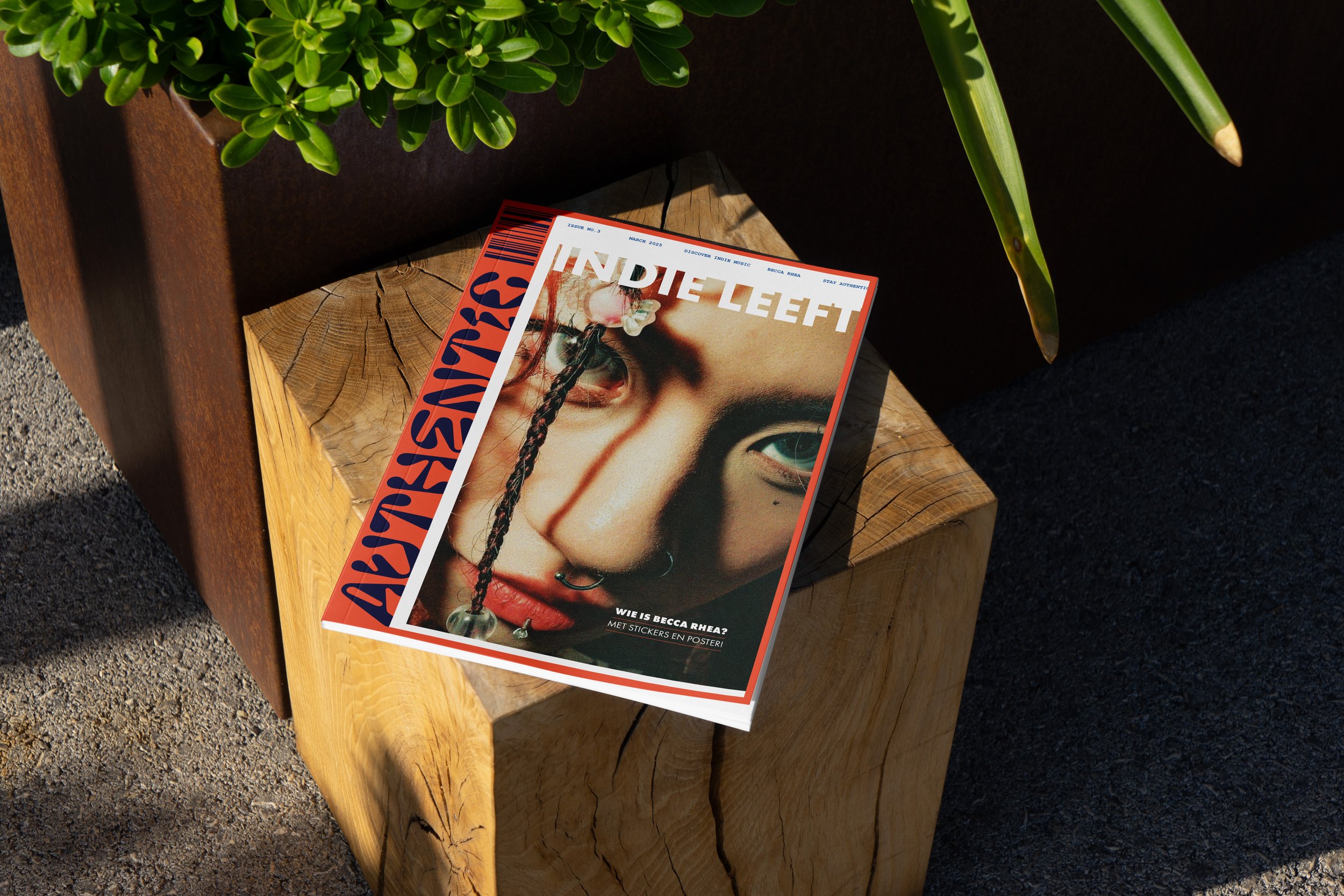
Authentic
Magazine concept
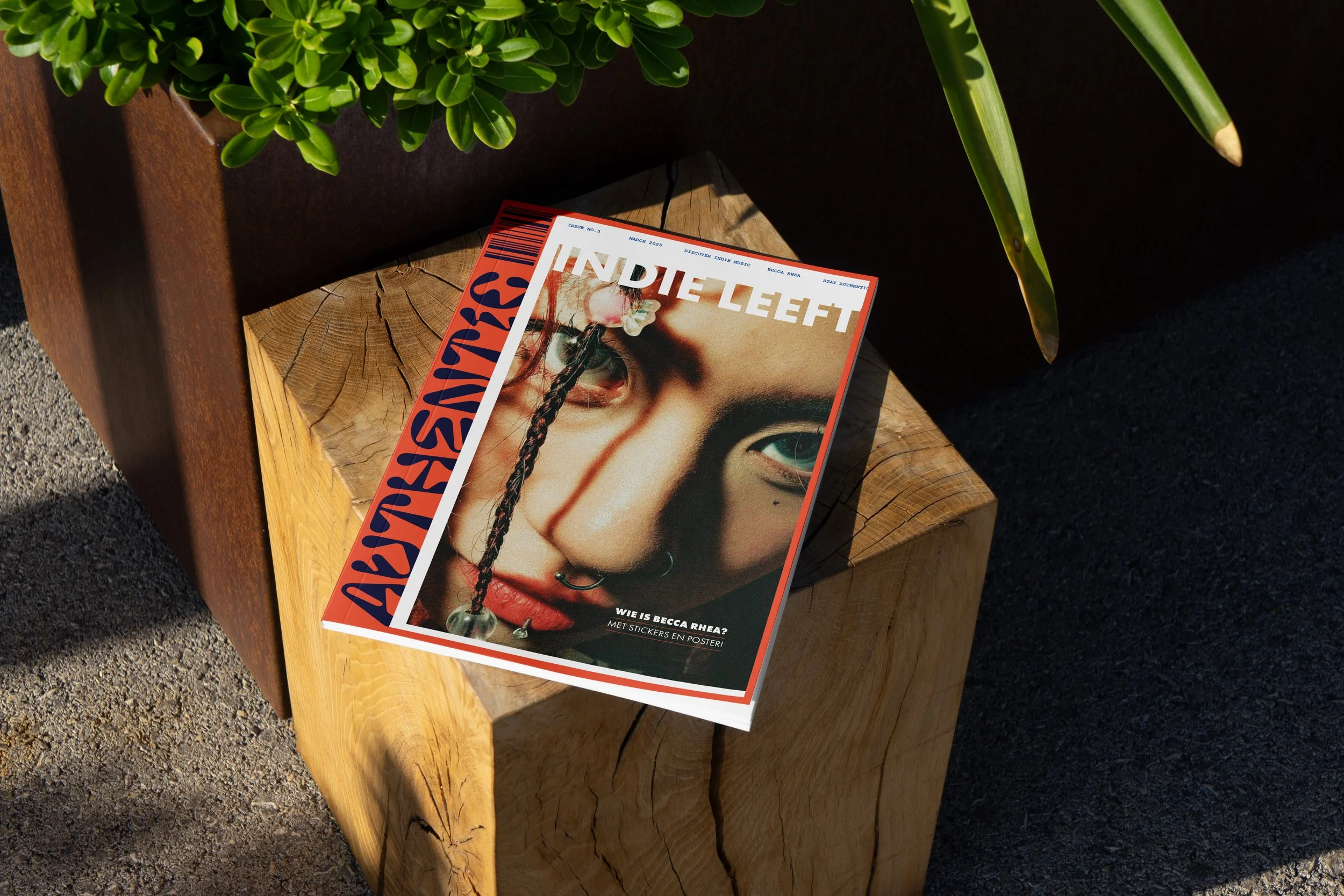
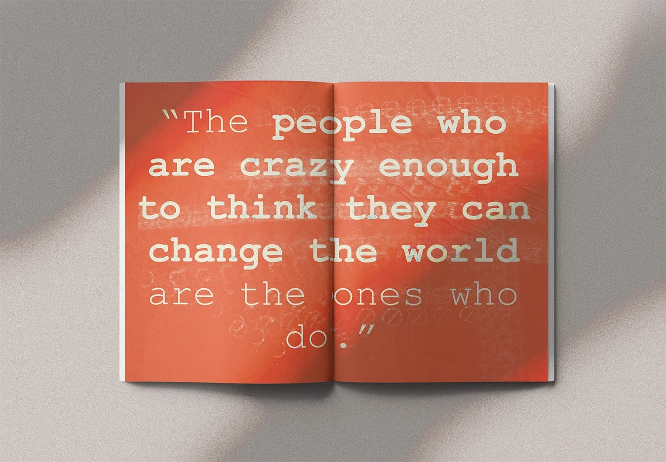
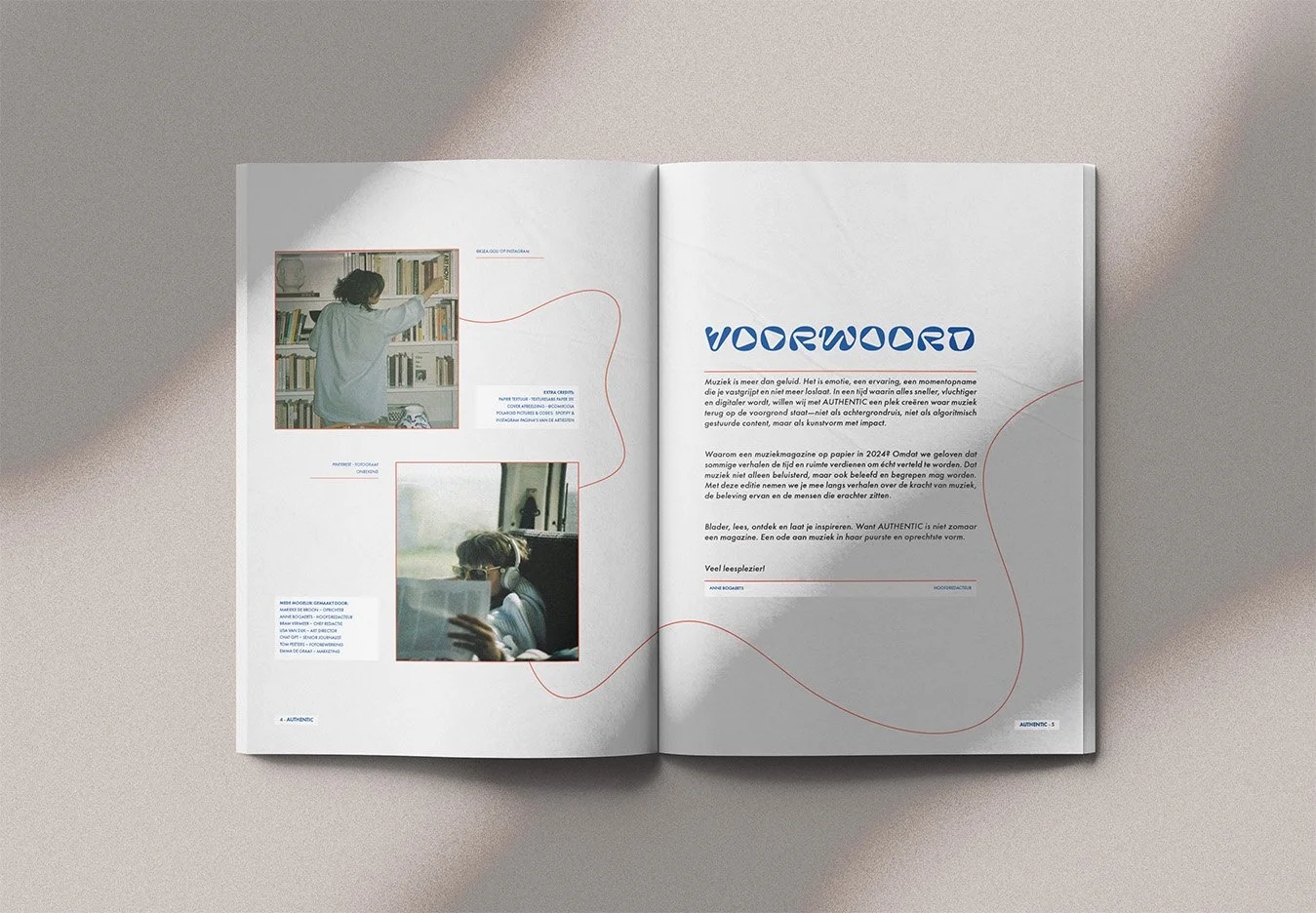
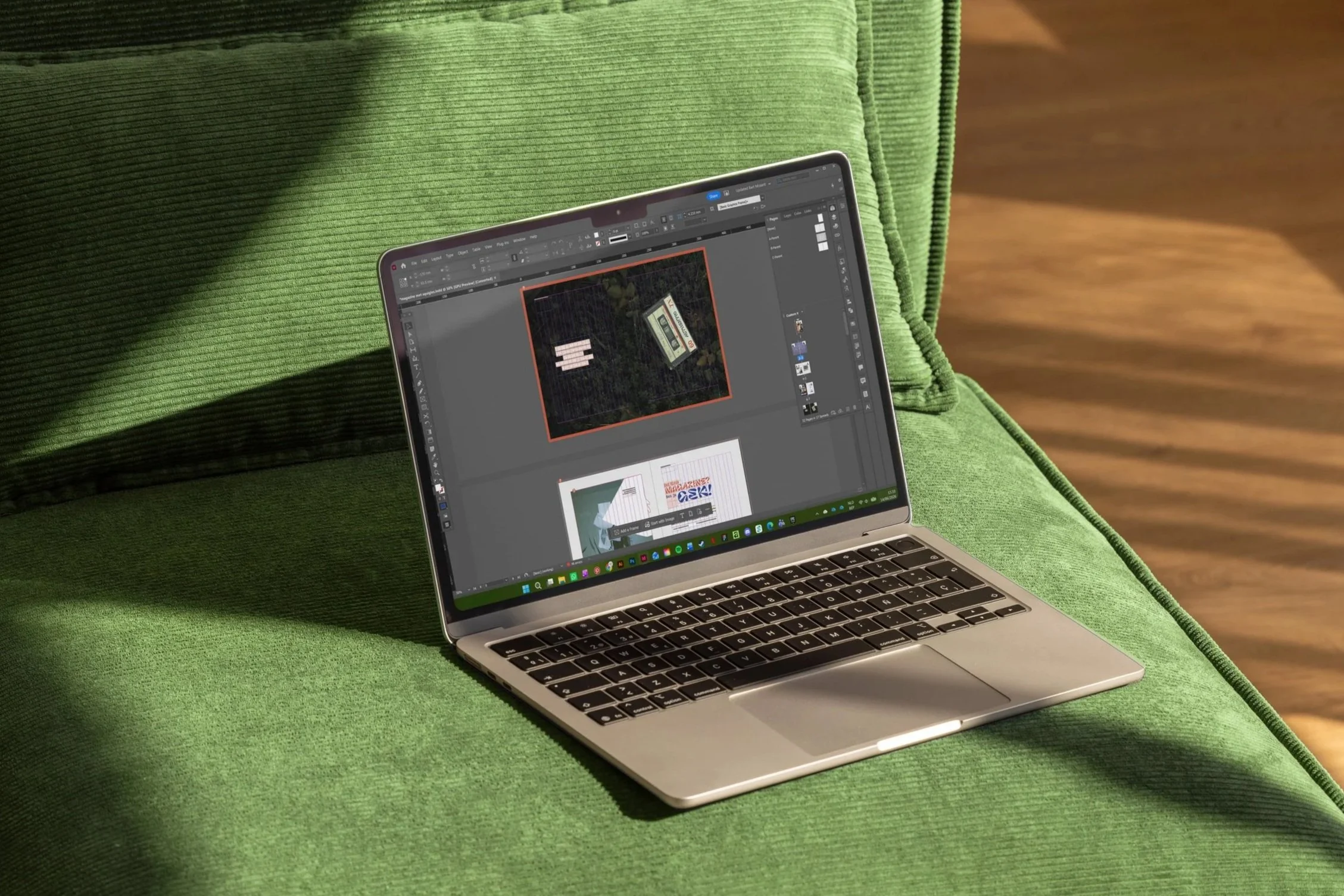
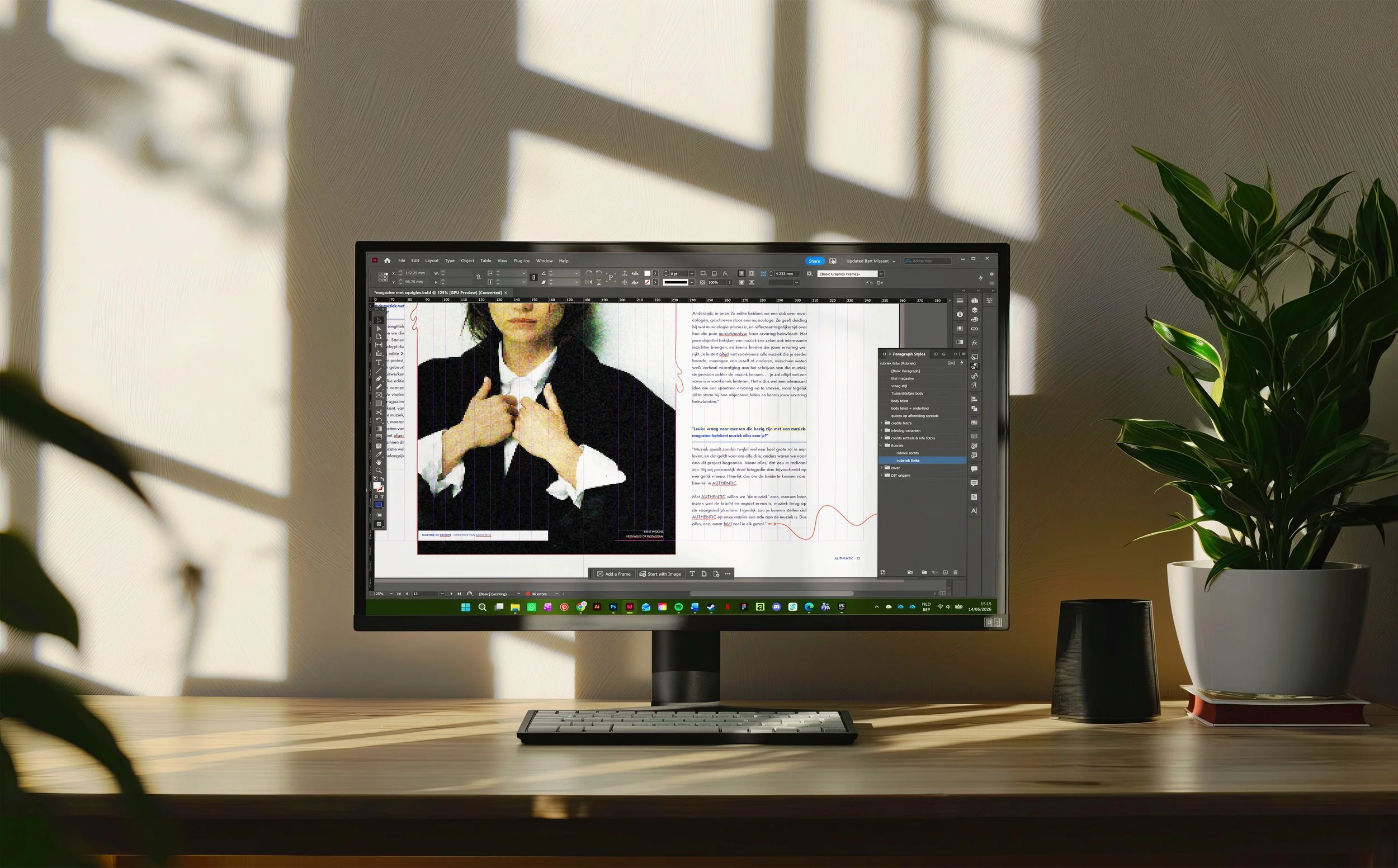
Authentic is an indie music magazine rooted in the spirit of DIY culture. Rather than striving for polished perfection, it explores the beauty of texture, noise and character within the underground music scene.
The visual identity reflects this attitude. Expressive typography, dynamic imagery and spacious layouts capture the raw, honest energy of independent music, while a clear editorial structure keeps the magazine readable and grounded.

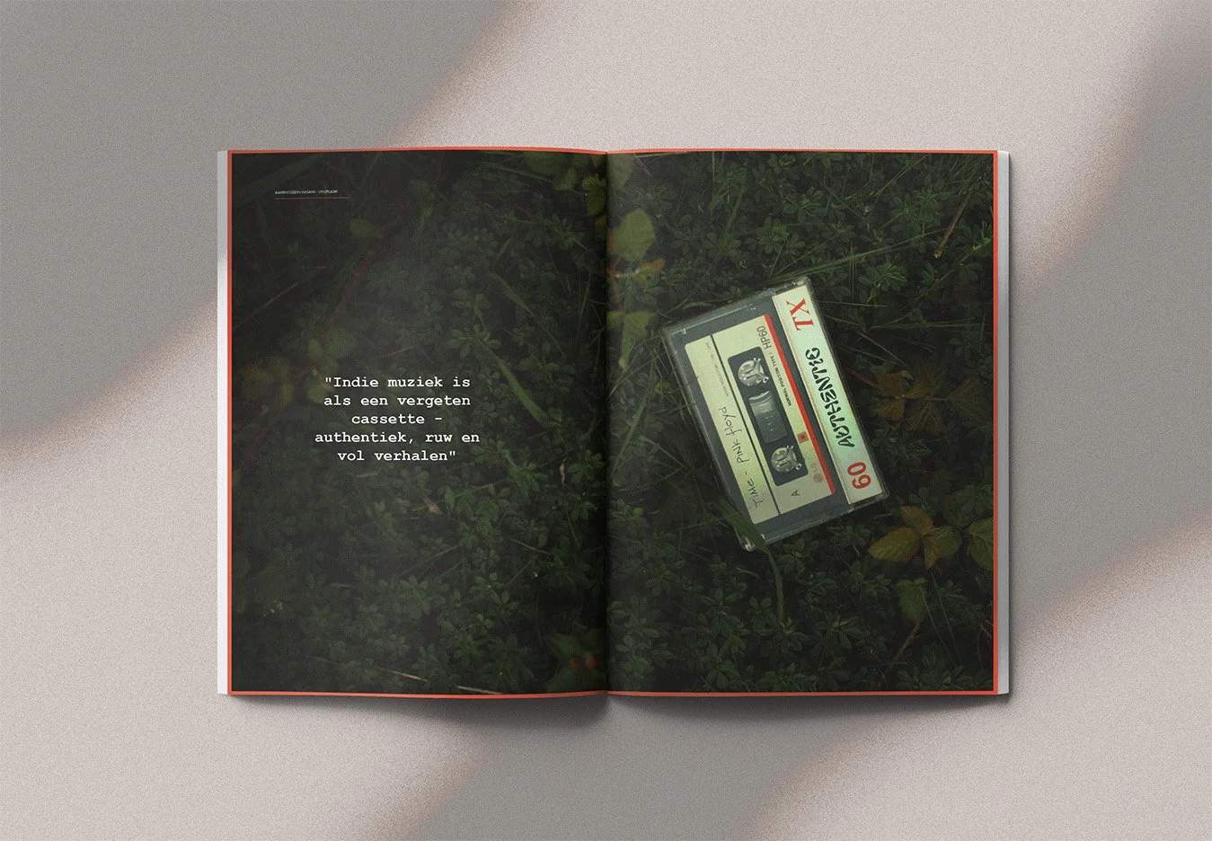
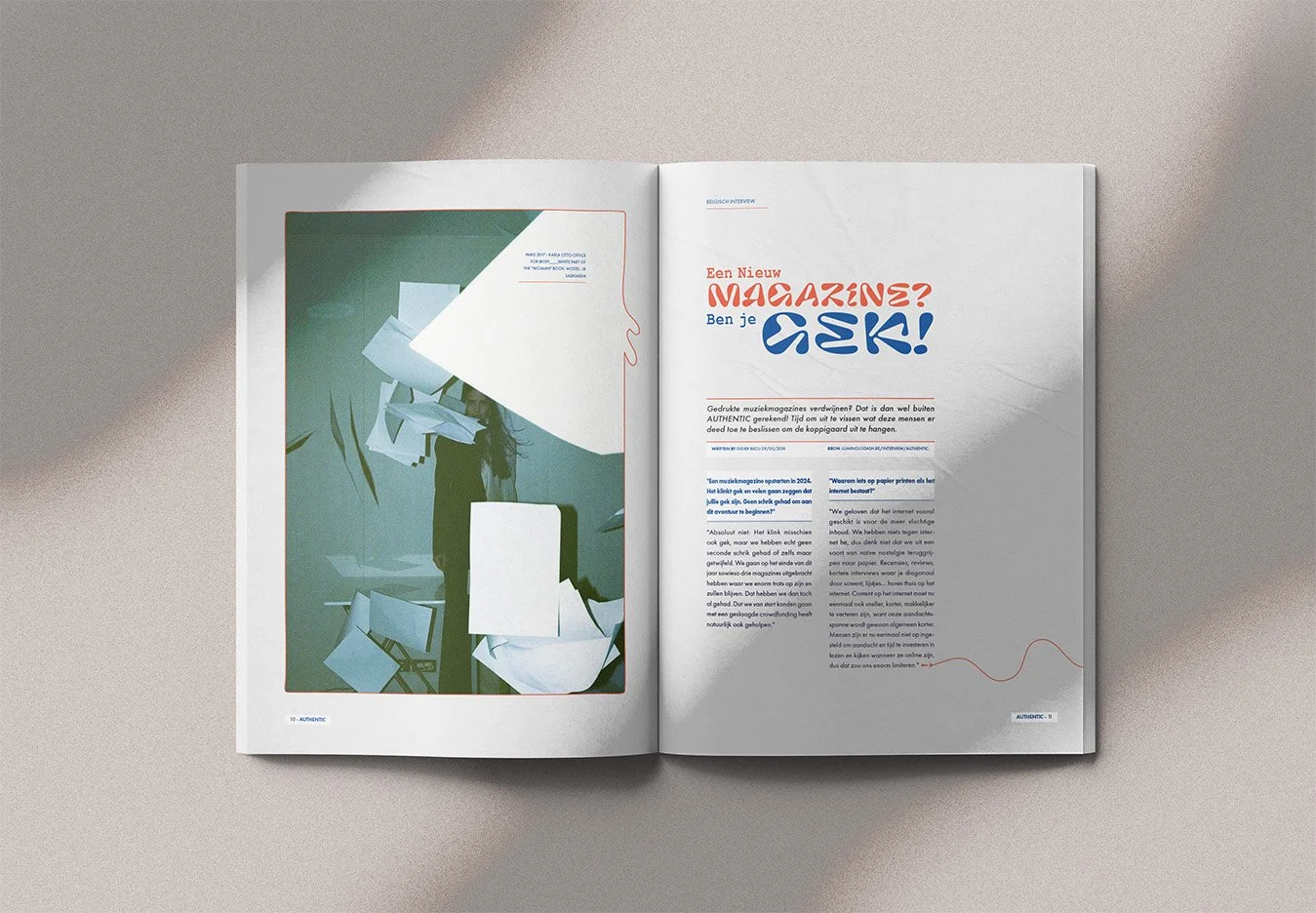
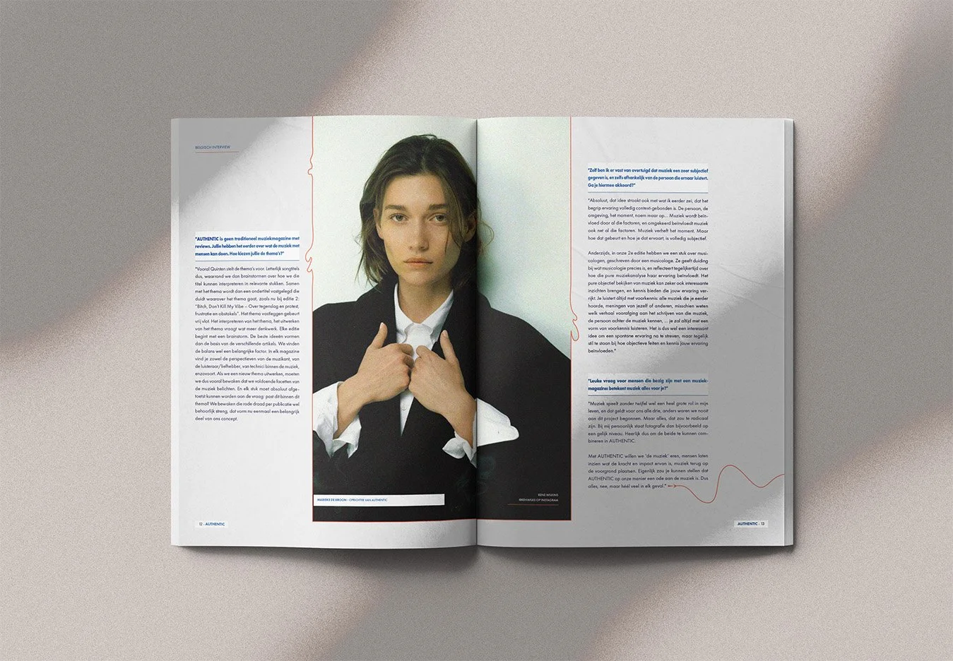
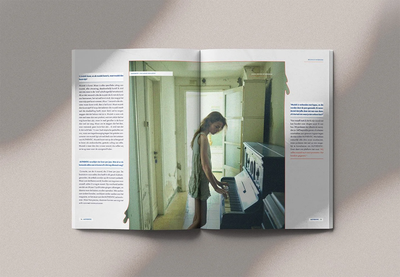
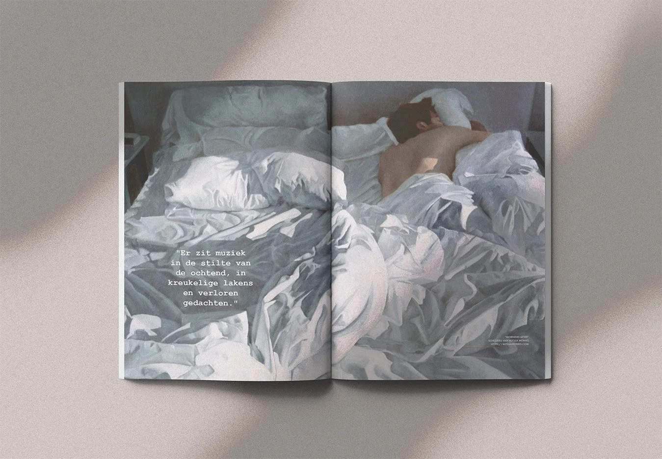
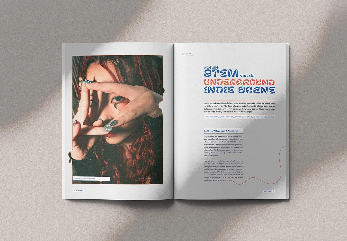
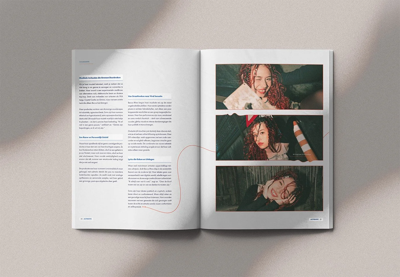
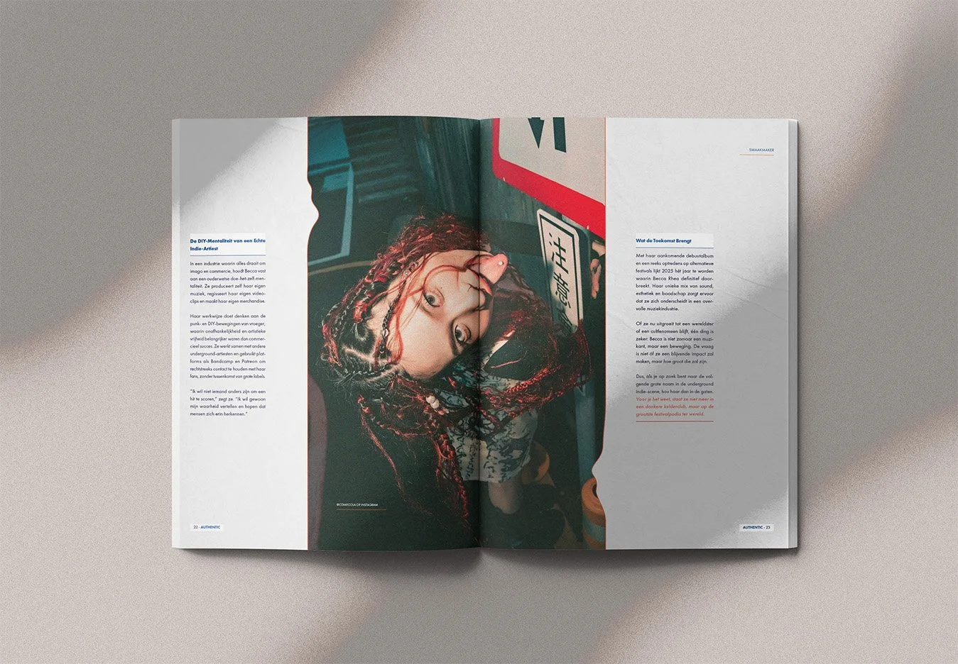
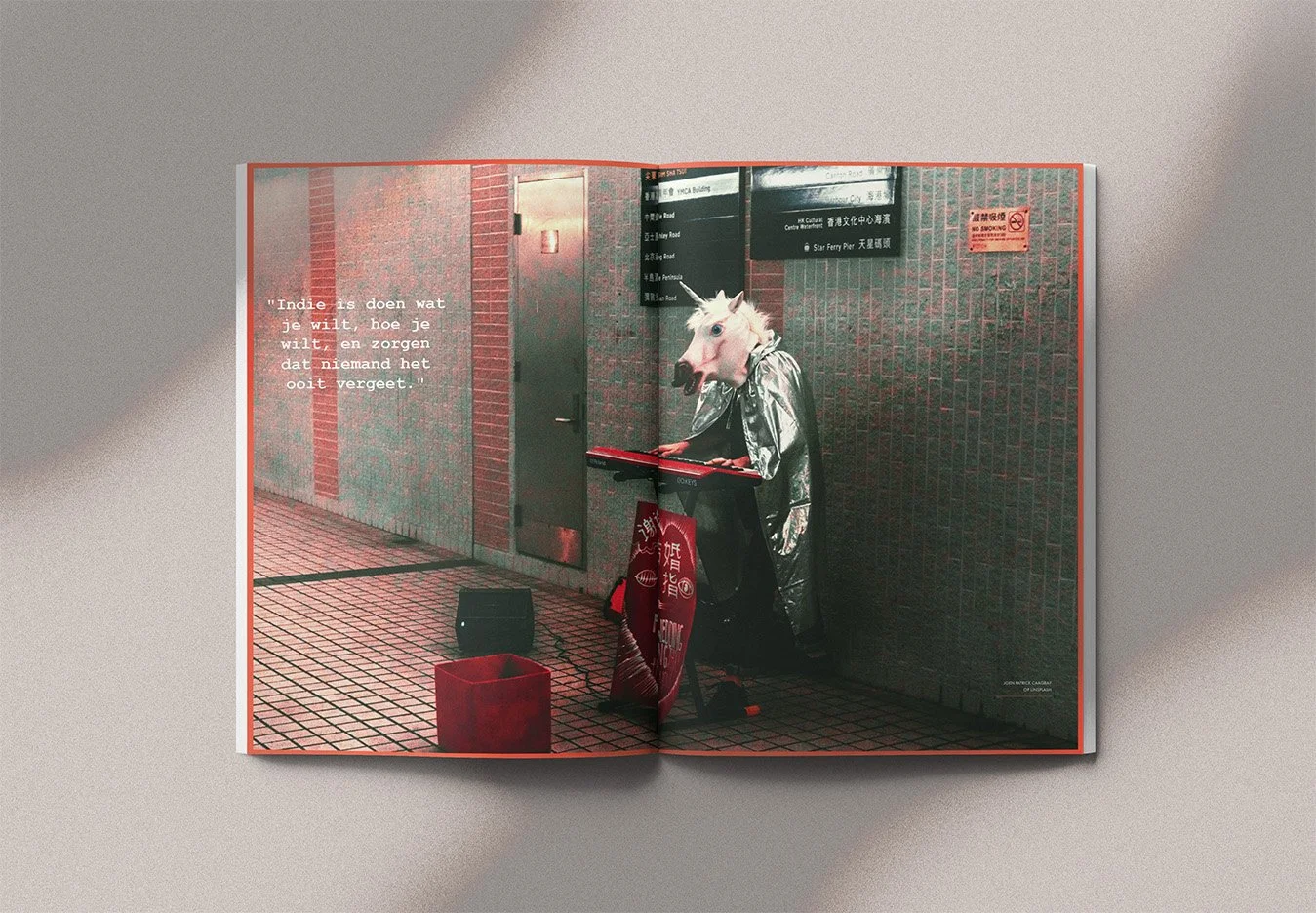
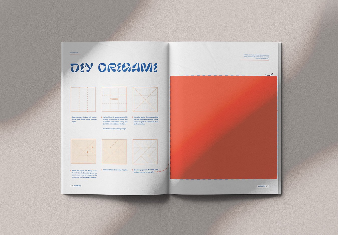
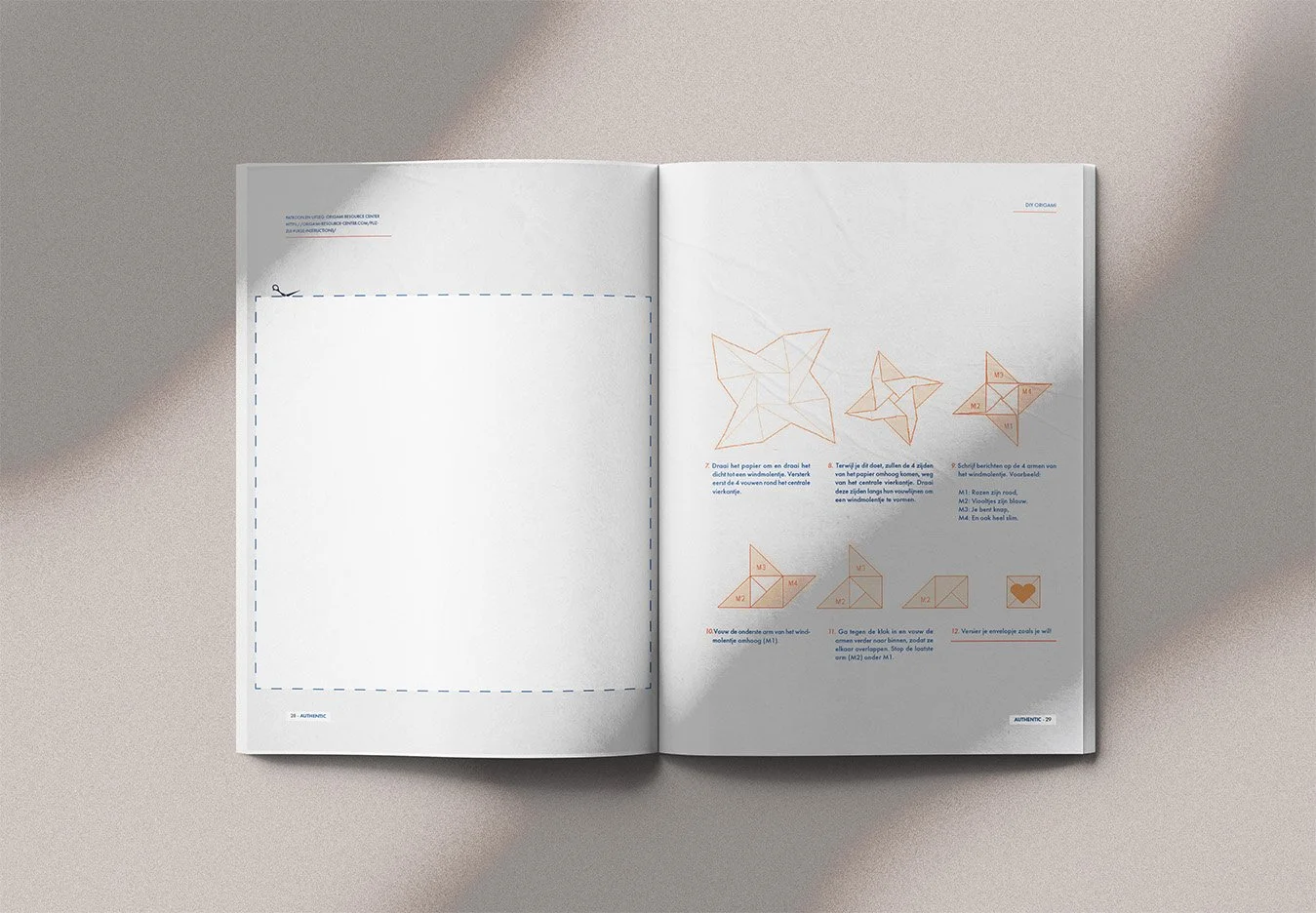
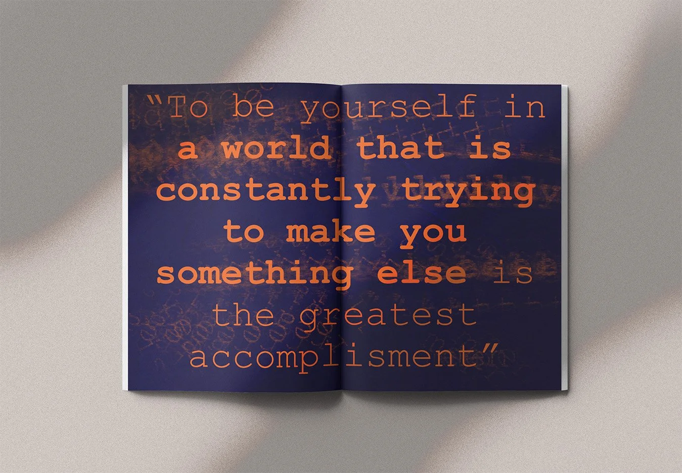
Conceptual educational project. Images and generated texts were used for educational and mock-up purposes.
Evaluation:
"Clear analysis. You discuss a wide range of references. Strong studies, a well-documented process and original design decisions. The typography is carefully refined and the magazine is highly usable."
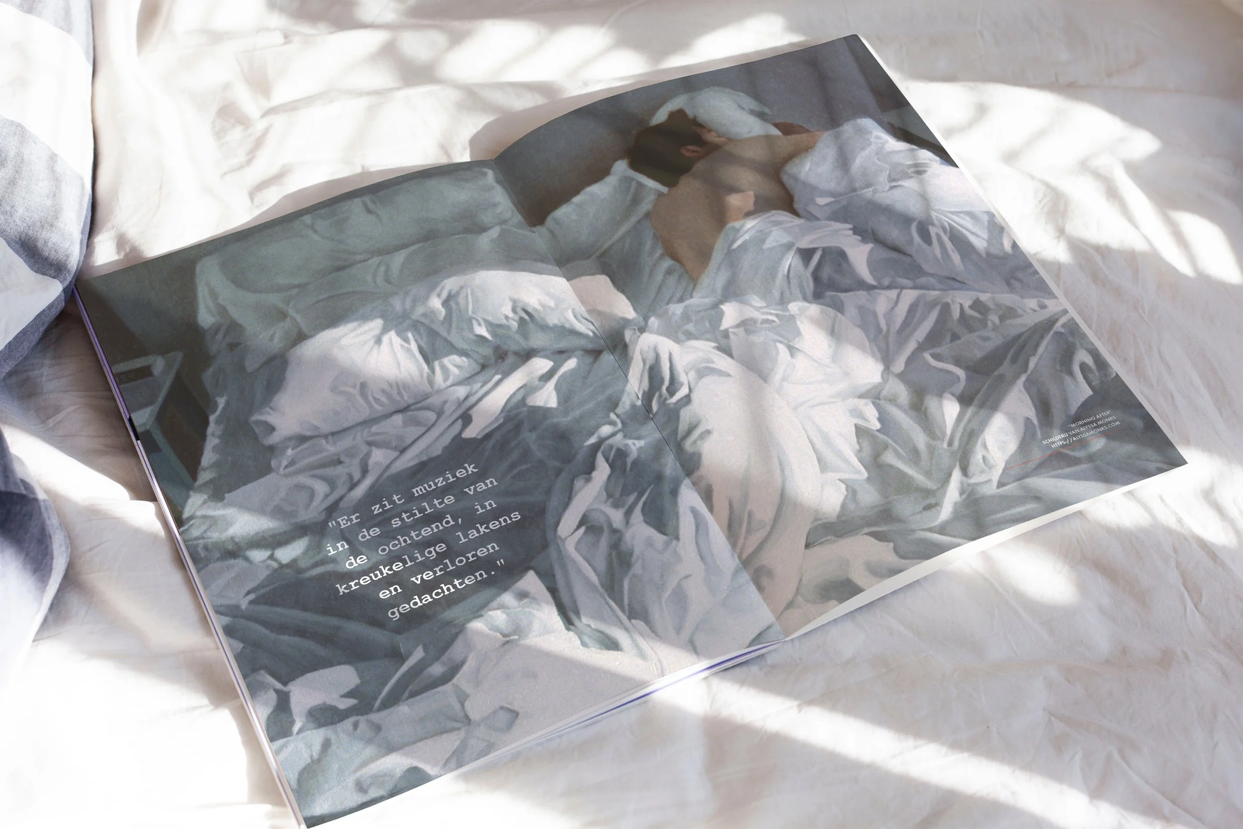
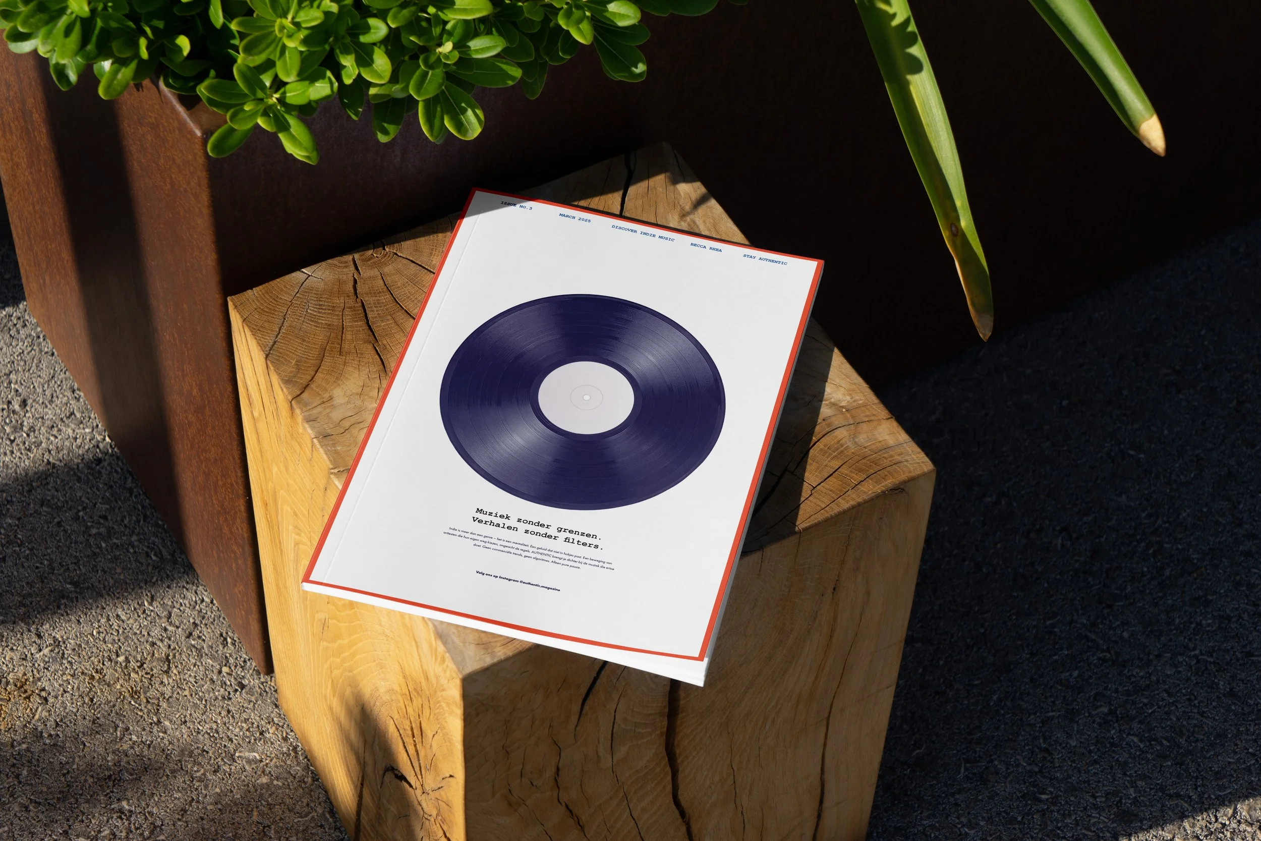
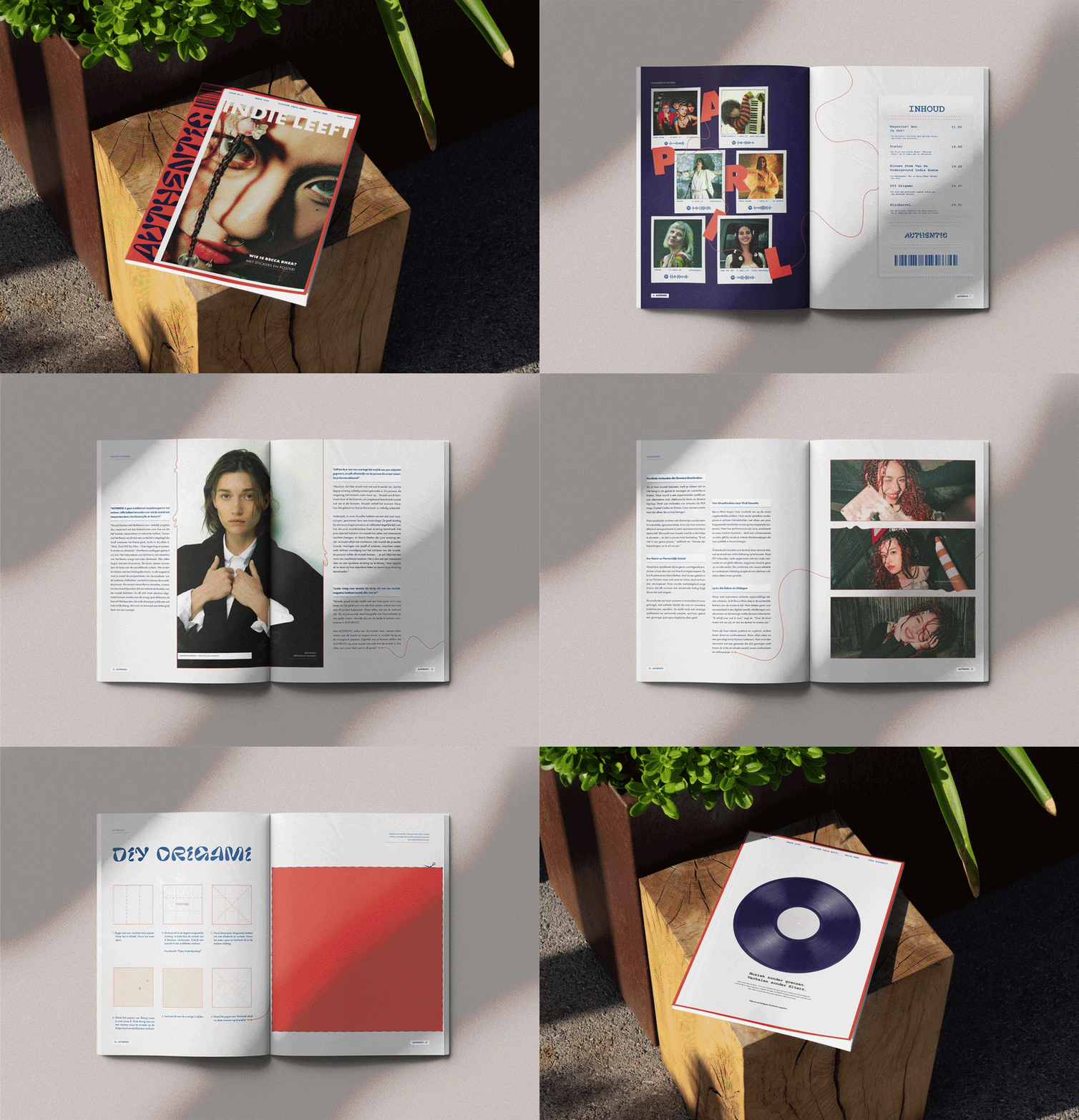
Process Authentic
Analysis & Concept:
For Authentic, I stepped beyond the role of designer. I wrote the copy, selected the imagery and gathered stories that reflected the spirit of independent musicians. These elements became the foundation for an editorial concept in which every spread contributes to one coherent narrative.
Iteration & Presentation:
Through multiple iterations, I refined the typography, pacing and visual rhythm until every page felt connected. The final result is an editorial identity with a distinctive voice, balancing expressive design with clarity and readability.
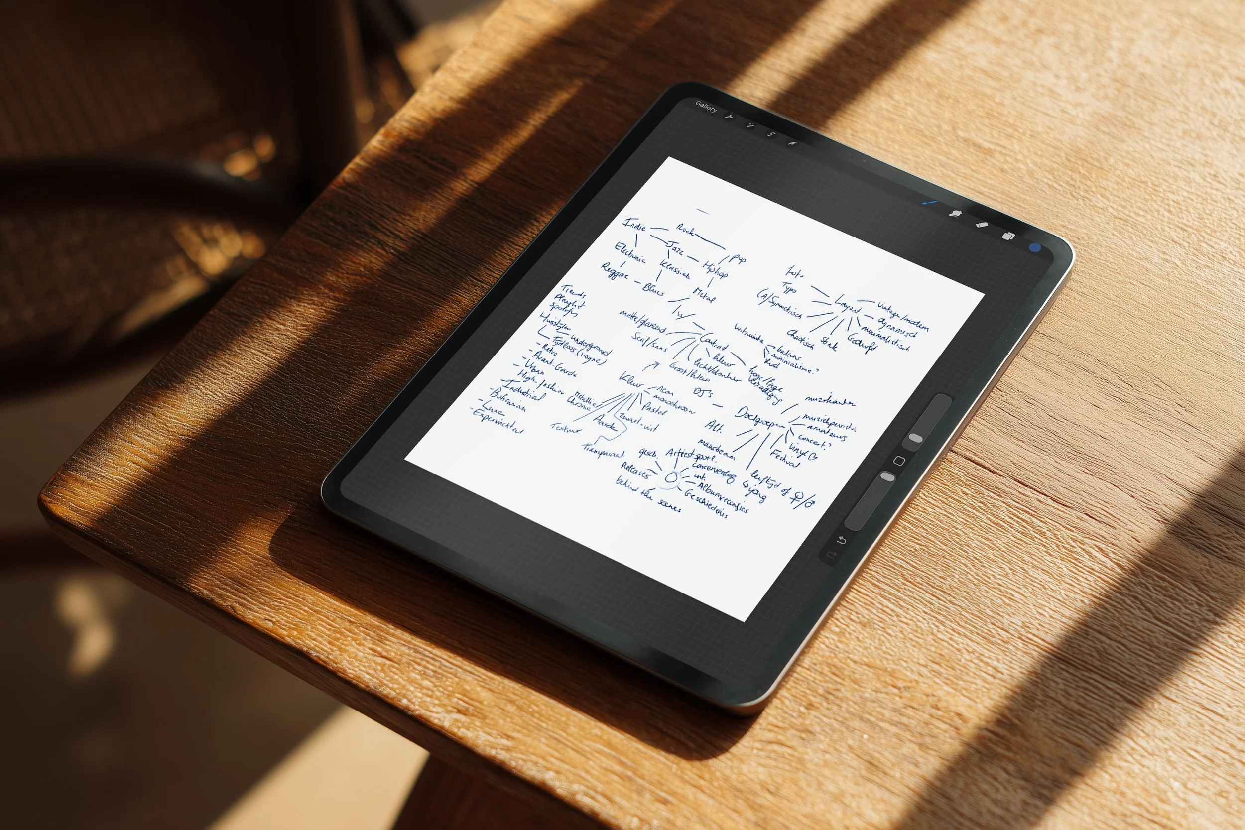
Curious about the process behind this project? I'd be happy to share the full research, concept development and visual studies that shaped the final design. Feel free to get in touch.
People-first strategy
·
Visual Storytelling
·
People-first strategy · Visual Storytelling ·
Design Method
-

In-depth Research
Every project begins with listening and observing. I explore the story behind the brand or product to understand what it truly wants to communicate.
-

Concept Development
Those insights evolve into a visual system where emotion and strategy come together. This is where the tone, rhythm and direction of the design take shape.
-

Iterative Exploration
Typography, colour and composition are refined through experimentation. Every iteration brings the visual language closer to its strongest and most coherent form.
-

Presentation
The final outcome should be more than a finished design; it should tell a story. Every project is presented with careful attention to context, consistency and experience.