BRAND DESIGN
A closer look at three projects where I built visual identities; from concept to a complete brand system.
Showcase 01
·
Showcase 01 ·
Aura
Energydrink concept
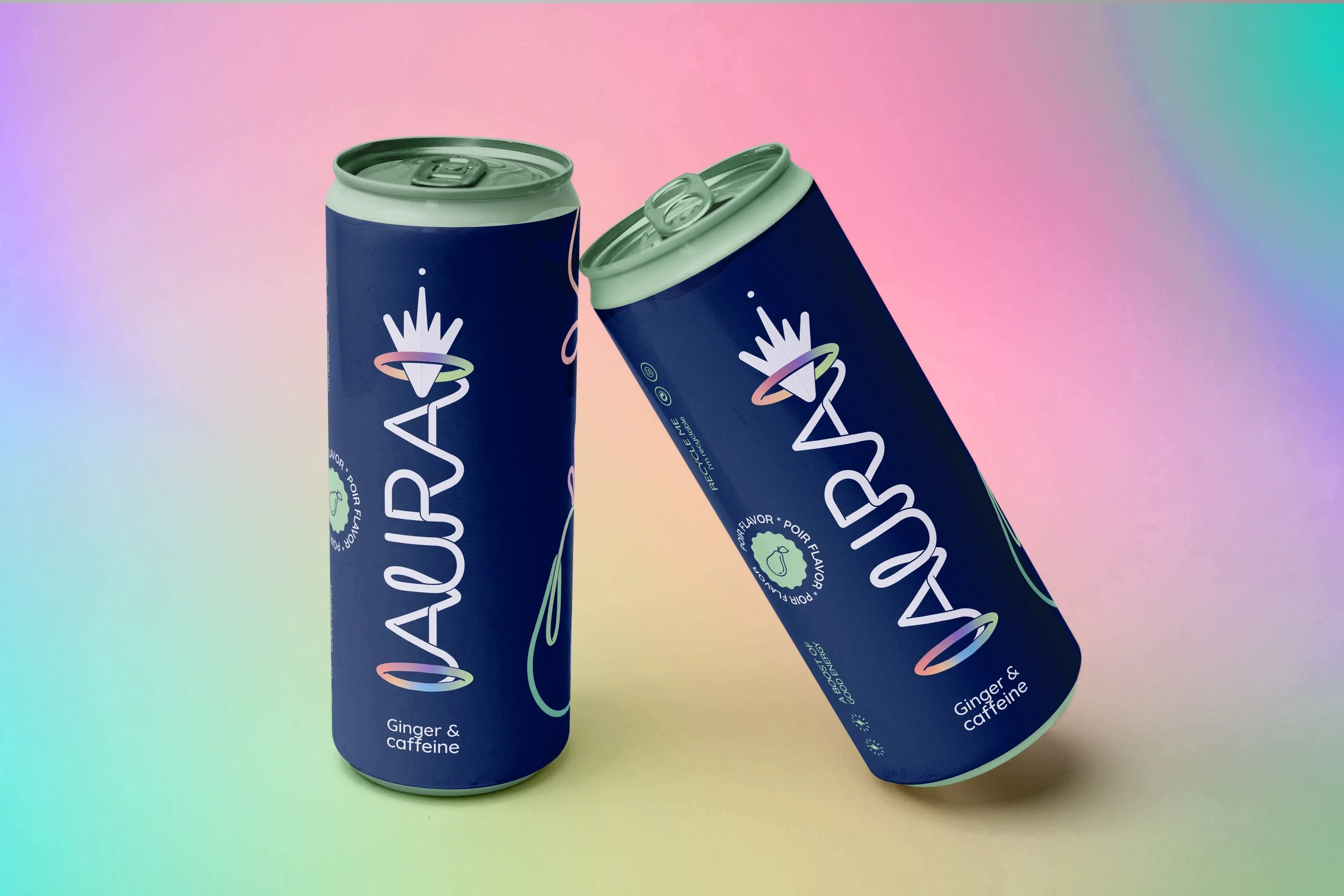
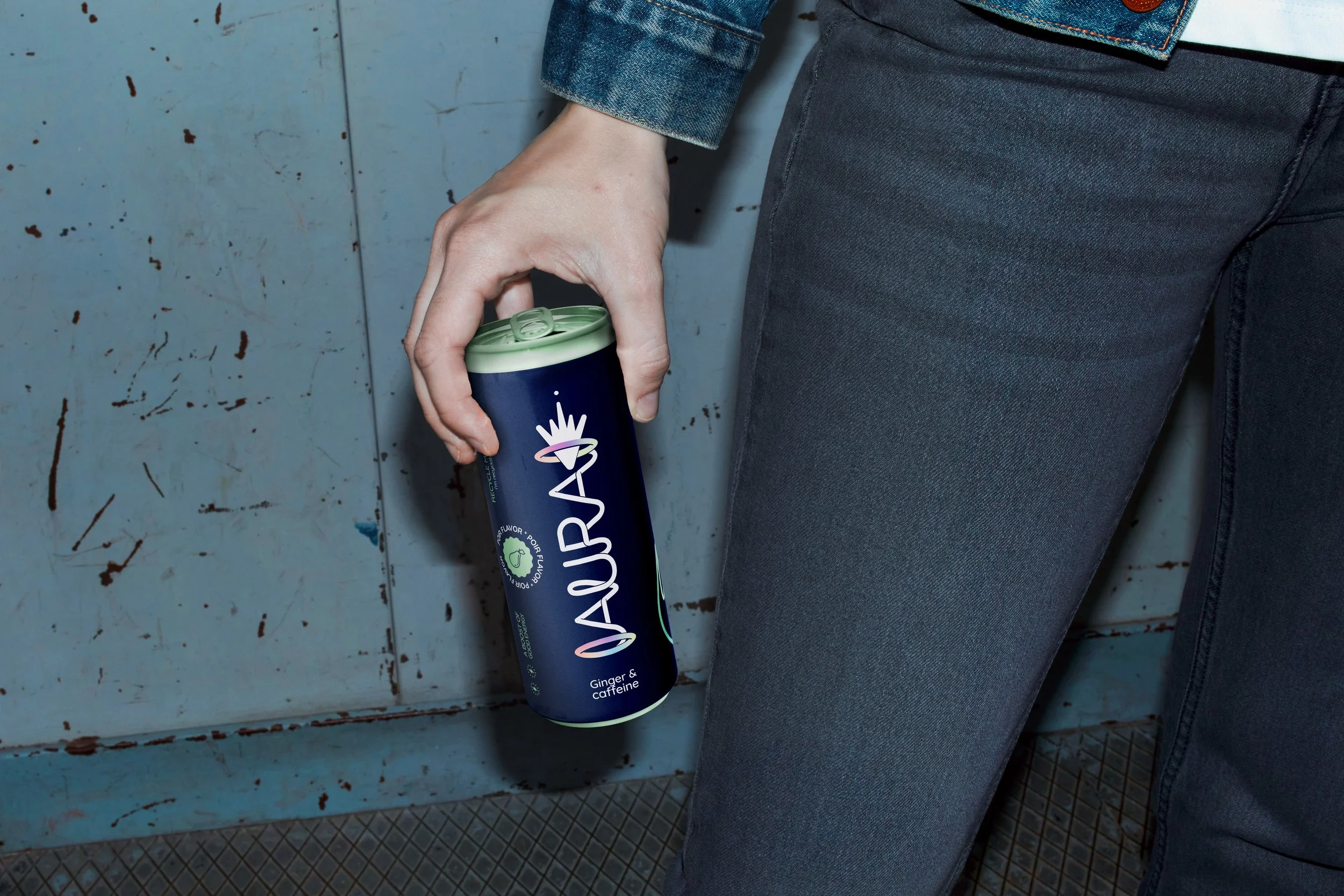
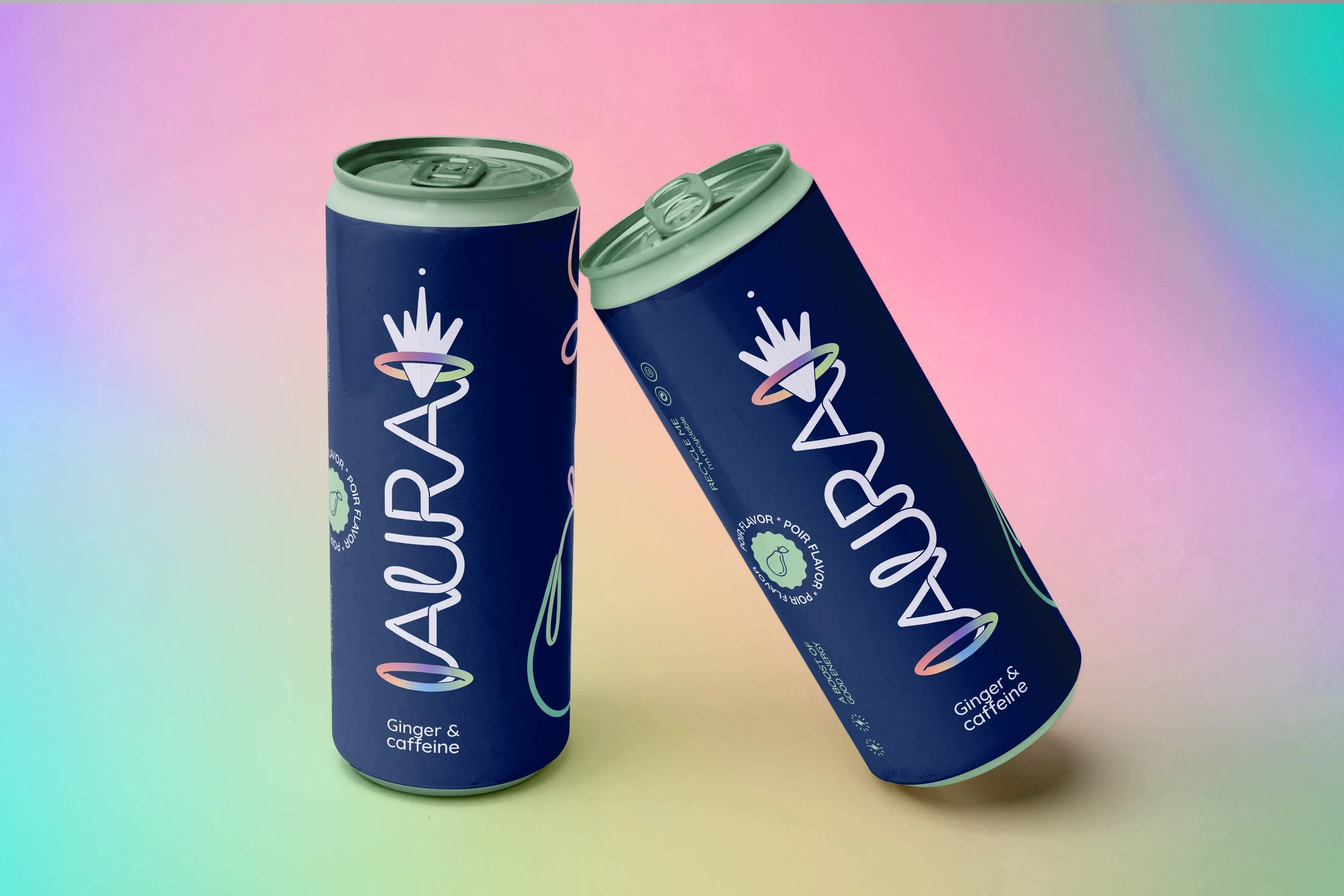
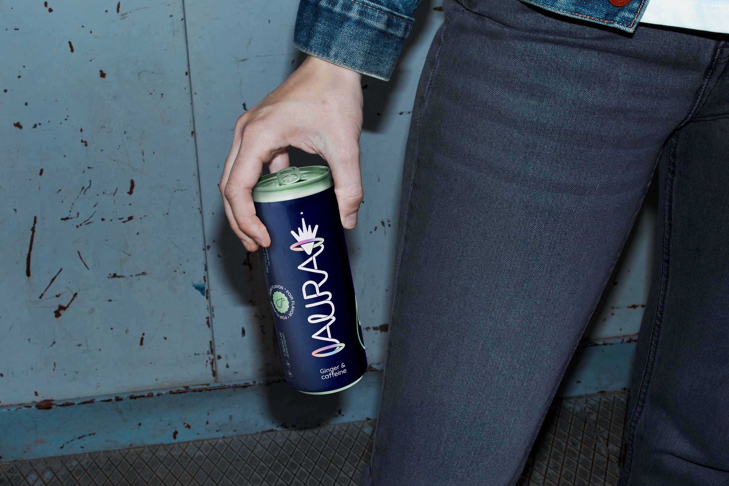
Aura is a fruity, healthy energy drink created for students who want a more nourishing boost during late study nights. Rather than relying on traditional energy‑drink clichés, it aims to feel just as energetic and appealing through a fresher, more contemporary approach.
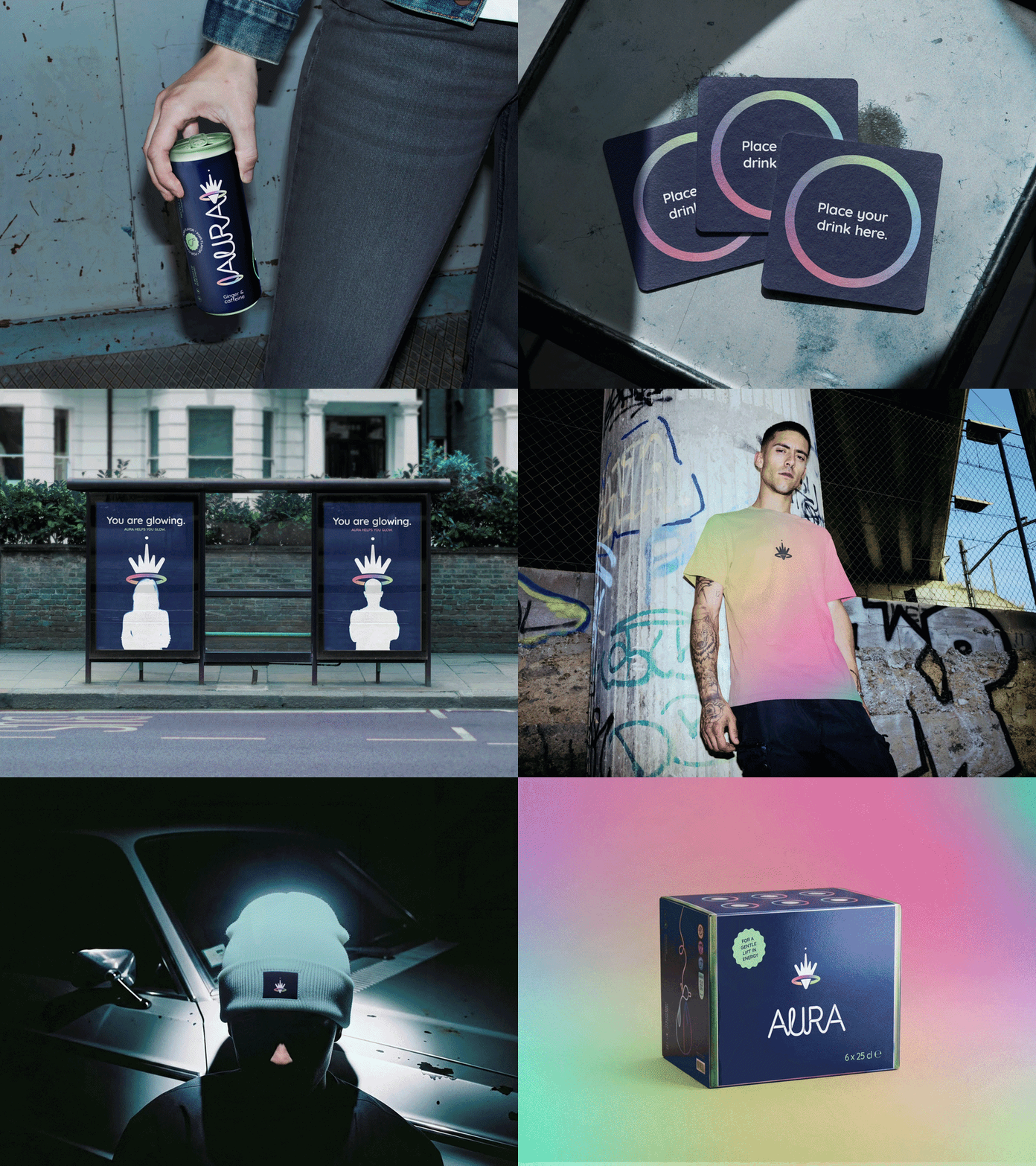
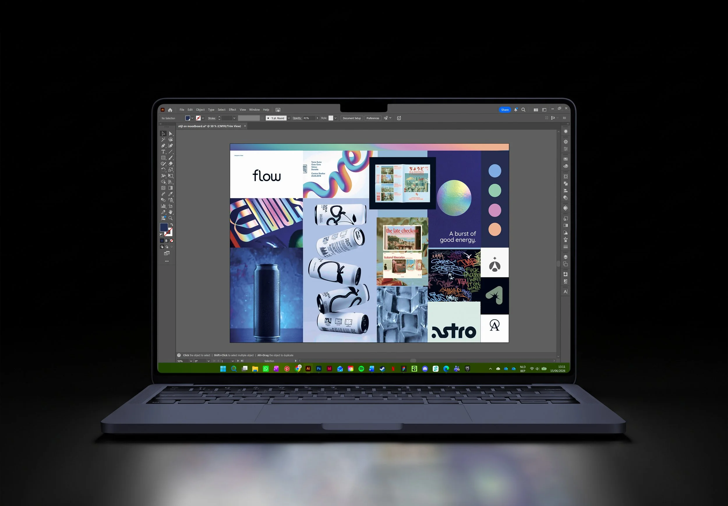
The visual identity reflects this balance. Pastel colours, cooltoned, flash images, and a modern aesthetic convey the cool energy students look for, while a thoughtful, supportive tone ensures the brand leaves a lasting and positive impression.
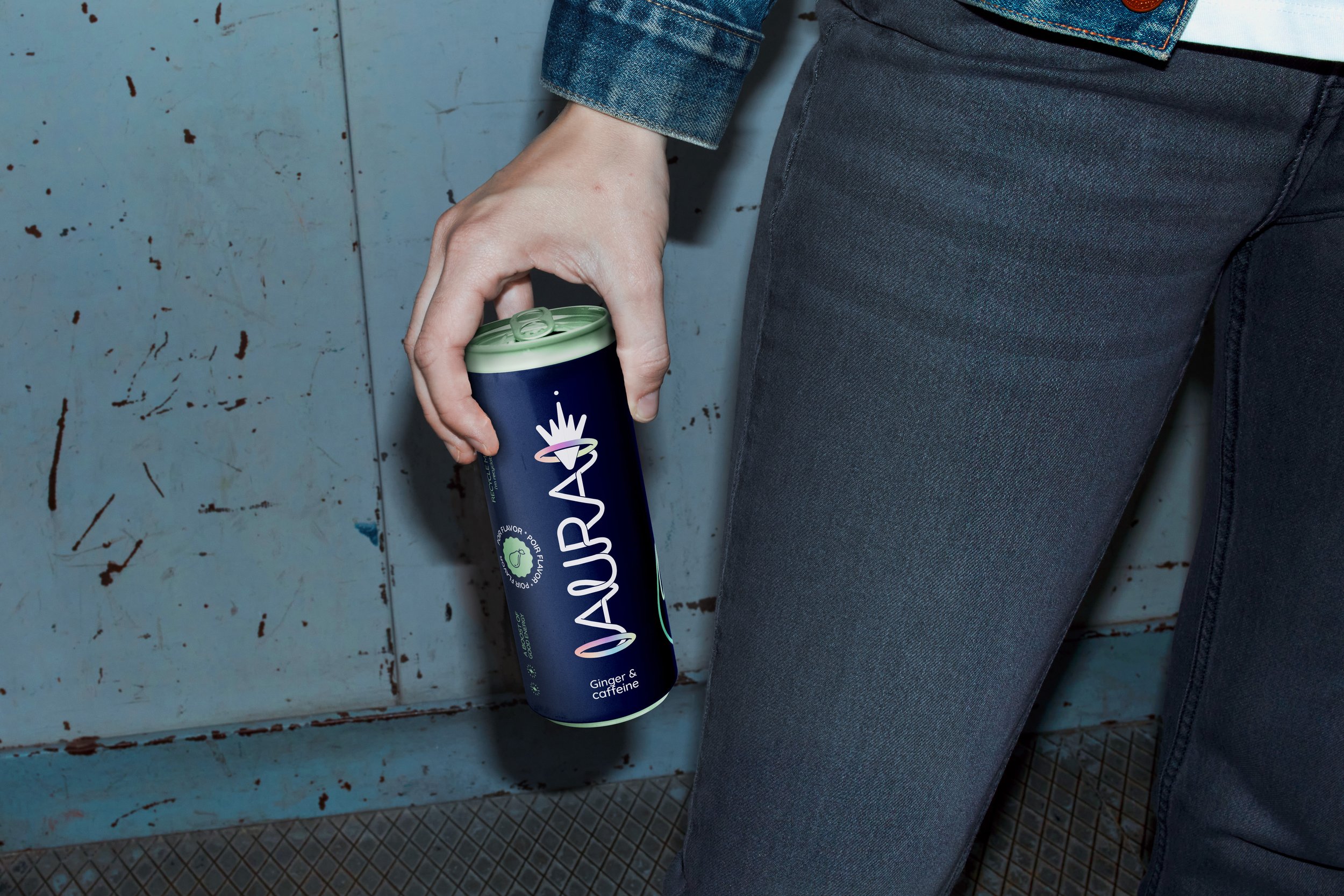
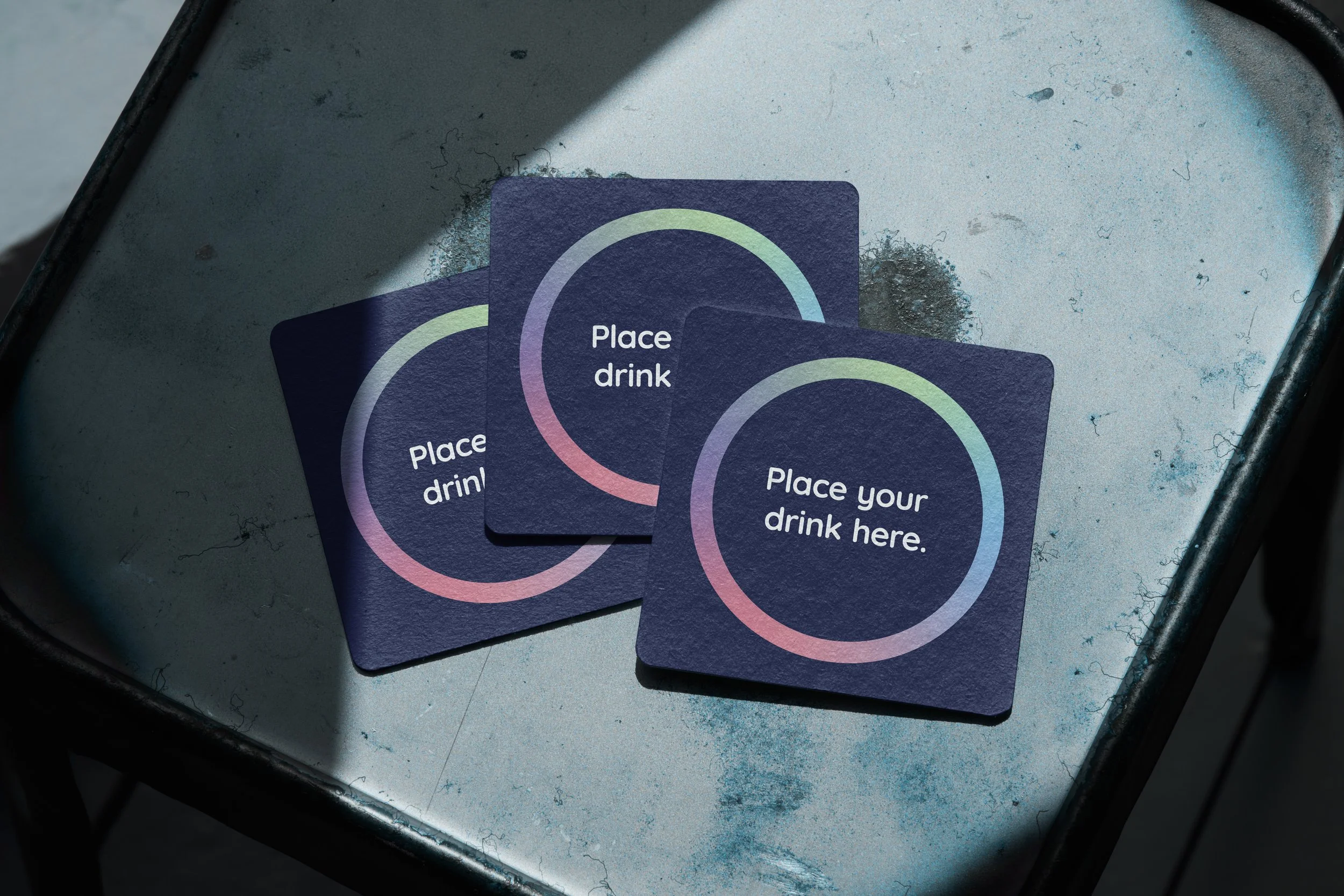
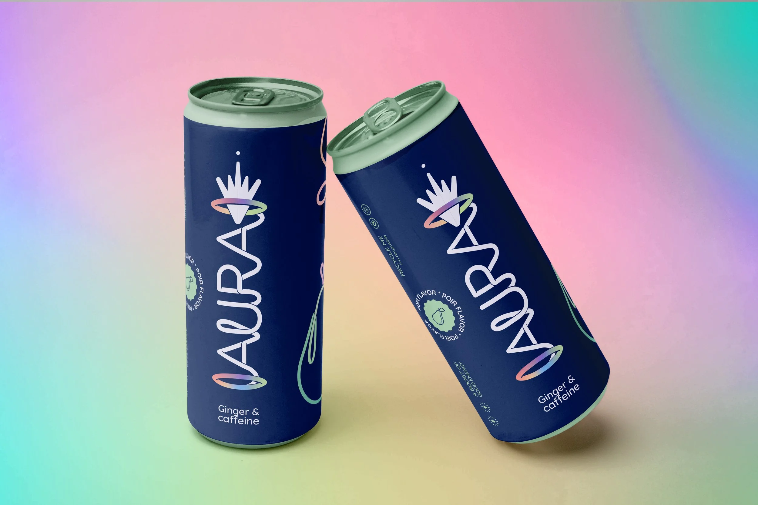
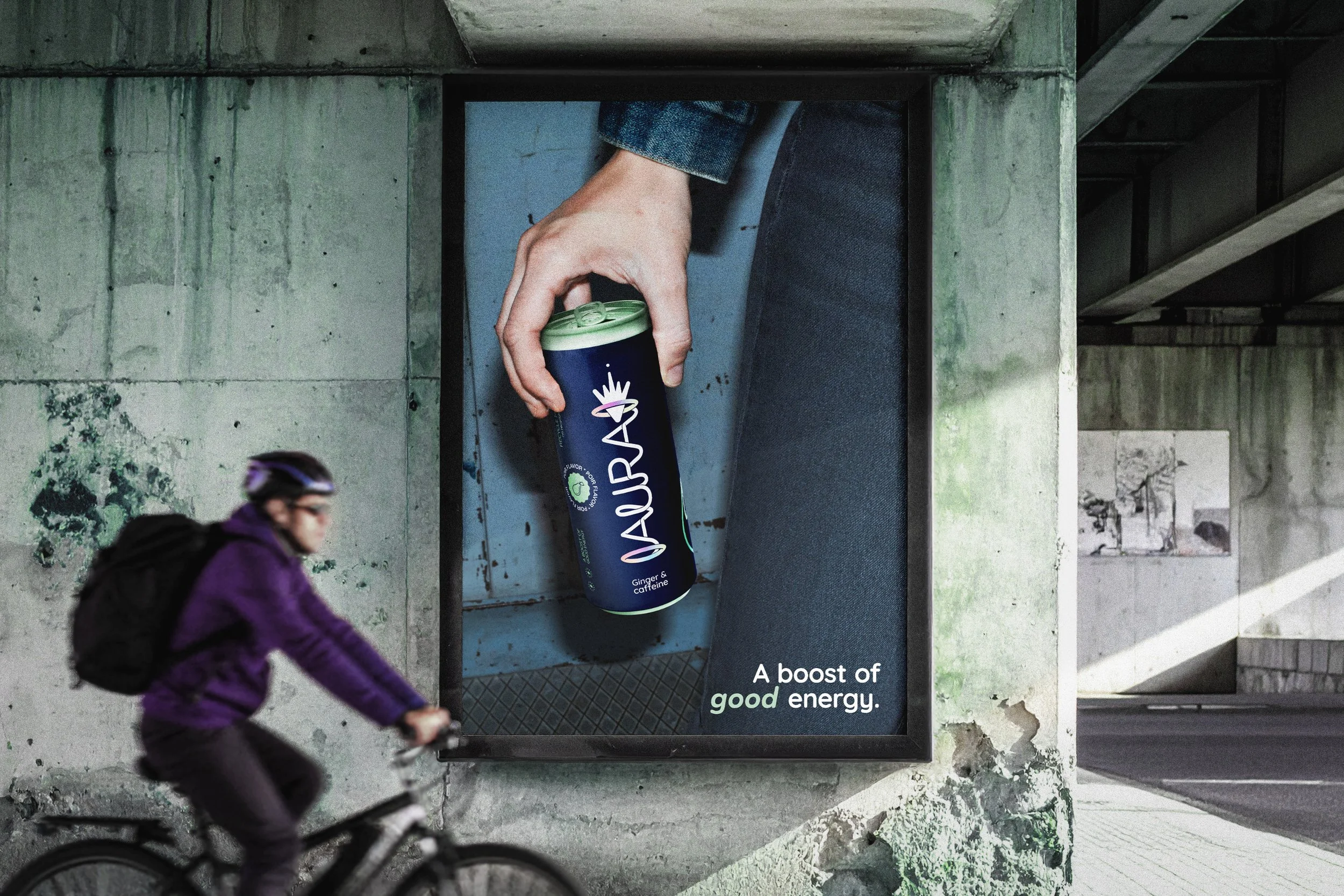
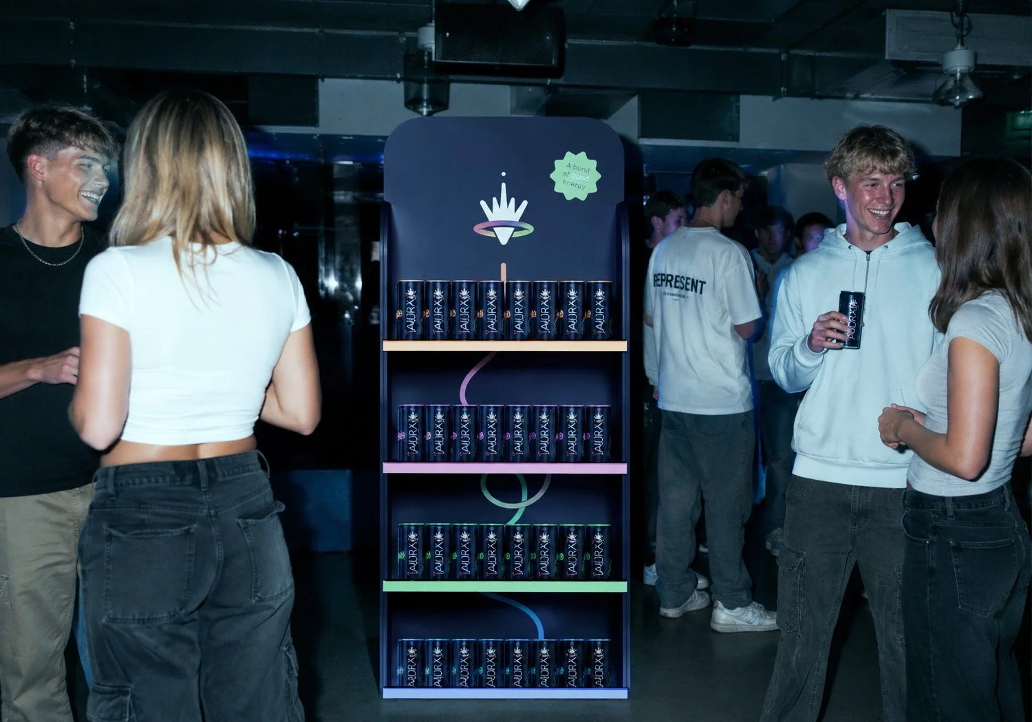
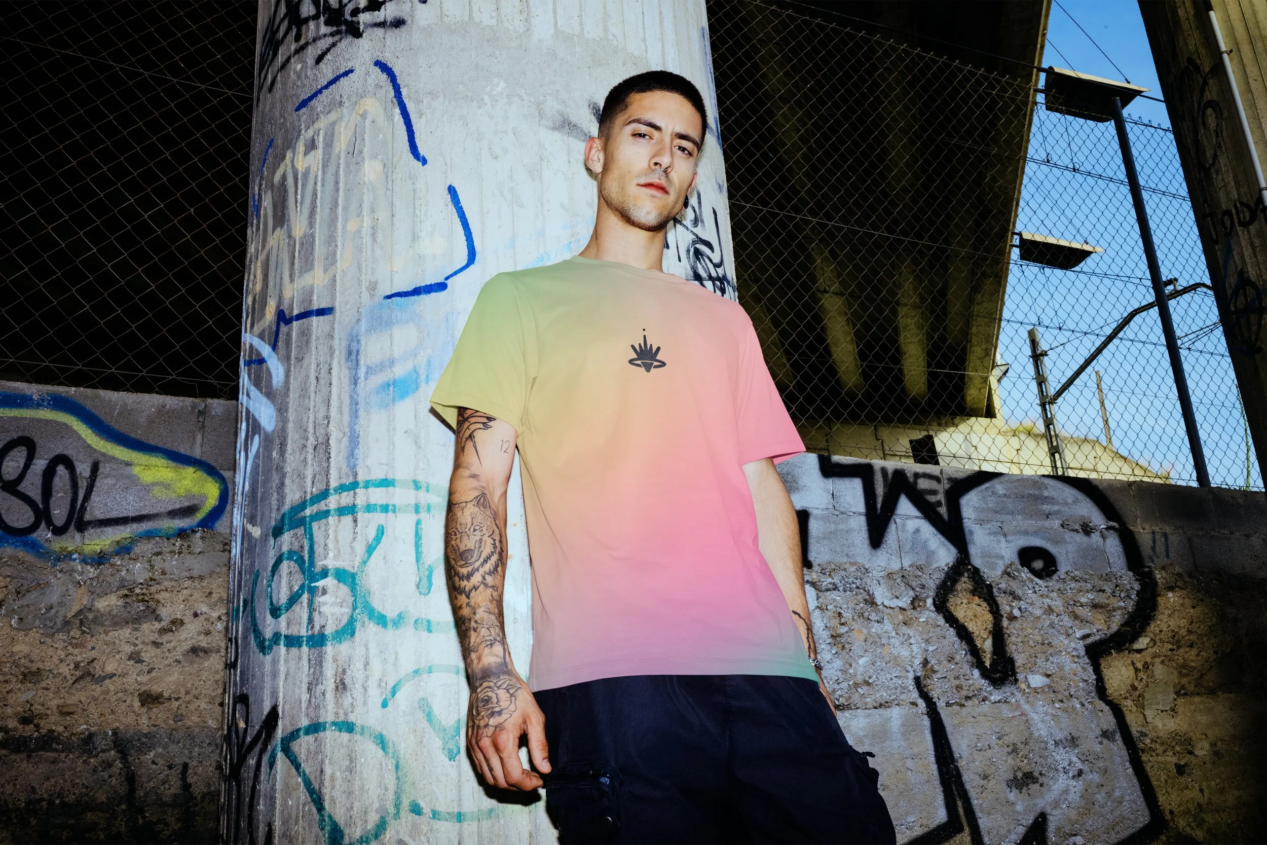
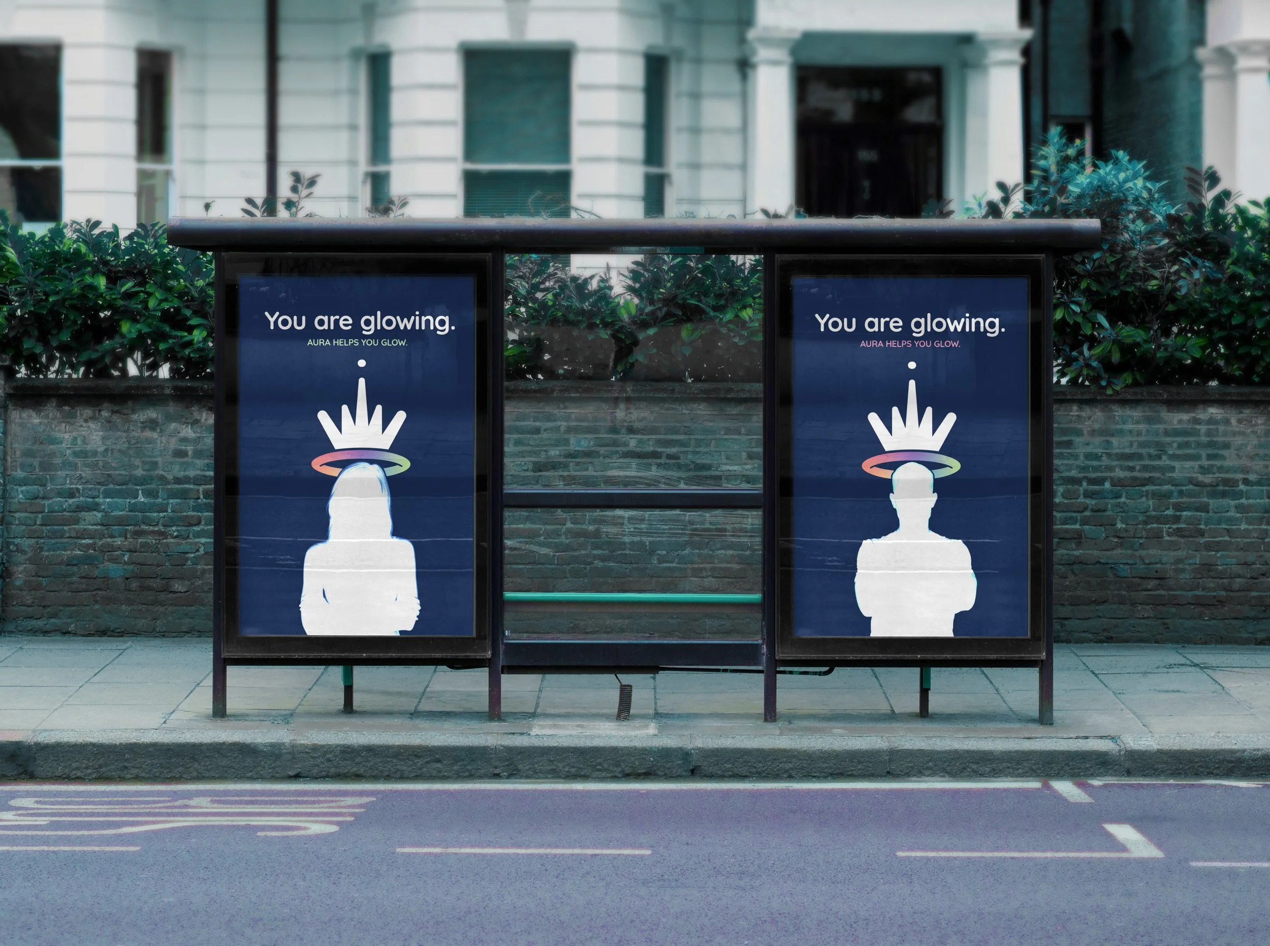
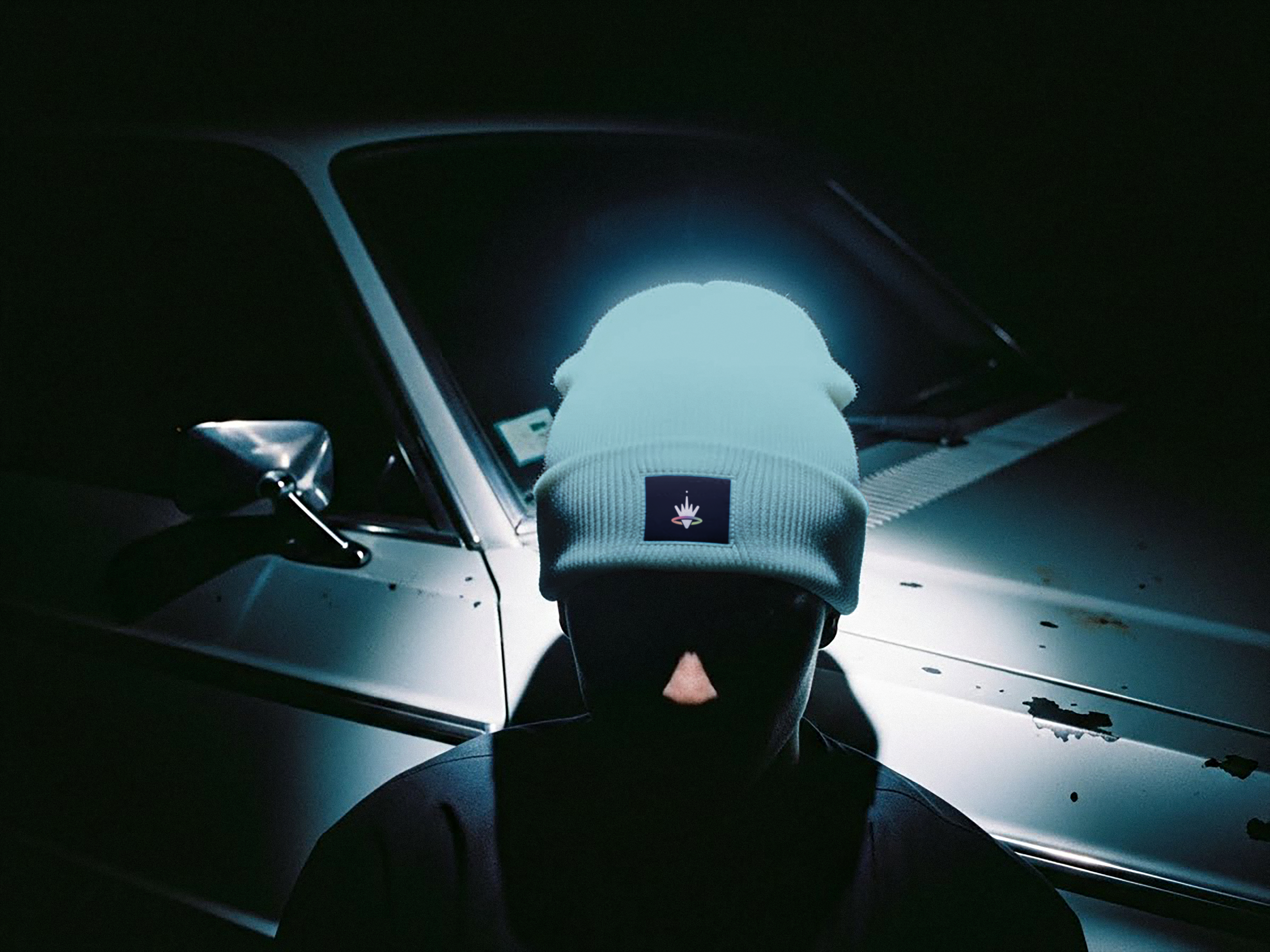
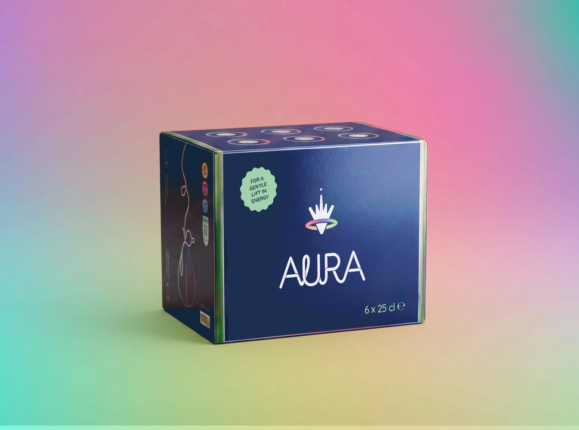
Conceptual educational project. Stock- and generated images were used for educational and mock-up purposes.
Evaluation:
"Beautiful work, Anne, congratulations! A highly polished project with a consistent look and feel. There's a lot to discover, yet everything works together seamlessly. The many layers within your design clearly show the amount of thought and care you invested in every decision."
Process Aura
Analysis & Concept:
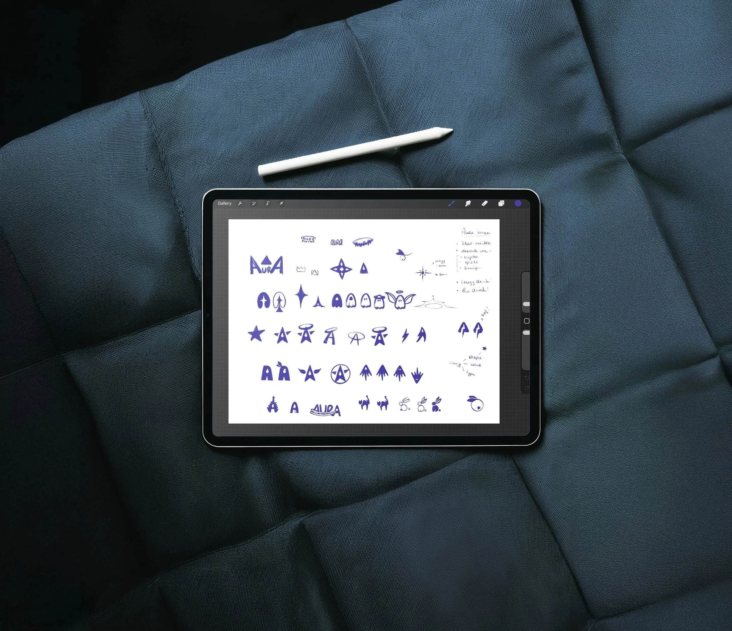
The project began with logo sketches, packaging studies and the development of a detailed brand story. Together, these formed the foundation for an energy drink with a clear purpose, personality and visual identity.
Iteration & Interpretation:
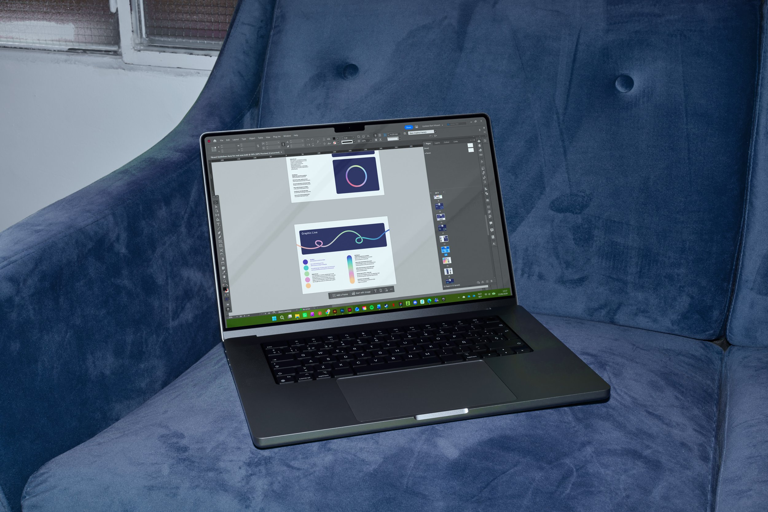
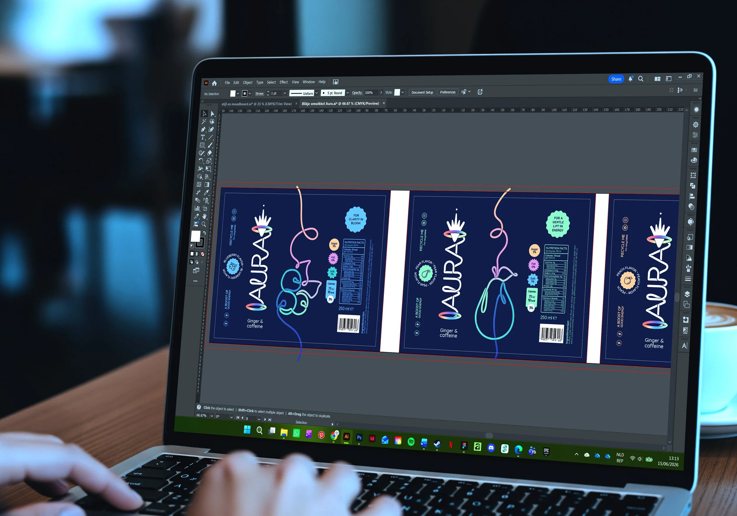
From brand guidelines to packaging and carefully selected mock-ups, every element was refined to create a vibrant and consistent brand world. Each design decision reinforces Aura's energetic character while maintaining a clean and approachable visual language.
Curious about the entire process behind this project? I'd be happy to share the full research, concept development and visual studies that shaped the final design. Feel free to get in touch.