BRAND DESIGN
A closer look at three projects where I built visual identities; from concept to a complete brand system.
Showcase 02
·
Showcase 02 ·
Worn
Solid Perfume concept
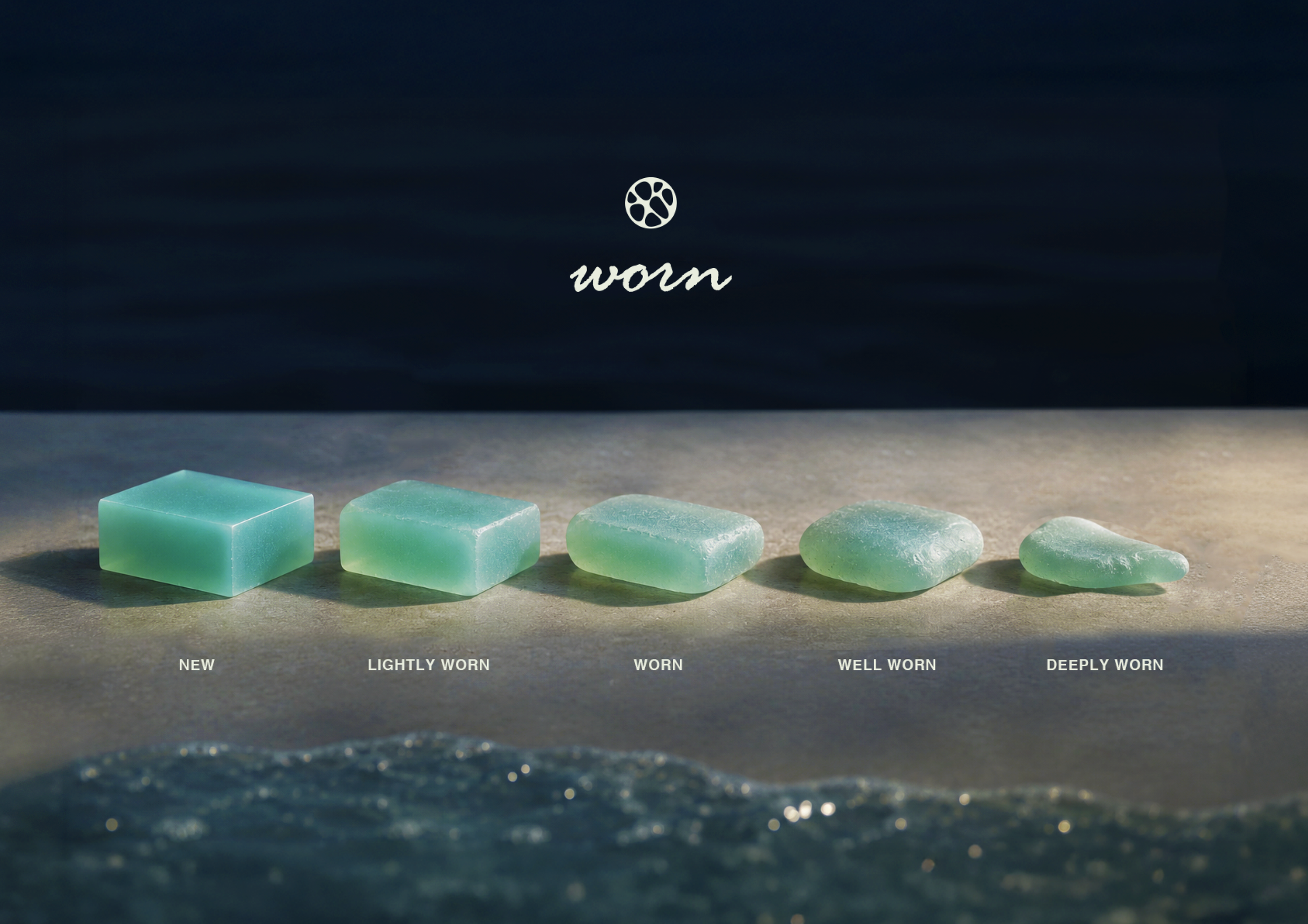
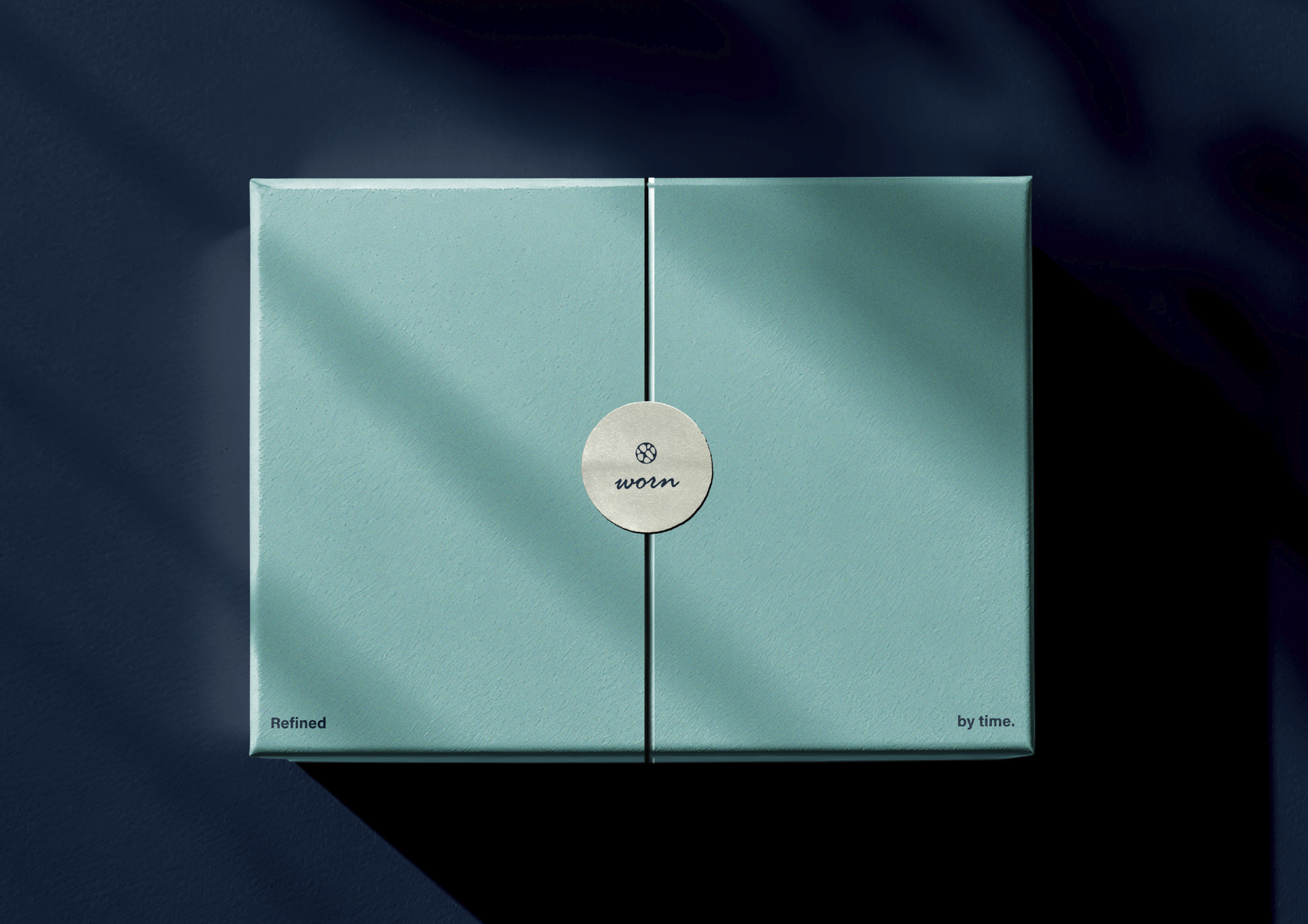
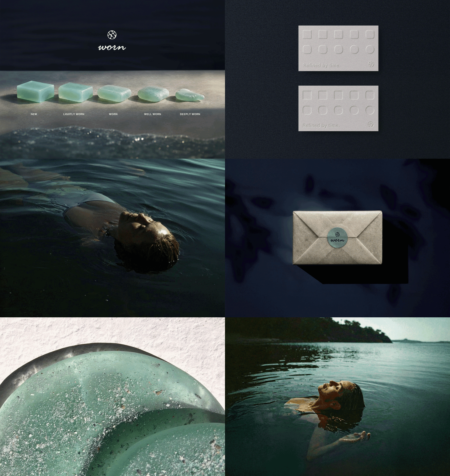
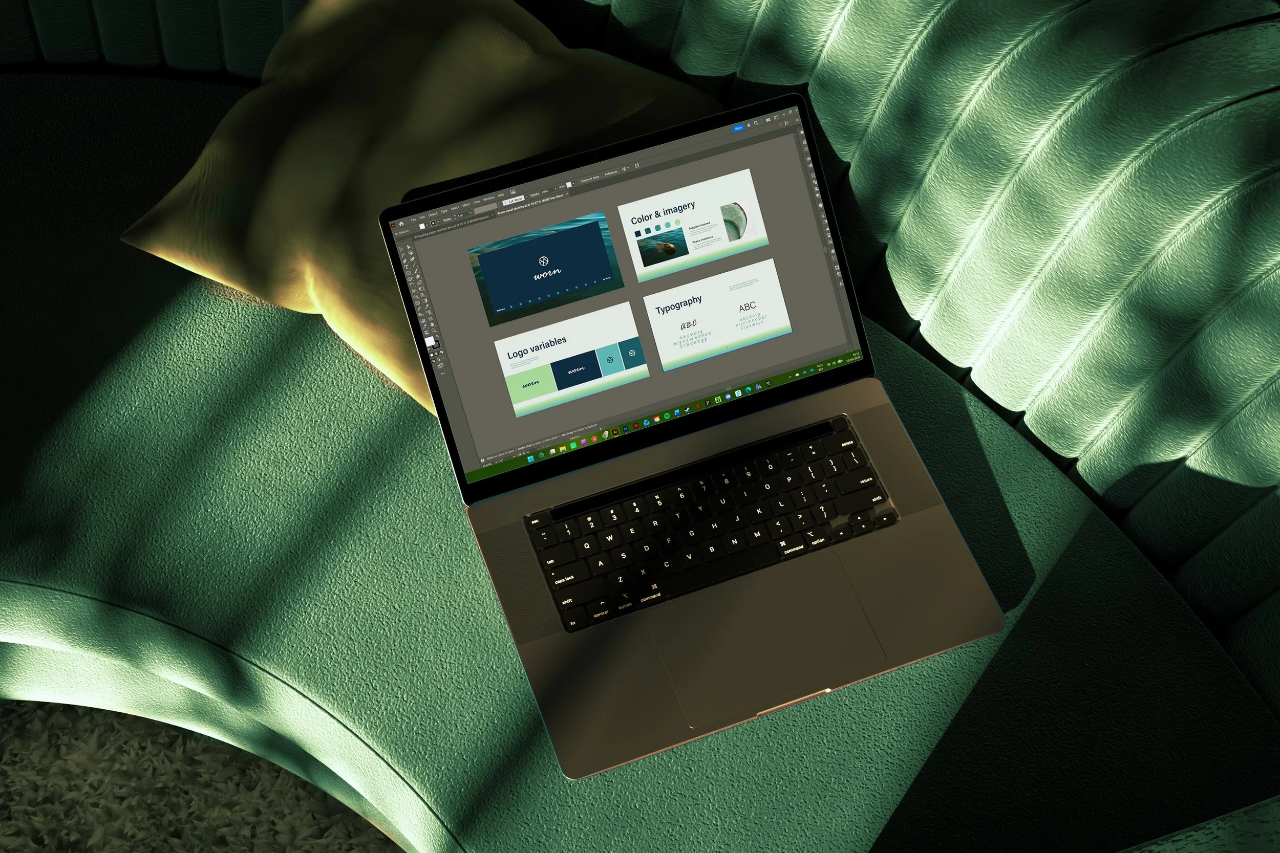
Worn is a solid perfume brand centred around softness, intimacy and quiet confidence. Rather than chasing bold statements, it speaks to people whose identity has been shaped through experience; those who appreciate beauty that grows richer over time.
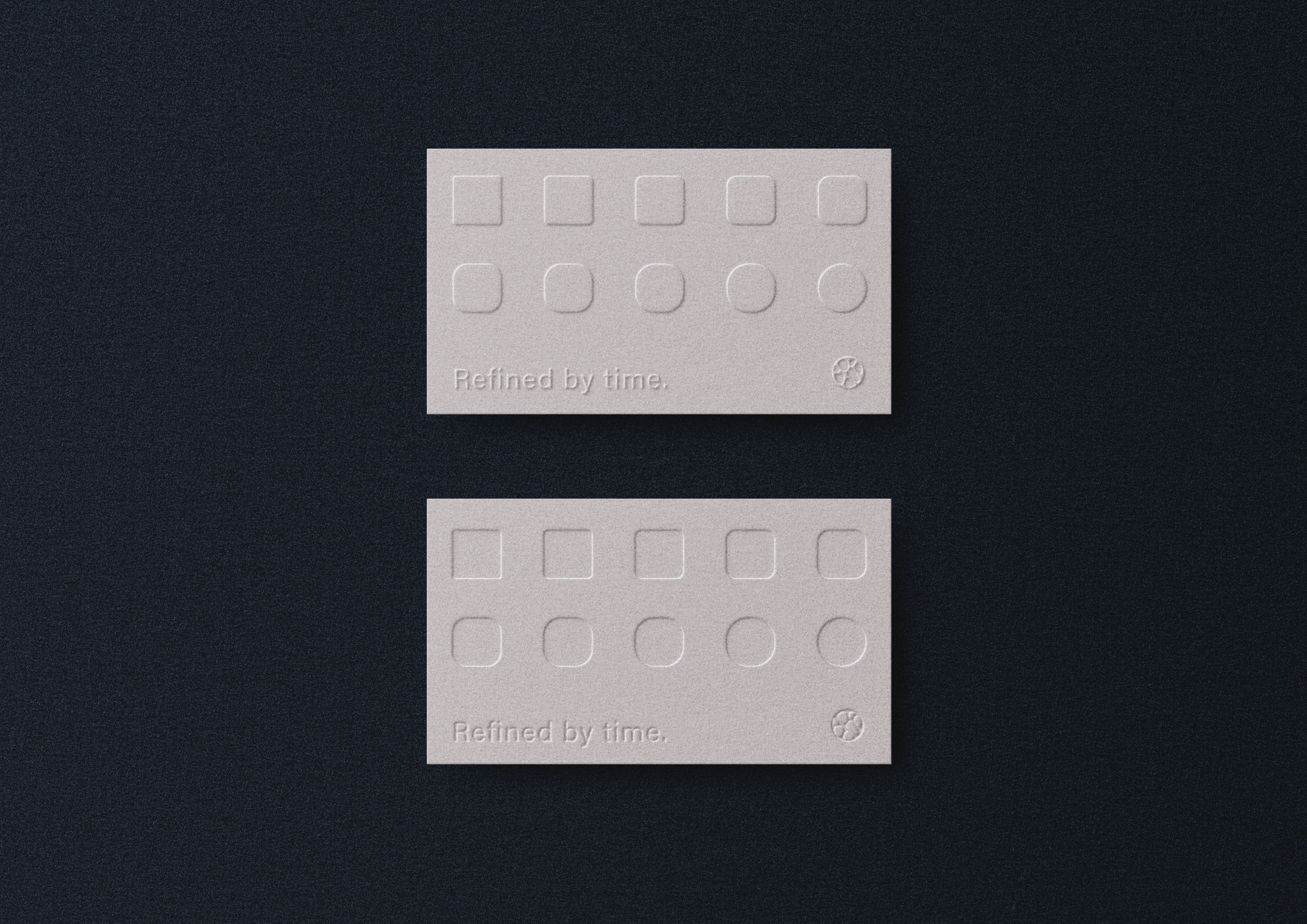
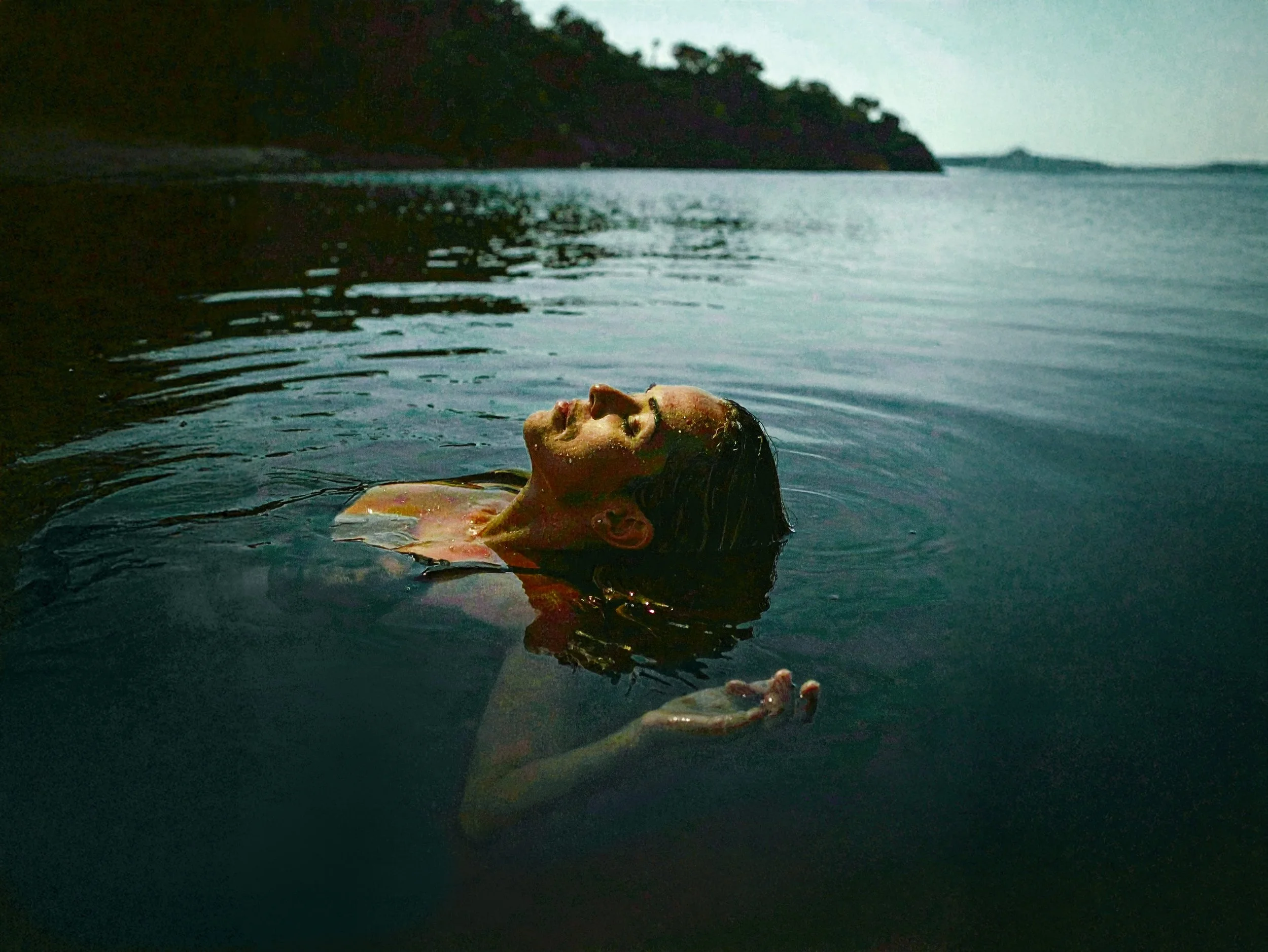
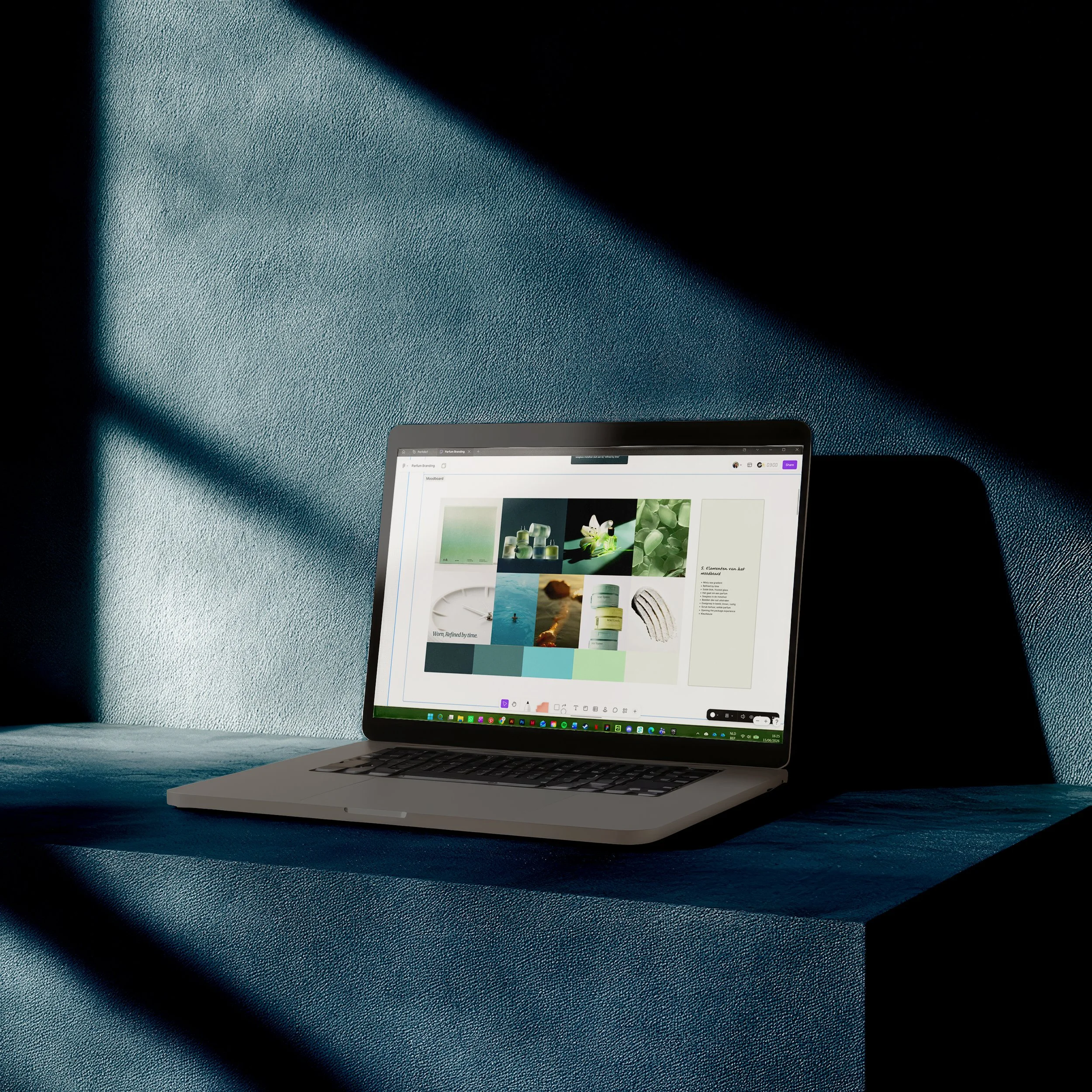
The visual identity reflects this philosophy. Inspired by sea glass, it embraces the idea that time refines rather than diminishes, captured in the calm, tactile aesthetic and the tagline Refined by Time.
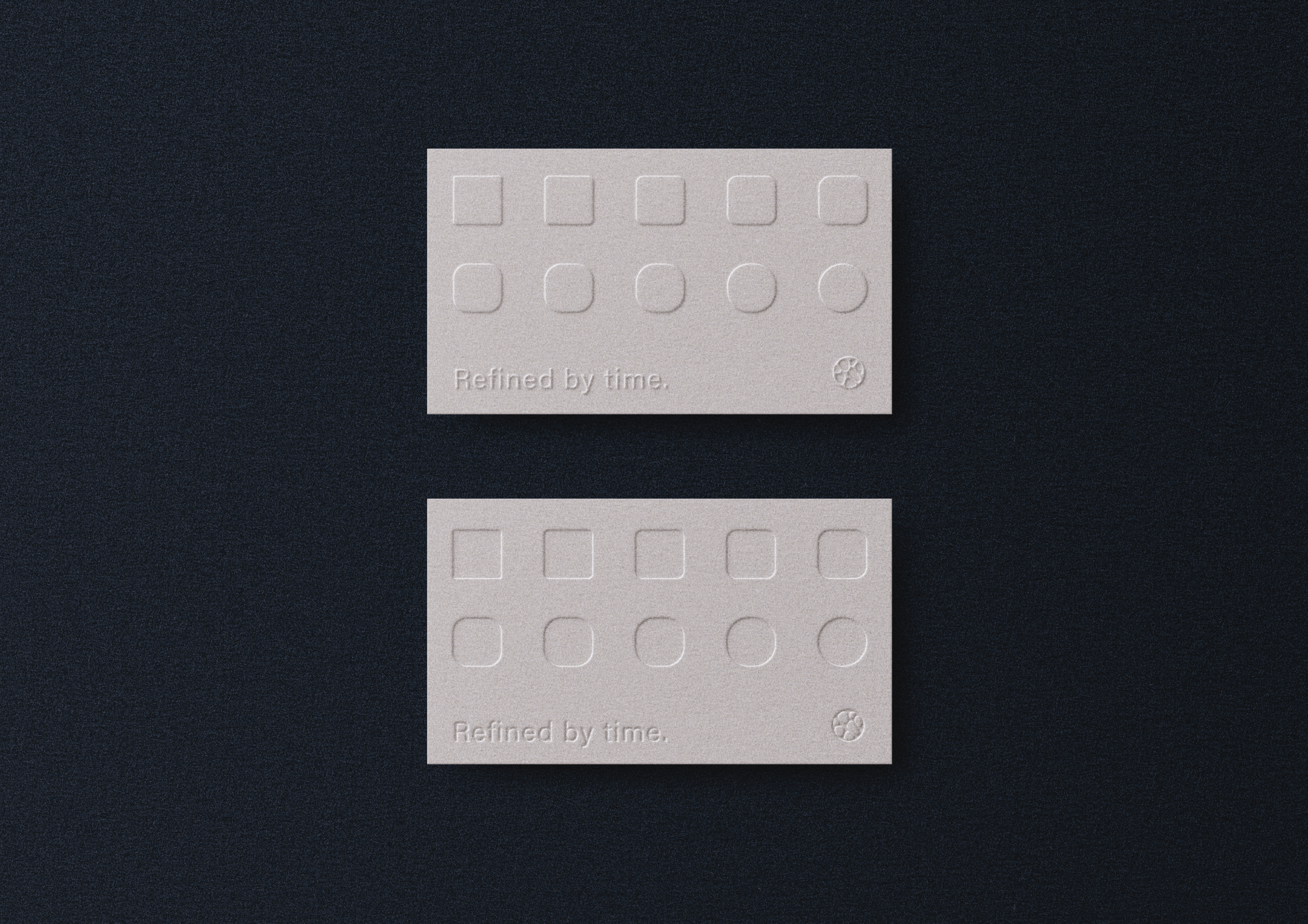
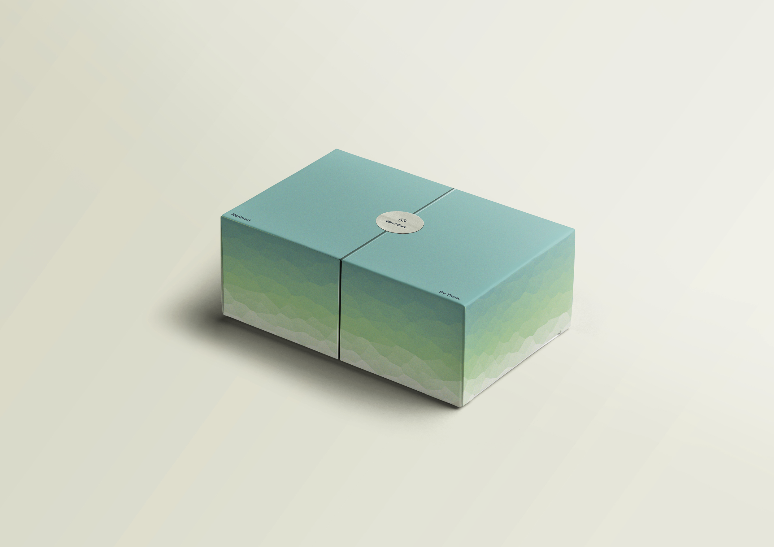
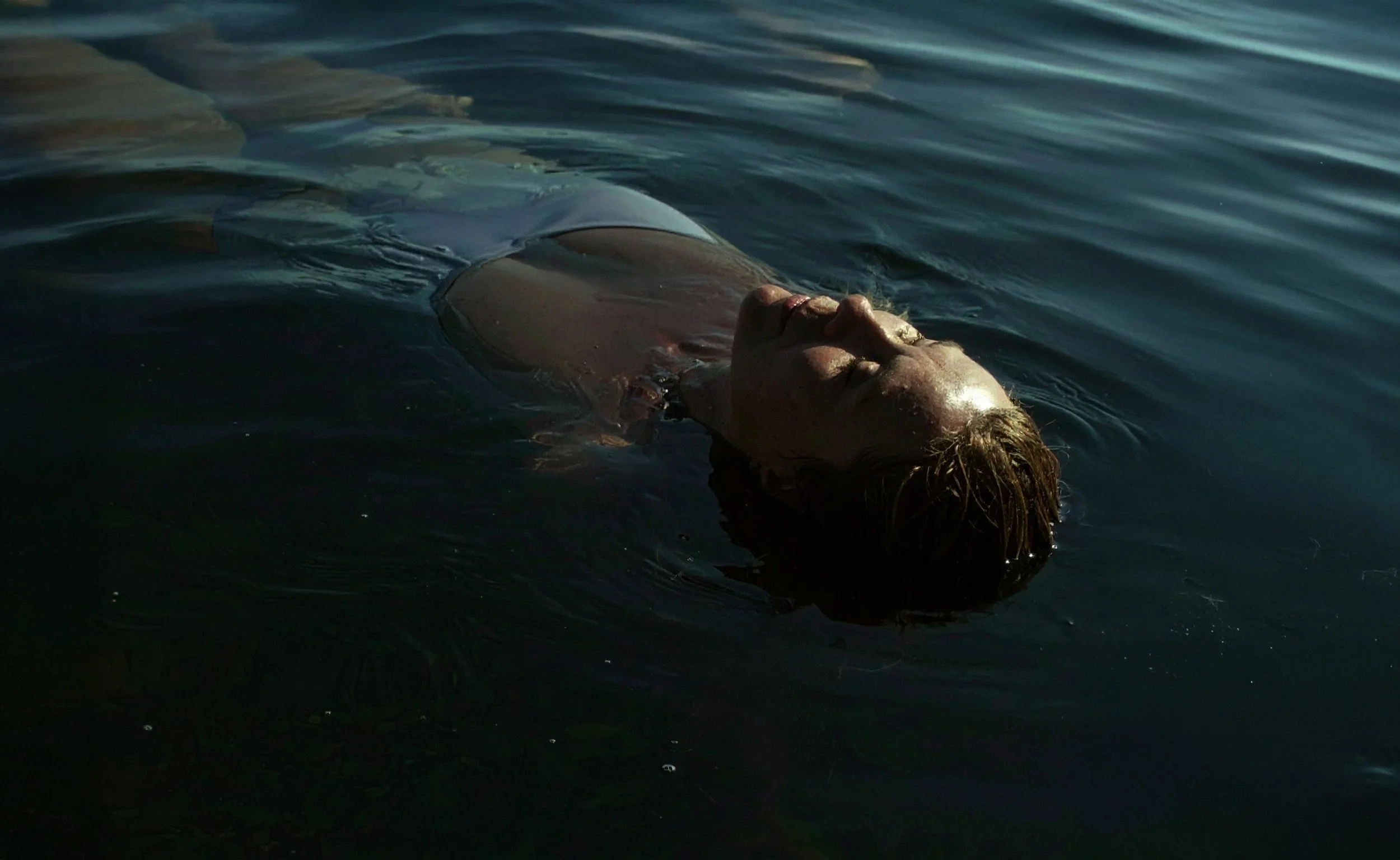
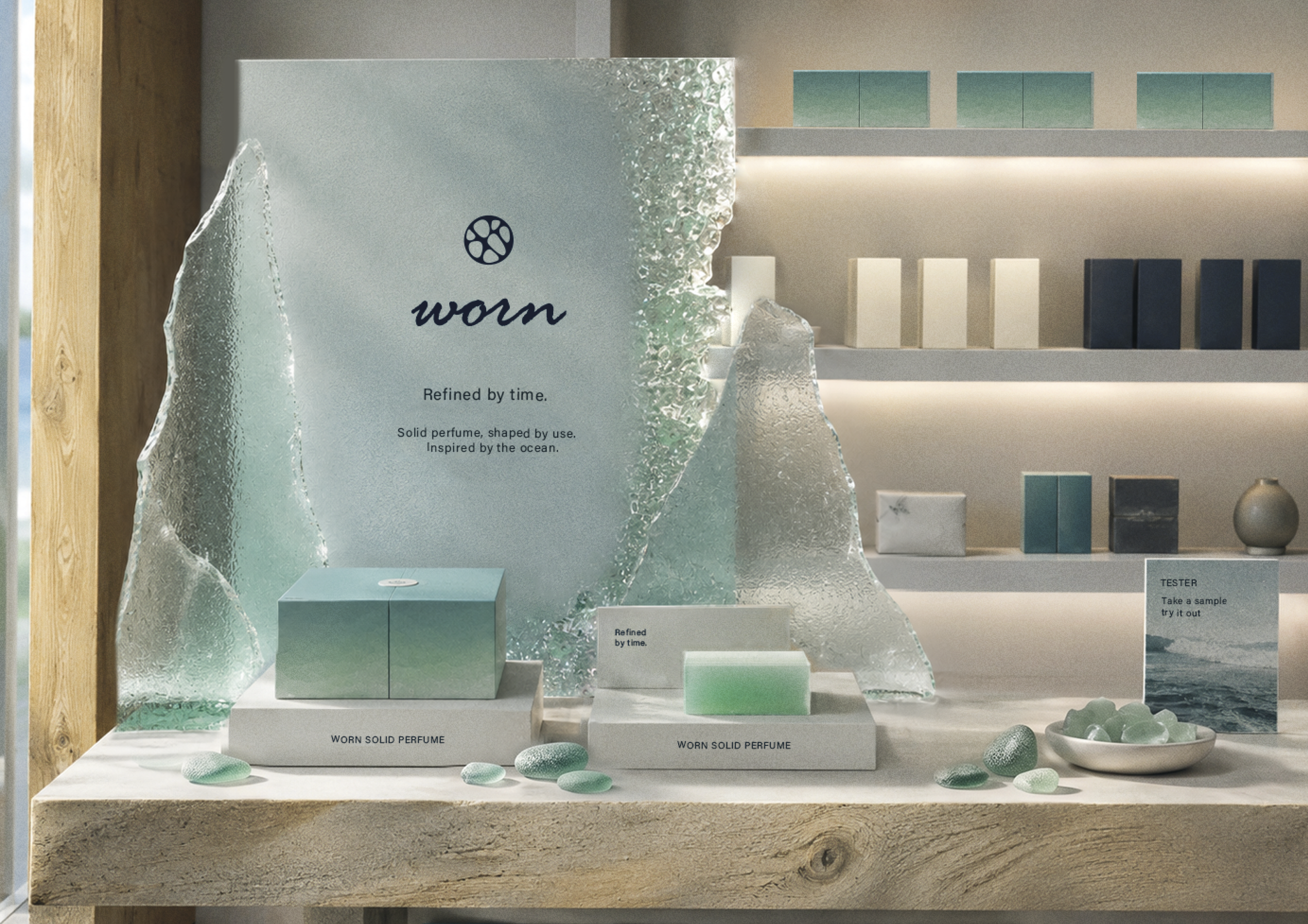
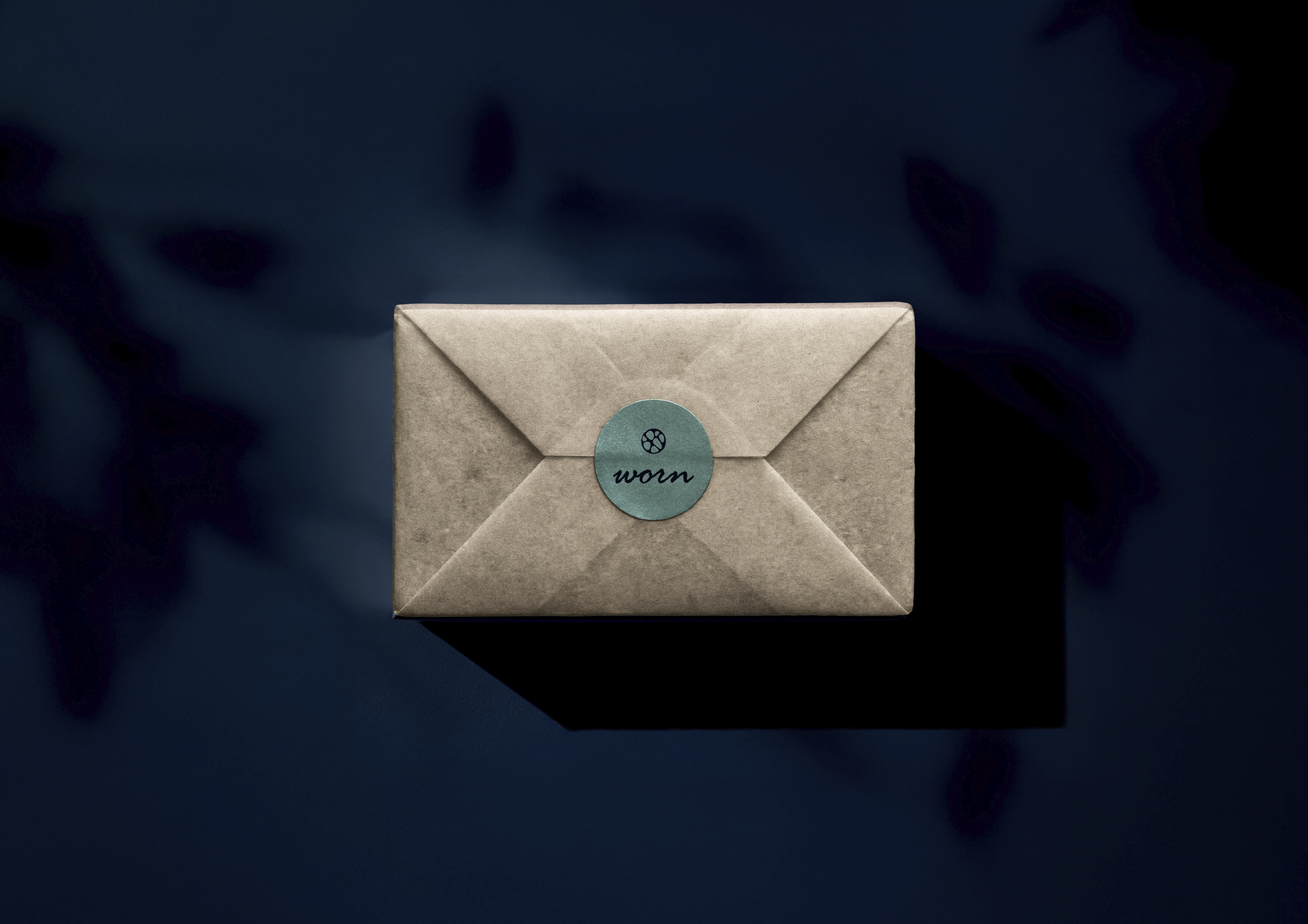
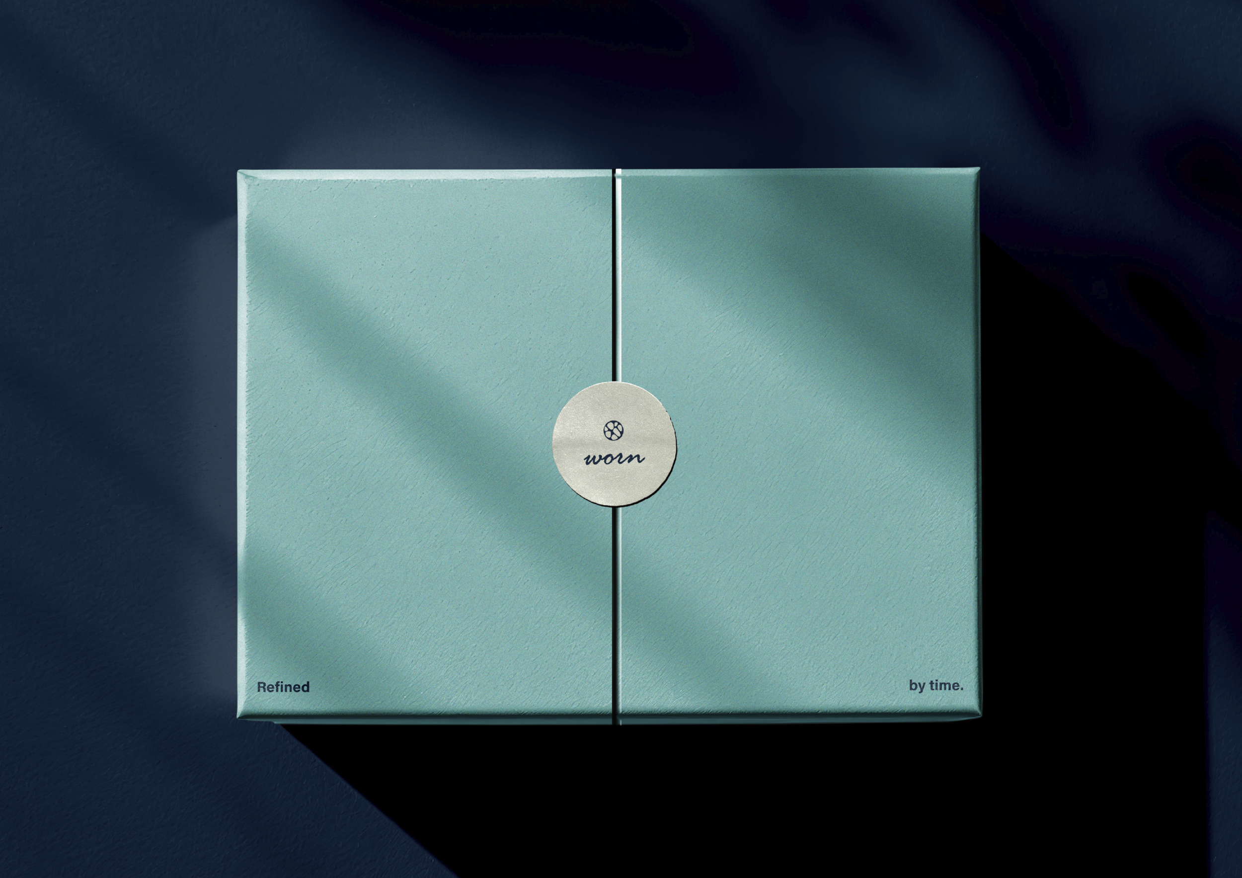
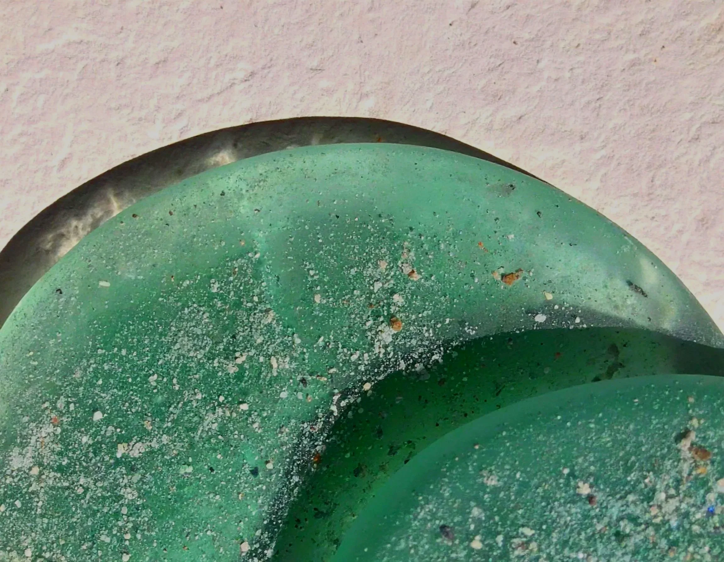
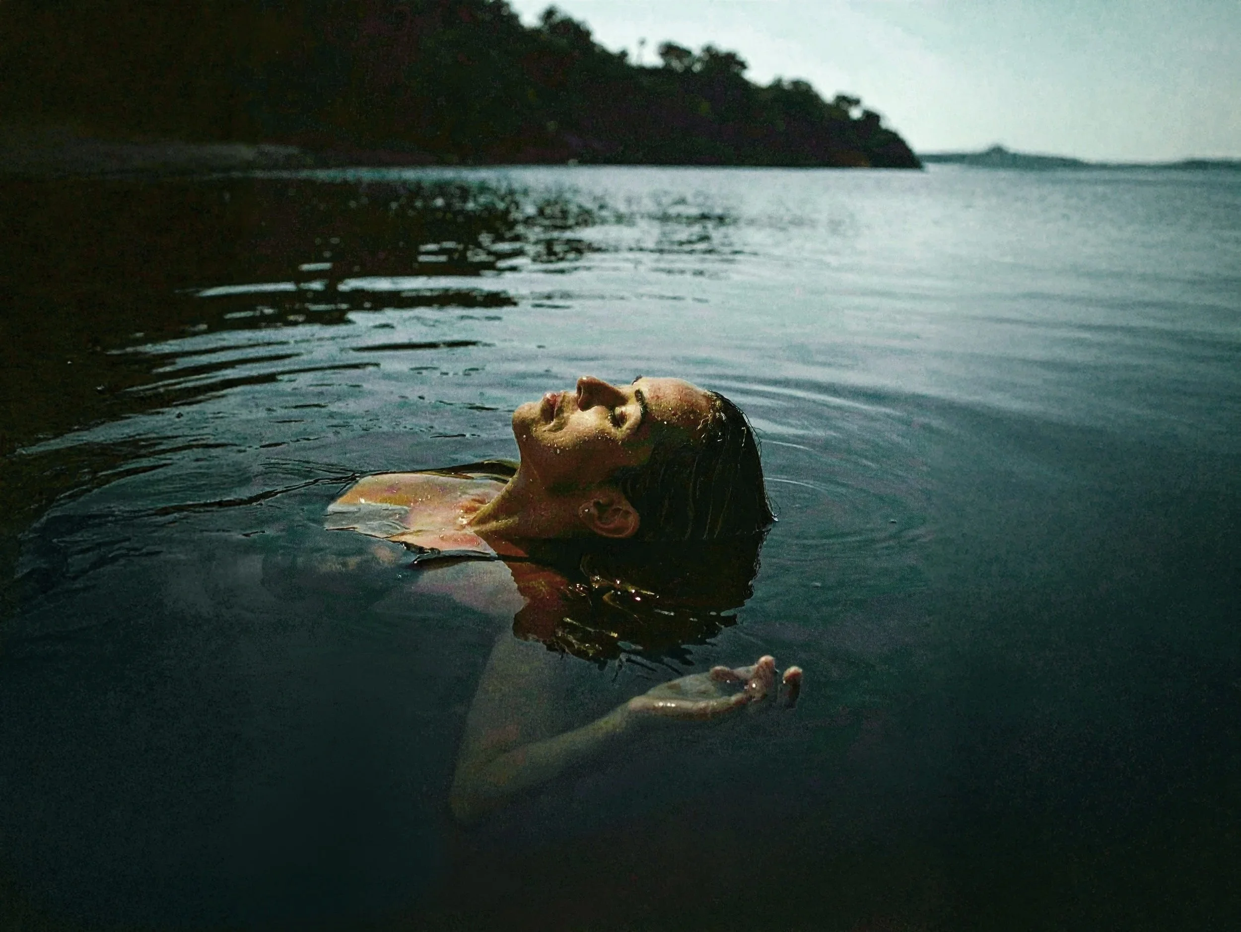
Conceptual educational project. Stock- and generated images were used for educational and mock-up purposes.
Reflection:
"Worn pushed me outside my comfort zone. I usually create colourful and expressive brands, so designing something this quiet and tactile challenged me in a completely different way. That challenge is exactly what made the final result so rewarding."
Process Worn
Analysis & Concept:
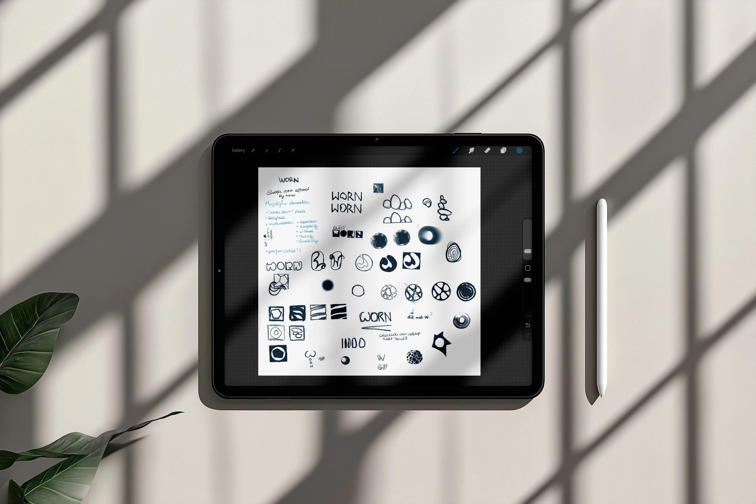
The concept evolved through research into scent associations, materials and audience perception. Together, these explorations shaped a brand identity focused on tactility, calmness and understated elegance.
Iteration & Interpretation:
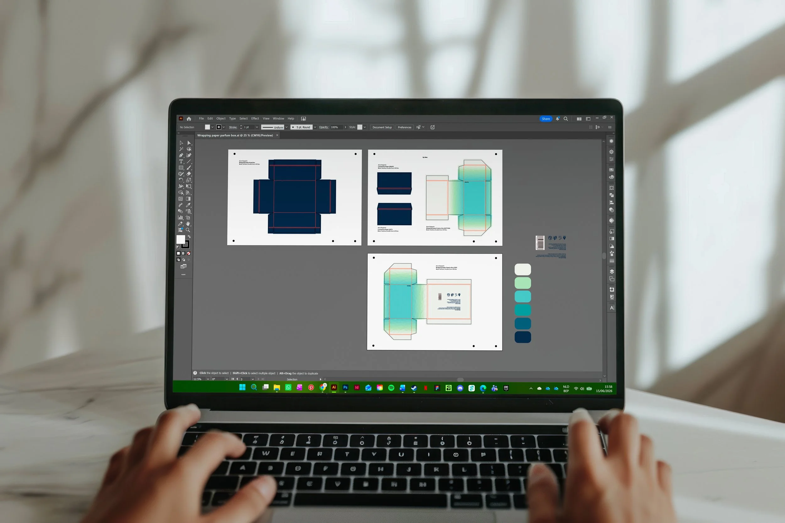
Every iteration refined the visual language further. Delicate typography, restrained colour choices and curated mock-ups translated the concept into a brand that feels minimal and human in a way that creates connection.
Curious about the entire process behind this project? I'd be happy to share the full research, concept development and visual studies that shaped the final design. Feel free to get in touch.