LAYOUT DESIGN
A closer look at three projects where I focused on editorial layout, structure, and storytelling through print.
Showcase 02
·
Showcase 02 ·
De Schakel
2026
Cultural brochure concept
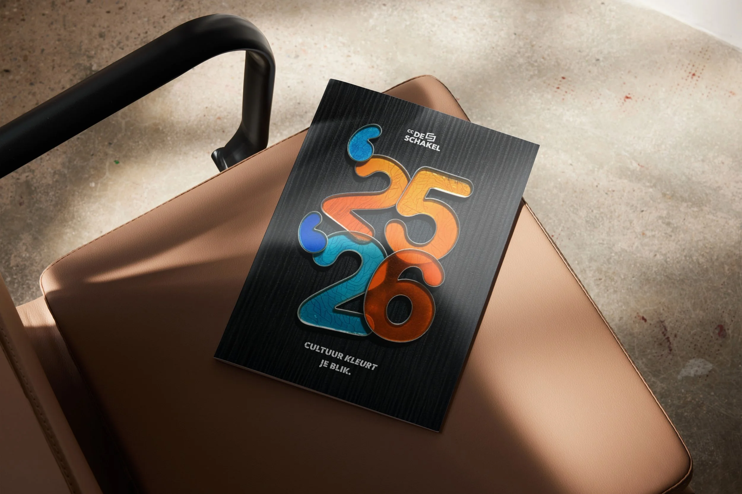
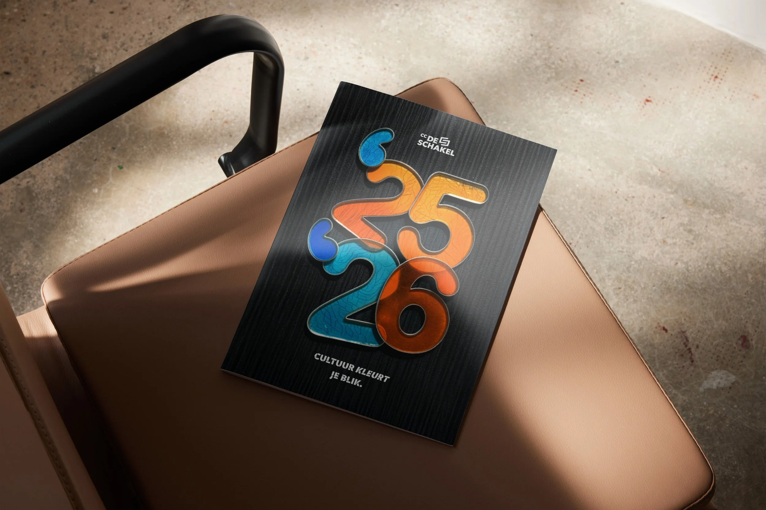
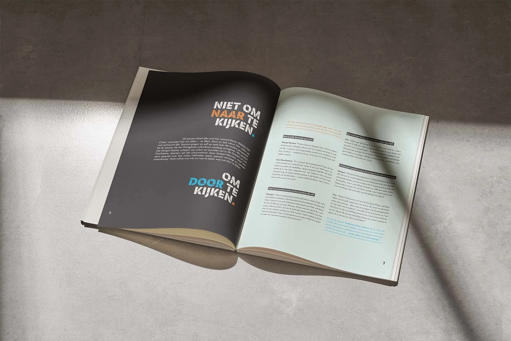
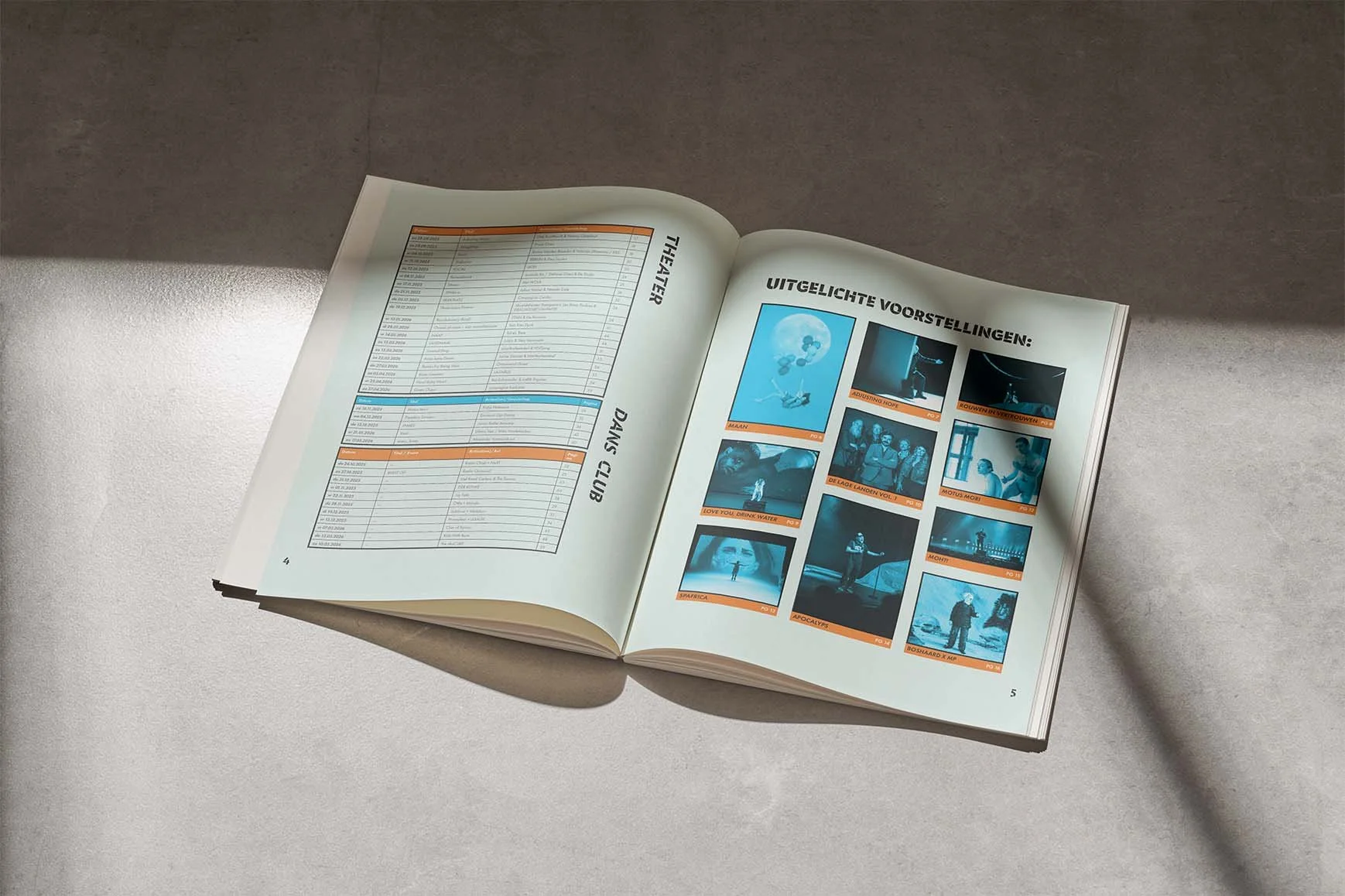
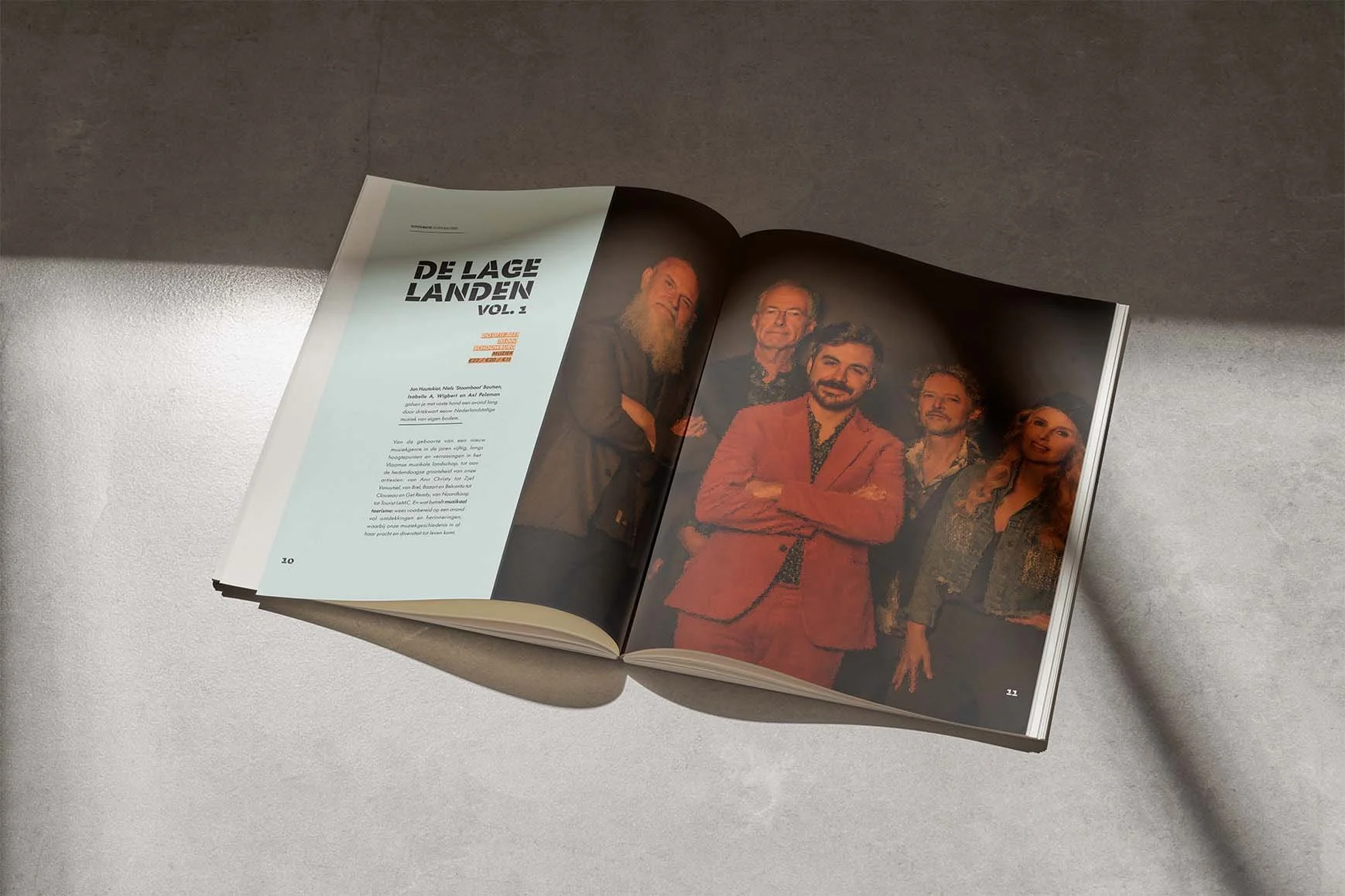
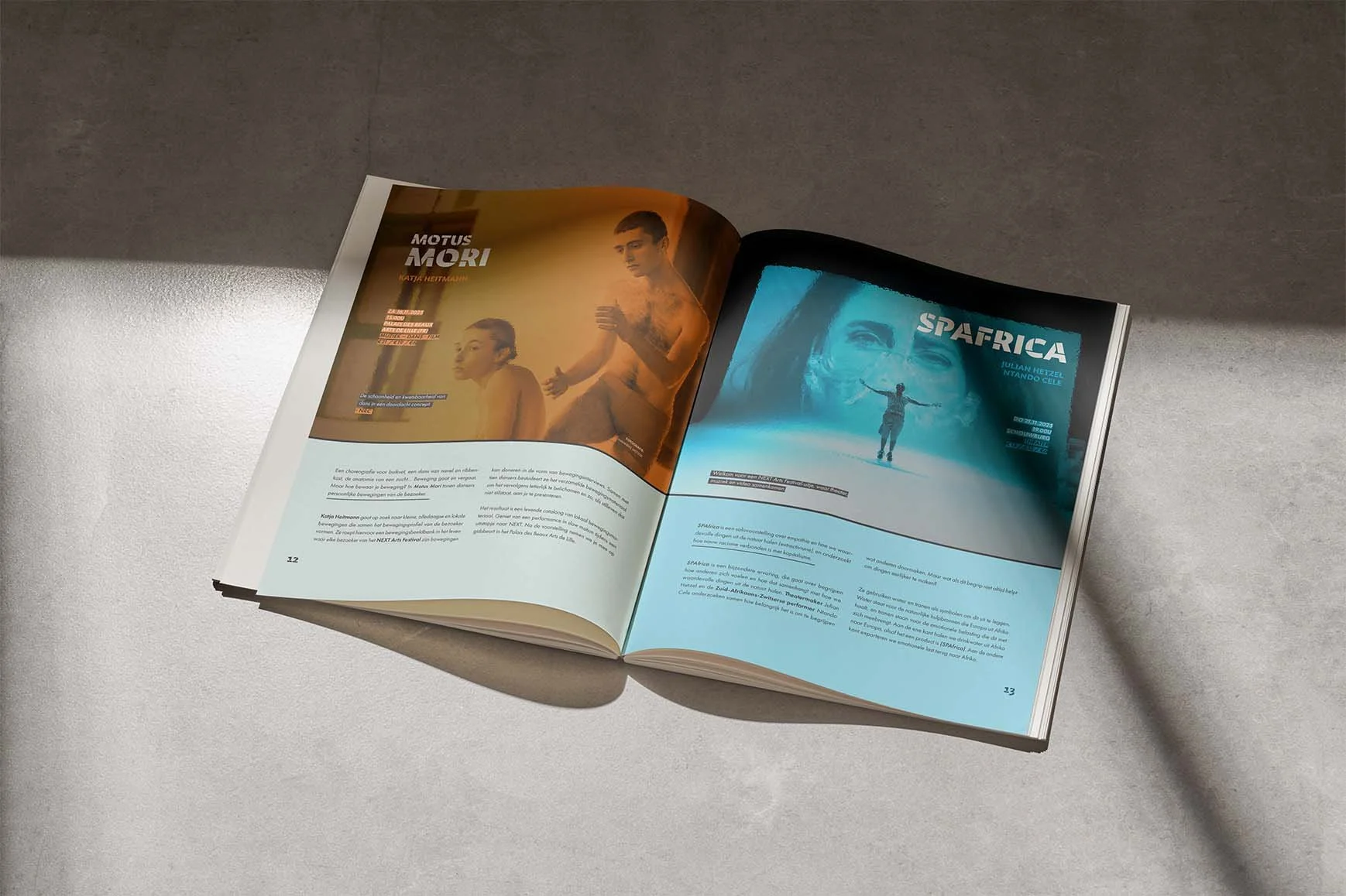
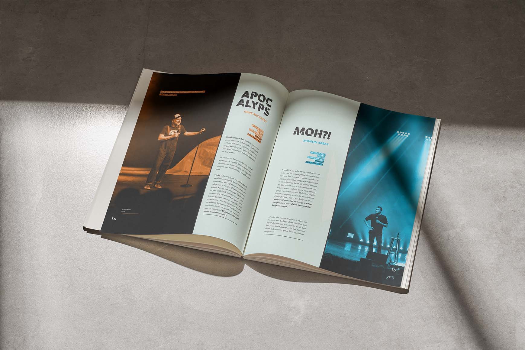
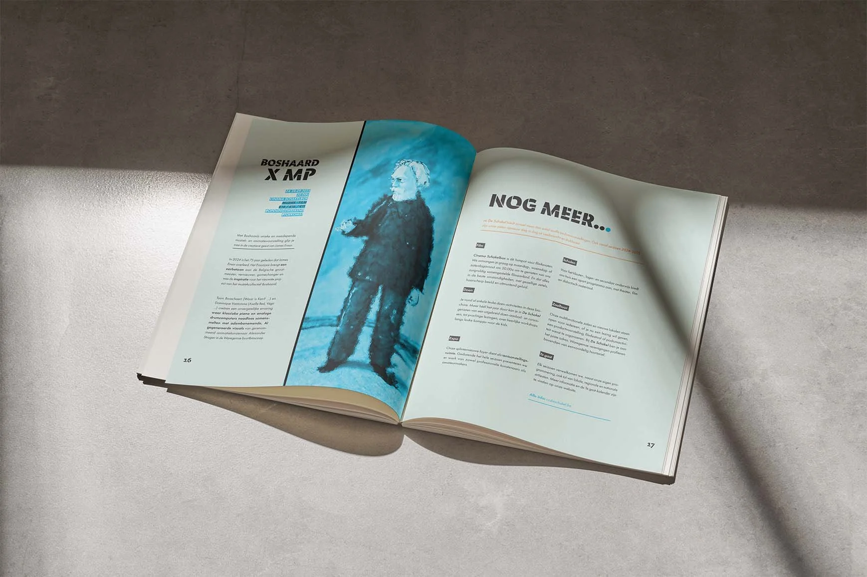
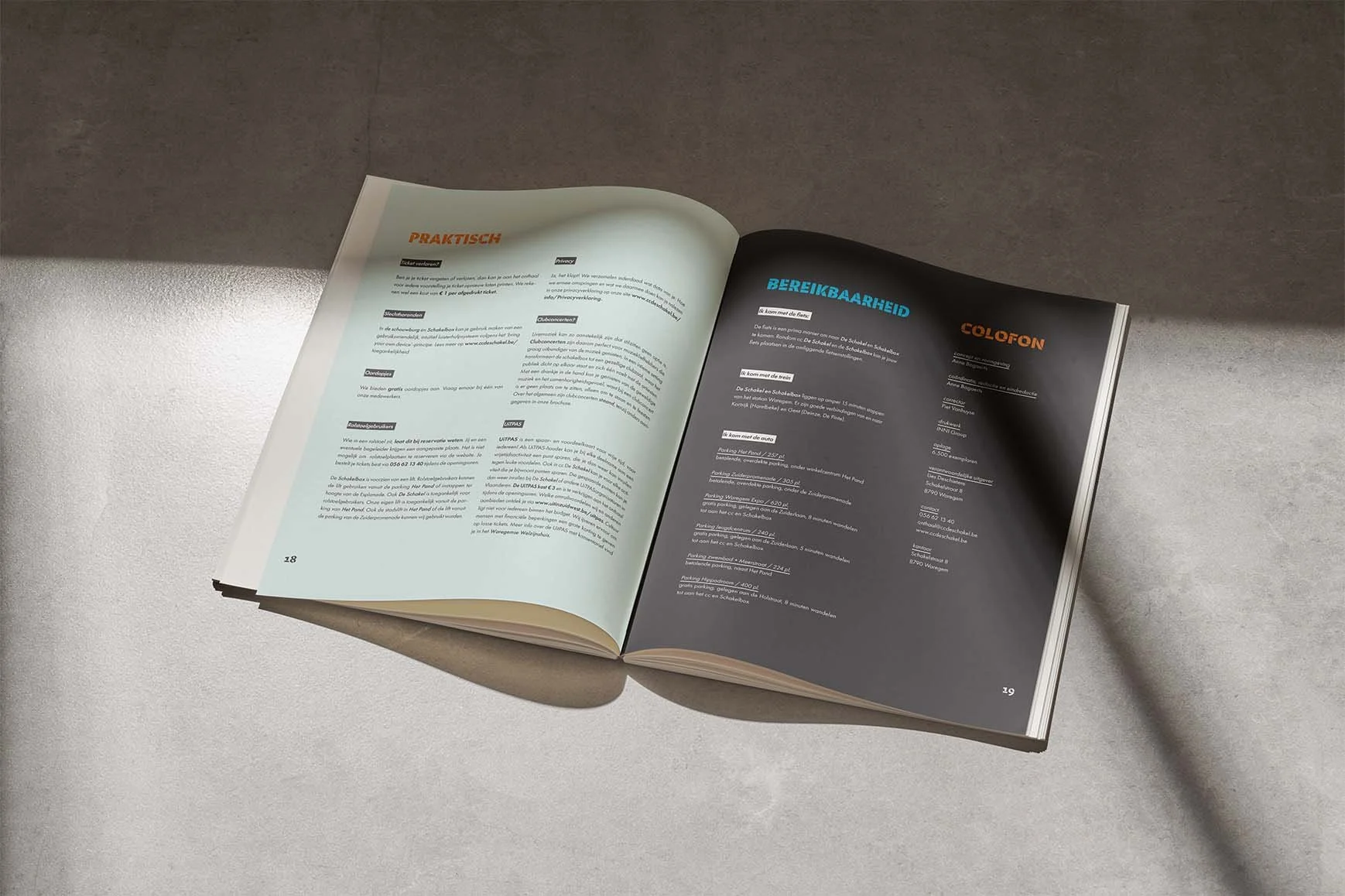
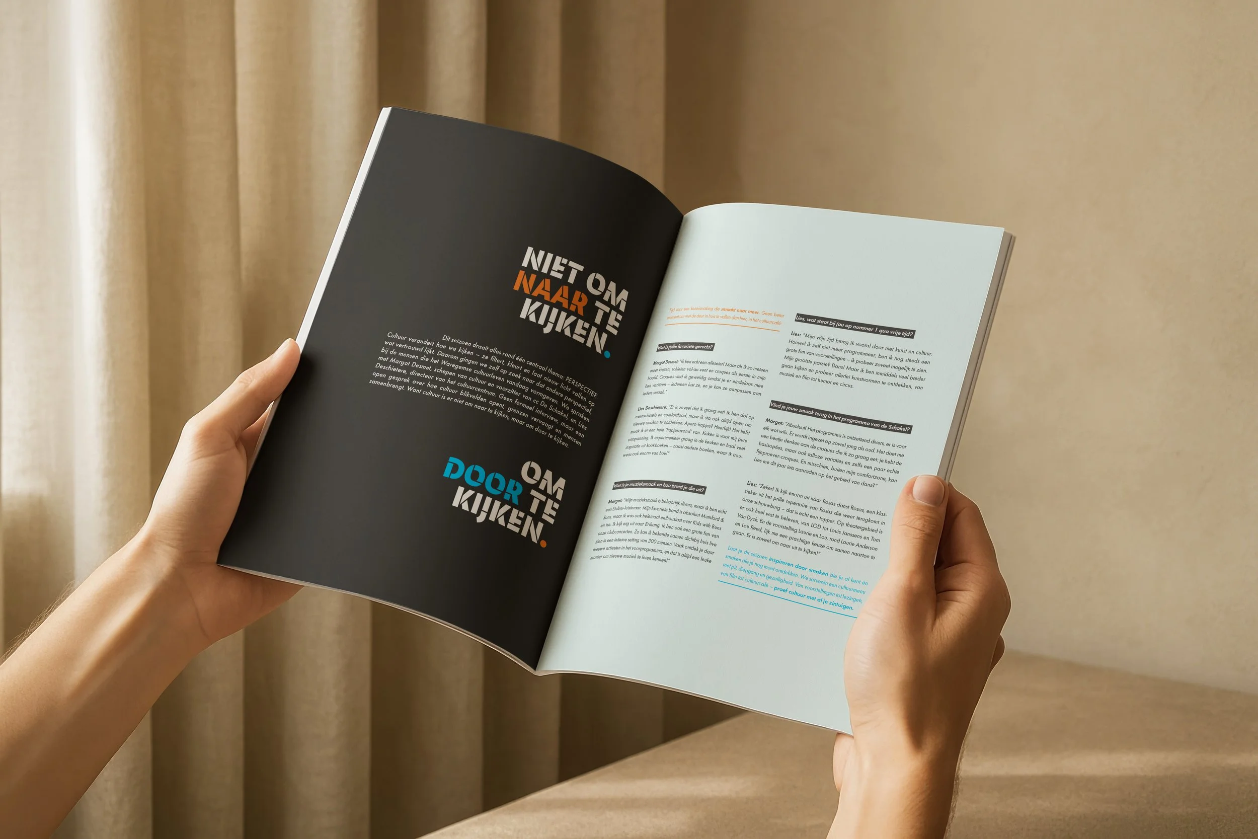
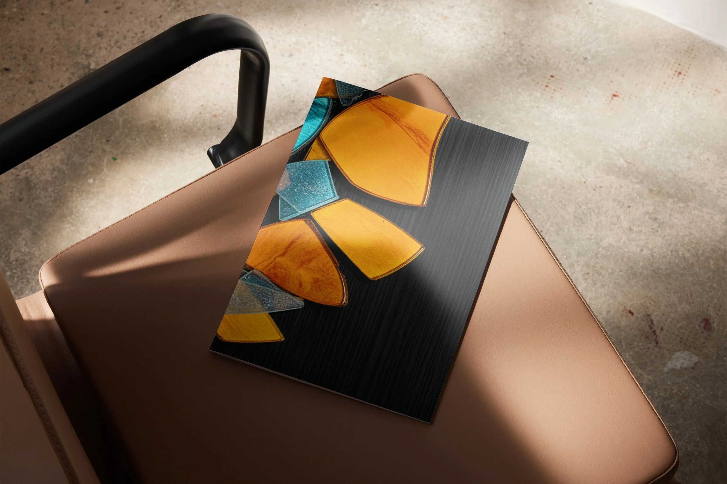
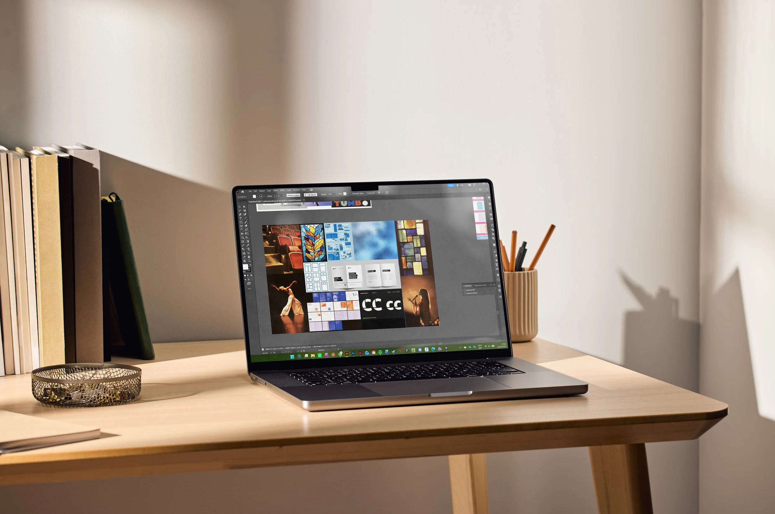
De Schakel 2026 is a cultural brochure designed to bring clarity and calm to a diverse programme. Rather than overwhelming readers with information, it invites them to look through culture, inspired by the visual logic of stained glass.
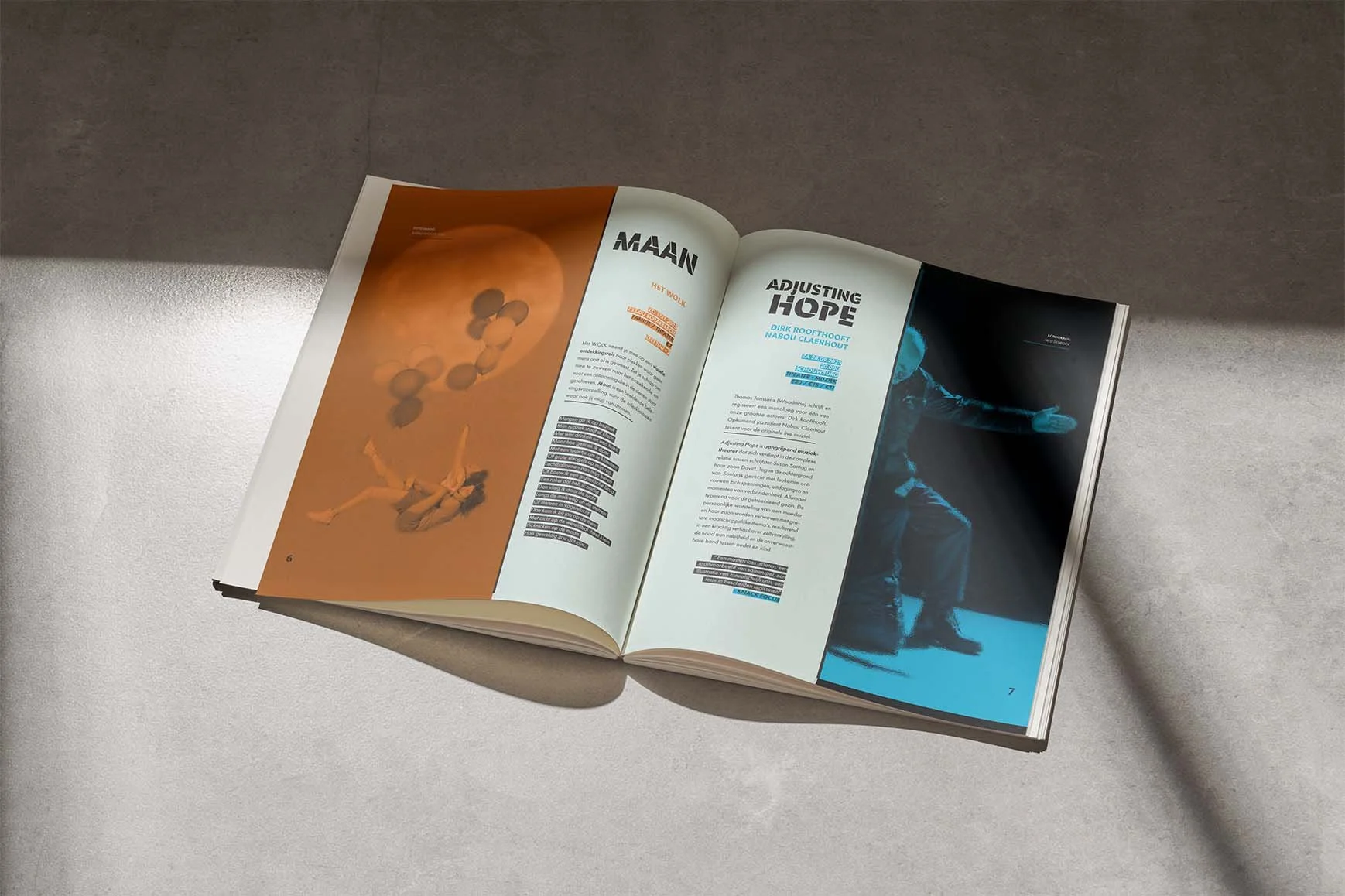
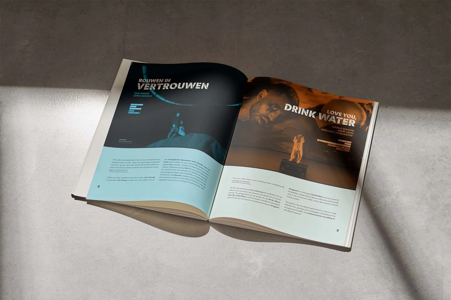
The visual identity reflects this idea. Transparent structures, a clear typographic hierarchy and an organised layout guide visitors naturally through the publication, creating a brochure that feels open, structured and quietly expressive.
Evaluation:
"You take me through your entire design process with great care. Your exploration of composition, colour and typography clearly shows experimentation and variation. The only thing I would have liked to see is more sketching on paper."
Conceptual educational project. Provided Images and texts were used for educational and mock-up purposes.
Process De Schakel 2026
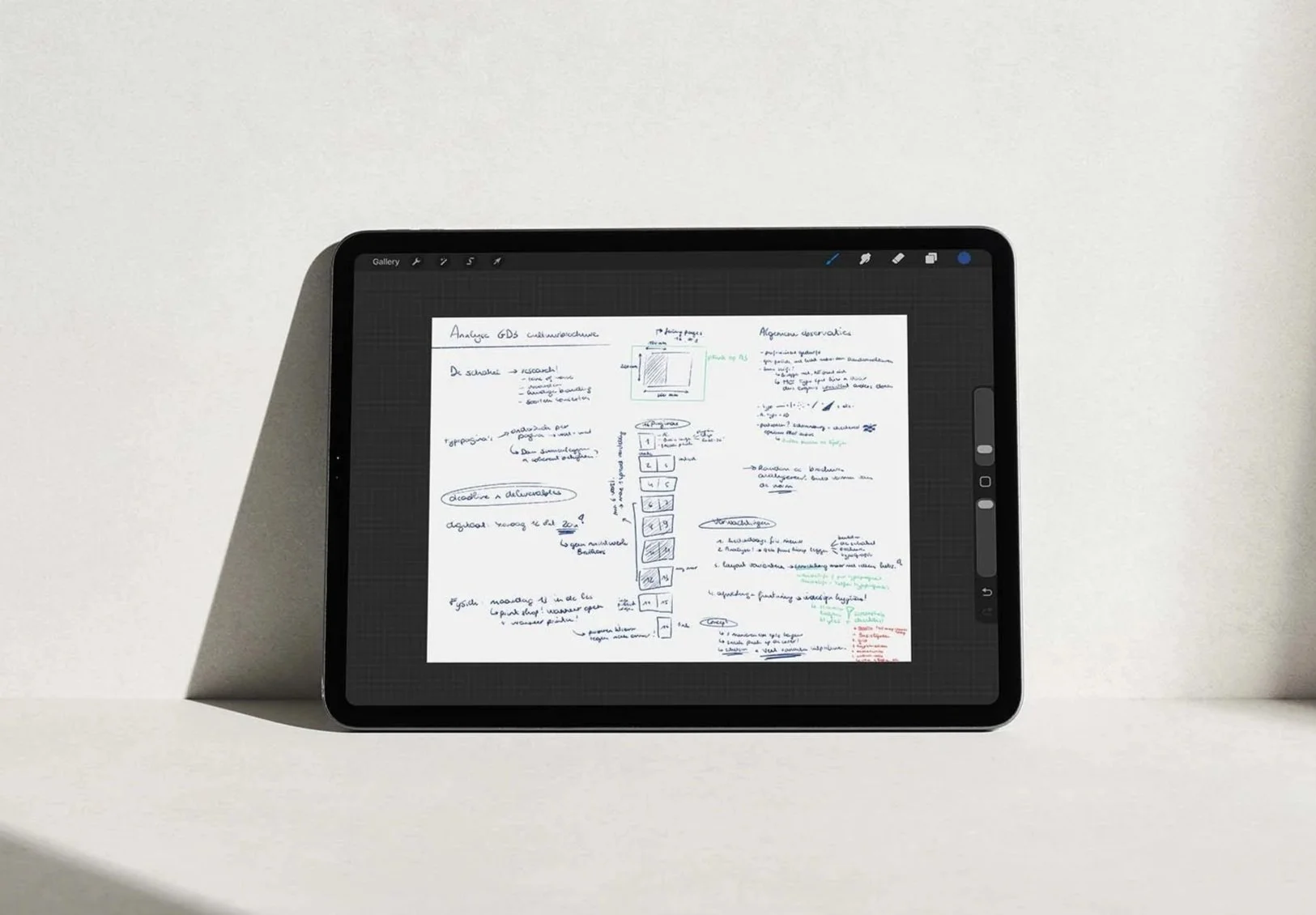
Analysis & Concept:
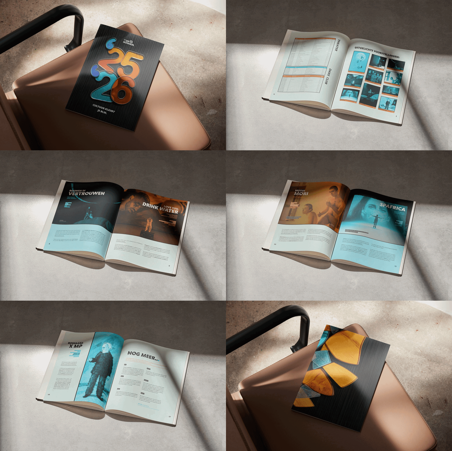
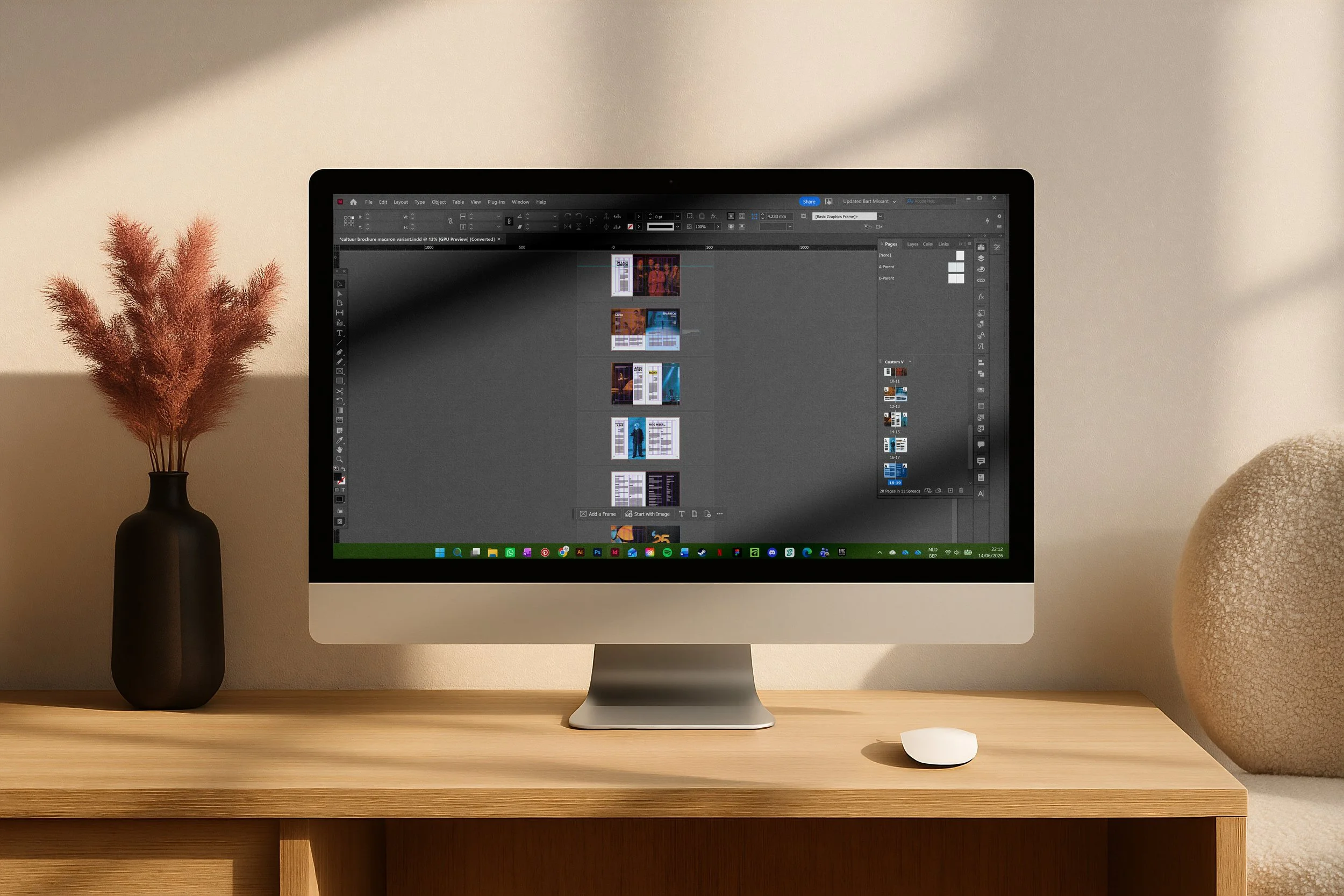
Because the editorial content was provided, my focus shifted entirely to structure and navigation. I developed a clear rhythm and page sequence, ensuring the programme remained accessible despite the large amount of information.
Iteration & Interpretation:
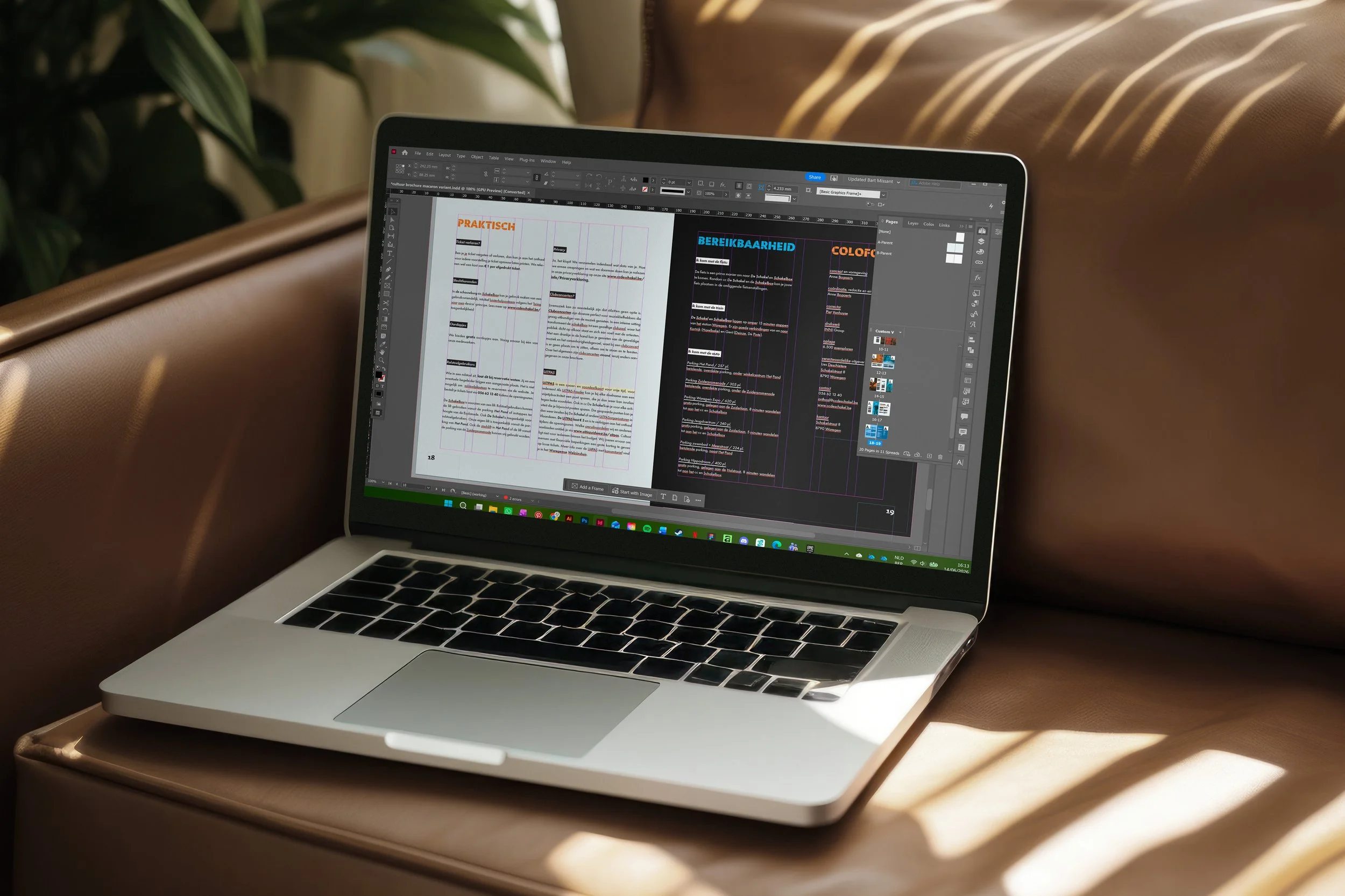
Using a structured grid and a restrained typographic hierarchy, I refined every spread through continuous testing. Each iteration improved the balance between imagery, white space and composition until the brochure felt both calm and intuitive to navigate.
Curious about the entire process behind this project? I'd be happy to share the full research, concept development and visual studies that shaped the final design. Feel free to get in touch.