LAYOUT DESIGN
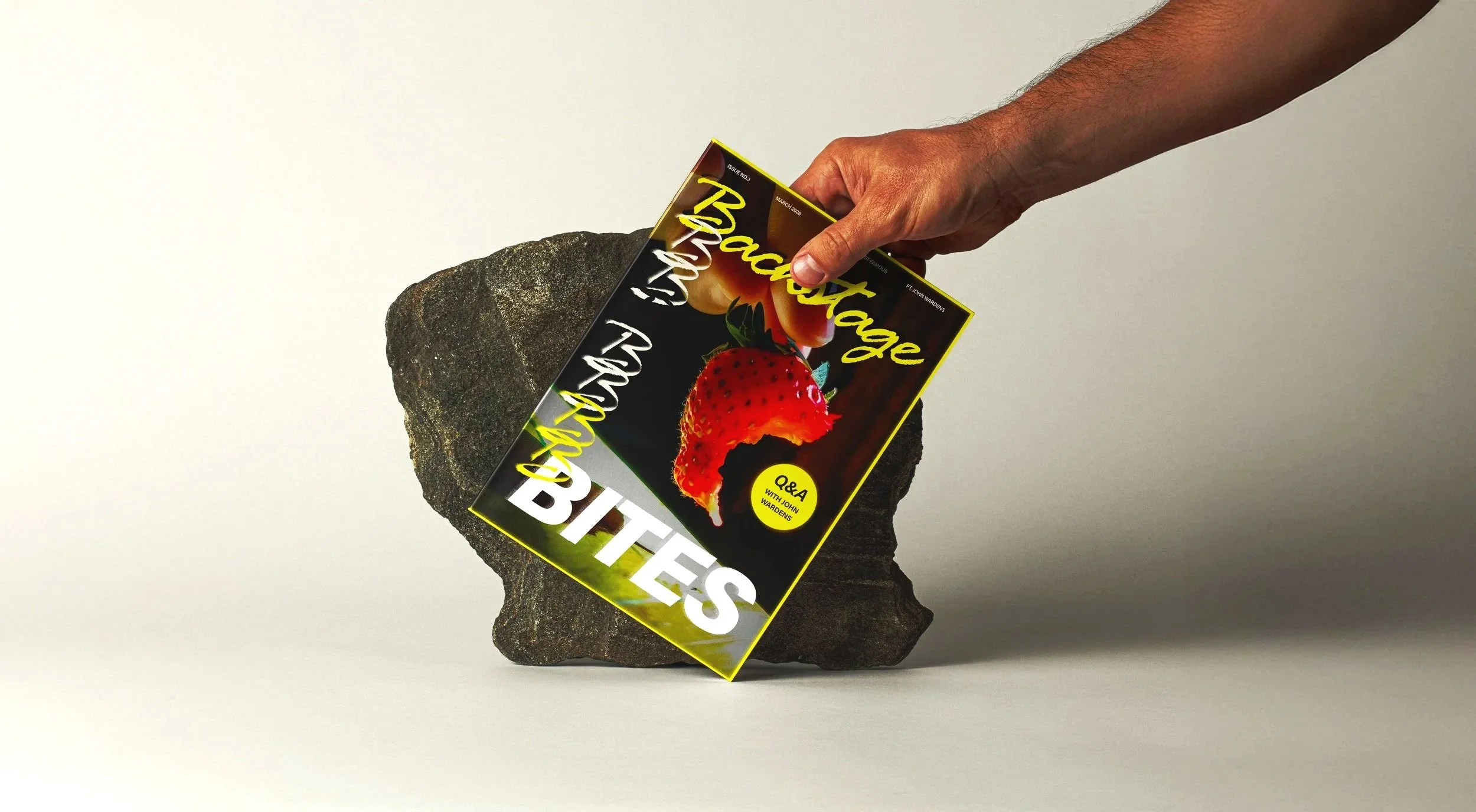
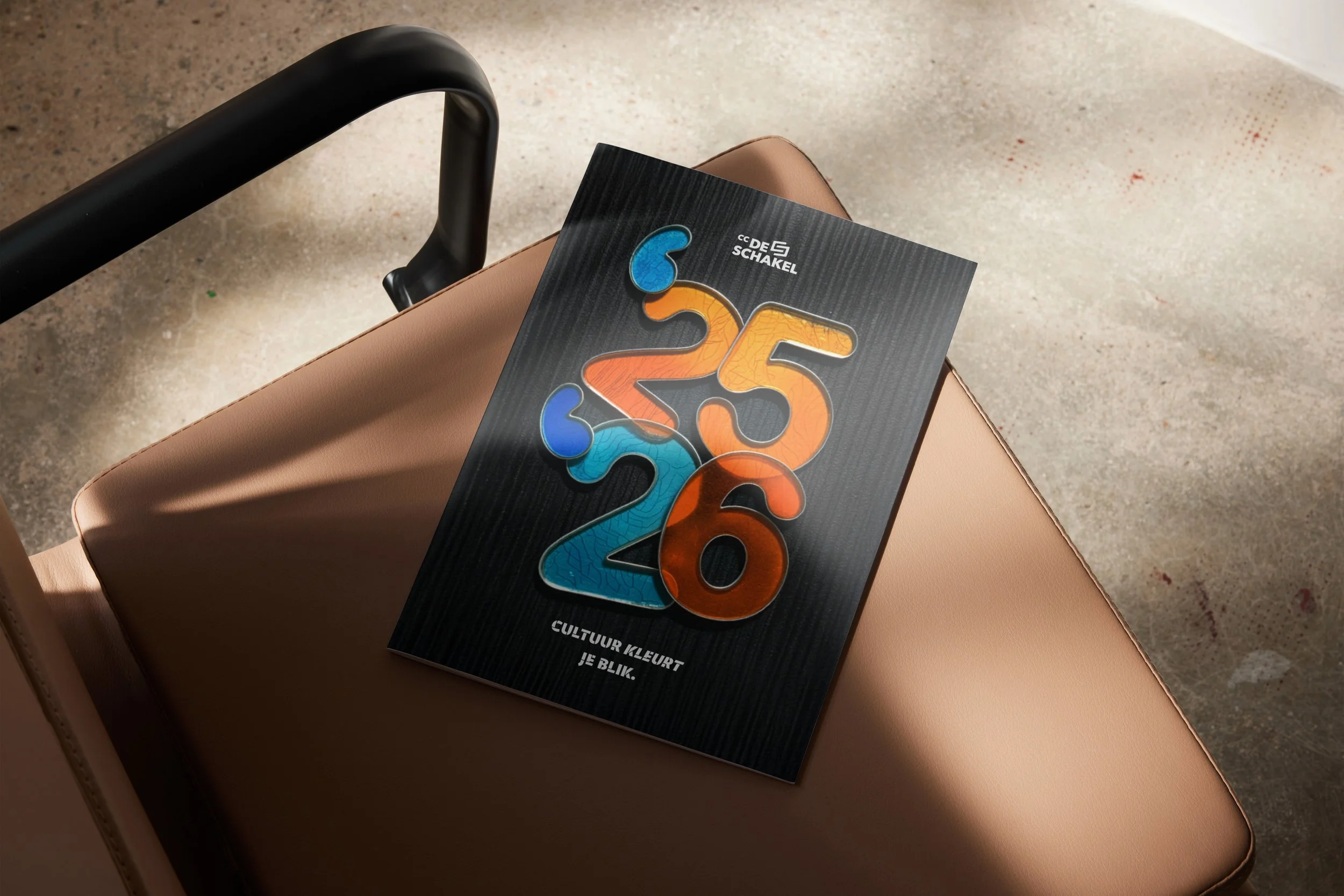
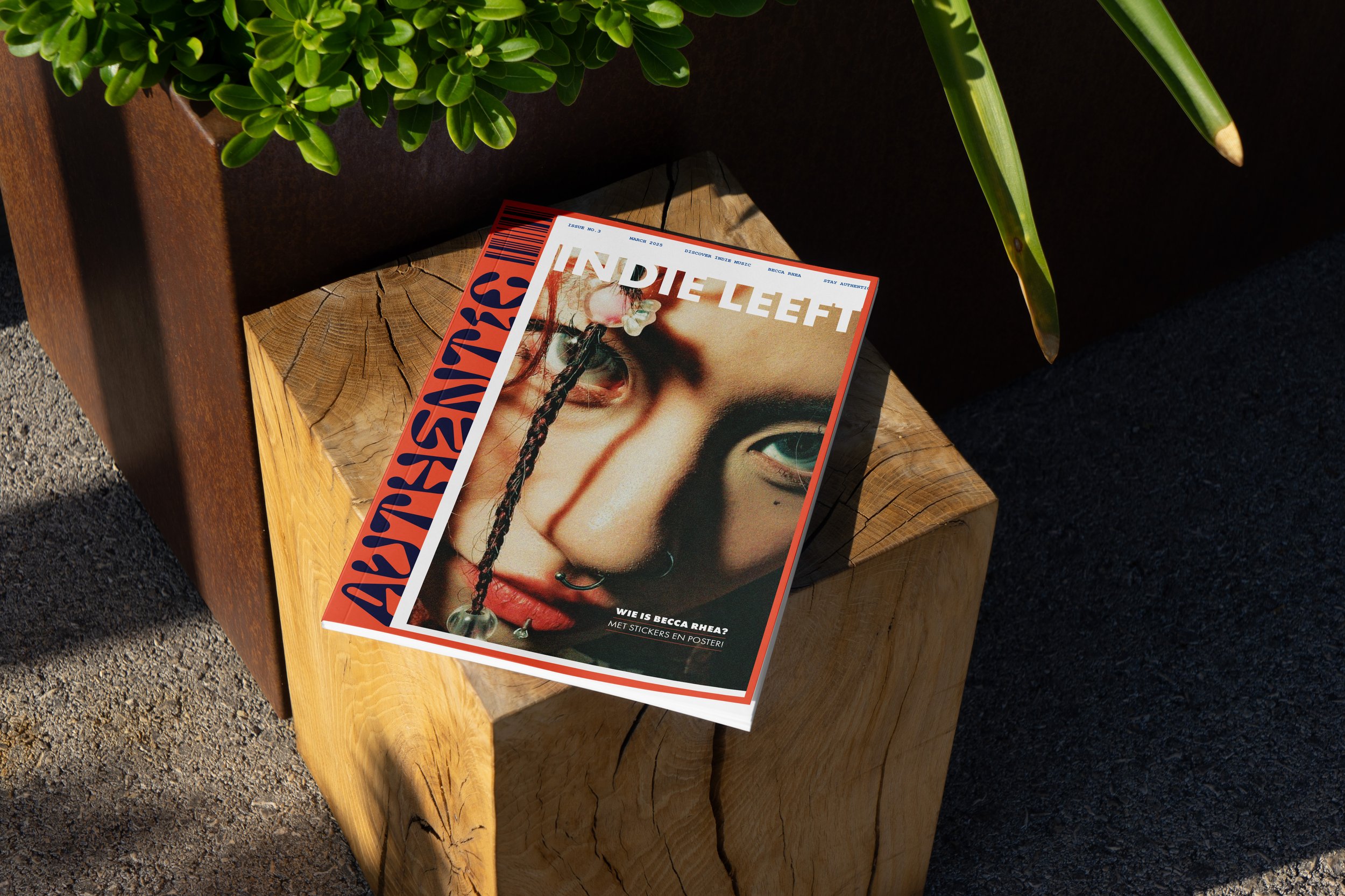
A closer look at three projects where I focused on editorial layout, structure, and storytelling through print.
Showcase 03
·
Showcase 03 ·
Authentic
Magazine concept
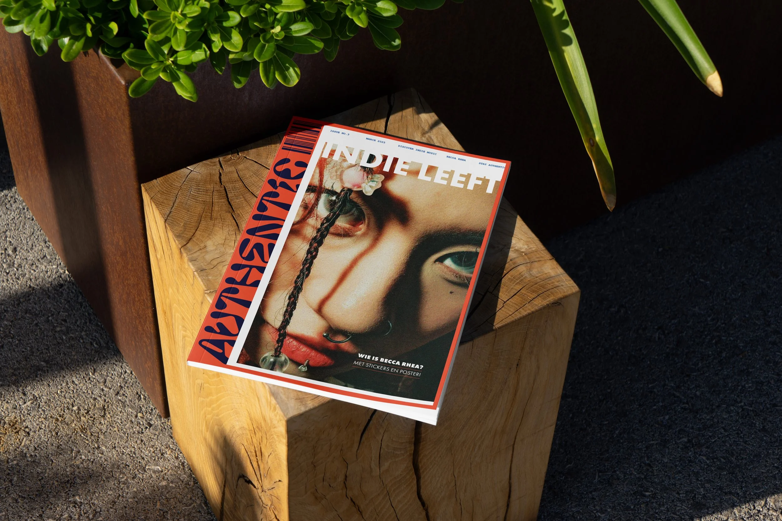
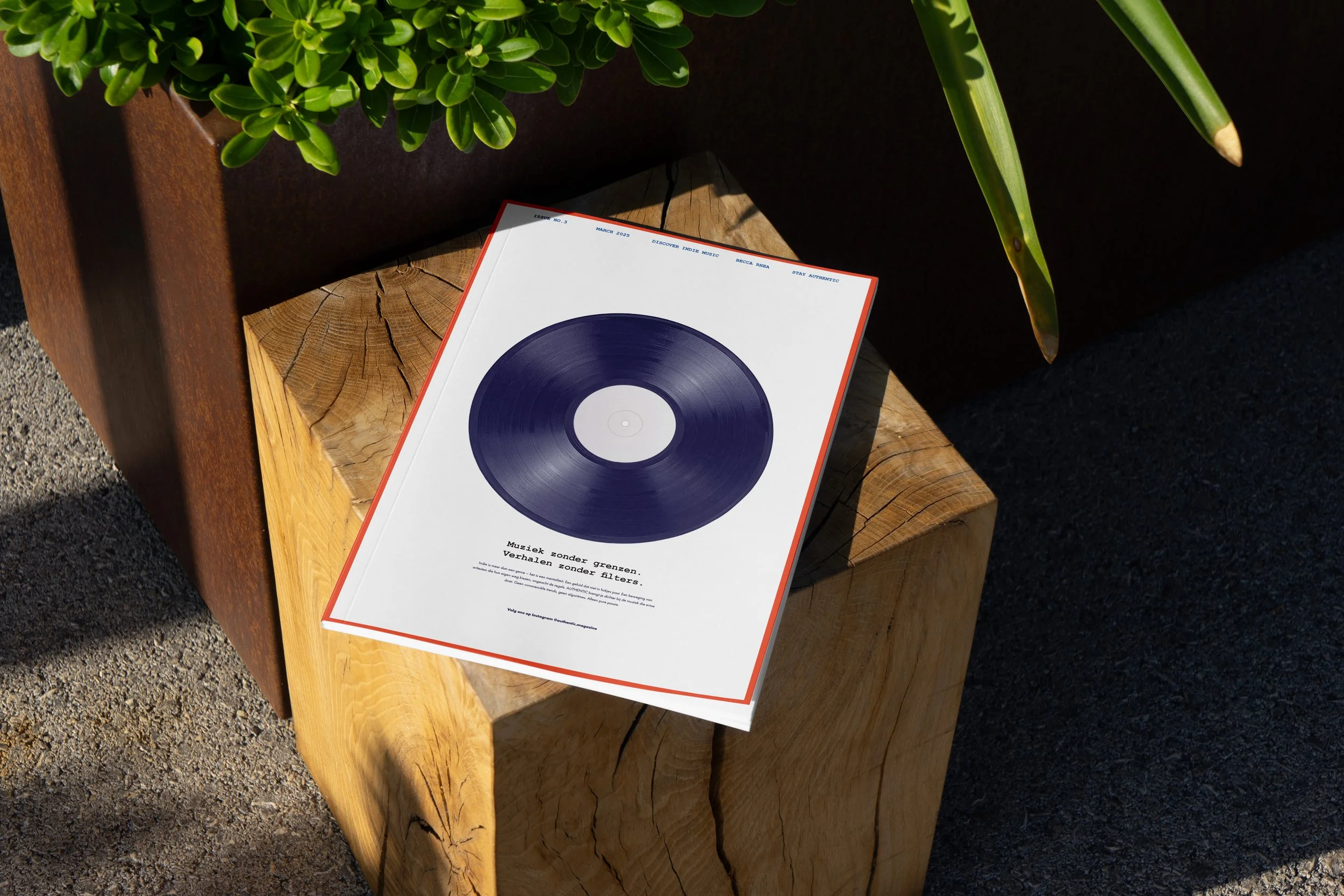
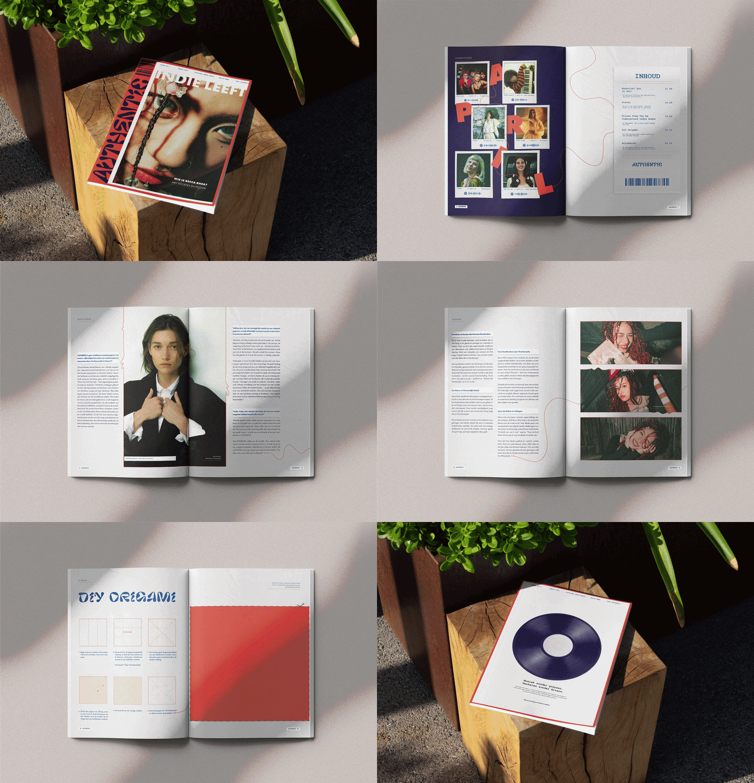
Authentic is an indie music magazine rooted in the spirit of DIY culture. Rather than striving for polished perfection, it explores the beauty of texture, noise and character within the underground music scene.
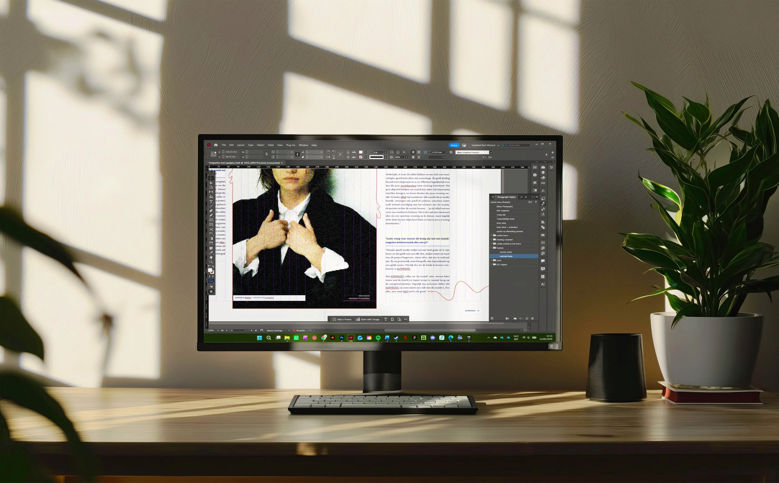
The visual identity reflects this attitude. Expressive typography, dynamic imagery and spacious layouts capture the raw, honest energy of independent music, while a clear editorial structure keeps the magazine readable and grounded.
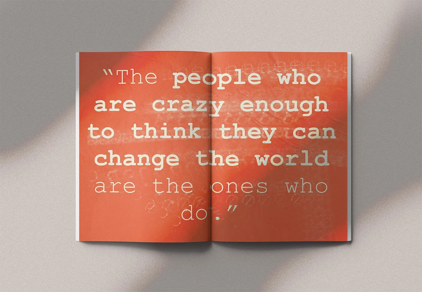
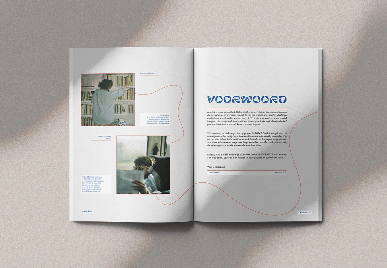
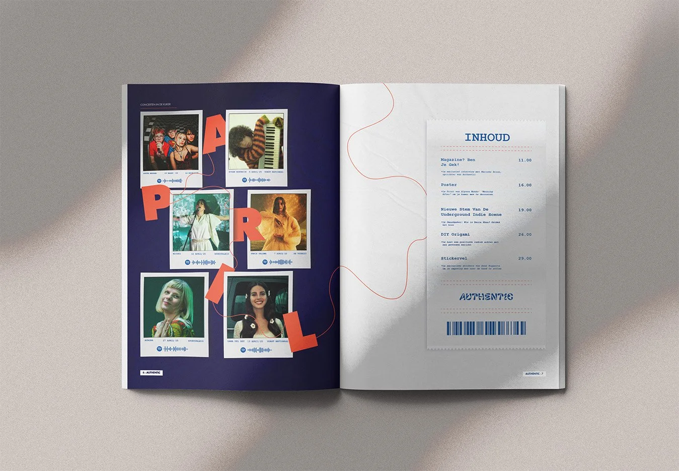
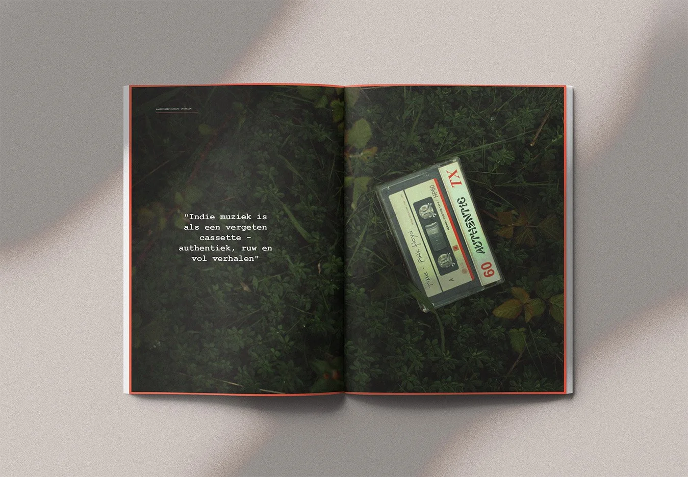
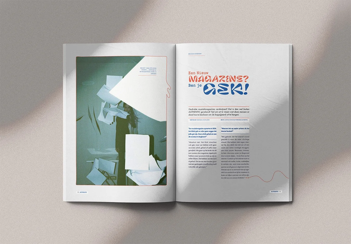
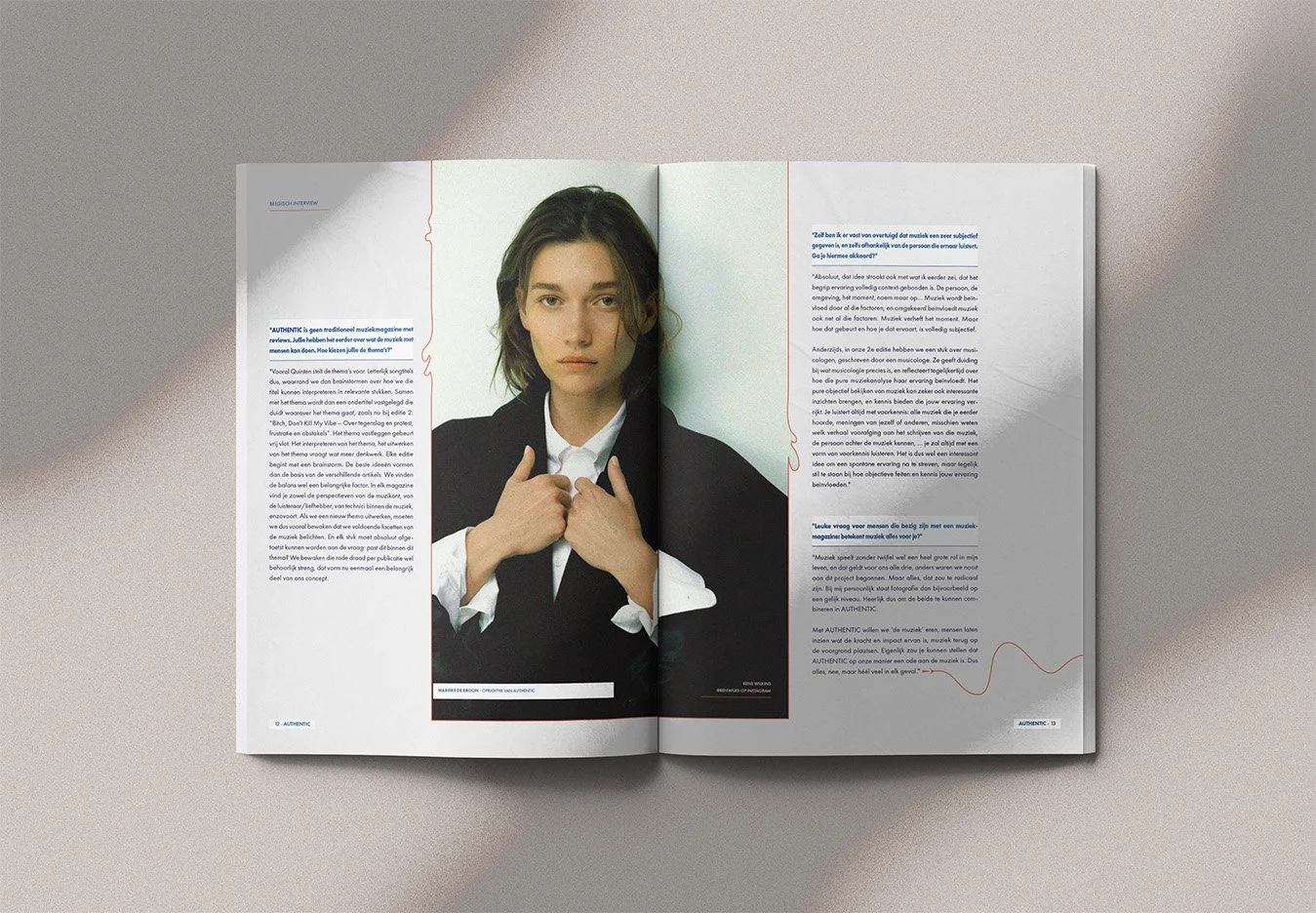
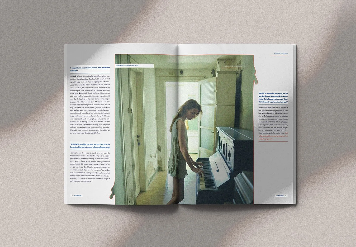
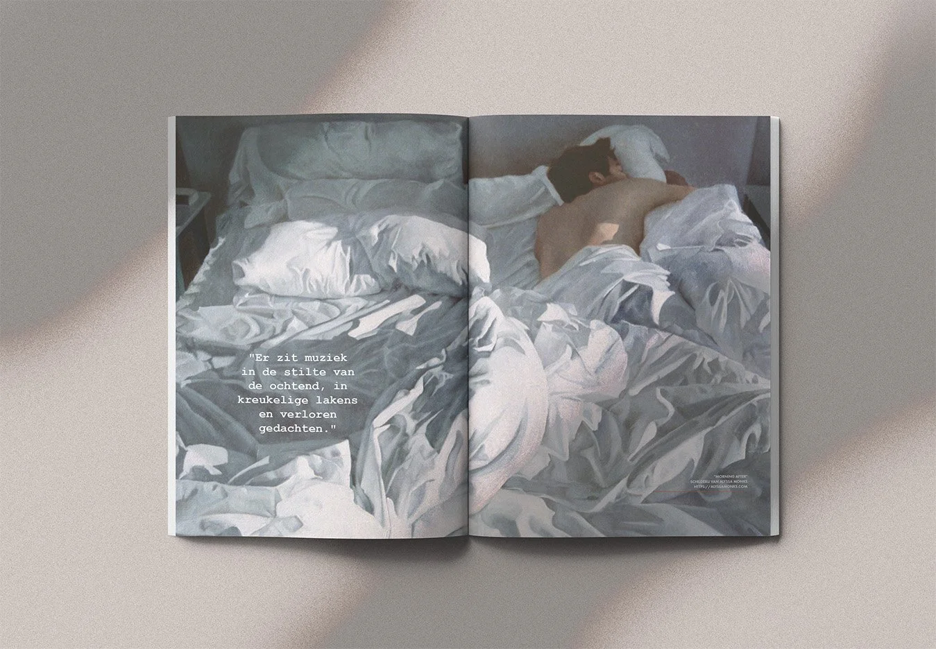
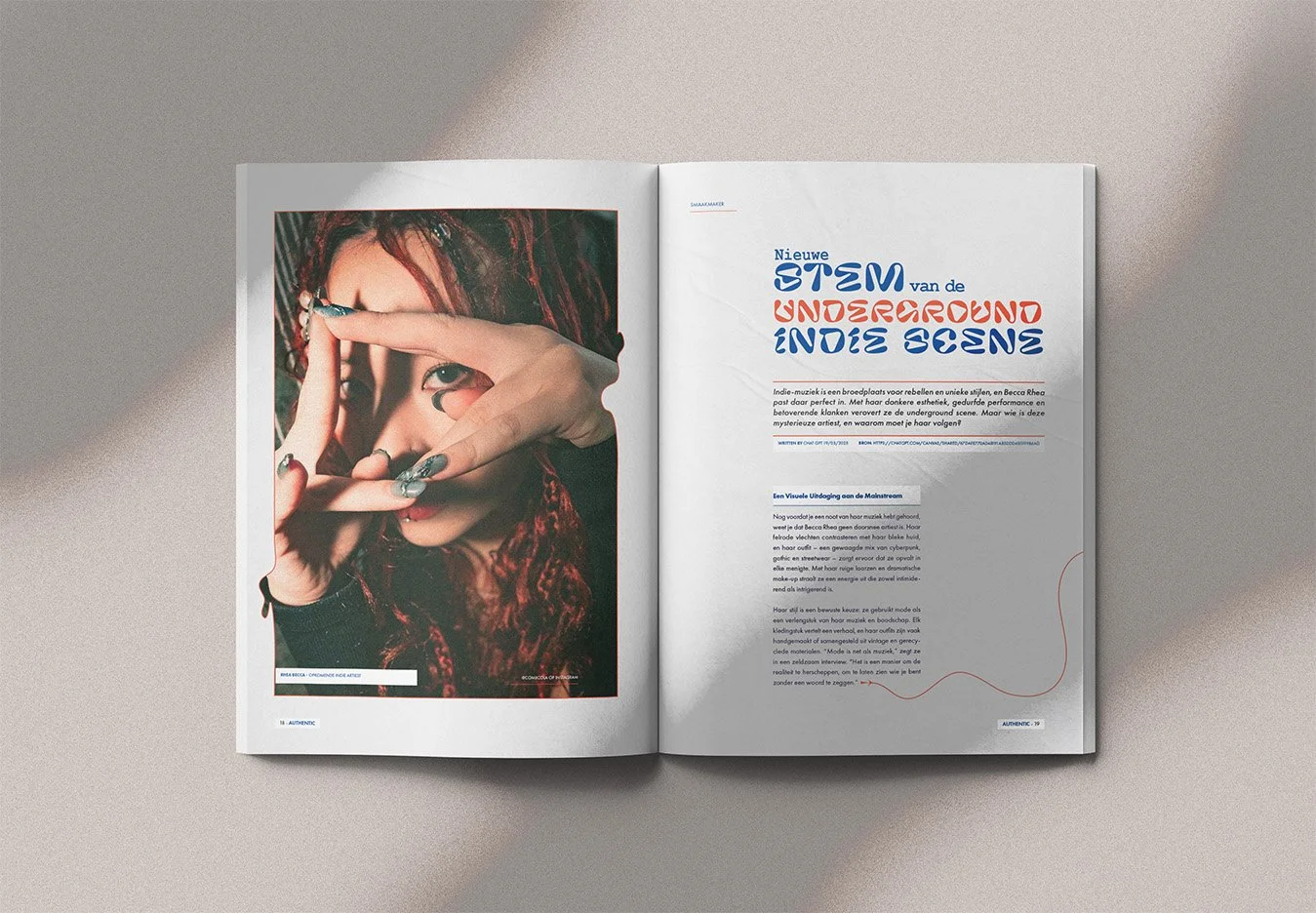
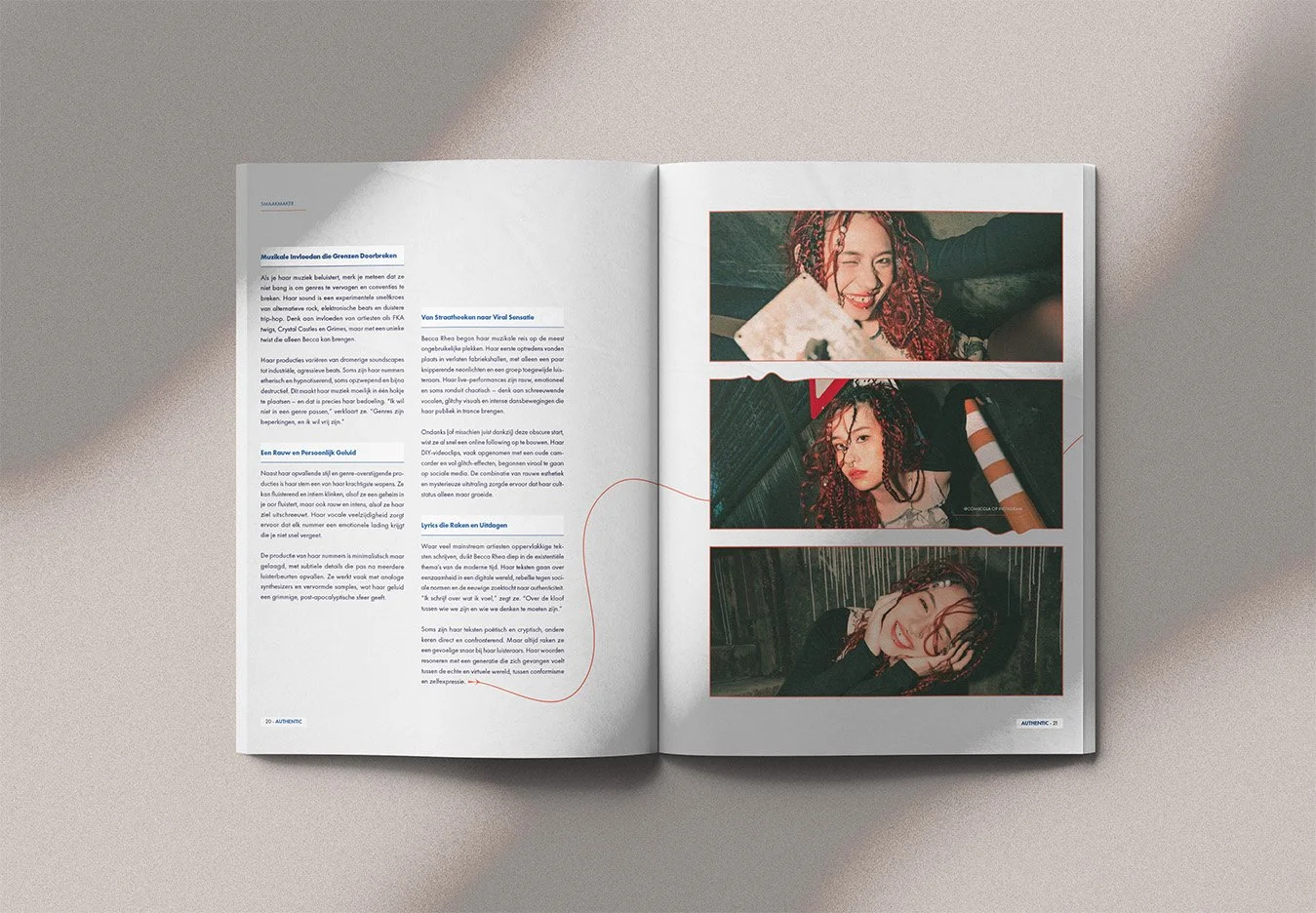
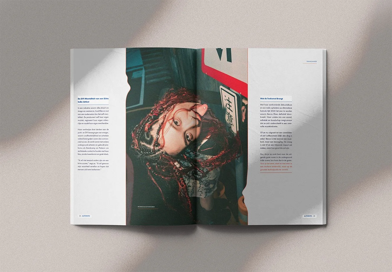
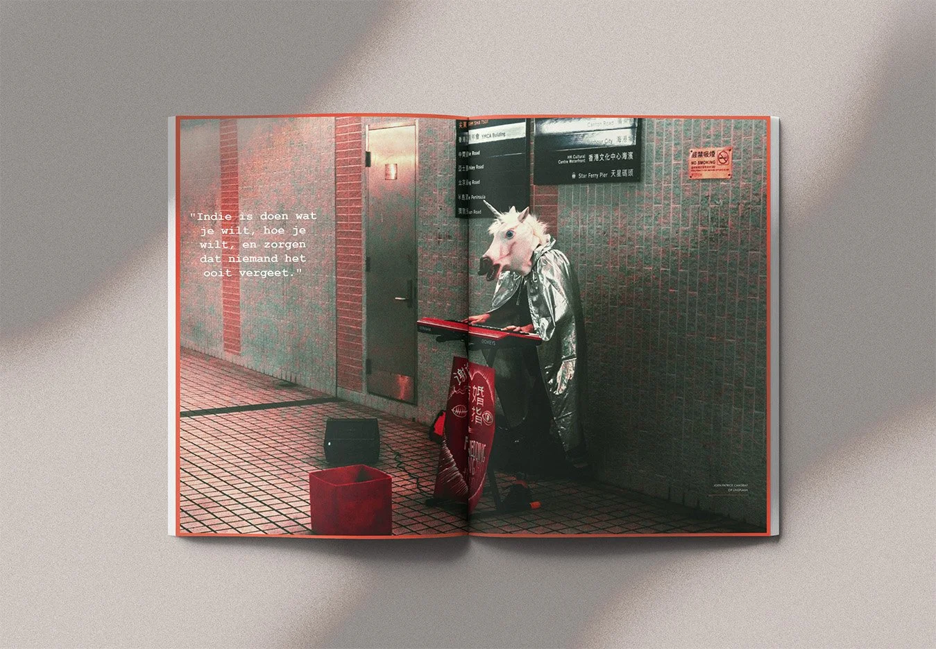
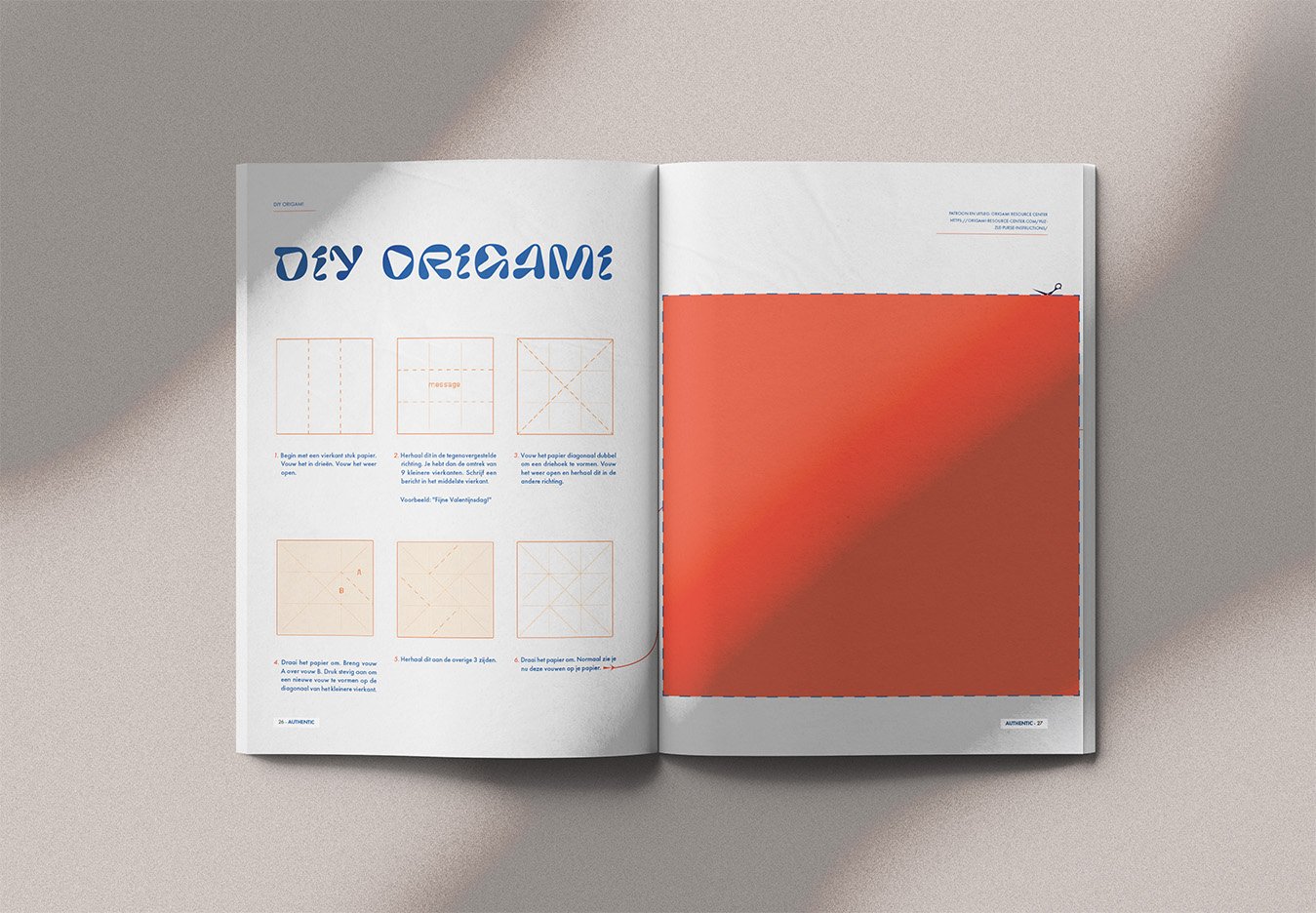
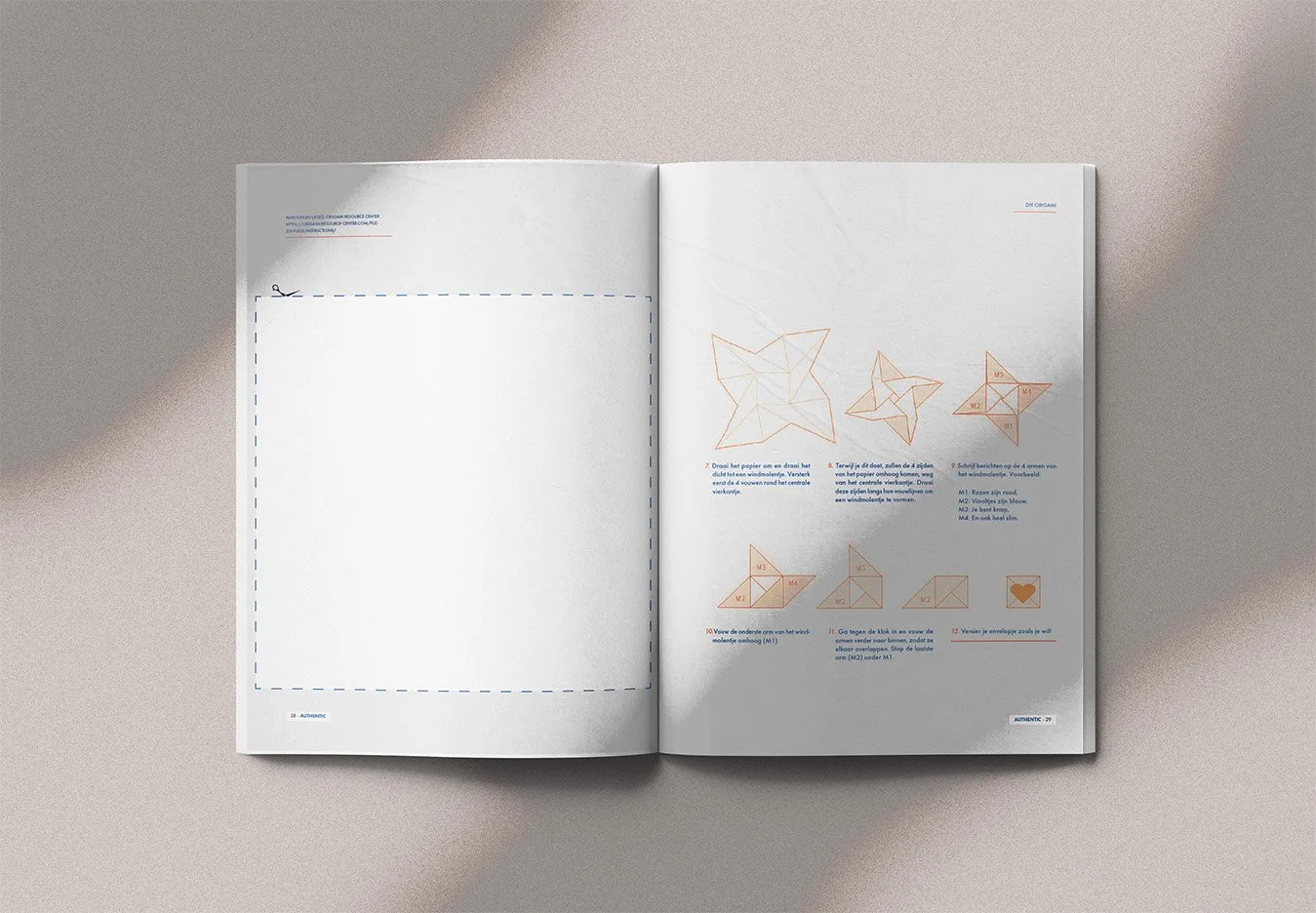
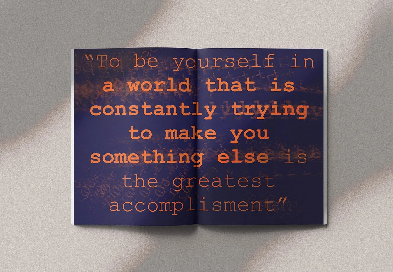
Conceptual educational project. Images and generated texts were used for educational and mock-up purposes.
Evaluation:
"Clear analysis. You discuss a wide range of references. Strong studies, a well-documented process and original design decisions. The typography is carefully refined and the magazine is highly usable."
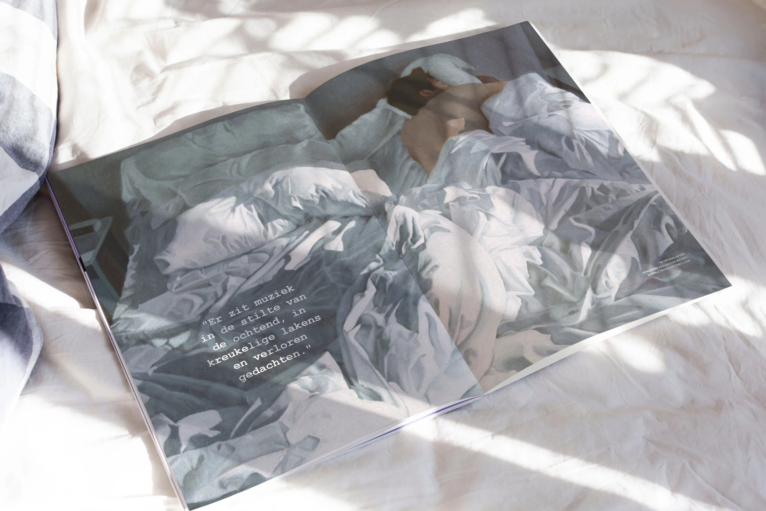
Process Authentic
Analysis & Concept:
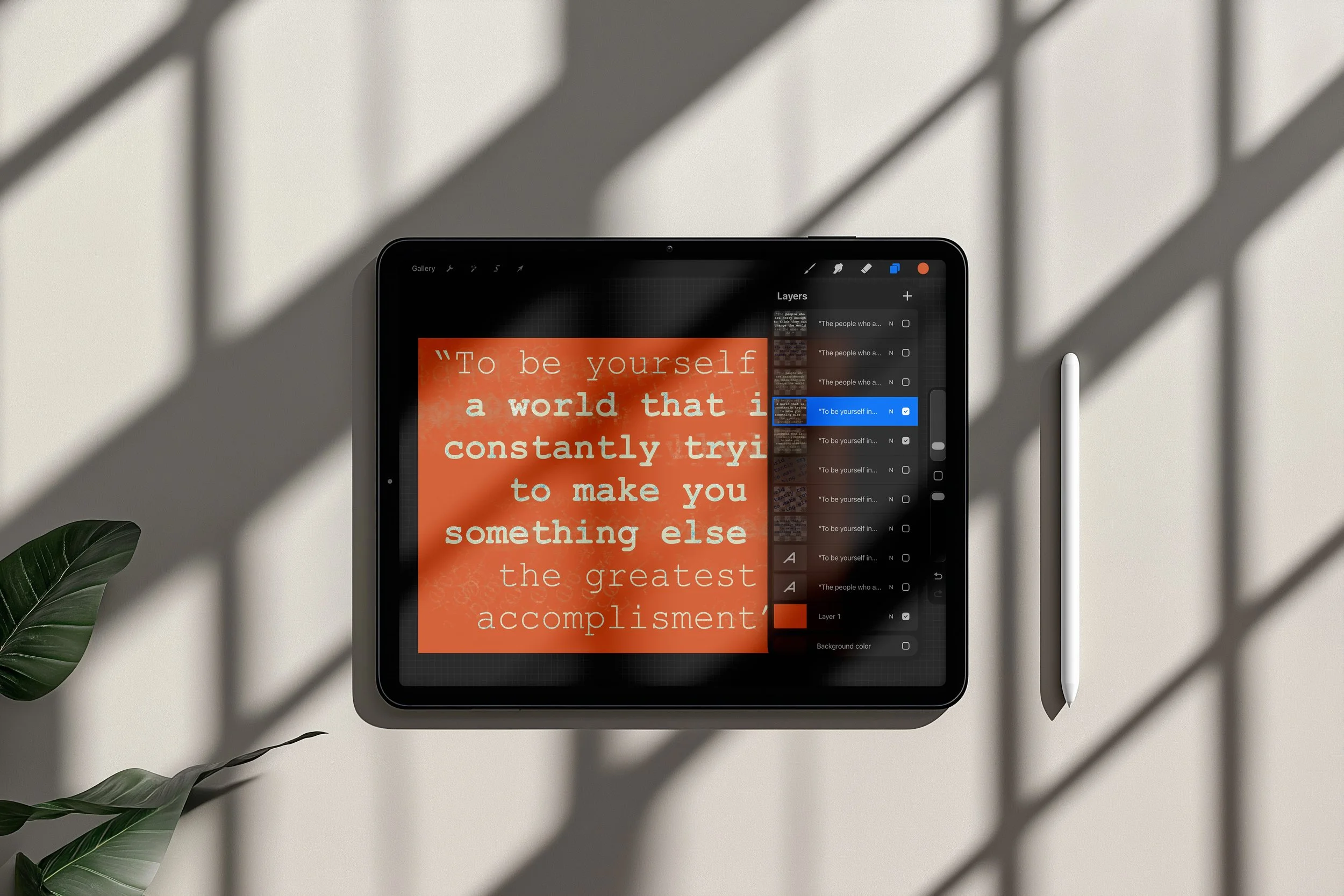
For Authentic, I stepped beyond the role of designer. I wrote the copy, selected the imagery and gathered stories that reflected the spirit of independent musicians. These elements became the foundation for an editorial concept in which every spread contributes to one coherent narrative.
Iteration & Presentation:
Through multiple iterations, I refined the typography, pacing and visual rhythm until every page felt connected. The final result is an editorial identity with a distinctive voice, balancing expressive design with clarity and readability.
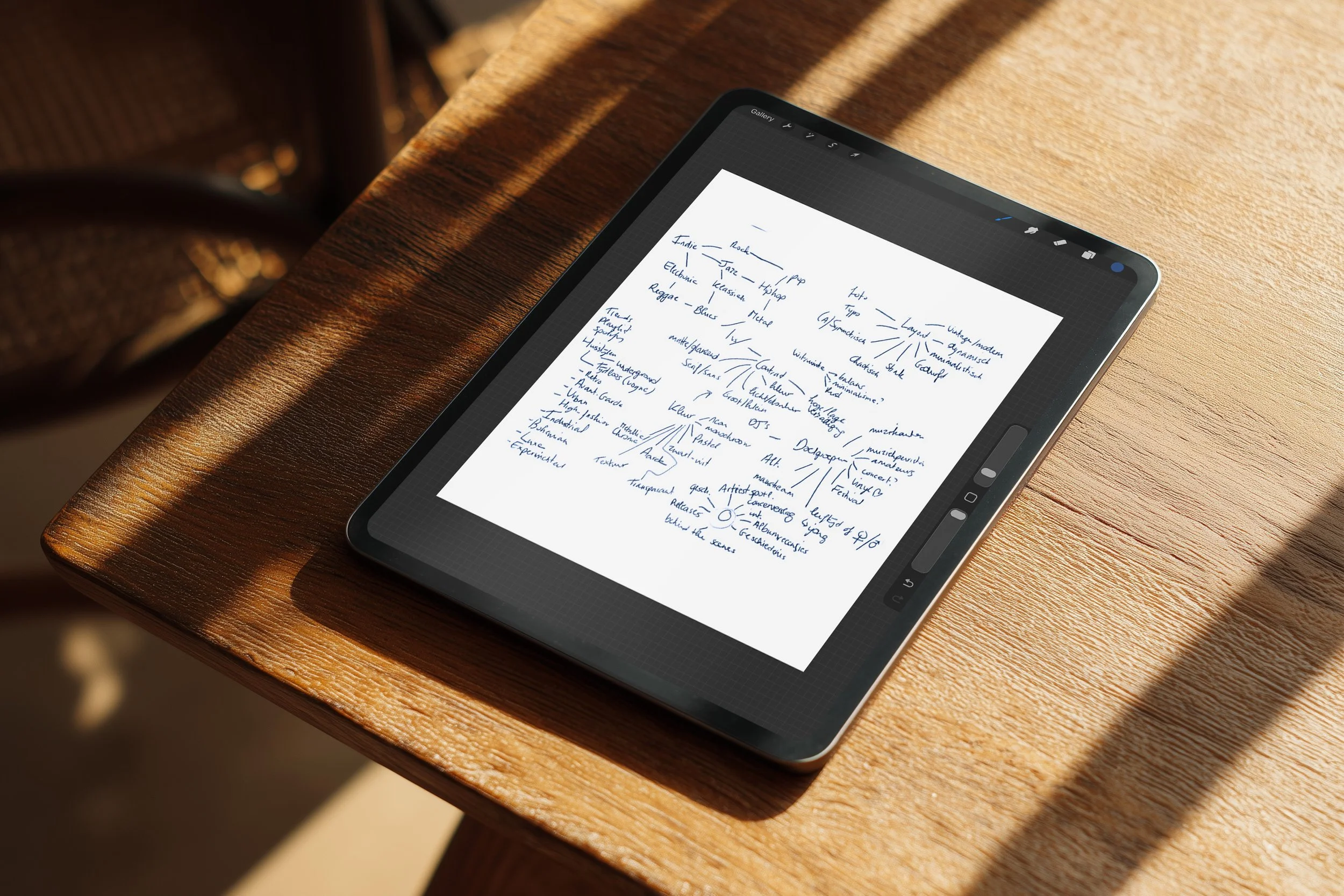
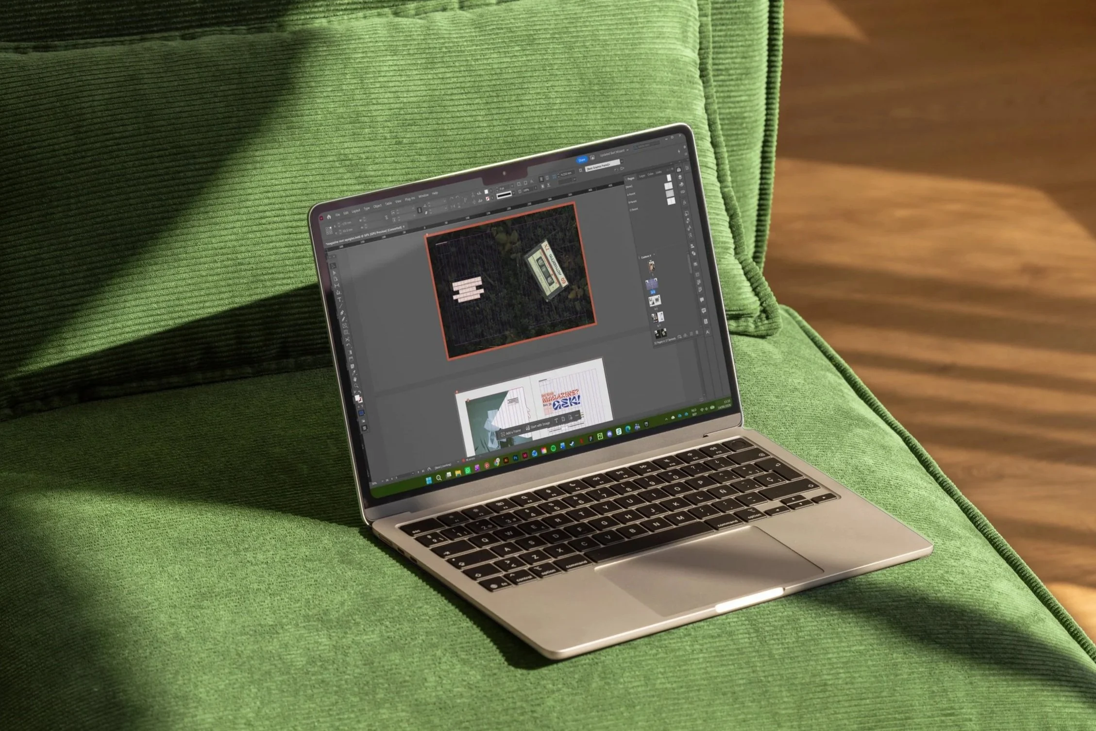
Curious about the entire process behind this project? I'd be happy to share the full research, concept development and visual studies that shaped the final design. Feel free to get in touch.