EXPLORATIONS
A selection of school assignments where I explored different mediums, styles, and design directions.
Additional Case 06
·
Additional Case 06 ·
Skön
Logo concept
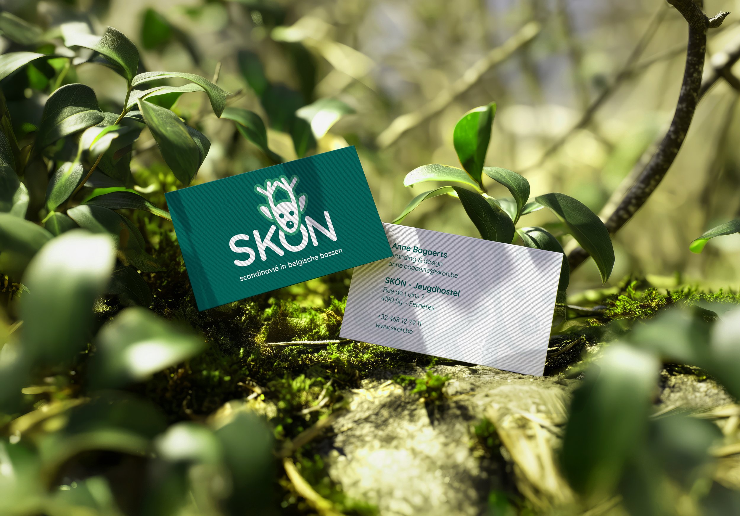
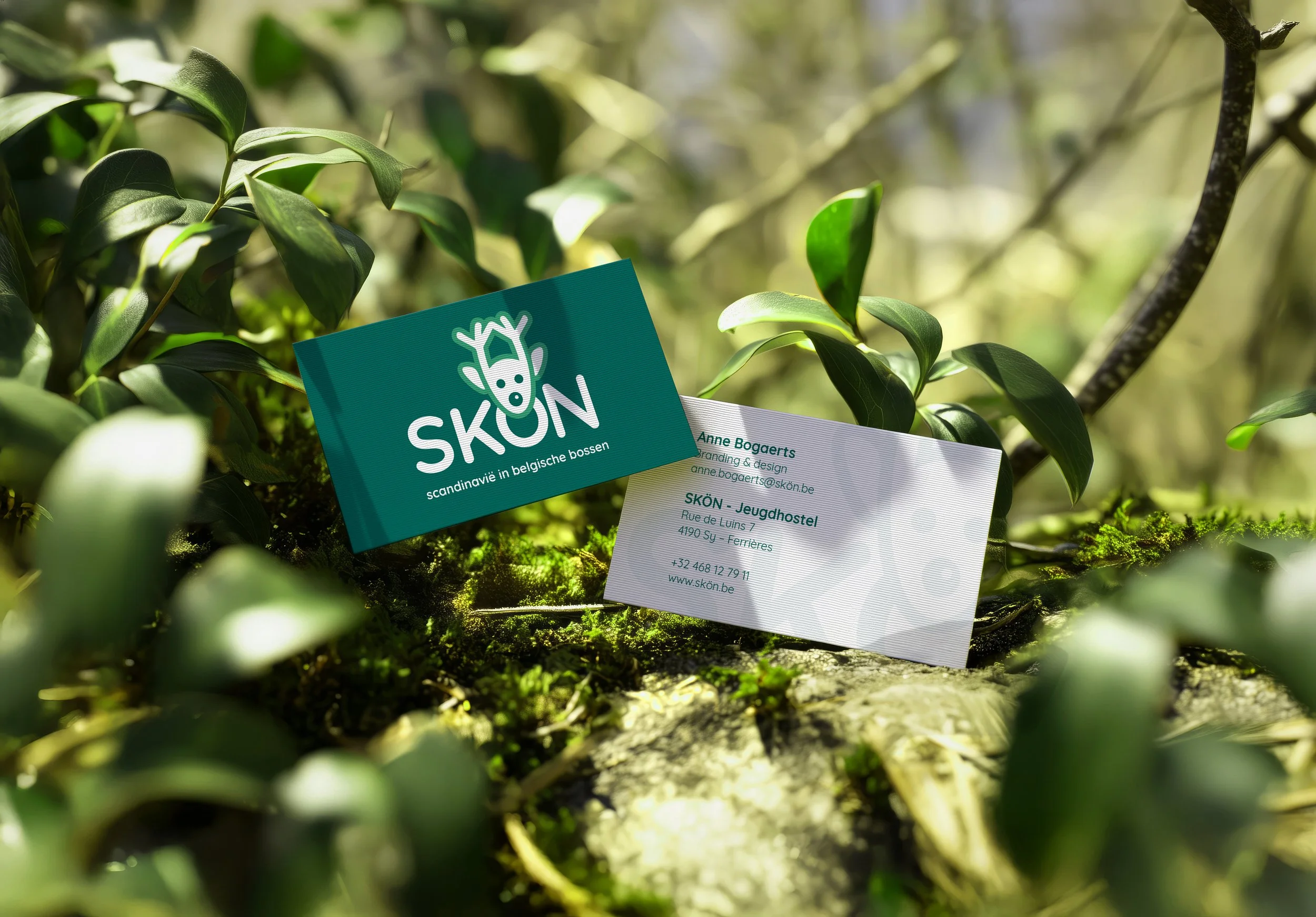
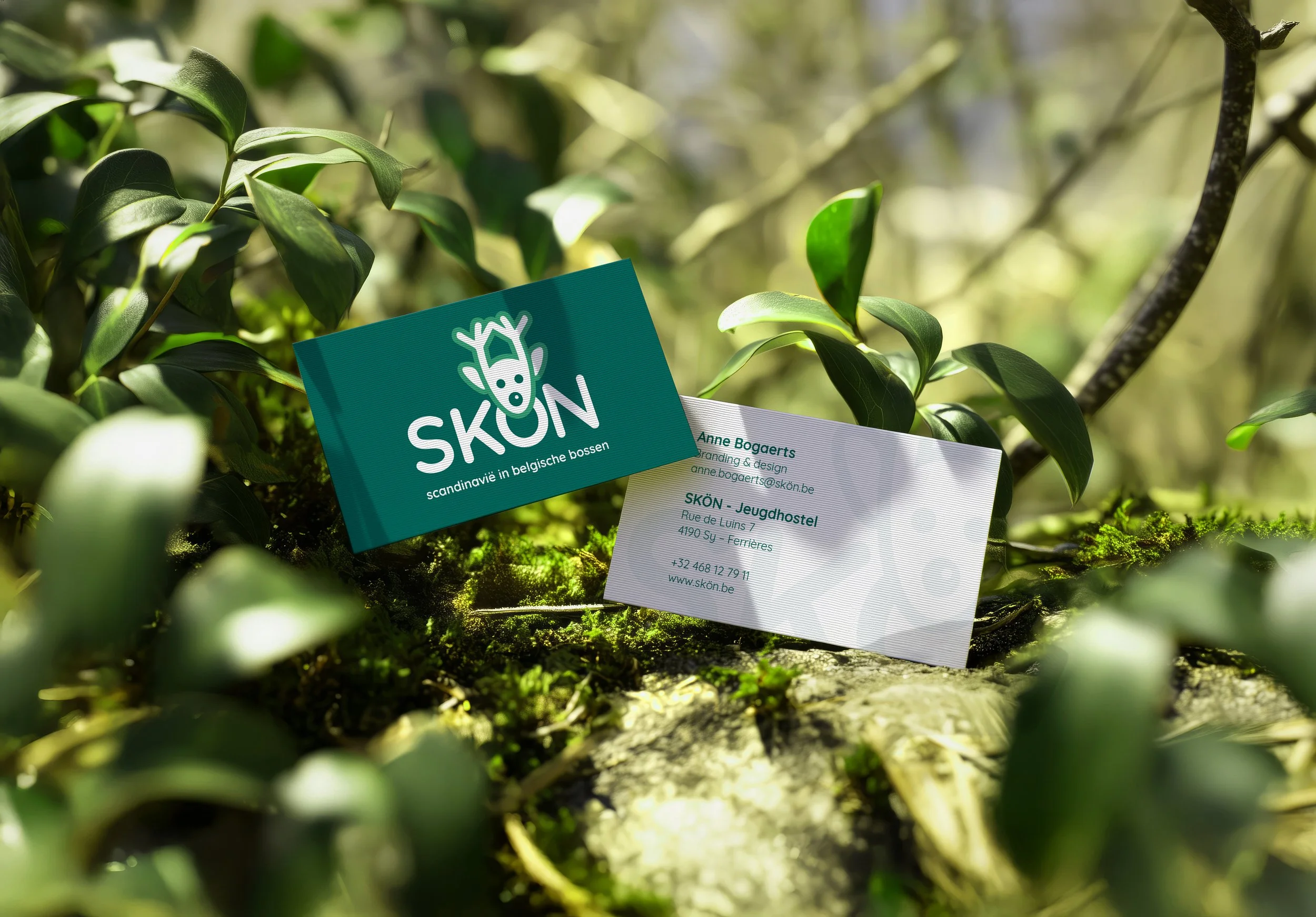
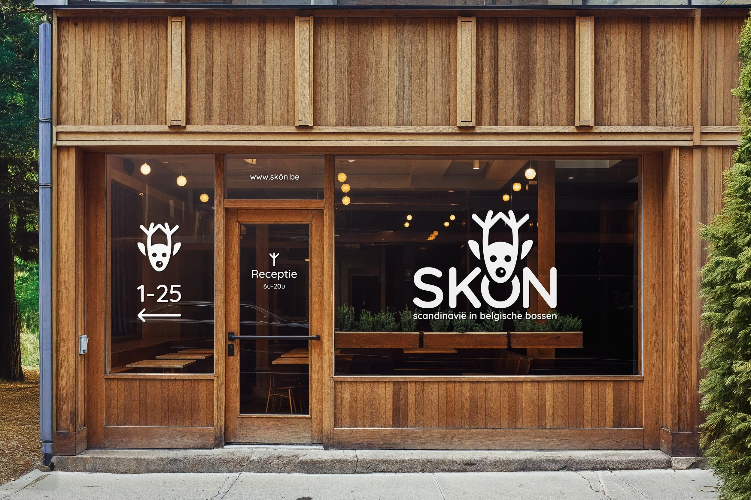
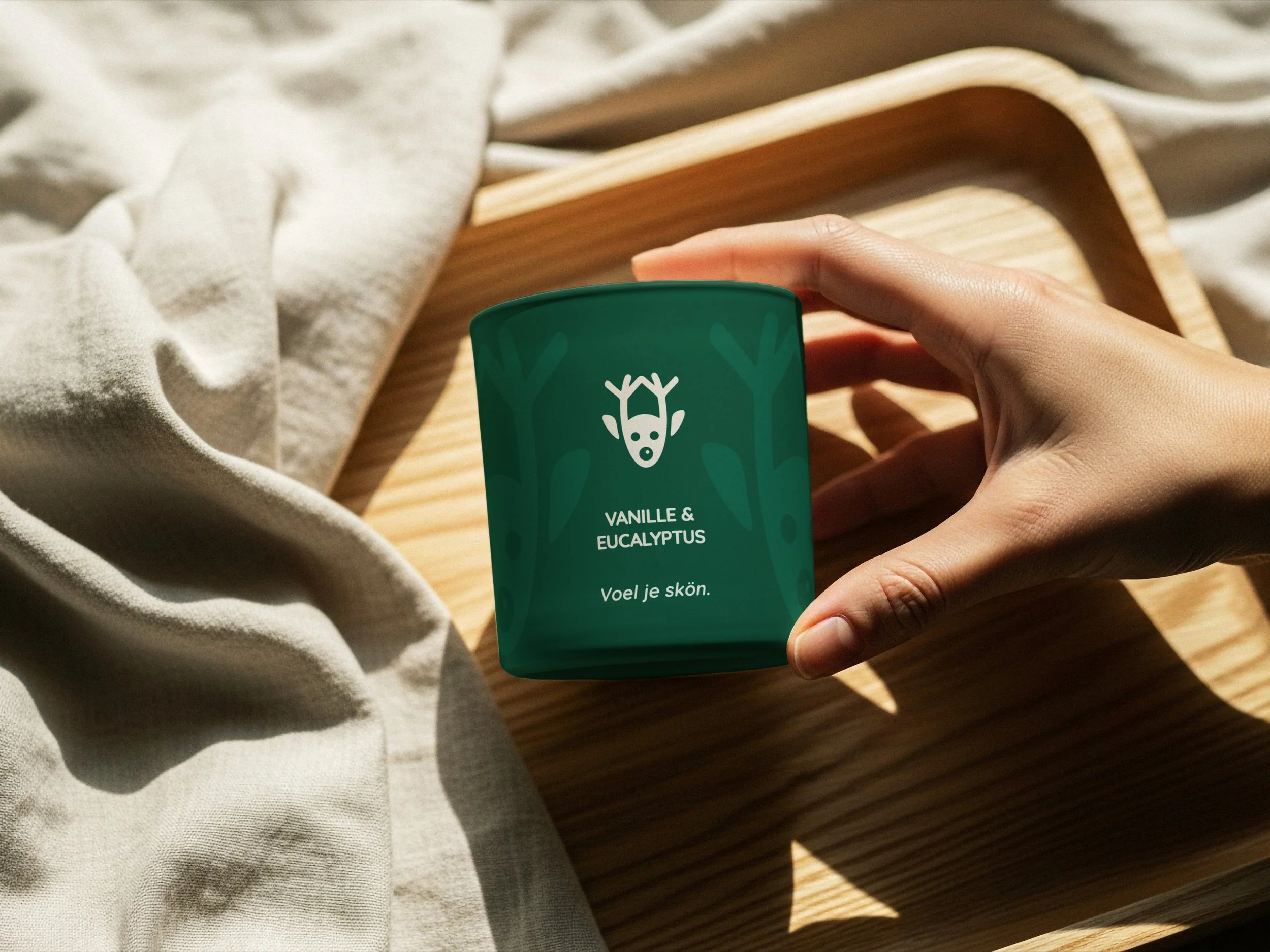
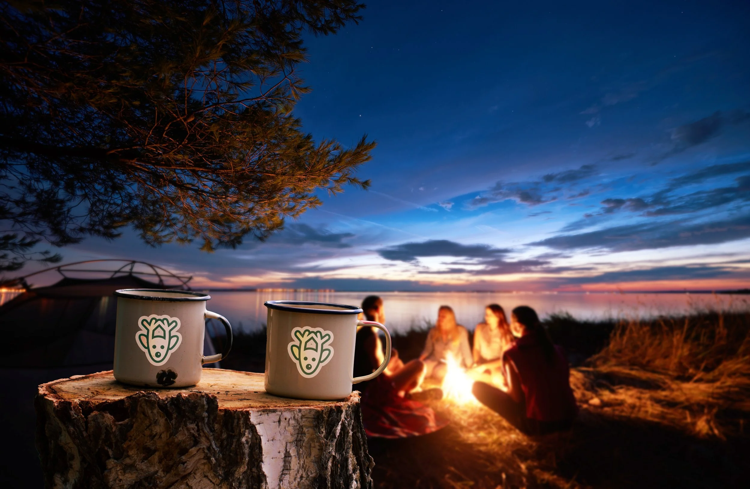
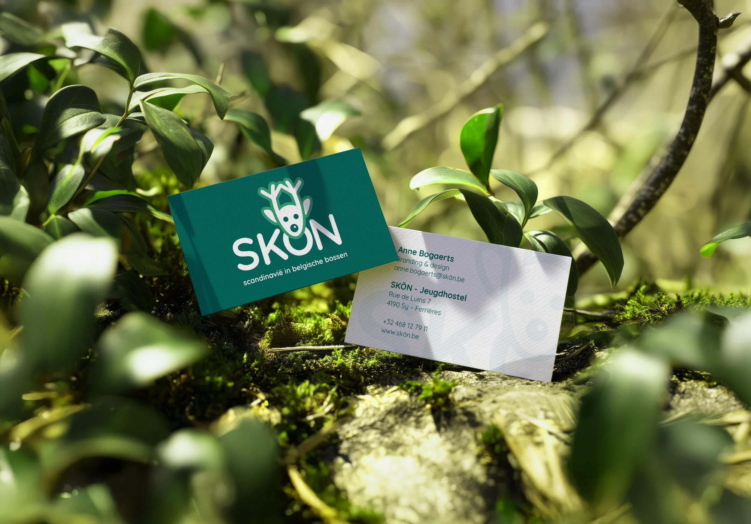
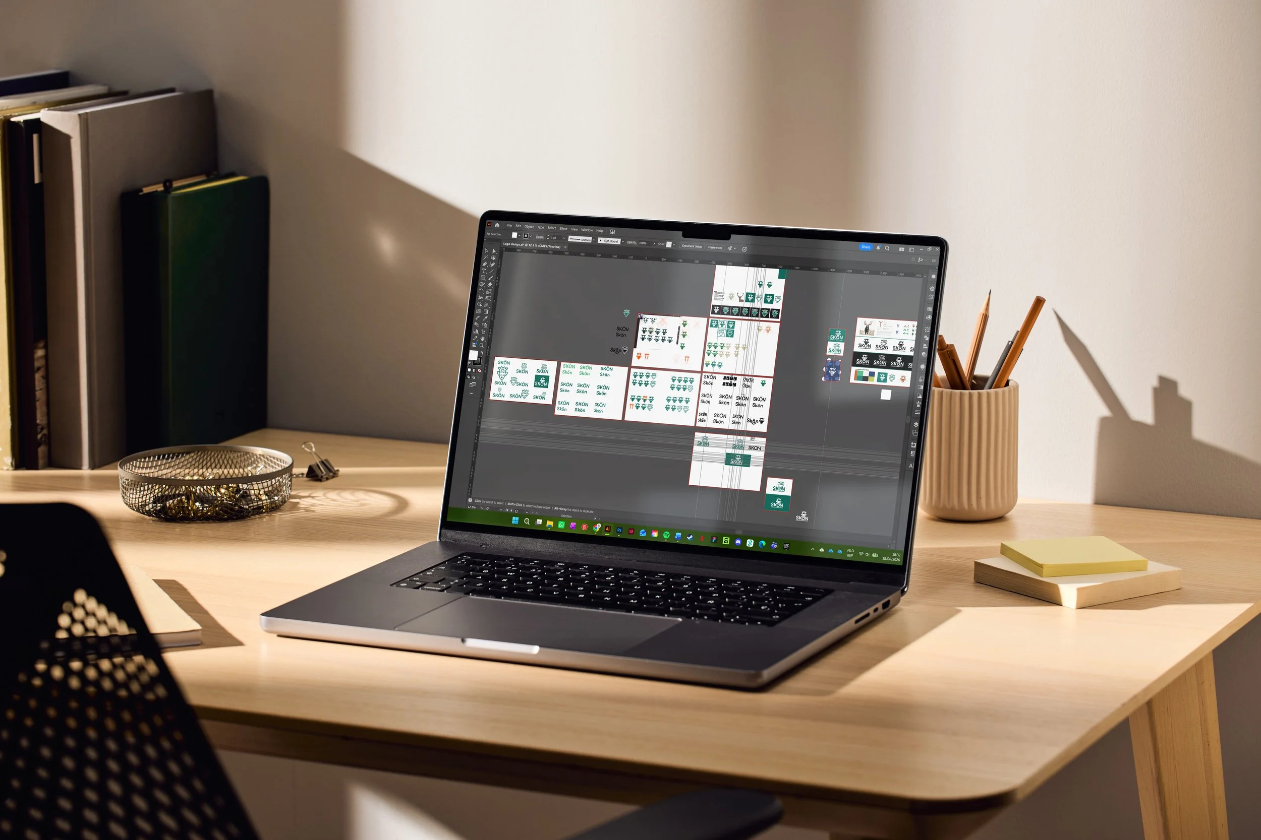
I designed a logo for Skön, a fictional youth hostel with Scandinavian roots, located in the Belgian Ardennes. Combining a wordmark and symbol, the identity was developed through extensive research into the organisation's personality, audience and competitive landscape. These insights shaped every design decision, from the overall concept to the typographic style and symbolic meaning embedded within the final logo.
Softwares:
Procreate
Adobe Illustrator
Adobe Photoshop
Conceptual schoolproject.
Stockimages were used for mockup purposes only.
Process
This project focused entirely on refining a single visual identity. Through extensive sketching and iteration, I searched for a concept that reflected Skön's values in a meaningful way. The final icon subtly incorporates the Norse symbol Algiz, representing sanctuary and protection, integrated into the antlers to reinforce the hostel's story before being perfected as a dynamic logo system in Illustrator.
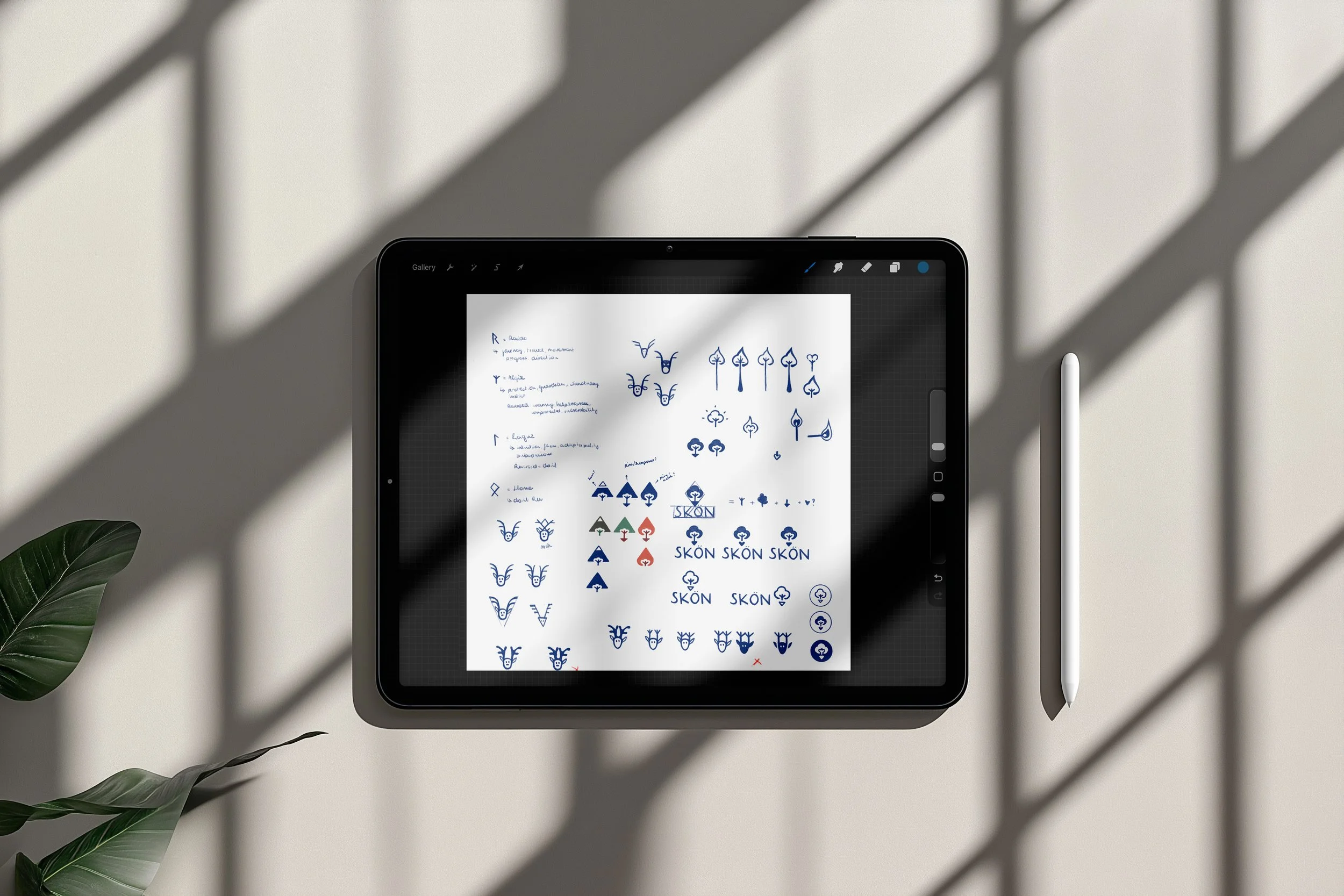
Curious about the process behind this project? I'd be happy to share the full research, concept development and visual studies that shaped the final design. Feel free to get in touch.
Design Method
-

In-depth Research
Every project begins with listening and observing. I explore the story behind the brand or product to understand what it truly wants to communicate.
-
Concept Development
Those insights evolve into a visual system where emotion and strategy come together. This is where the tone, rhythm and direction of the design take shape.
-
Iterative Exploration
Typography, colour and composition are refined through experimentation. Every iteration brings the visual language closer to its strongest and most coherent form.
-
Presentation
The final outcome should be more than a finished design; it should tell a story. Every project is presented with careful attention to context, consistency and experience.
-
![]()
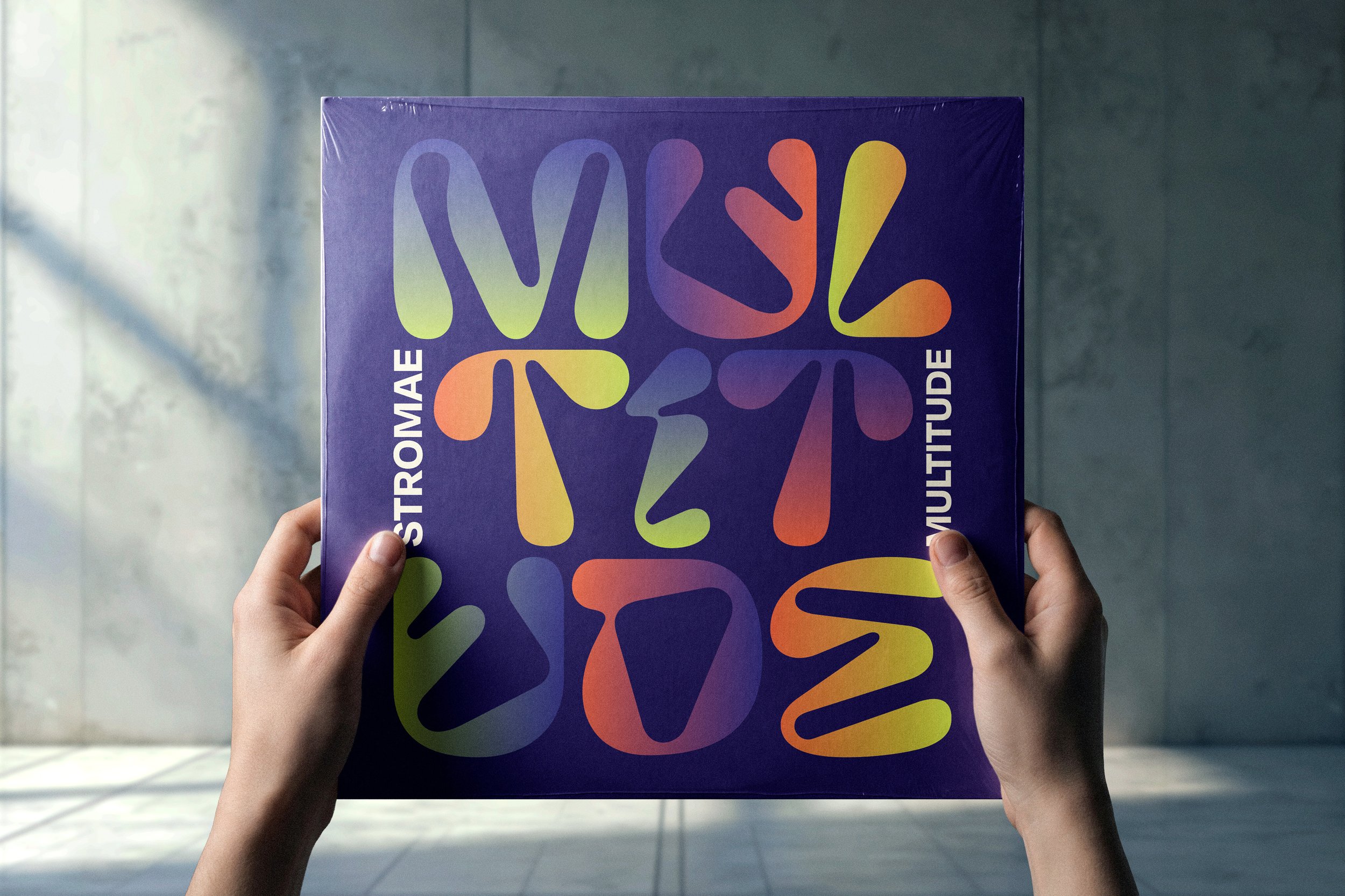
01: Multitude by Stromae
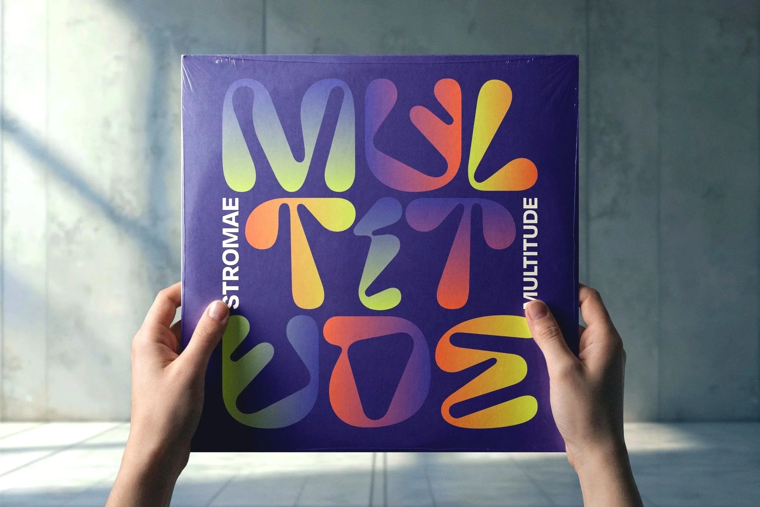
For this vinyl sleeve design, I translated my personal view on Stromae’s album Multitude into a visual identity. Inspired by the music, lyrics and themes of the record, I created an inner and outer sleeve to refect the album best.
-
![]()
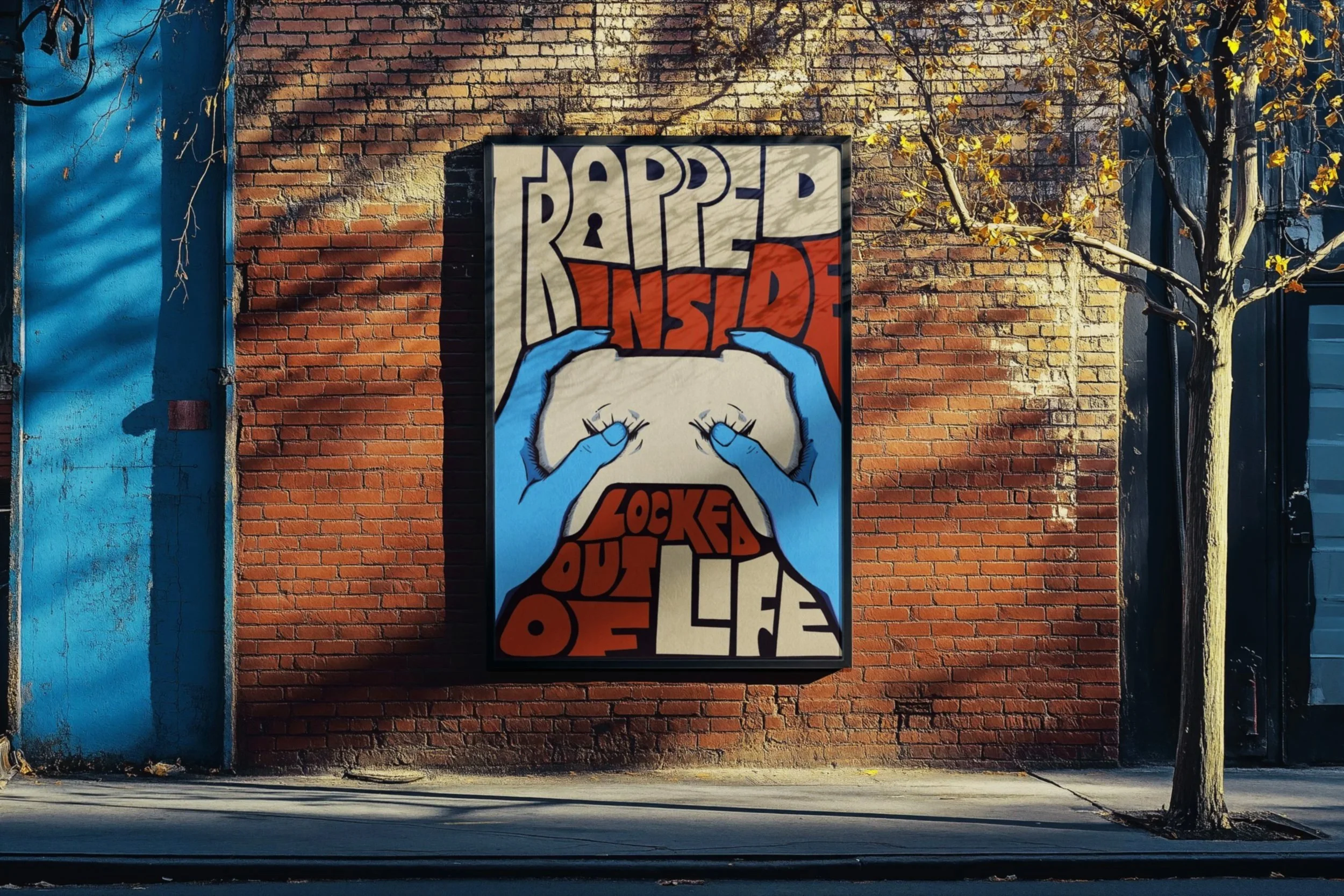
02: Spreading Awareness
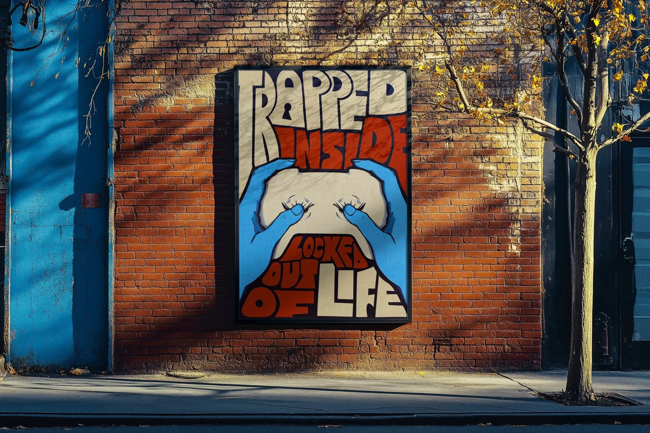
Have you ever heard of Hikikomori? This illustrated poster raises awareness of the social isolation some gaming addicts voluntarily withdraw into. Every visual element was drawn by hand to reinforce the personal nature of the subject.
-
![]()
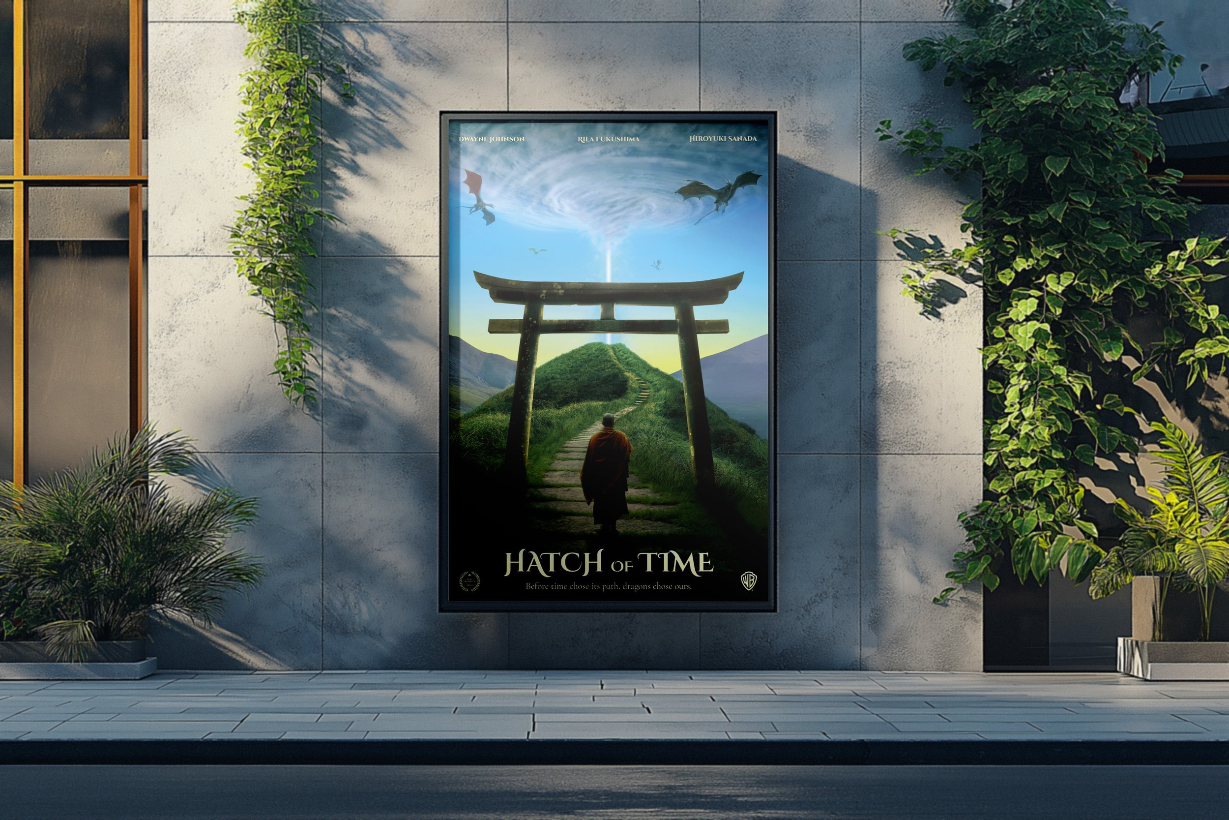
03: Hatch of Time
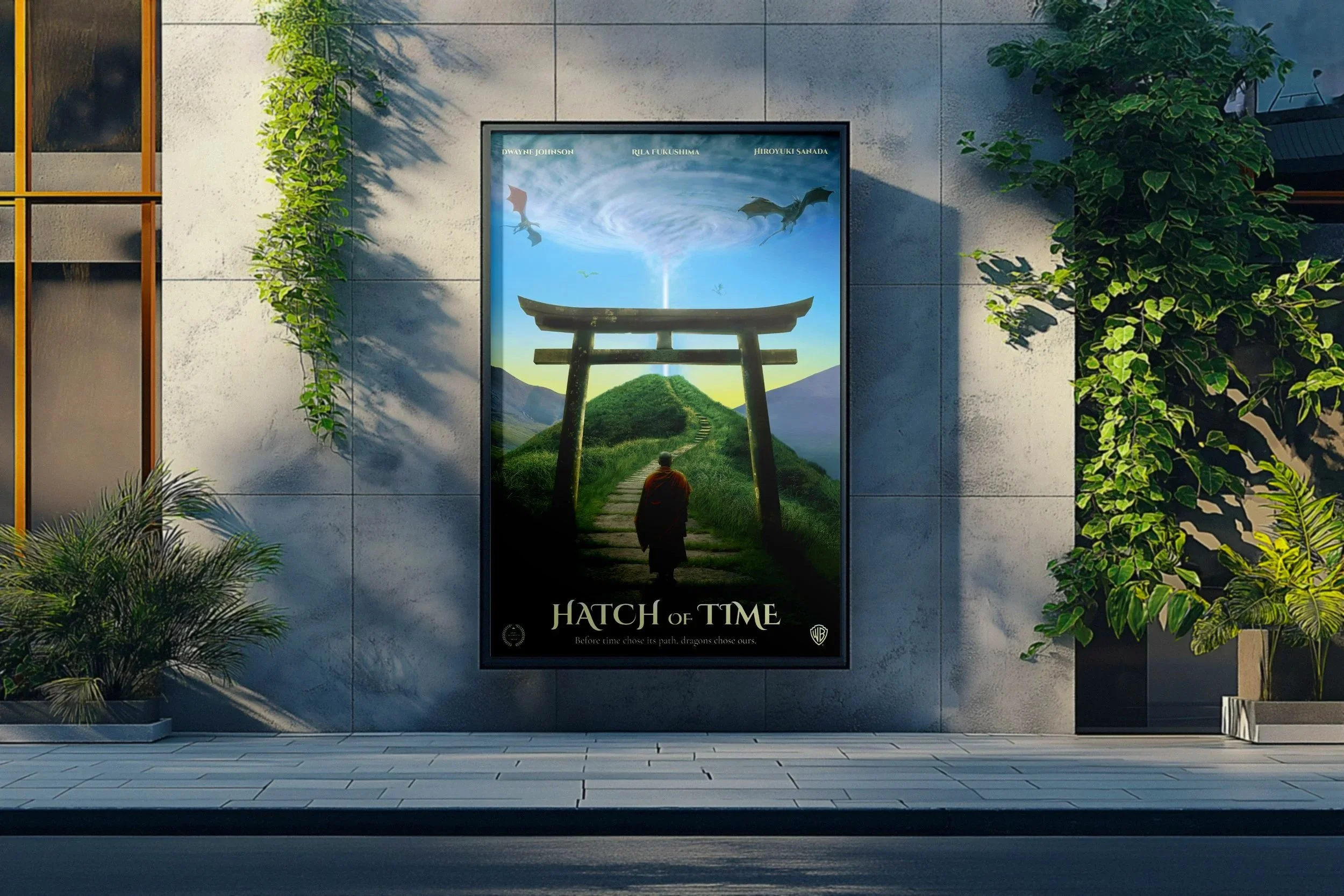
A movie with dragons, portals and monks? Count me in. For this fictional film poster, I developed a time-travel story and translated its narrative into a cinematic visual concept using Photoshop. A fun challenge, with a great result.
-
![]()
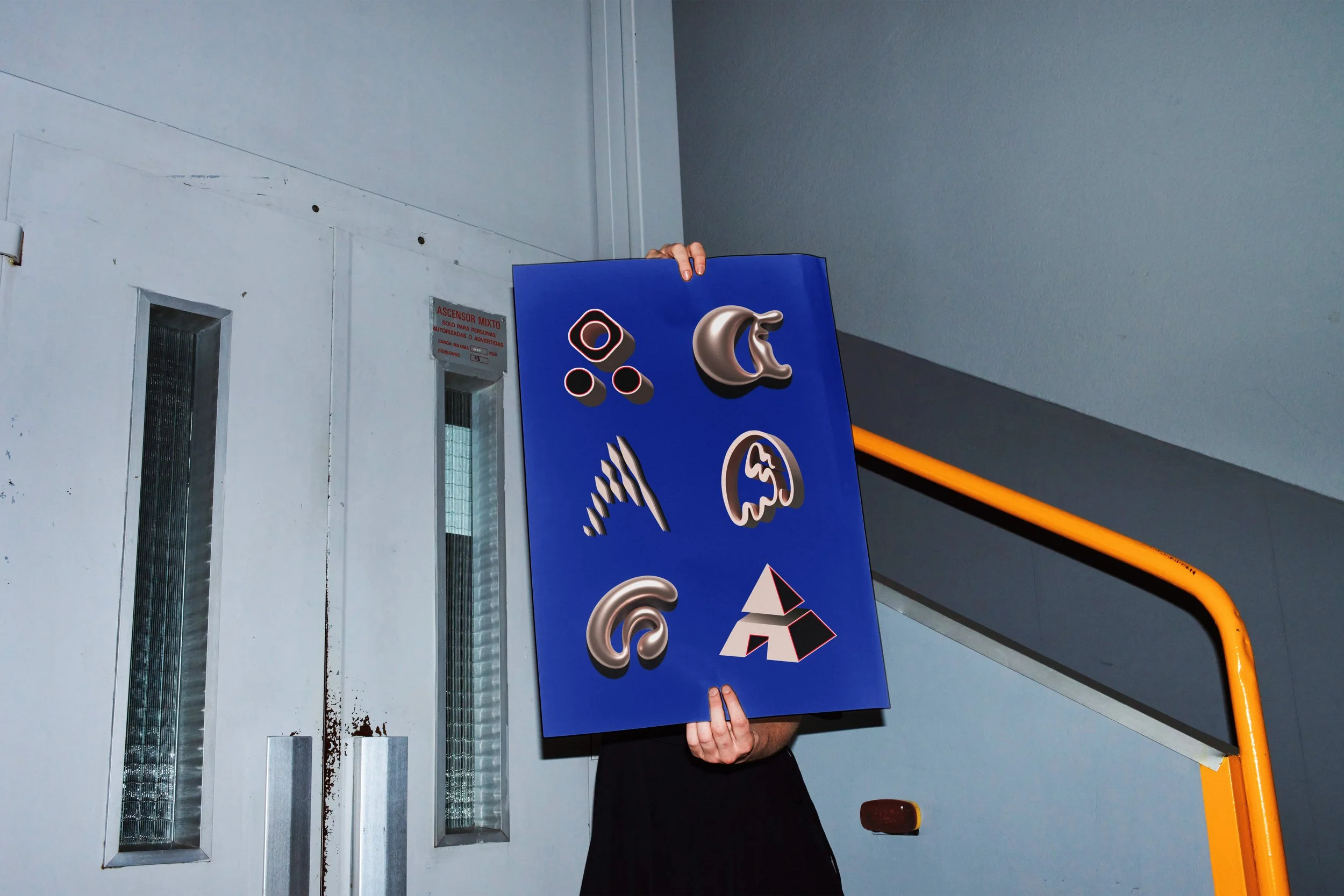
04: A set of A's
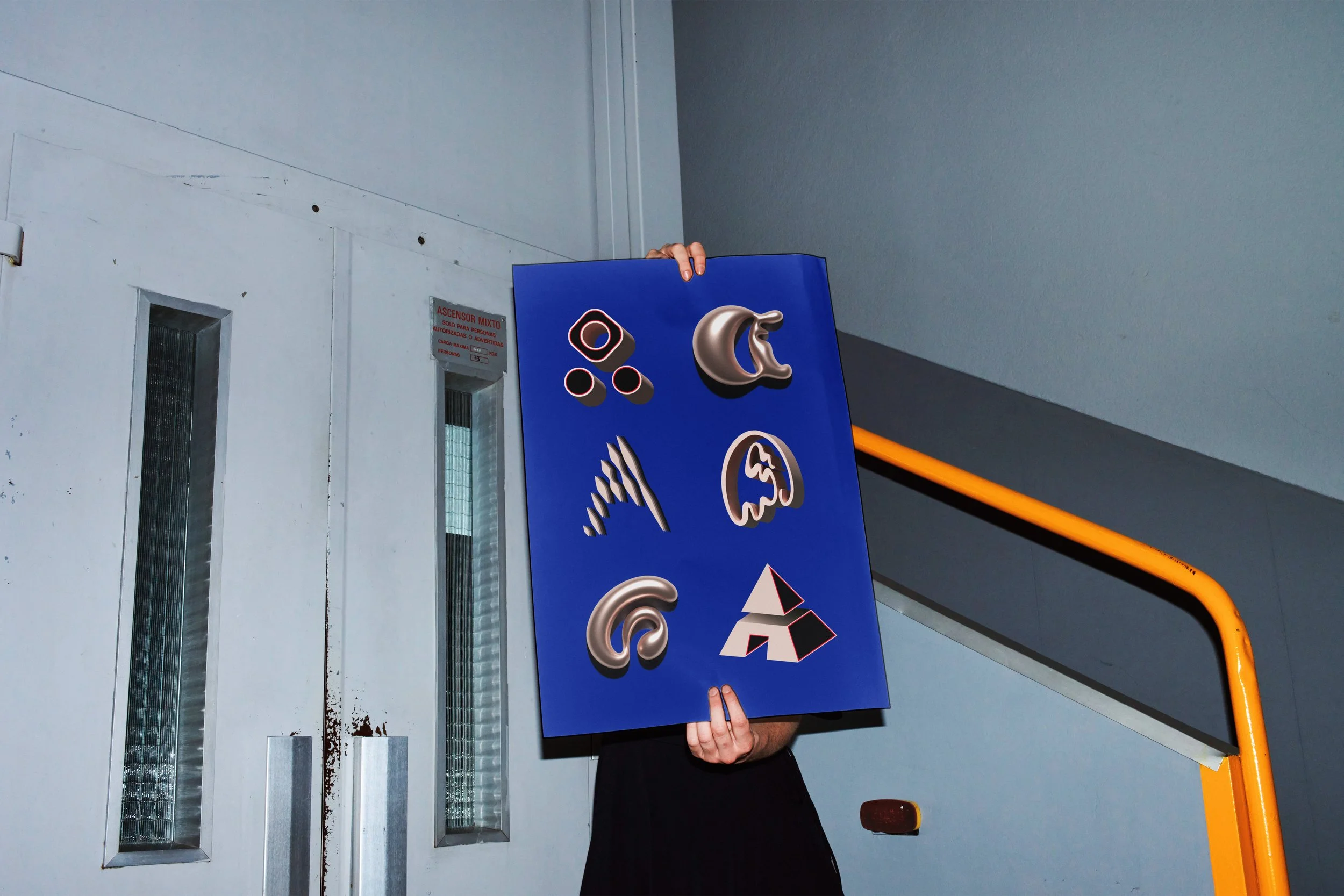
Inspired by the global 36 Days of Type challenge, this project explores the creative possibilities of a single letter. Each interpretation of the letter A pushes typography in a different direction, experimenting with form and visual expression.
-
![]()
05: OmniSense Teaser
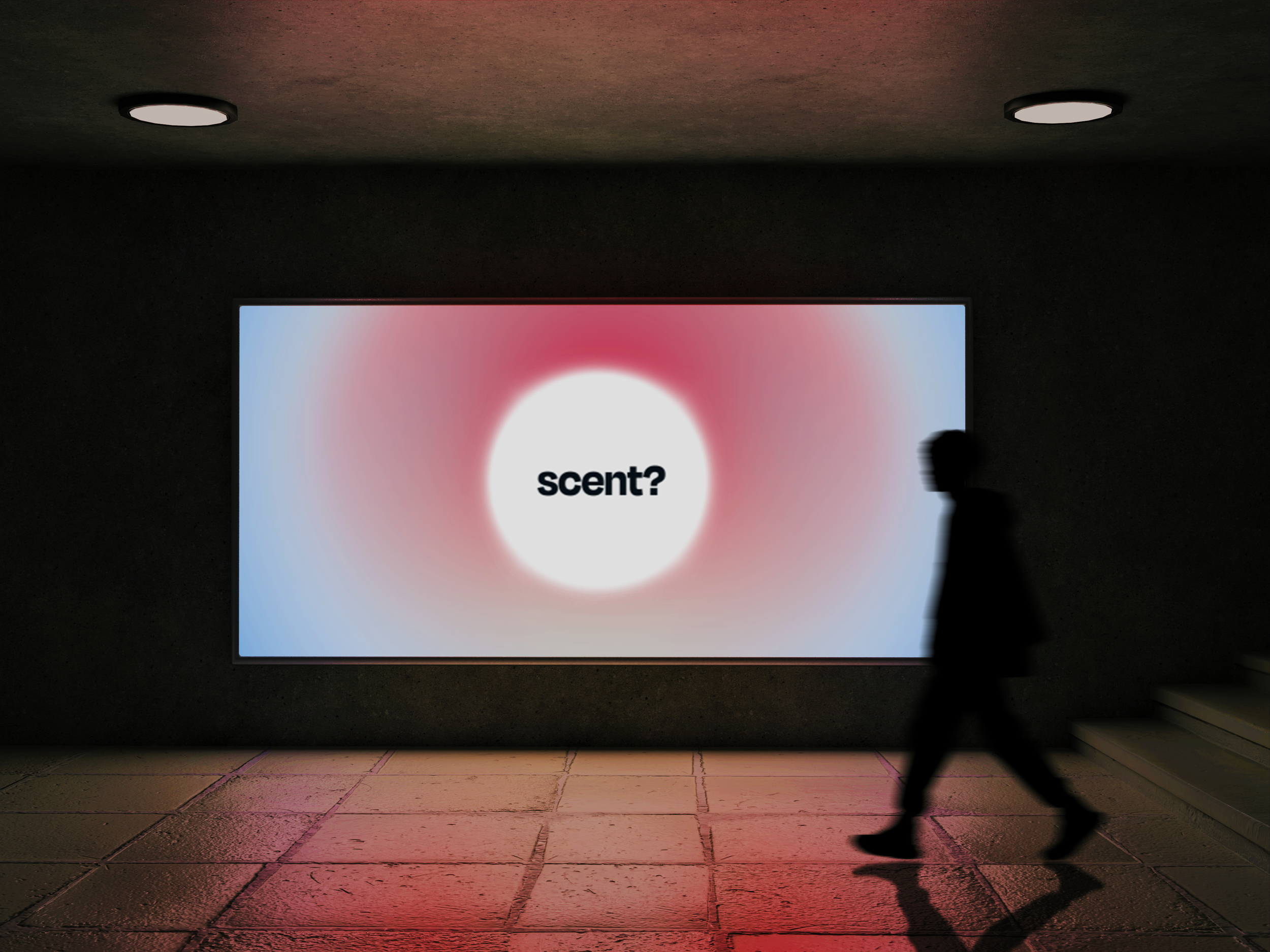
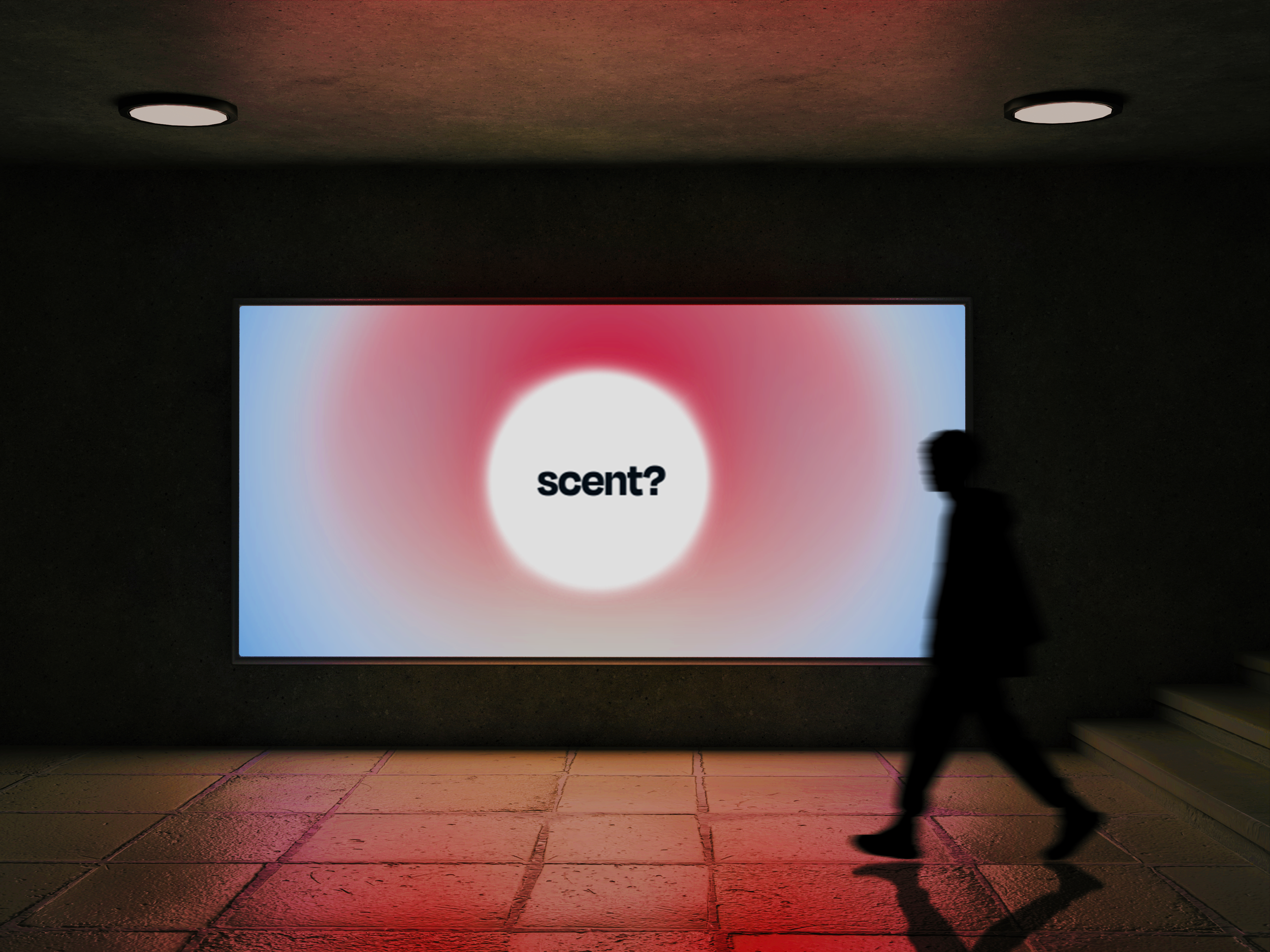
Can you see scent? Taste colour? Hear texture? For this fictional sensory festival, I created a promotional motion video designed to blur the boundaries between the senses and spark curiosity before the event even begins.
-
![]()
06: Skön Logo Design
Skön is a fictional youth hostel that brings Scandinavian simplicity to the Belgian Ardennes. This project focused on developing a dynamic logo system that reflects both the hostel’s identity and its connection to nature.
-
![]()
07: Zebra Striping
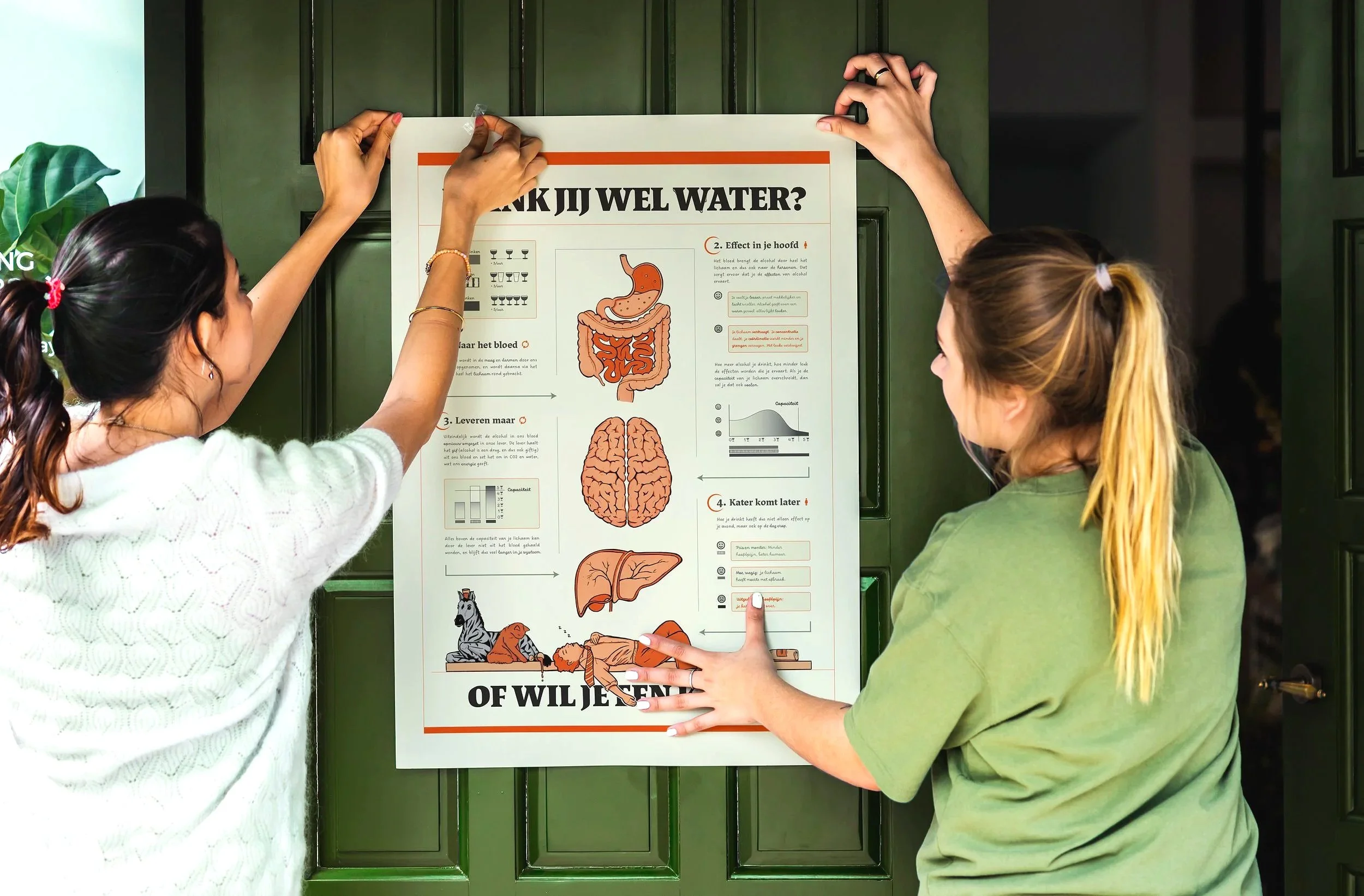
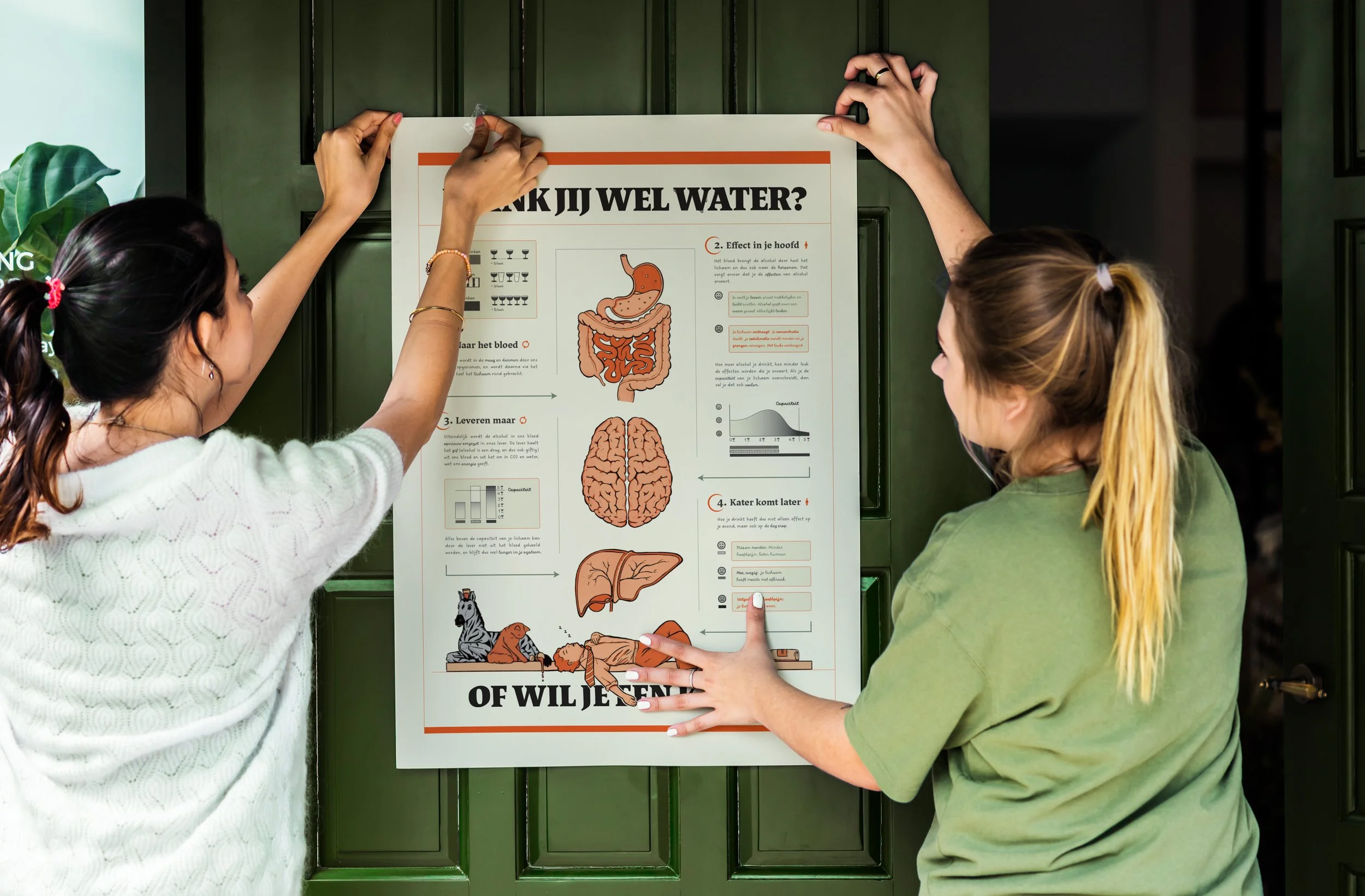
Binge drinking is no joke. This infographic I designed highlights the benefits of alternating alcoholic drinks with non-alcoholic drinks, using clear visual communication and structure to encourage healthier drinking habits.